Hotel Website Design Inspiration From 13 Independents
Thirteen independent hotels, inns and lodges. Their hotel website design makes one typeface decision loudly and every other decision very quietly.
Shown
13 sites
Reviewed
30 candidates
Chosen on
The work, not the ranking
Updated
15 October 2026
01
hotelkinsley.com
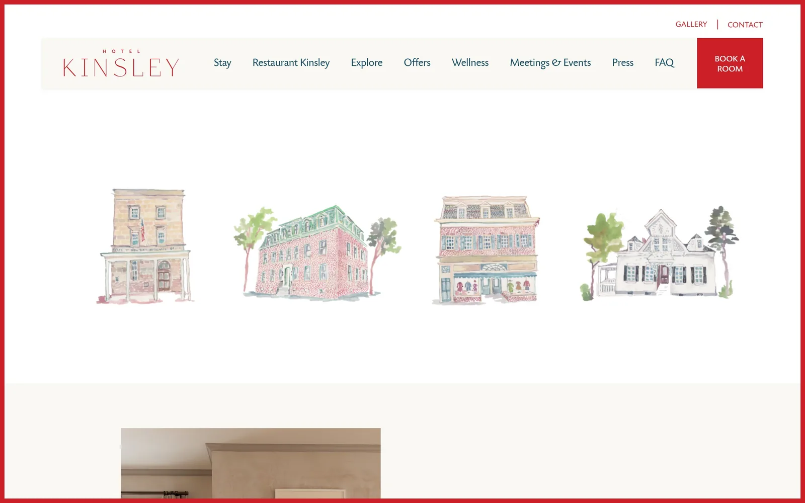
Four watercolour paintings of the hotel's buildings float on white, framed by a thin red border around the whole viewport.
Type
Wide light serif wordmark with a 58px serif further down
Body
TodaySB sans, 300 weight, 16px to 19px
Build
1290px container, 16 columns, 78px gaps
Made on
WordPress
Colour
#ffffff #024c63 #cc2028
Type. The wordmark sets KINSLEY in a wide-tracked light serif with HOTEL above it in tiny caps. Everything else runs in one humanist sans at 19px for nav and 16px for body, weight 300, tracking pulled very slightly negative at -0.016em. A 58px high-contrast serif and a marker-style script appear further down, so the house has three voices and uses the sans for all the work.
Colour. White at #ffffff holds the page, with a warm off-white #faf8f3 for the nav bar. All ink is a deep teal #024c63, which is the real decision here: not black, not navy, a colour that sits beside the watercolours instead of on top of them. Red #cc2028 gets under one percent of the screen, spent on the border rule and the BOOK A ROOM block.
Layout. A 1290px container inside a 1440px viewport, 90 percent wide, built on a 16-column grid with 78px gaps and 80px section padding. The hero is not a photograph. It is four illustrations in a row with enormous air above and below, nothing cropped, nothing bled. Below the fold a room photograph begins, so the first screen is entirely drawing.
The ask. BOOK A ROOM sits in the red block at the top right, the only filled button on the screen. GALLERY and CONTACT sit above the nav bar in small red type. Eight nav items compete for attention but none of them is styled as a button, so the red square wins by colour alone.
Illustration can carry a hero better than photography when the photography would look like every other hotel's.
02
touristswelcome.com
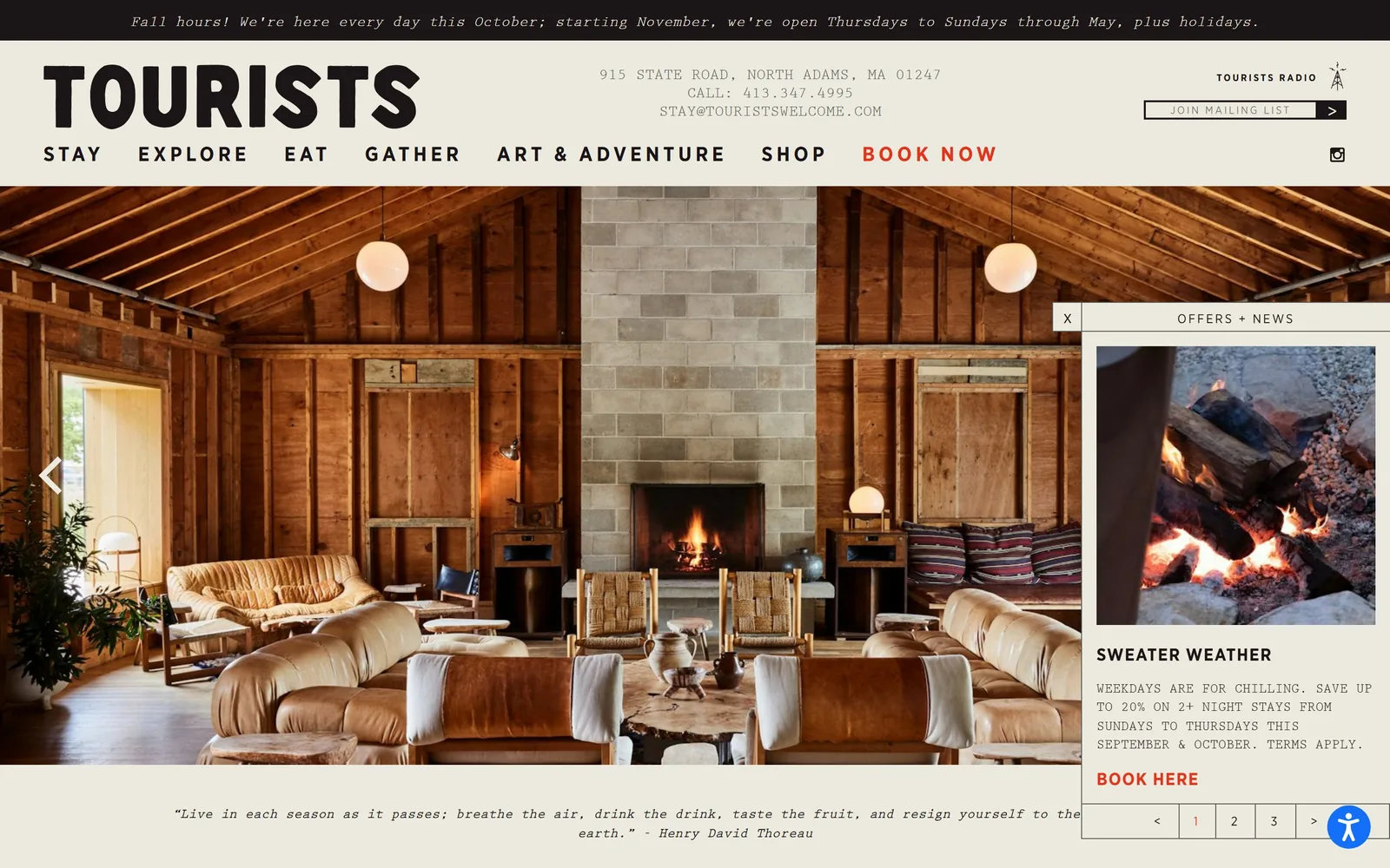
A barn-wood lounge with a lit fireplace under heavy black condensed type and a typewriter-face address block.
Type
Gotham Narrow Bold, 60px, 0.133em tracking
Body
Prestige Elite typewriter, 14px to 16px
Build
1350px container, stacked three-row header
Made on
WordPress
Colour
#eceadf #1c1518 #e4341b
Type. TOURISTS is set in Gotham Narrow Bold at 60px with 0.133em tracking, filling the top left corner like a stencil. The nav runs the same face at 21px, 600 weight, uppercase, 0.19em tracked. Body copy switches to Prestige Elite, a typewriter face, for the address, the hours strip and the offer panel. Two voices, condensed poster and carbon copy, and they do not fight.
Colour. A warm paper #eceadf covers the chrome, with near-black #1c1518 for text and a black hours bar across the very top. The only hot colour is #e4341b, an orange red spent on BOOK NOW in the nav and BOOK HERE in the offers panel, about thirty characters of it on the whole screen. The photograph supplies all the brown.
Layout. A 1350px container at 94 percent of a 1440px viewport. The header stacks three rows: hours bar, then wordmark with centred address and mailing list signup, then the nav. The photograph runs full bleed below with a slider arrow at the left edge and a Thoreau quote under it. An OFFERS + NEWS panel docks at the right, paginated 1 2 3.
The ask. BOOK NOW in the nav, JOIN MAILING LIST with its own arrow button, and BOOK HERE inside the offers panel. Three asks on one screen, each in a different register. The offers panel is the pushiest and it earns its place by carrying an actual discount rather than a generic invitation.
Two typefaces with opposite jobs, poster and typewriter, give a small property more personality than a third photograph would.
03
zerogeorge.com
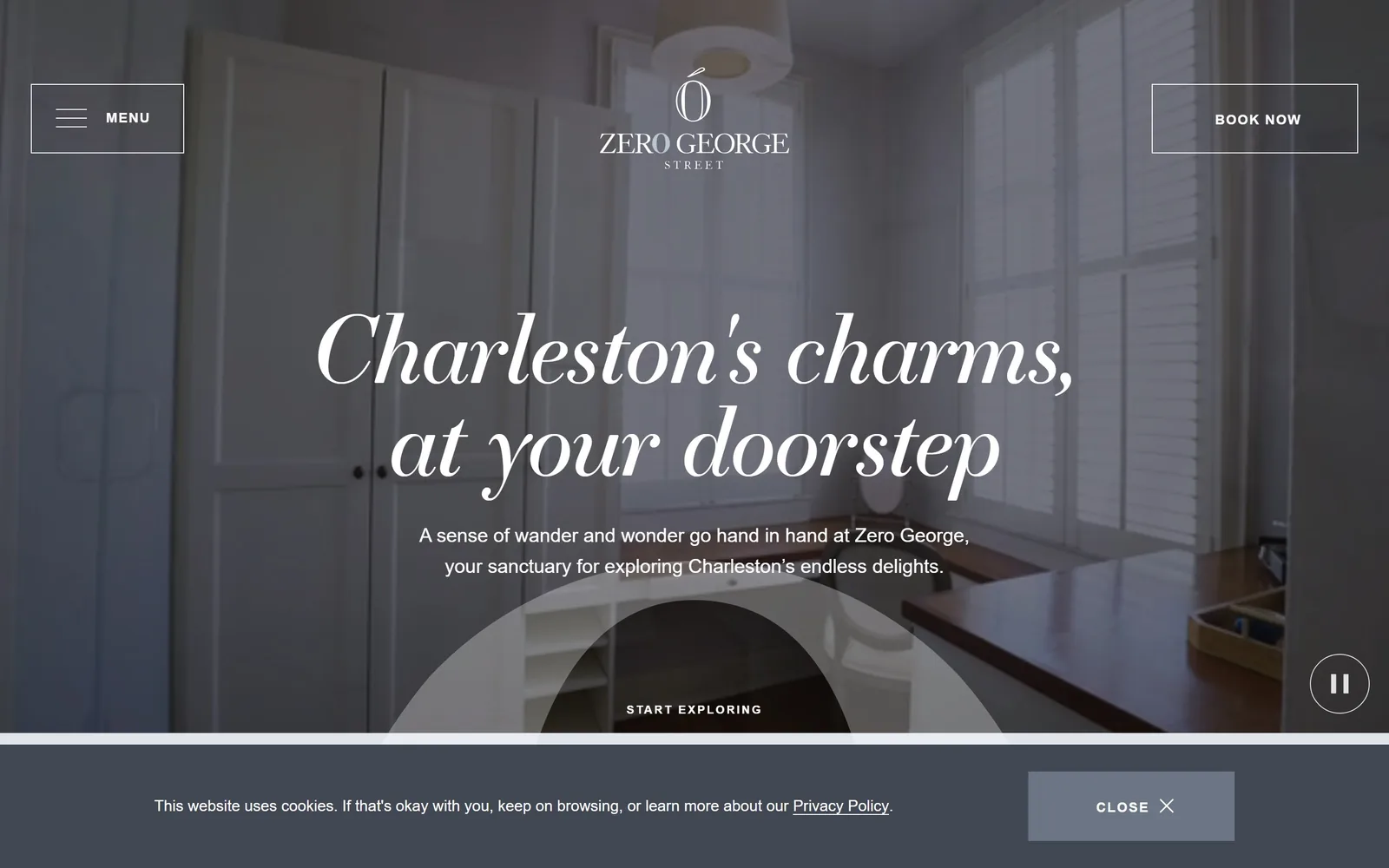
A 96px italic serif headline reads Charleston's charms, at your doorstep over a desaturated video of a shuttered white room.
Type
Essonnes Display Italic, 96px, -0.020em
Body
Benton Sans Book, 16px to 20px
Build
Full-bleed 1440px hero, 290px section padding
Made on
WordPress
Colour
#f3f5f7 #414854 #ffffff
Type. The headline is Essonnes Display Italic at 96px, weight 300, tracking tightened to -0.020em over a 1.0 line height, so the two lines sit almost on top of each other. The subhead drops to Benton Sans Book at 20px with 1.75 line height. Small caps labels like START EXPLORING run Benton Sans Bold at 12px with 0.155em tracking. The jump from 96 to 20 to 12 is the whole system.
Colour. The page body is a cool near-white #f3f5f7, and the hero video is graded so far down toward #414854 that the room reads grey rather than white. Headline and subhead are pure white. There is no accent colour anywhere on the first screen, not on the buttons, not on the nav. The restraint is deliberate and it is the risk the site takes.
Layout. Full 1440px bleed with no visible container on the hero and 290px of section padding further down, which is a lot of air. MENU sits boxed top left, BOOK NOW boxed top right, both outlined rather than filled, both the same size. The wordmark centres between them. A circular pause control sits bottom right. Corner radius is zero throughout.
The ask. BOOK NOW is an outlined box in the corner and START EXPLORING is a link under the subhead, so neither is a filled button. A grey cookie bar with a CLOSE button eats the bottom strip of the screen. The booking ask is quieter than the cookie notice, which is the one thing here working against the page.
A single oversized italic display face can do all the branding if you refuse to add a second accent colour.
04
callicoonhills.com
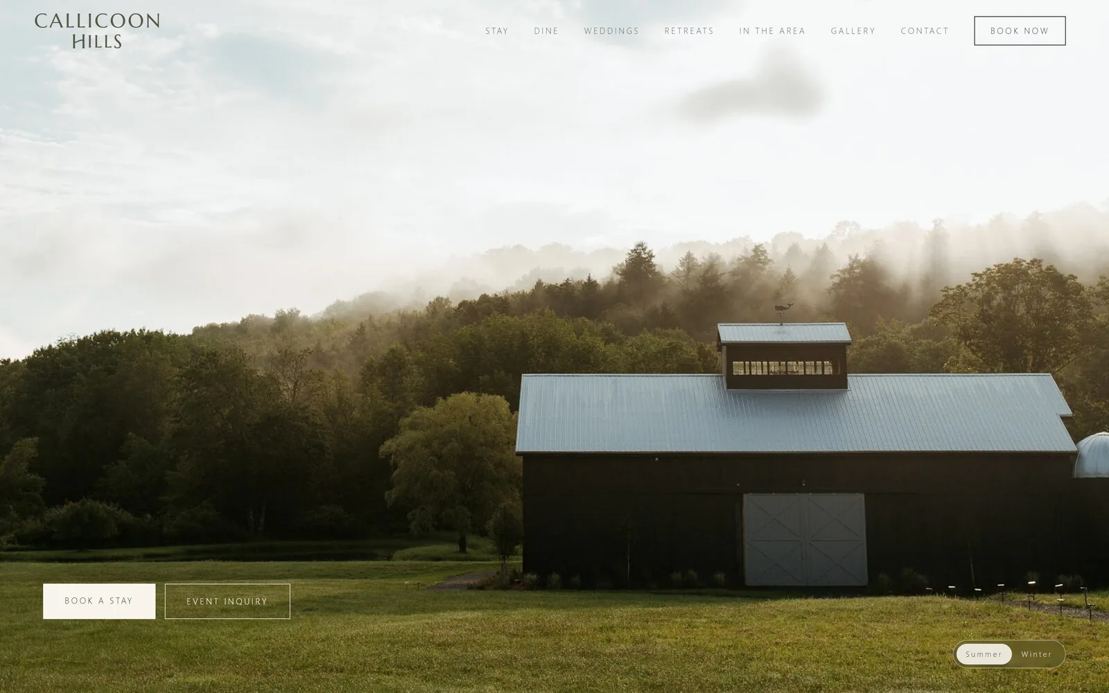
A dark barn with a pale metal roof sits against fog-lit woods, with two outlined buttons low in the left corner.
Type
Wide-tracked serif wordmark, Marcellus at 48px
Body
Nunito Sans 300, 11px uppercase, 0.220em
Build
1440px, 12 columns, 64px gaps, 128px padding
Made on
Custom
Colour
#f2edde #3b3f31 #656959
Type. The wordmark stacks CALLICOON over HILLS in a wide-tracked serif, olive rather than black. Nav and buttons both run Nunito Sans at 11px, weight 300, uppercase, tracked out to a severe 0.220em, which is the single most consistent decision on the page. A 48px Marcellus serif handles headings below the fold. Eleven-pixel nav is small and it works because the tracking gives it width.
Colour. A cream #f2edde carries the body and a lighter #f8f5ed fills the one solid button. Text is a muted olive-grey #656959 with headings in a darker #3b3f31. No blue, no gold, no red anywhere. For a Catskills property this is a decision rather than a default, because the obvious default would have been charcoal on white.
Layout. A full 1440px container on a 12-column grid with 64px column and row gaps and 128px section padding. The header is transparent over the photograph with the wordmark left and seven nav items plus an outlined BOOK NOW right. The two hero buttons sit at the bottom left on the grass rather than centred, which keeps the barn clear. Corner radius zero except the Summer / Winter pill bottom right.
The ask. BOOK NOW outlined in the header, BOOK A STAY as the one filled cream button, and EVENT INQUIRY outlined beside it. Pairing the room ask with the events ask at equal size is honest about where a 65-acre property earns its money. The Summer / Winter toggle is the only other interactive thing competing.
Running every piece of interface type at one size and one tracking makes a page feel designed rather than assembled.
05
thefifthavenuehotel.com
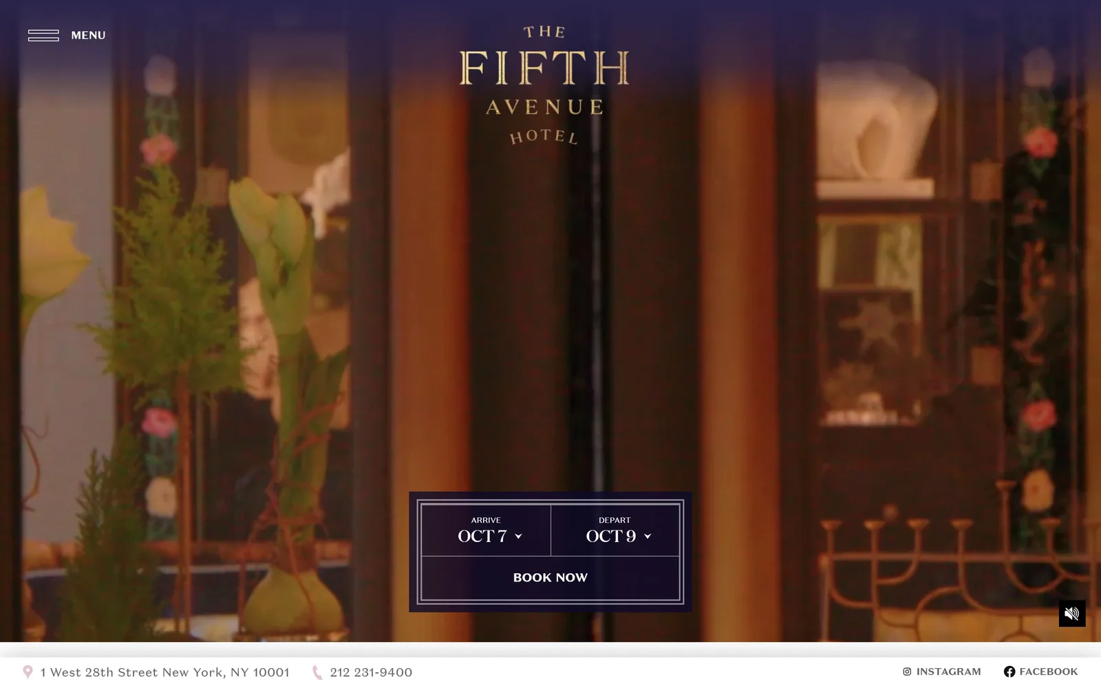
A gold stacked wordmark floats over a slow video of a florist's window, with a navy date picker boxed below it.
Full-bleed hero, centred booking panel, footer bar
Made on
WordPress
Colour
#342d63 #fbeff4 #0e0a29
Type. THE FIFTH AVENUE HOTEL stacks in Domaine Display Medium, uppercase, with FIFTH set far larger than the words around it so the mark reads as a monogram. Body and nav use Domaine Sans Text at 14px and 16px, uppercase for nav. Headings further down sit at 36px. Pairing the display and sans cuts of one family is the tidiest typographic choice on this page.
Colour. Deep indigo #342d63 and a near-black #0e0a29 do the structural work, with a pale pink #fbeff4 covering 40 percent of the page below the fold. The hero is all amber and bottle green from the video itself. Gold is in the wordmark only, never in a button. Pink as the secondary for a Gilded Age New York hotel is a braver call than the navy.
Layout. Full 1440px bleed with no gutters on the hero. MENU is top left, the wordmark is centred, and a bordered navy panel sits low centre holding ARRIVE Oct 7 and DEPART Oct 9 side by side with BOOK NOW under them. A white footer strip carries the street address, the phone number and social links, so contact detail is above the fold.
The ask. The page asks once, through a real date picker rather than a button that opens one. Arrive and depart are prefilled with today and the day after next, which removes a step. Nothing else on the screen is a call to action except the phone number in the footer strip, so the booking panel has no competition.
Put the date fields themselves in the hero instead of a button that leads to them, and prefill the dates.
06
hotelmccoy.com
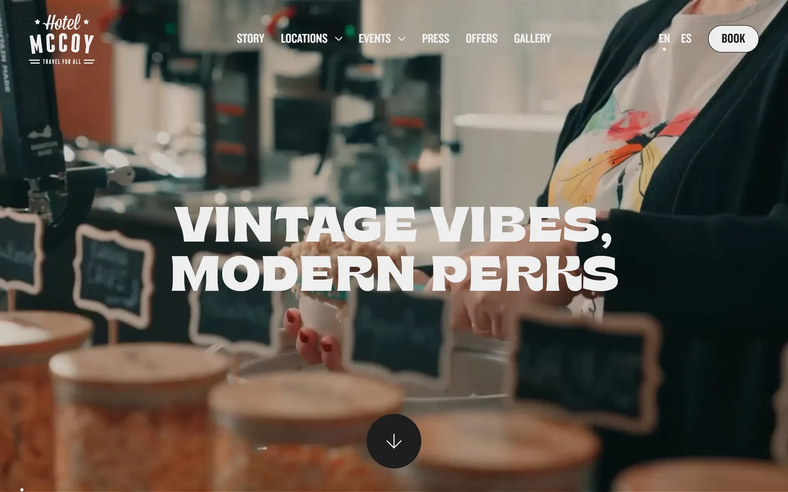
VINTAGE VIBES, MODERN PERKS in heavy condensed caps across a shallow-focus video of a coffee counter.
Type
Brice Bold, 90px uppercase, 1.0 line height
Body
Knockout 52 Cruiserweight, 20px
Build
Full-bleed hero, 250/834/250 content column
Made on
Webflow
Colour
#000000 #eeeeee #1e1e1e
Type. The headline is Brice Bold at 90px, uppercase, zero tracking, 1.0 line height, two lines tight enough to read as a block. Brice has flared stems and an unusual R, so it carries the retro signal without a script face. Nav and the BOOK pill use Knockout 49 Liteweight at 24px uppercase, and body copy uses Knockout 52 Cruiserweight at 20px. Three weights of one condensed family against one display face.
Colour. The screen is near-black and warm brown from the video, with all type in #eeeeee rather than pure white, which keeps it from glaring. The badge logo is white with a star either side. There is no accent colour on the first screen at all. The brand colour arrives below the fold, so the hero is carried by type weight instead.
Layout. Full 1440px with no container on the hero and a 3-column grid of 250 / 834 / 250 further down, so body content sits in a centre column with wide margins. The headline is centred and vertically near the middle. A dark circular scroll arrow sits at the bottom centre. The BOOK button is the one pill shape on an otherwise square page.
The ask. BOOK sits top right as a white pill, short and unhedged. EN and ES sit beside it, which for a Tucson property is a real feature rather than decoration. The nav carries OFFERS and GALLERY, both of which pull against booking, but the pill is the only filled element so it still reads first.
A 90px condensed display face at 1.0 line height can replace a brand colour entirely in the hero.
07
korakia.com
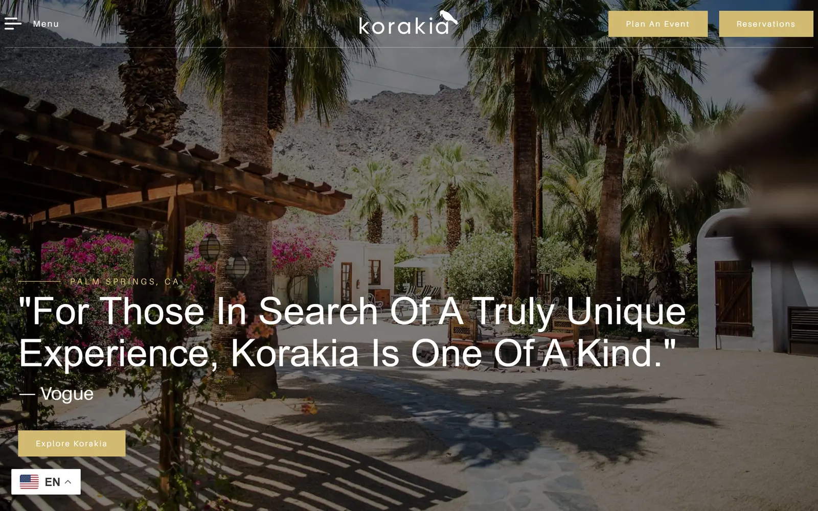
A Vogue pull-quote in large caps-initial type runs across a sunlit courtyard of palms, bougainvillea and whitewashed walls.
Type
Crimson Pro 300, 67px, word-capitalised
Body
Aileron, 16px, 1.8 line height
Build
Full-bleed hero, left-aligned quote block
Made on
WordPress
Colour
#ffffff #d2bb71 #727272
Type. The hero line is Crimson Pro at 67px, weight 300, capitalised word by word rather than sentence case, which reads oddly at first and then reads like a magazine deck. The attribution sits at 32px in Aileron. Nav runs Crimson Pro at 19px uppercase with 0.104em tracking, and body text drops to Aileron at 16px with a loose 1.8 line height. The lowercase korakia wordmark with a bird perched on the final letter is the counterweight.
Colour. White at #ffffff dominates once you scroll, and the hero is all the photograph's greens and terracotta. The one brand colour is a soft brass #d2bb71, used on the two header buttons and on the Explore Korakia button, roughly one percent of the screen. Body text is a mid grey #727272 rather than black. Brass on white is the default for Palm Springs, so this is category-correct rather than surprising.
Layout. Full 1440px bleed, no container visible on the hero, no grid, two flex rows. The header is a transparent strip with a hamburger plus the word Menu at the left and two brass buttons at the right. The quote is set hard against the left edge with its rule and PALM SPRINGS, CA label above it, so the composition is left-weighted against a centred wordmark.
The ask. Reservations and Plan An Event sit side by side in the header as equal brass buttons, and Explore Korakia sits under the quote as a third. Three brass rectangles on one screen dilutes each of them. The press quote is doing the persuading and the buttons are only catching the result.
Lead with someone else's sentence about you rather than your own, and give it the largest type on the page.
08
250mainhotel.com
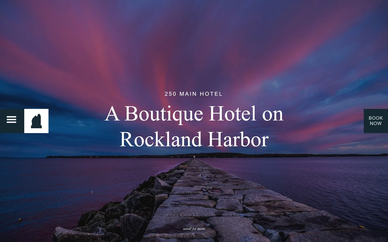
A stone breakwater runs to the horizon under a magenta and blue dusk sky, with a serif headline centred on it.
Type
Vollkorn, 80px, 1.20 line height
Body
Lato, 16px, 1.85 line height
Build
Full-bleed 900px hero, fixed left and right edge tabs
Made on
Custom
Colour
#152932 #fdf1e1 #ffffff
Type. A Boutique Hotel on Rockland Harbor is set in Vollkorn at 80px, weight 400, 1.20 line height, breaking over two lines. Vollkorn is a sturdy bookish serif rather than a fashion serif, which suits a working harbour town. Above it, 250 MAIN HOTEL runs in Lato at 20px uppercase with 0.200em tracking. Body copy sits in Lato at 16px with a generous 1.85 line height. A small italic scroll for more marks the bottom.
Colour. The hero is entirely the photograph, which is why the sampled palette reads #1e1e1e at half the screen. The interface colour is a deep slate #152932, used for the menu rail, the BOOK NOW tab and the button background. A cream #fdf1e1 covers a third of the page below. Three colours total, and the slate is the only one chosen rather than inherited.
Layout. The hero fills 1440 by 900 with no container. Two fixed tabs break the edges: a slate square with a hamburger plus a white logo tile on the left, and a narrow slate BOOK NOW tab on the right, both vertically centred. That leaves the entire middle of the screen for the photograph and the headline. Corner radius is zero.
The ask. BOOK NOW is a vertical tab pinned to the right edge, visible but never in the way. It is the only ask on the first screen. Nothing competes with it because the navigation is hidden behind the hamburger, which is the trade: one clean screen in exchange for making visitors click to see what else exists.
Pinning the booking tab to the screen edge keeps the photograph whole and keeps the ask permanent.
09
duntondestinations.com
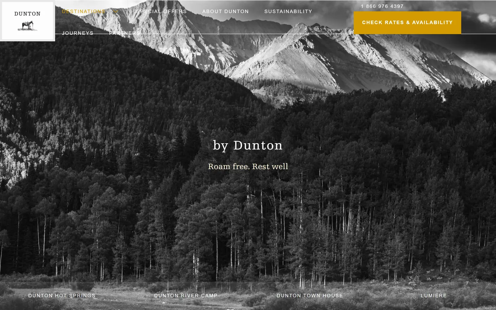
A black and white Colorado valley, aspen forest below bare peaks, with a small serif line floating at centre.
Type
Egyptienne slab serif, 38px, 0.053em
Body
Neuzeit Grotesk, 14px uppercase, 0.143em
Build
Full-bleed hero, corner logo tile, pinned property row
Made on
WordPress
Colour
#272727 #fdfdfd #d49c00
Type. The hero line is Egyptienne at 38px, a slab serif with blunt bracketed terminals, tracked at 0.053em over a 1.11 line height, with the tagline Roam free. Rest well at 24px beneath it. Nav and the booking button run Neuzeit Grotesk at 14px uppercase, 0.143em tracked, with the button at weight 700. Slab serif over geometric grotesk is a 1930s national-park pairing and it suits the photography exactly.
Colour. The photograph is fully desaturated, so the screen is only #fdfdfd white and a charcoal #272727. Against that, a mustard #d49c00 takes under one percent on the CHECK RATES AND AVAILABILITY block and on the active nav item. Converting the hero to black and white so a single warm yellow can carry the entire brand is the decision the whole page rests on.
Layout. Full 1440px bleed with no container and no grid. The logo sits in a white tile hard in the top left corner with a tiny engraved horse under the wordmark. Six nav items run across the top. A row of four property names, DUNTON HOT SPRINGS, DUNTON RIVER CAMP, DUNTON TOWN HOUSE and LUMIERE, is pinned along the bottom edge. In this capture the open DESTINATIONS submenu overlaps the header rule, which is the one rendering fault.
The ask. CHECK RATES AND AVAILABILITY is the single mustard block, with the phone number 1 866 976 4397 set directly above it in small white type. Naming the action rates rather than booking suits a collection where people compare four properties first. The four property names along the bottom are the real secondary navigation.
Desaturating the hero photograph entirely lets one accent colour do all the brand work at under one percent of the screen.
10
twinfarms.com
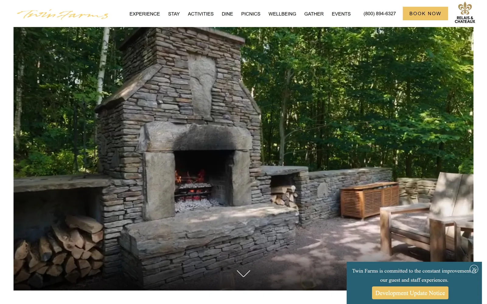
An outdoor dry-stone fireplace with a live fire and split logs stacked beside it, under a gold script wordmark.
Type
Gold script wordmark, Playfair Display at 65px
Body
Karla, 14px to 22px
Build
1440px, inset framed hero, 90px padding
Made on
WordPress
Colour
#ffffff #eec363 #285f72
Type. The Twin Farms wordmark is a gold script, loose and handwritten, which is the only expressive type on the screen. Headings below use Playfair Display at 65px. Nav and buttons run Karla at 14px uppercase, and body copy sits in Karla at 18px and 22px. Playfair plus Karla is one of the most used pairings on the web, so the script mark is doing all of the differentiating on its own.
Colour. White #ffffff holds the chrome and the hero is entirely the photograph's greys and greens. The accent is a soft gold #eec363 on the BOOK NOW button, under one percent of the screen. A teal #285f72 appears in the notice panel at the bottom right. Gold on white with a Relais and Chateaux badge is the category default for a property at this price, not a decision.
Layout. A 1440px container with 90px section padding. The header is a white bar with the script mark left, eight nav items and a phone number centred, the gold BOOK NOW button and the Relais and Chateaux crest right. The photograph is inset with a visible white margin on all four sides rather than bled, which is unusual and gives it a framed, printed quality.
The ask. BOOK NOW in gold is the single button, with the phone number (800) 894-6327 set beside it in the nav as an equal alternative, which fits a property where people still call. A teal notice panel about development work sits bottom right and pulls attention away from the chevron, but it is honest and placed where it does least harm.
Insetting the hero photograph with a white margin on all sides makes it read as a plate in a book rather than a web banner.
11
undercanvas.com
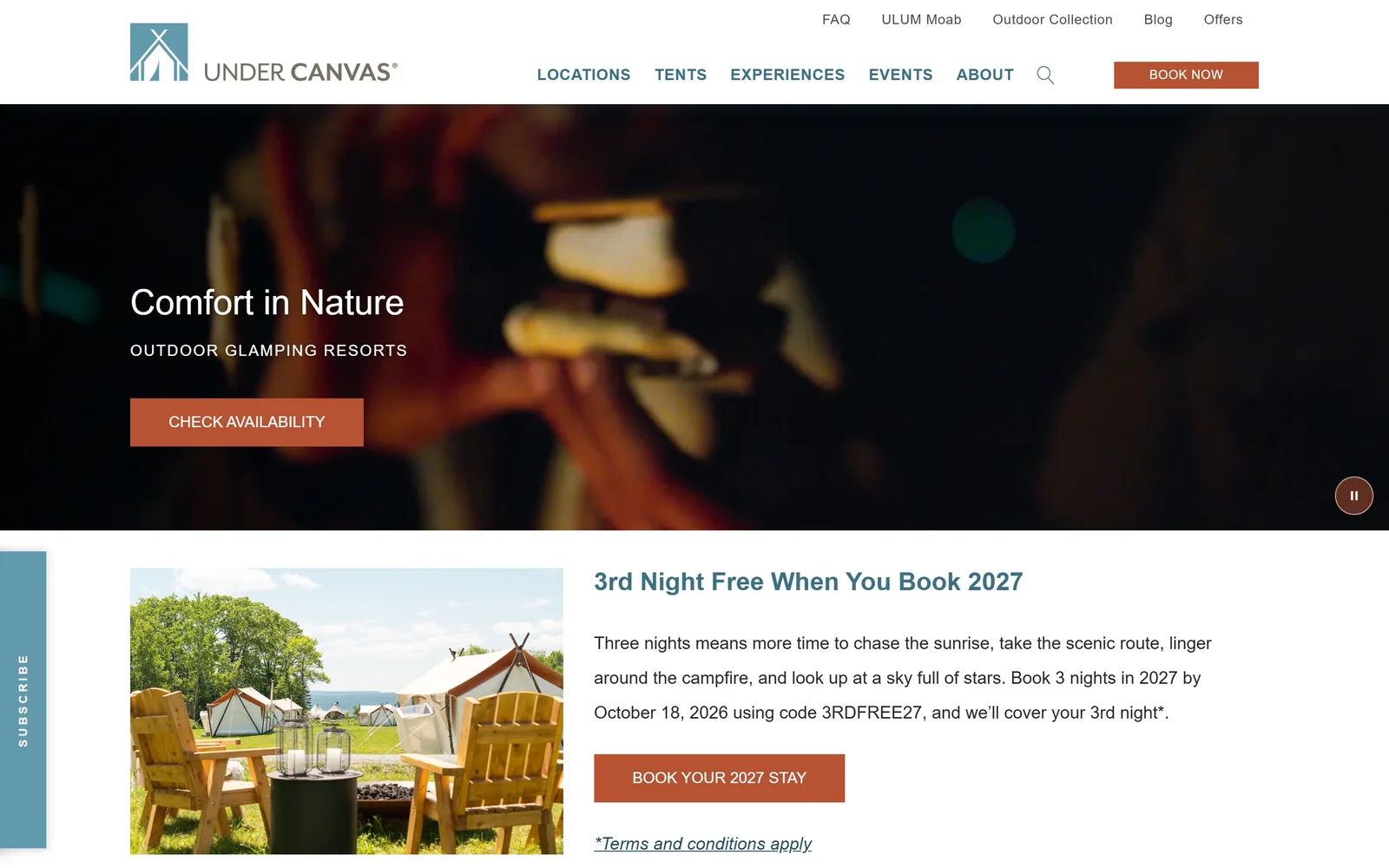
A dark out-of-focus campfire frame with Comfort in Nature in white and a rust Check Availability button.
Type. Everything on this page is Montserrat. The headline sits at 36px weight 500, the kicker OUTDOOR GLAMPING RESORTS at 16px weight 500 with 0.094em tracking, nav at 16px weight 600 uppercase, body at 18px with a very open 2.0 line height. One family at five weights is a defensible system and a dull one, and at 36px the headline is far too small for a 1440 by 900 hero.
Colour. White #ffffff carries most of the page, with #333333 for structure. The accent is a rust #b75333 on every button, about 1.7 percent of the screen, and a slate blue #3b7085 on nav links and headings. Rust against slate blue is the clearest palette on this list, and it holds across the hero, the nav and the offer block without wobbling.
Layout. A 1440px container on a 12-column grid with tight 2px column gaps and 40px section padding. The header is a white bar with two tiers, a quiet utility row of FAQ, ULUM Moab, Outdoor Collection, Blog and Offers above the main five items. The hero band is roughly 620px rather than full height, so the offer block below it starts above the fold. A vertical SUBSCRIBE tab is docked at the left edge.
The ask. CHECK AVAILABILITY in rust sits in the hero, BOOK NOW in rust sits in the header, and BOOK YOUR 2027 STAY in rust sits in the offer block, all three visible at once and all the same colour and shape. The offer carries a real code, 3RDFREE27, and a deadline, which is more persuasive than any of the buttons.
Pairing rust with slate blue and refusing to use any other colour keeps a busy multi-location site coherent.
12
eastwindhotels.com
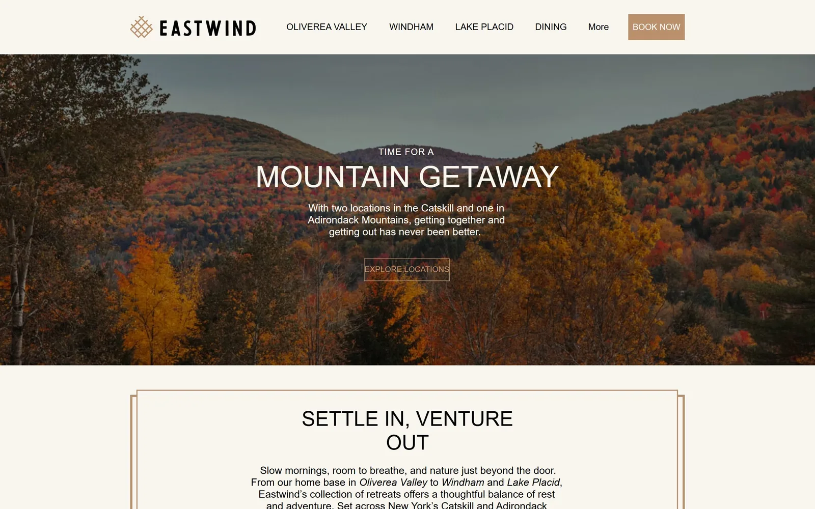
Peak autumn colour across two Catskill ridges, with a centred headline and an outlined Explore Locations button.
Type
DIN Neuzeit Grotesk, 52px
Body
Futura LT Book, 18px
Build
1440px, 780px hero band, keyline-framed section
Made on
Wix
Colour
#f8f6ee #28352b #b59372
Type. MOUNTAIN GETAWAY runs in DIN Neuzeit Grotesk at 52px, zero tracking, with TIME FOR A above it at a much smaller size, so the headline reads as a sentence broken across two scales. Body copy uses Futura LT Book at 18px, which gives the geometric O and single-storey a their usual effect. DIN over Futura is competent and a little cold for a property selling slow mornings.
Colour. A cream #f8f6ee carries the header and the section below, with black body text and a deep forest #28352b appearing in blocks further down. The accent is a tan #b59372 on the BOOK NOW button and the italic place names. The autumn photograph supplies the orange that the palette itself refuses to, which is a sensible division of labour.
Layout. A 1440px container with no grid. The header is a cream bar with the diamond logo and wordmark left, four location items plus Dining and a More dropdown centred, and a tan BOOK NOW block right. The hero photograph is a band roughly 780px deep rather than full height, so the second section with its thin tan keyline frame starts above the fold.
The ask. BOOK NOW in tan at the top right and EXPLORE LOCATIONS as an outlined box under the headline. The outlined button is weaker than the headline above it and nearly vanishes into the trees, which is the main fault here. Putting the next section partly above the fold is the better idea on the page because it tells you the site continues.
Let a shallow hero band end above the fold so the second section peeks through and invites the scroll.
13
hotelpetaluma.com
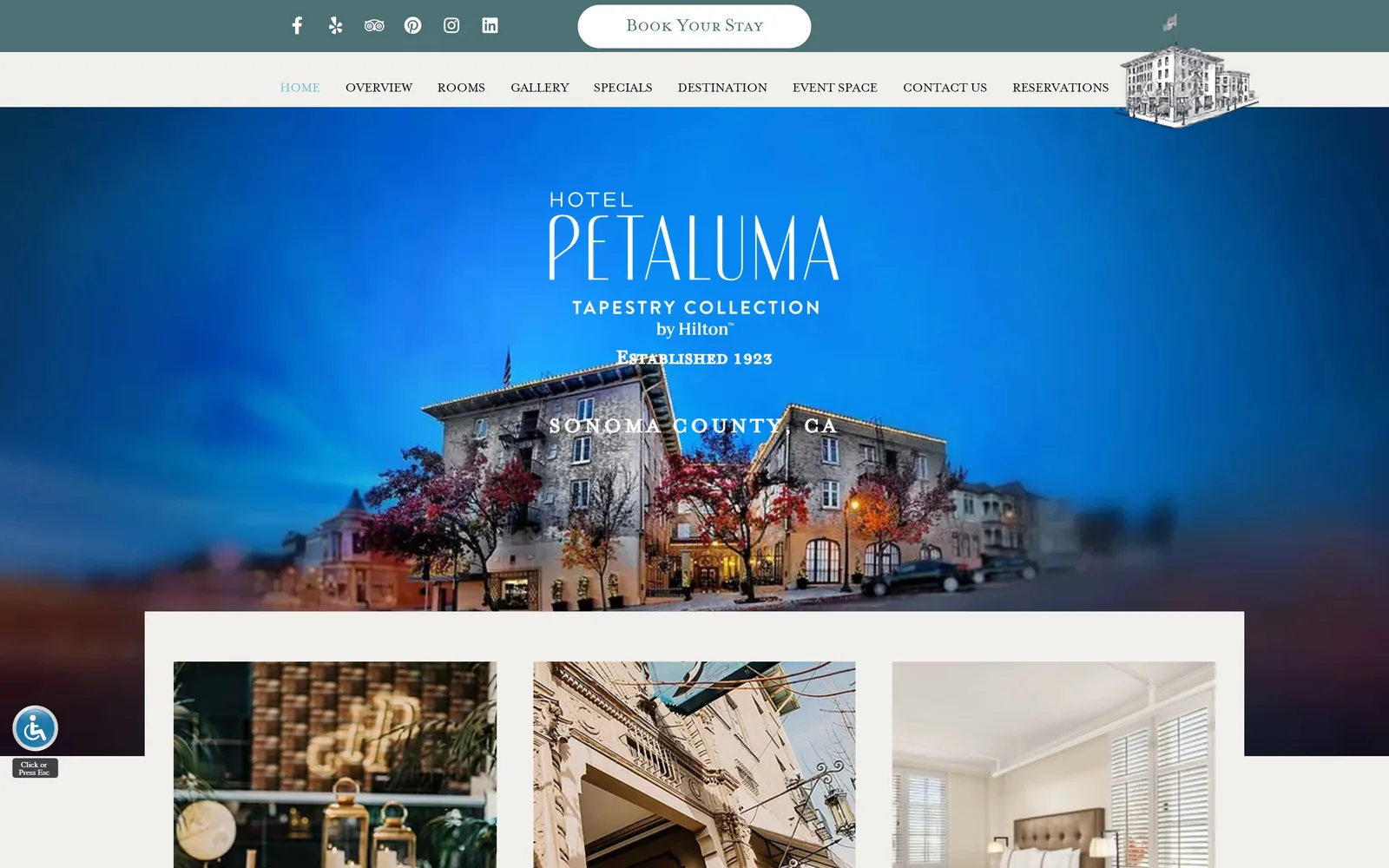
A 1923 stone hotel at blue hour under a stacked white wordmark, with a line drawing of the building in the corner.
Type
Deco sans wordmark with Mrs Eaves Small Caps at 50px
Body
Proxima Nova, 15px
Build
1440px, stacked teal and cream header, 30px padding
Made on
Custom
Colour
#f1f0ec #4d7075 #c7bbab
Type. HOTEL PETALUMA is set in a high-waisted deco sans with a notably narrow E and A, stacked over TAPESTRY COLLECTION. Headings elsewhere use Mrs Eaves Small Caps at 50px and 26px, and body copy runs Proxima Nova at 15px. Mrs Eaves small caps plus a deco display plus Proxima is three unrelated voices, and the small caps subheads set SONOMA COUNTY, CA directly over the roofline where it is hard to read.
Colour. A warm stone #f1f0ec carries the page below with a taupe #c7bbab on panel edges, and a teal #4d7075 fills the top utility bar. The hero itself is an electric blue sky that the photograph has been pushed hard toward, far past dusk. That blue is the problem: it fights the teal bar above it and flattens the building it is meant to show off.
Layout. A 1440px container with only 30px section padding, which is tight. The header stacks a teal social bar with a white pill Book Your Stay button over a cream nav of ten items, with a pen drawing of the hotel breaking out of the bar at the right. Below the hero a cream panel inset about 210px from each side holds a three-up image row.
The ask. Book Your Stay sits in a white pill at the top centre, and RESERVATIONS and SPECIALS both appear in the nav underneath it, so the same ask arrives three times in the top 150 pixels. The accessibility widget pinned to the lower left is the only other control. More nav items than a 42-room hotel needs.
A hero photograph graded this far into one colour stops showing the building, which was the only reason to use it.
How these were chosen
Twenty-five independent hotels, inns and small resorts were captured for this page and thirteen survived the cut. They run from a 42-room Hudson Valley hotel that leads with watercolour paintings to a Palm Springs courtyard property that hands its headline over to a magazine quote. The pattern worth noticing is how little colour the good ones use: most spend their accent on a single button and let one photograph and one display face carry everything else. Strong hotel website design here almost always means one typeface decision made loudly and every other decision made quietly. Where a site is only competent, or where the type is too small for the picture behind it, it is said plainly in the notes.
Finding hotel sites that someone had actually designed took far longer than it should have. 30 candidates made the shortlist. 13 made the page.
Each one was opened and looked at properly: what the type is doing, where the colour gets spent, how the page is built, how it asks for the job. Nothing is here because it ranks. Nothing is here because an agency filed it under portfolio. Several well known names were left out for the plain reason that their site came out of the same template as everyone else's, and a few sites worth including did not survive a second look.
Where a site is only competent, it says so. The order is the order worth your time, best first.
Reviewed and selected by Larry W. Matthews for Websitely.