Travel Agency Website Design Across 16 Trip Planners
Sixteen US agencies, outfitters and trip planners. The travel agency website design question is whether the photograph is doing any selling.
Shown
16 sites
Reviewed
30 candidates
Chosen on
The work, not the ranking
Updated
15 October 2026
01
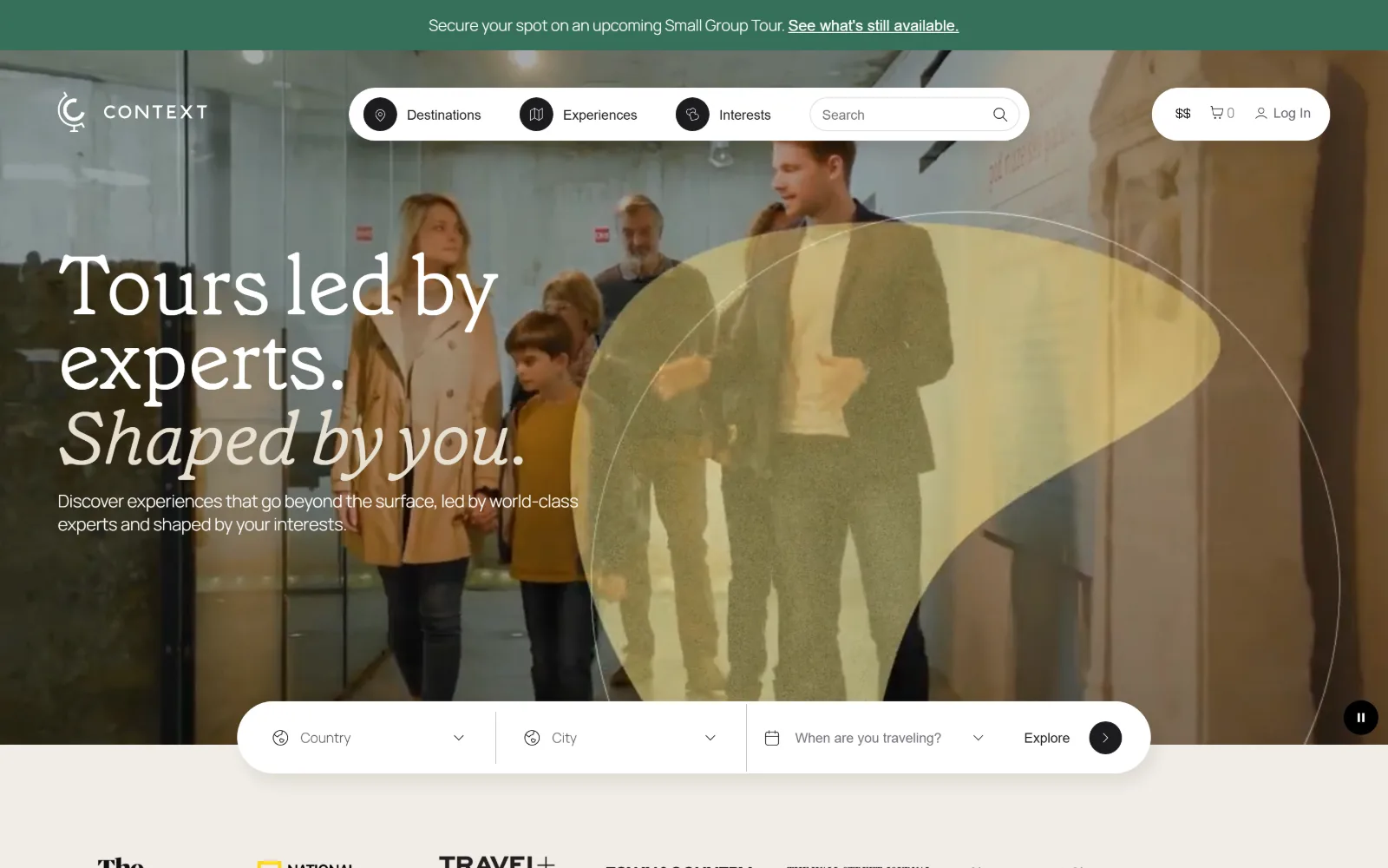
contexttravel.com
A video of a family walking through a museum gallery fills the frame, with a translucent yellow lens shape drifting over the right half.
Type
Grenette Pro 86px, -0.012em
Body
Manrope 16px
Build
full-bleed video, 1400px container, floating pill nav
Made on
Not detected
Colour
#f1ede6 #1c1b1f #35705a
Type. Grenette Pro carries the hero at 86px, weight 300, tracked in to -0.012em, with the second line in italic so one typeface does both the statement and the aside. Manrope handles everything functional: 16px nav, 12px labels used 32 times across the page. A 20px Grenette register appears 16 times, which keeps the serif present well below the fold.
Colour. Four values carry the page: a #f1ede6 ground at full coverage, white at 57.4 percent, black at 45.1, and a green #35705a at 2.9 percent doing the announcement bar and nothing else. Ink is #1c1b1f rather than black, softened again to #66646d for secondary copy. All the saturation on screen comes from the film.
Layout. The header floats over the video as a single white pill holding three labelled dropdowns and a search field, with currency, cart and log in broken out to the right. Container is 1400px, 97 percent of a 1440 viewport, and corner radius is 0 everywhere except that pill and the booking bar. The search bar straddles the bottom edge of the video.
The ask. Three asks stack without colliding: a green strip at the very top for small group tours, the hero bar asking country, city and dates, and Explore as the only button. There is no phone number in the header. Press logos begin immediately below the fold, so the proof arrives before any individual trip does.
Floating the nav and the booking bar as white pills over video lets one asset run full bleed while the controls stay readable.
02
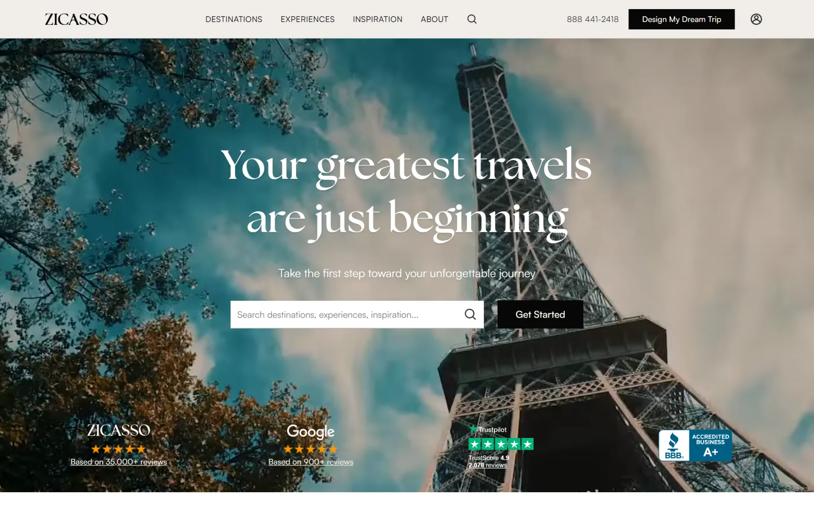
zicasso.com
An upward shot of the Eiffel Tower through blossom fills the hero, with a search field, a black Get Started button and four rating badges below.
Type
The Seasons 72px / 1.31
Body
Satoshi 17px / 1.53
Build
full-bleed hero, 1440px, 80px section padding
Made on
Not detected
Colour
#faf6f2 #070707 #f0ece9
Type. The Seasons sets the hero at 72px weight 700, a high contrast serif with very fine hairlines, split over two lines at 1.31 line height so the thin strokes get air. Satoshi takes everything else: 17px body at 1.53, 16px nav, 15px labels. No tracking is applied anywhere on the page, which leaves the serif to supply all of the character.
Colour. A warm near-white #faf6f2 covers the page, with #070707 at 14.6 percent on buttons and headings and #f0ece9 at 8 percent separating bands. The named accent is #fff8eb, a cream used for button type rather than as a colour. Everything bright in the viewport is photographic: the teal sky and the rust foliage.
Layout. The hero runs full bleed at 1440px, the whole viewport, with content centred and the trust row pinned inside the bottom of the image rather than in a band under it. Sections step at 80px padding. A three column grid below the fold runs 283, 430 and 567px, deliberately uneven. Radius is 0 on every button and card.
The ask. Two asks sit side by side in the hero, a search field and Get Started, with Design My Dream Trip and a phone number in the header. Four separate proof marks run along the base of the image: Zicasso at 35,000 reviews, Google, Trustpilot and a BBB rating. That is a lot of reassurance for one screen to carry.
Pinning review badges inside the hero image rather than in a band below buys social proof without spending a section on it.
03
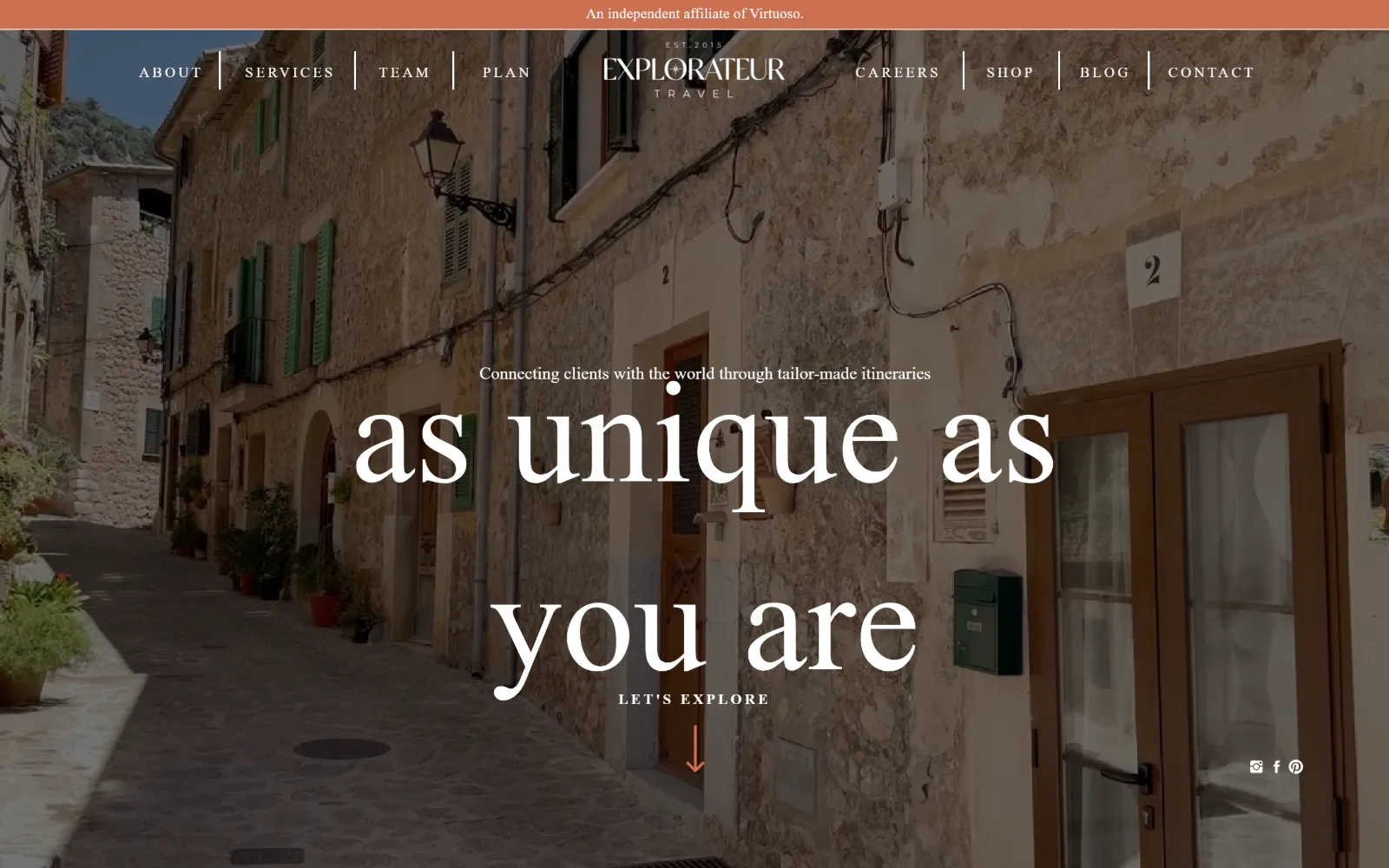
explorateurtravel.com
A sunlit Mediterranean alley of stone walls and green shutters runs the full frame, with huge white display type reading as unique as you are.
Type
Sebastian Bobby 150px
Body
Montserrat 20px / 1.70
Build
split nav round centred mark, full-bleed video
Made on
WordPress
Colour
#f4efe8 #000000 #cc7152
Type. Sebastian Bobby sets the headline at 150px, a high contrast didone with ball terminals, dropped to lowercase so the descenders cut through the photograph. A second display face, Analogue Regular, handles a 50px uppercase register. Montserrat does the work underneath at 20px over 1.70, plus a 15px weight 600 cut tracked out to 0.2em.
Colour. Three values plus one accent: #f4efe8 covering the page, black ink at 50 percent coverage, white at 46.7, and a terracotta #cc7152 at 2.2 percent running the affiliate bar at the top and the scroll arrow at the bottom. The photograph supplies everything else, the warm stone and the shutter green.
Layout. Navigation splits around a centred wordmark, four items left and four right, divided by thin vertical rules. The hero video is full bleed at viewport width with no container at all. Headline, kicker, a LET'S EXPLORE label and an arrow stack centred down the middle, with social icons dropped into the bottom right corner. Radius is 0.
The ask. There is no button in the hero and no phone number anywhere above the fold. The only ask is the words LET'S EXPLORE over a terracotta arrow pointing down, which requests a scroll rather than a click. The affiliate line naming Virtuoso sits at the very top, so the credential lands before the pitch.
Setting 150px display type in lowercase lets the long descenders break the photo plane without needing an overlay or a scrim.
04
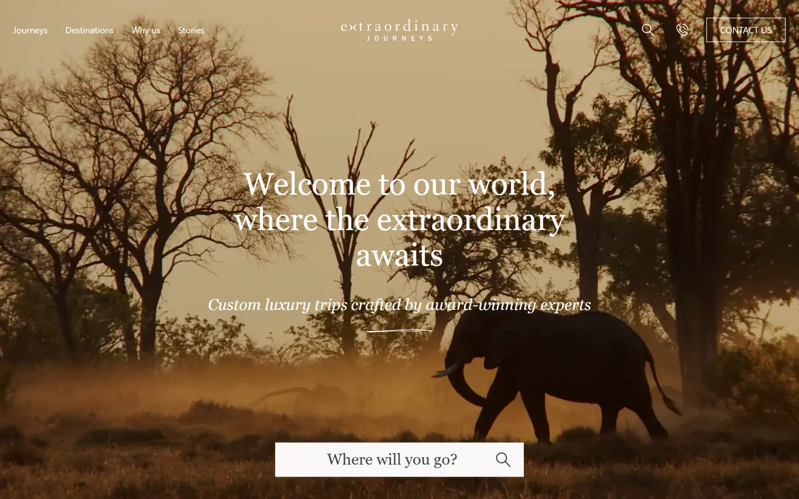
extraordinaryjourneys.com
An elephant crosses dusty gold savannah at low sun, with a serif headline centred over it and a white search field cutting the bottom edge.
Type. EB Garamond at 56px over 1.15 carries the headline across three lines, with an italic line beneath, and the same face returns at 28px as button type. Using the display serif on buttons is rare and gives them a literary rather than commercial voice. Mona Sans at 20px weight 300 does body and 16px the nav. Nothing is tracked.
Colour. Two near whites and black: #f4f1ed at 136 percent coverage, #f9f8f6 at 101 and black at 50. There is no brand accent at all. Ink is #3b4148, a grey blue rather than black, across 1,214 characters. The amber and dust in the photograph are the only saturated things the page carries.
Layout. A 12 column grid at 94px per column with 24px gutters underlies the page, with one subgrid running 14 columns. Section padding is 120px. The sticky header floats transparently over the full bleed hero: four nav items left, then search, a phone glyph and a bordered Contact Us at the right. Radius is 0 throughout.
The ask. The hero's only ask is a search field reading Where will you go, dropped so it straddles the bottom edge of the image. Contact Us sits in the header as an outlined button with a phone glyph beside it, which is understated for a business quoting trips between twelve and twenty five thousand dollars.
Using the display serif for button labels as well as headlines removes the usual break between editorial voice and call to action.
05
backroads.com
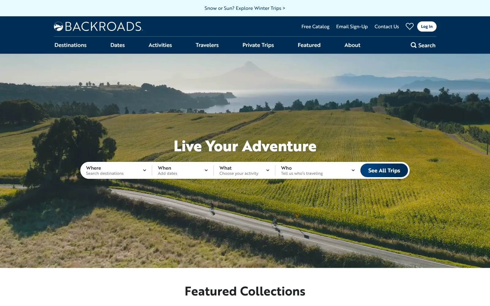
An aerial of cyclists on a road through yellow farmland above a lake, with a four-field booking bar floating across the centre of the image.
Type
Brother 1816 44px, weight 800
Body
Brother 1816 14-16px
Build
two-row navy header, full-bleed photo, floating booking bar
Made on
Not detected
Colour
#002d55 #ffffff #e5faff
Type. Brother 1816 does everything, a geometric sans with a squared single storey g, at 44px weight 800 for the hero and 14 to 16px for nav and labels. There is no serif and no second family anywhere. Eight weights and sizes were measured, all from the one face, which is why the chrome reads as a single piece rather than an assembly.
Colour. A deep navy #002d55 holds the two row header and the primary button, white sits at 3.7 percent coverage and a pale ice #e5faff at 2.7 runs the announcement strip above everything. Three values in the interface, and every other colour on screen belongs to the fields and the water in the photograph.
Layout. A two row header stacks utility links above eight nav items, both on navy, giving roughly 175px of chrome before the image starts. The hero is full bleed at the viewport width with a white booking bar floating across the middle, split into four labelled dropdowns and a pill button. Radius is 0 on the chrome.
The ask. The booking bar asks four questions at once, where, when, what and who, then See All Trips. Competing with it are Free Catalog, Email Sign-Up, Contact Us, a favourites heart, Log In and the winter trips strip. There is no phone number. That is seven parallel asks inside one viewport.
A four-field booking bar across the hero splits one hard decision into four easy ones, which only works if the chrome around it stays quiet.
06
wildernesstravel.com
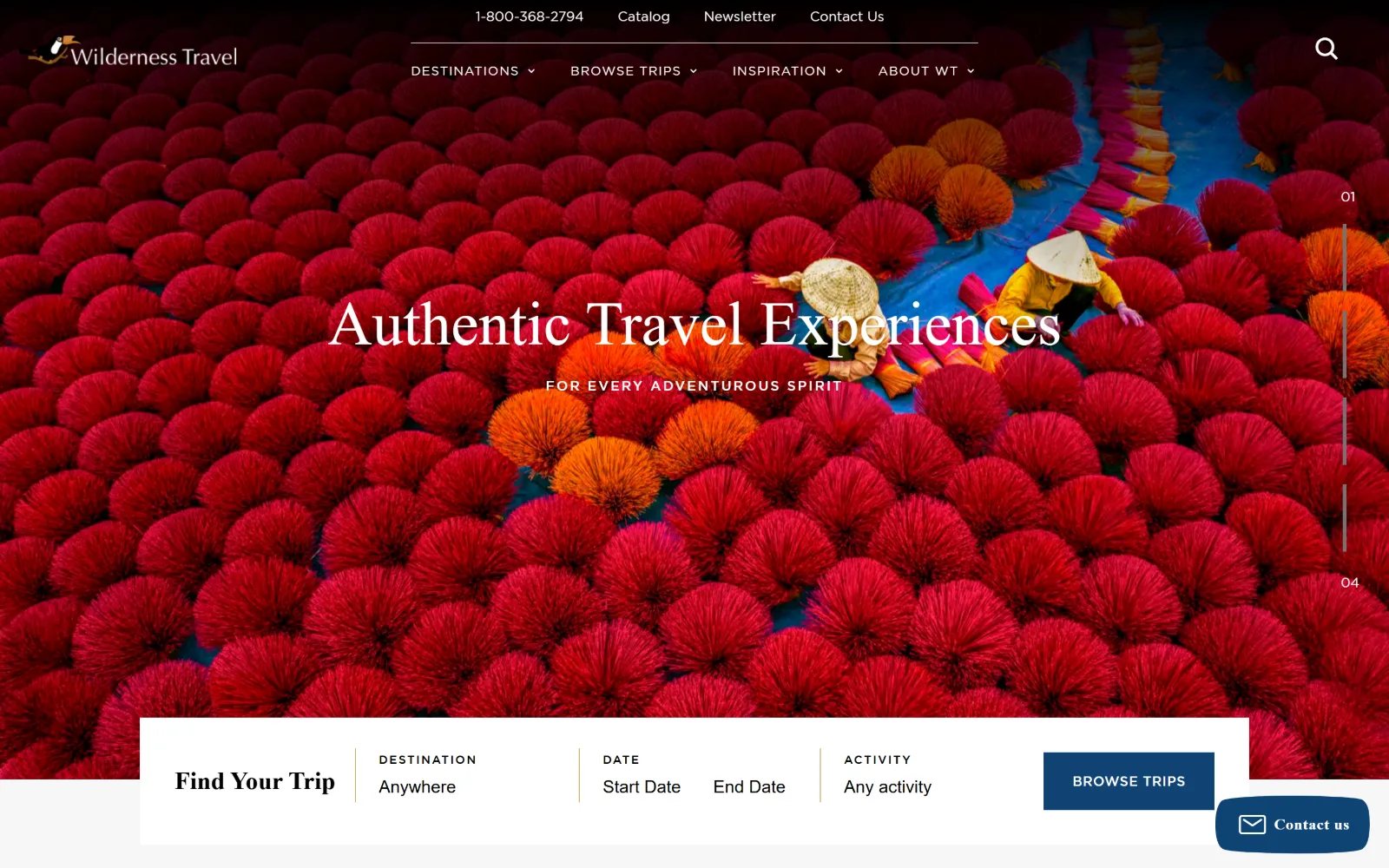
Bundles of red incense sticks fanned out to dry fill the whole frame, with two workers in conical hats and a white Find Your Trip bar below.
Type
Verdigris MVB Pro Big 64px
Body
Gotham 17px / 1.88
Build
full-bleed slider, 1440px, 132px padding, overlapping search bar
Made on
WordPress
Colour
#ffffff #f7f7f7 #0f4374
Type. Verdigris MVB Pro Big at 64px sets the hero, a text serif used at display size so its modelling stays soft against a very loud photograph. Gotham does the rest at 17px over 1.88, with a 14px uppercase cut tracked to 0.143em for buttons and a 13px uppercase at 0.077em for labels. Two families, four clearly separated registers.
Colour. White at 106 percent coverage, a grey #f7f7f7 at 58.7 and black at 44.9 make the frame, with a single navy #0f4374 at 0.4 percent on the Browse Trips button. The interface is almost monochrome, which is the only sane response to a hero photograph made of nothing but saturated red and orange.
Layout. The hero is a full bleed slider at viewport width with a numbered 01 to 04 rail down the right edge. The Find Your Trip bar is a white block overlapping the base of the image, carrying destination, date and activity fields plus the navy button. Container is 1440px, section padding 132px, radius 0 throughout.
The ask. The phone number sits first in the header, ahead of Catalog, Newsletter and Contact Us, with five dropdown nav items beneath. The hero's single ask is Browse Trips at the end of the search bar, and a Contact us tab docks bottom right. Trip prices from 5,595 dollars up appear further down.
When the photograph is this saturated, holding the whole interface to white, grey and one navy keeps the image the only thing competing.
07
packupgo.com
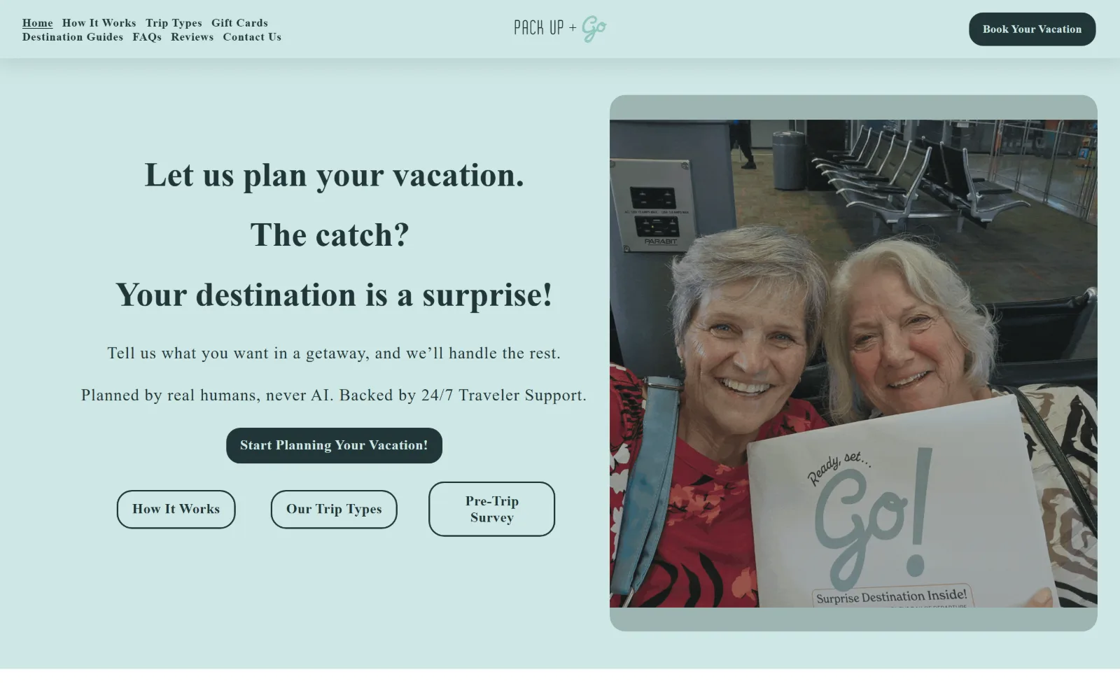
A pale mint page with a stacked serif headline on the left and a photo of two smiling older women holding a Go envelope at an airport gate.
Type
new-spirit 44px / 0.94
Body
Poppins 18px, 0.05em
Build
two-column split, 26-col grid, 75px padding
Made on
Squarespace
Colour
#cfe7e5 #213638 #ffffff
Type. New Spirit at 44px weight 700 sets three stacked lines at 0.94 line height, a contemporary serif with soft bracketed joins. Poppins carries body at 18px tracked to 0.05em over 1.70, and the nav at 14px weight 600. The headline is broken into three separate blocks rather than one paragraph, so each line lands as its own beat.
Colour. Three values and no more: white at 172.8 percent coverage, a mint #cfe7e5 at 100.8 as the page ground, and a deep spruce #213638 at 65.4 doing every character, button and outline on the page. Button type is mint on spruce and inverts for the outlined secondaries. The photograph supplies the only warmth.
Layout. A straight two column split, headline left and one rounded photograph right, inside a 26 column grid with 11px gutters. Section padding is 75px. The nav wraps onto two lines at the top left, eight items in all, with Book Your Vacation pulled right as a pill at 20px radius. Everything else is square cornered.
The ask. One primary, Start Planning Your Vacation, with three outlined secondaries beneath it for How It Works, Our Trip Types and the Pre-Trip Survey. Book Your Vacation repeats in the header. No phone number. The line about real humans and never AI does more selling than any of the five buttons.
Three outlined secondaries under one filled primary let a page offer four routes without any of them reading as equally weighted.
08
tripconcierge.co
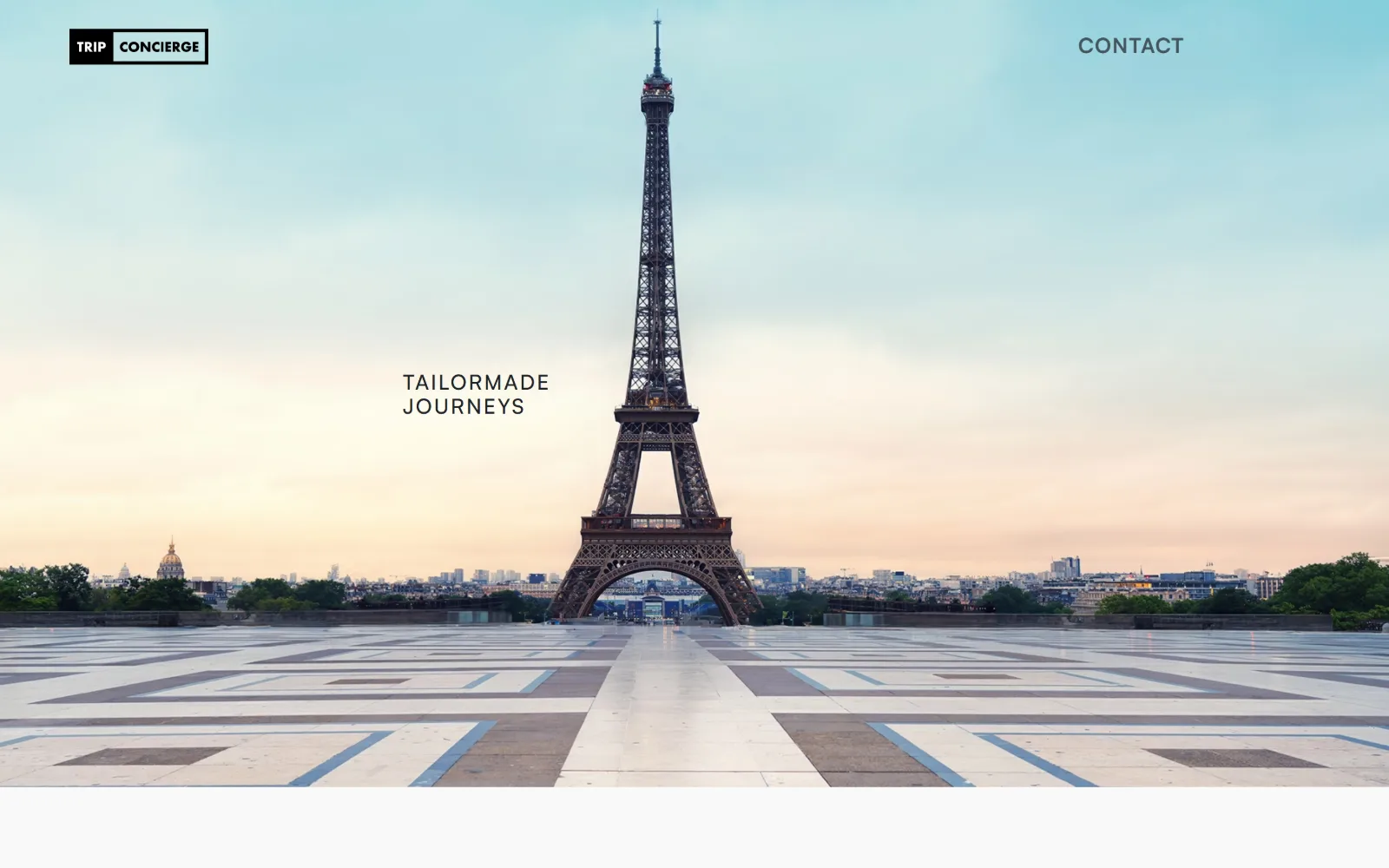
The Eiffel Tower stands centred at dawn above the empty paved terrace of the Trocadero, with two small words of type set low on the left.
Type
Satoshi 43px / 1.33
Body
Satoshi 14-22px
Build
full-bleed photo, 12-col 120px grid, off-centre type
Made on
Webflow
Colour
#f9f9f9 #1d2025 #a23e48
Type. Satoshi does the whole page. The hero line runs 43px at weight 400 over 1.33, set small and low rather than large and centred, while the nav sits at 36px uppercase tracked to 0.028em, larger than the headline it sits above. Only three sizes were measured in total, 43, 22 and 14px. That restraint is the design decision.
Colour. Effectively one value. #f9f9f9 covers 184 percent of the page, with a single claret #a23e48 at 0.4 percent on the button and #f5f5f5 at 0.1 percent. Ink is #1d2025 and only 120 characters of it exist on the whole page. The pink and teal dawn sky in the photograph is the entire colour story.
Layout. A 12 column grid at 120px per column underlies the page, with a three column 357px band below it. The hero photograph is full bleed and the type is placed off centre near the left third, a long way from the usual centred stack. Document height runs to 16,667px. Button radius is 128px, everything else 0.
The ask. One word in the header, CONTACT, and nothing else above the fold. The EXPLORE button appears further down in claret as a 128px pill. No phone number, no form, no search field. The page is built on the assumption that anyone who scrolls 16,000 pixels has already qualified themselves.
Setting the headline smaller than the navigation inverts the usual hierarchy and makes the photograph, not the sentence, the first thing read.
09
nathab.com
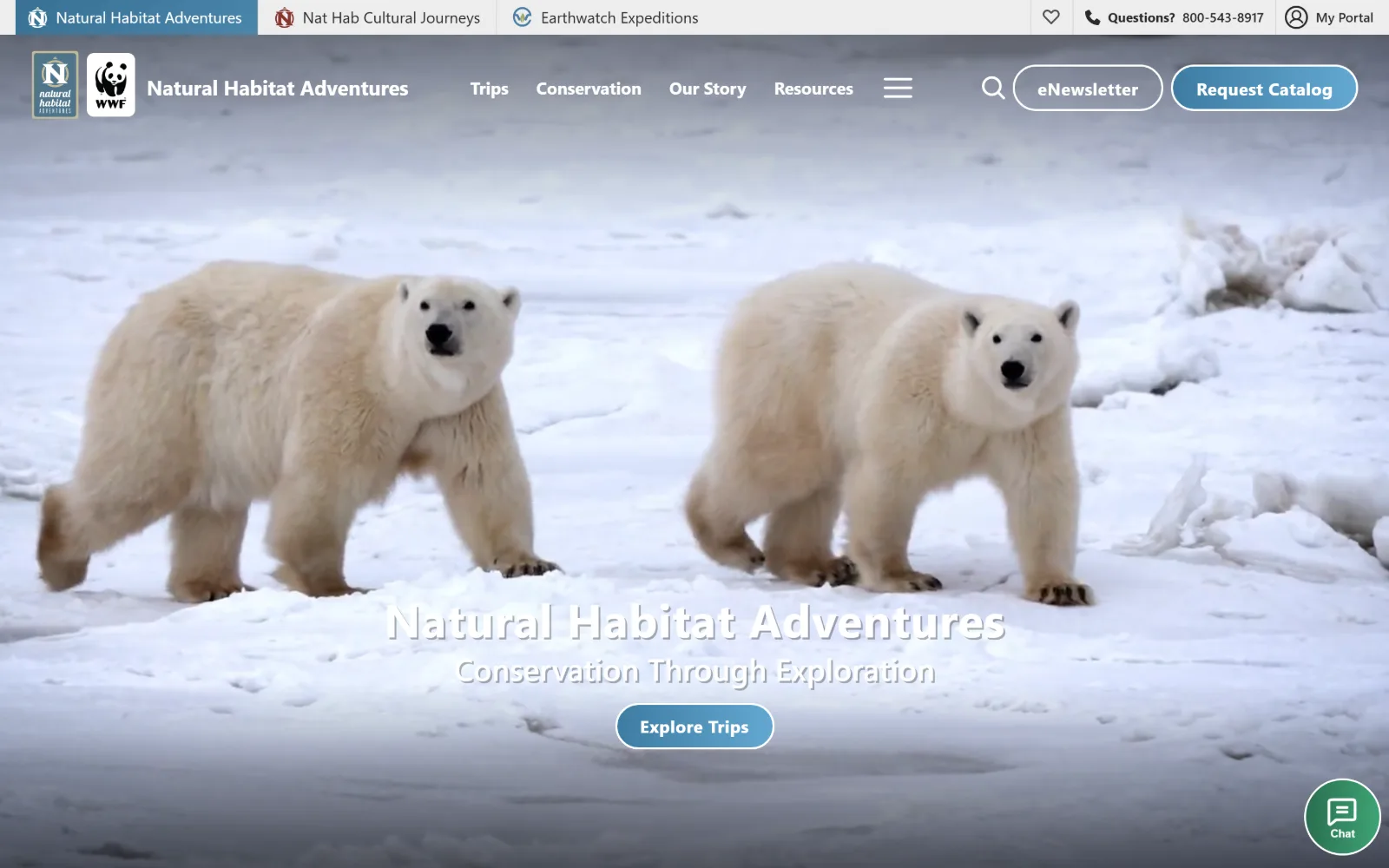
Two polar bears walk across sea ice in a full-width video, with the company name, a tagline and a blue Explore Trips button set low over it.
Type
proxima-nova 48px, 0.017em
Body
proxima-nova 18px / 1.60
Build
brand tab strip, full-bleed video, 48px padding
Made on
Not detected
Colour
#ffffff #e8e5d8 #292929
Type. Proxima Nova runs the entire page: 48px weight 700 tracked to 0.017em for the hero, then 32, 30, 21 and 18px steps for section heads, and 18px over 1.60 for body. A single sans across eight sizes is a conservative choice, but it leaves the wildlife footage to do all of the differentiating.
Colour. White at 123.7 percent coverage and a warm stone #e8e5d8 at 50 percent make the ground, with #ededed at 2 percent for rules. Ink is #292929, and a brick #86342d appears across 63 characters only. The blue on the buttons arrives with the WWF partnership rather than from a palette decision, and the ice supplies the rest.
Layout. Three branded tabs run along the very top, one per sub-brand, which is unusual chrome to spend 40px on. Below it the header carries two logos side by side, five nav items, a hamburger, search and two pill buttons. The video is full bleed. Section padding is 48px, tight, and grids below run three and five columns.
The ask. Request Catalog is the loudest element in the header, with eNewsletter outlined beside it and a phone number labelled Questions above both. The hero's ask is Explore Trips. A chat bubble docks bottom right. Four asks live in the top 140px, and the catalogue rather than the booking gets the solid fill.
Running sub-brands as tabs above the header keeps a multi-brand portfolio navigable without spending any of the main nav on it.
10
mtsobek.com
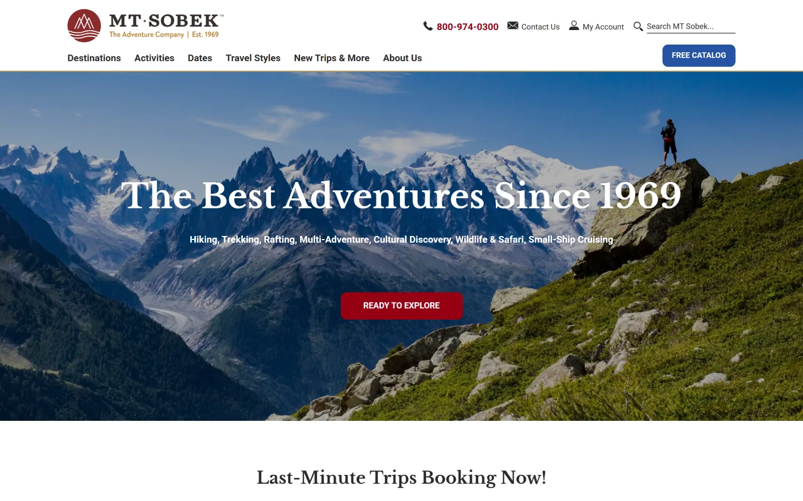
Snow peaks above Chamonix fill the hero with a lone hiker on a green ridge at the right, a serif headline centred and a red button beneath.
Type. Libre Baskerville at 60px over 1.50 sets the hero, with 30px and 20px steps below, so the serif carries three levels on its own. Roboto handles nav at 17px weight 700 and buttons at 14px uppercase. Pairing a transitional serif with Roboto is a pragmatic pick rather than a considered one, and the serif ends up doing the work.
Colour. White at 123 percent and black at 35, then three accents at under 1.5 percent each: a dark red #950013 on nav links, a blue #2553a2 on the catalogue button and a gold #c19c5d. Three accent colours is one or two too many for a page whose hero already runs blue sky against a red jacket.
Layout. The container is 1230px, 85 percent of the viewport, narrower than almost anything else here, so visible margin stays on both sides below the fold. The header stacks a utility row above six nav items with a blue pill at 10px radius at the right. The hero is full bleed. Grids below run 280 by 886px and three equal columns.
The ask. The phone number is set in red at the top, ahead of Contact Us, My Account and search, with FREE CATALOG in blue beside them. The hero asks READY TO EXPLORE in red. The catalogue and the trip browse end up in different colours at different heights, and red carries both the phone number and the hero button.
A 1230px container at 85 percent of the viewport gives a dense tour page visible margins and stops the grid reading as a search results screen.
11
rmiguides.com
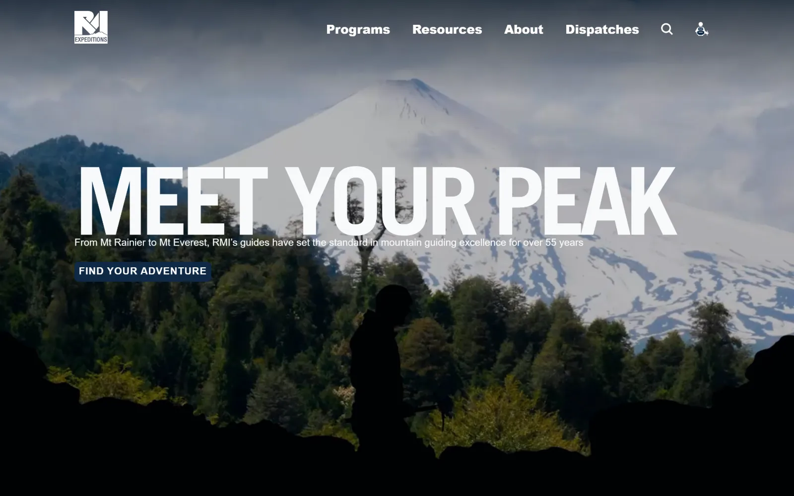
A snow-capped volcano behind forest, half in shadow, with MEET YOUR PEAK in enormous white caps running almost the full width of the frame.
Type
TradeGothicLTStd 170px, -0.065em
Body
Poppins 18px / 1.67
Build
full-bleed video, transparent header, 1440px
Made on
Webflow
Colour
#0e2946 #ffffff #f8f9fa
Type. Trade Gothic LT Std at 170px, weight 700, uppercase, tracked to -0.065em so the letters almost touch. That negative tracking at that size is the whole idea: the headline reads as one mass rather than three words. Manrope handles nav at 22px weight 800 and buttons at 18px uppercase, and Poppins does body at 18px over 1.67.
Colour. Two values were measured, white at 133 percent and a navy #0e2946 at 33.9, with ink alternating between that navy and an off-white #f8f9fa. There is no third colour anywhere in the interface. The forest green and the grey cloud in the hero are the only other things on screen.
Layout. The hero is full bleed video at 1440px with the headline set left and overflowing toward both edges, the subhead and a small square button tucked directly beneath it. The header is transparent with the mark hard left and four items right. Document height is 13,399px. Button radius is 7px and everything else 0.
The ask. FIND YOUR ADVENTURE is a small navy rectangle, deliberately undersized against a 170px headline, and it is the only ask above the fold. No phone number, no form, no search. Trip prices from 2,050 to 56,900 dollars appear further down the page, which is where the qualifying actually happens.
Negative tracking at -0.065em turns a three-word headline into one visual block, which is what lets it survive at 170px over a busy photograph.
12
ubuntutravelgroup.com
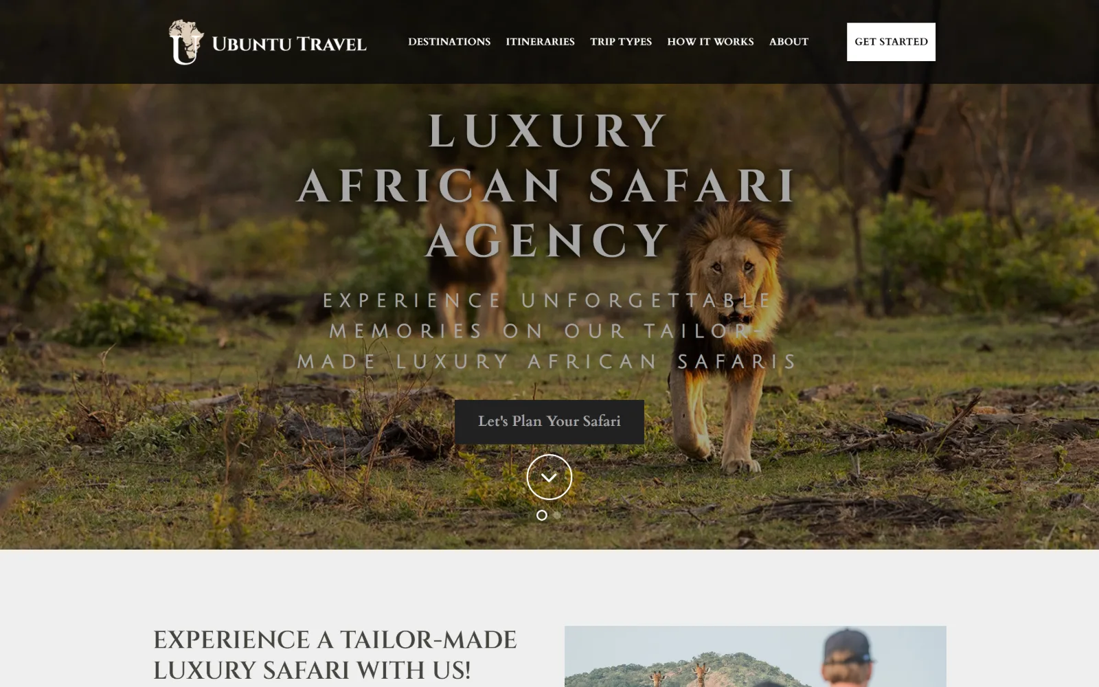
A pair of lions walk toward the camera through green bush at golden hour, with wide-tracked caps set across the middle of the frame.
Type
Cinzel 60px caps, 0.167em
Body
Cardo 18px / 1.67
Build
120px black header, full-bleed slider, 1440px
Made on
WordPress
Colour
#fefefe #343333 #b6c4a6
Type. Cinzel at 60px, weight 700, uppercase, tracked to 0.167em, an inscriptional roman built on Trajan letterforms and used here as a safari-category convention. Cardo takes body at 18px over 1.67 and nav at 13px. A third face, Julius Sans One, appears at 24px tracked to 0.417em. Three serif voices is one more than the page needs.
Colour. Near white #fefefe as the ground, black at 80 percent coverage from the darkened photography, #efefef at 53.6 for alternating bands, and a sage #b6c4a6 at 0.7 percent as the only hue decision made. Buttons are #343333, the same grey as body ink, so nothing on the page is picked out by colour at all.
Layout. A black header bar roughly 120px tall runs the full width with the mark left, five nav items centred and a white GET STARTED block right. The hero is a two-slide carousel with the type centred and a scroll chevron in a ring beneath it. Container is 1440px, the full viewport, with no grid detected and radius 0 everywhere.
The ask. One ask in the hero, Let's Plan Your Safari in a translucent grey block, with GET STARTED repeated in white in the header. No phone number and no form above the fold. A 10K figure appears further down, setting the price expectation before any enquiry is made.
Tracking caps out to 0.167em buys legibility over a busy photograph, but running three display serifs spends the distinctiveness it bought.
13
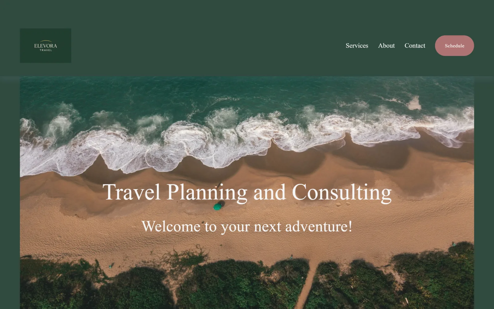
elevoratravel.com
A drone shot of surf breaking onto empty sand, inset inside a deep green page so the forest green frames the photograph on three sides.
Type
orpheus-pro 66px / 1.23
Body
Montserrat 19px, weight 300
Build
inset hero, 222px section padding, 1440px
Made on
Squarespace
Colour
#304a40 #9db5a2 #af7373
Type. Orpheus Pro at 66px over 1.23 sets the headline, a Weiss-derived serif with small sharp serifs that stay elegant at size, with 46 and 36px steps below it. Montserrat at 19px weight 300 does body and nav alike, at exactly the same size, which flattens the hierarchy more than it should. Only five sizes exist across the page.
Colour. Two greens and a rose: #304a40 at 193.7 percent coverage as the dominant forest, #9db5a2 at 100 percent as the lighter sage body ground, and #af7373 at 0.3 percent on the Schedule pill. Ink is #f5f5f5 across 1,646 characters. A three value palette with no black and no true white anywhere in it.
Layout. The header sits on the dark green with a boxed logo lockup left and three nav items plus the rose pill right. The hero photograph is inset rather than full bleed, with green margin visible left, right and top, so it reads as a framed print. Section padding is 222px, the largest measured here. Radius 0, buttons 300px.
The ask. A single ask, Schedule, as a rose pill in the header. No phone number, no form, no search, and no button in the hero at all. For a consultancy selling planning time rather than trips that is consistent, though it leaves the hero doing nothing except setting a mood.
Insetting the hero photograph instead of bleeding it turns the page colour into a frame and makes one image feel chosen rather than stocked.
14
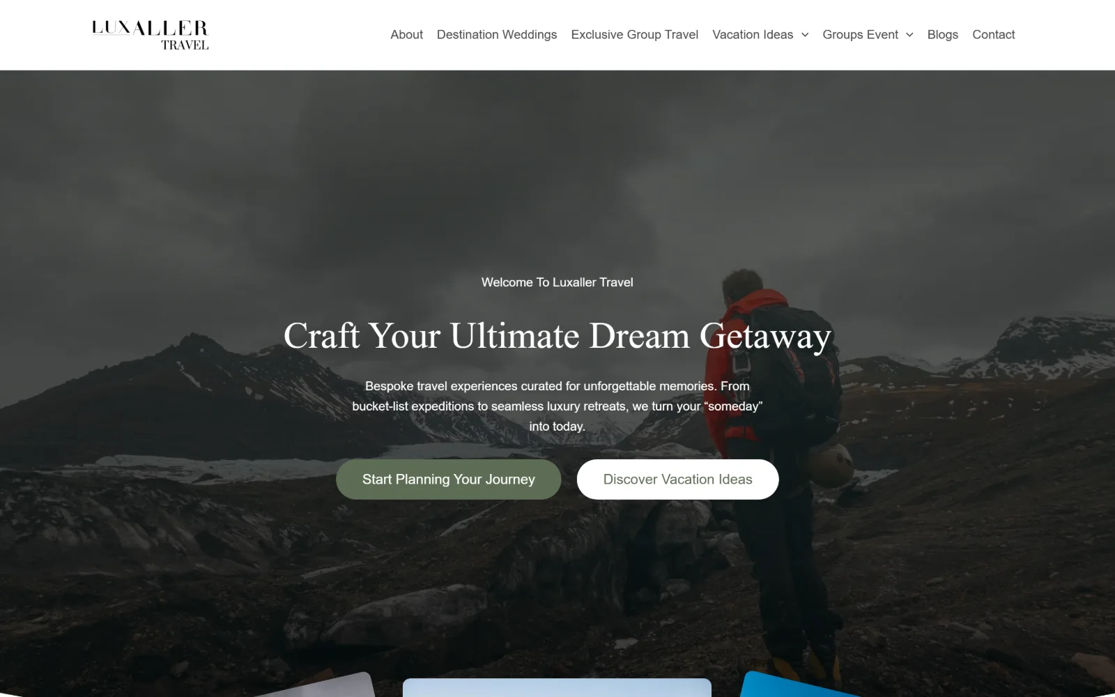
luxaller.com
A hiker in a red jacket looks out over a dark glacial valley under heavy cloud, with two buttons centred and card edges rising from the bottom.
Type
Marcellus 48px
Body
Work Sans 16px / 1.65
Build
solid white header, full-width slider, 1440px
Made on
WordPress
Colour
#ffffff #5e6d55 #f9fff7
Type. Marcellus at 48px and 38px carries the headings, a humanist roman with flared stems that reads as inscriptional without the formality of a Trajan face. Work Sans runs everything else at 16px over 1.65 and 18px weight 500 on buttons, capitalised rather than uppercase. Only four sizes were measured, which keeps the system small.
Colour. White at 105.6 percent, a cool tinted white #f9fff7 at 47.4, black at 14.6, and a single olive #5e6d55 at 0.6 percent on the primary button. The hero image is desaturated nearly to grey, so the one red jacket and the olive button are the only saturated things anywhere in the viewport.
Layout. A white header bar roughly 100px tall sits above the image rather than over it, with the stacked wordmark left and seven nav items right. The hero is a full width slider, type centred, two buttons side by side at 30px radius. Three cards begin to rise into the bottom of the viewport. Container is 1440px, radius elsewhere 0.
The ask. Two buttons of equal size compete in the hero, Start Planning Your Journey in olive and Discover Vacation Ideas in white, so the page never says which it prefers. There is no phone number and no header button at all, which is unusual when seven nav items are already sitting there.
Two hero buttons at identical size cancel each other out; weight the one you actually want and let the other drop to a text link.
15
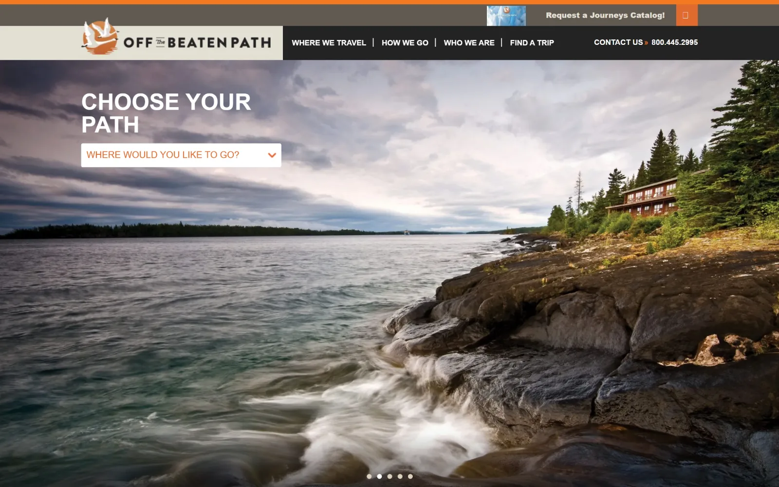
offthebeatenpath.com
A long exposure of waves breaking on rock below a lodge in pines, with CHOOSE YOUR PATH in white caps and one white destination dropdown.
Type. Montserrat at 42px weight 700 in caps sets the hero across two lines at 1.00 line height, and the same face at 14px caps runs the nav. Lato carries body at 17px over 1.59, with a 900 weight uppercase cut used six times for labels. Montserrat over Lato is a common pairing, handled plainly rather than pushed anywhere.
Colour. White at 150.6 percent and black at 29.4 dominate, with a cyan #03c3c8 at 6.2 percent and an orange #e06b2f at 1.6 running the catalogue strip and the dropdown type. Body ink is a warm #615a52 rather than grey. Cyan and orange sit opposite each other on the wheel and both appear in the top 120px.
Layout. A cream logo block sits flush left inside the header bar, separating the mark from the nav with a hard edge rather than with space. Above it a promotional strip carries a catalogue thumbnail. The hero is a full bleed five-slide carousel. Container 1440px, section padding 143px, a three column 366px grid below.
The ask. The hero ask is a dropdown rather than a button: Where would you like to go, in orange on white. Competing with it are the catalogue request strip, CONTACT US and a phone number in the header. Three asks land in the top 120 pixels before the single hero control is even reached.
Opening with a destination dropdown instead of a button makes the visitor state what they want before the site has to guess at it.
16
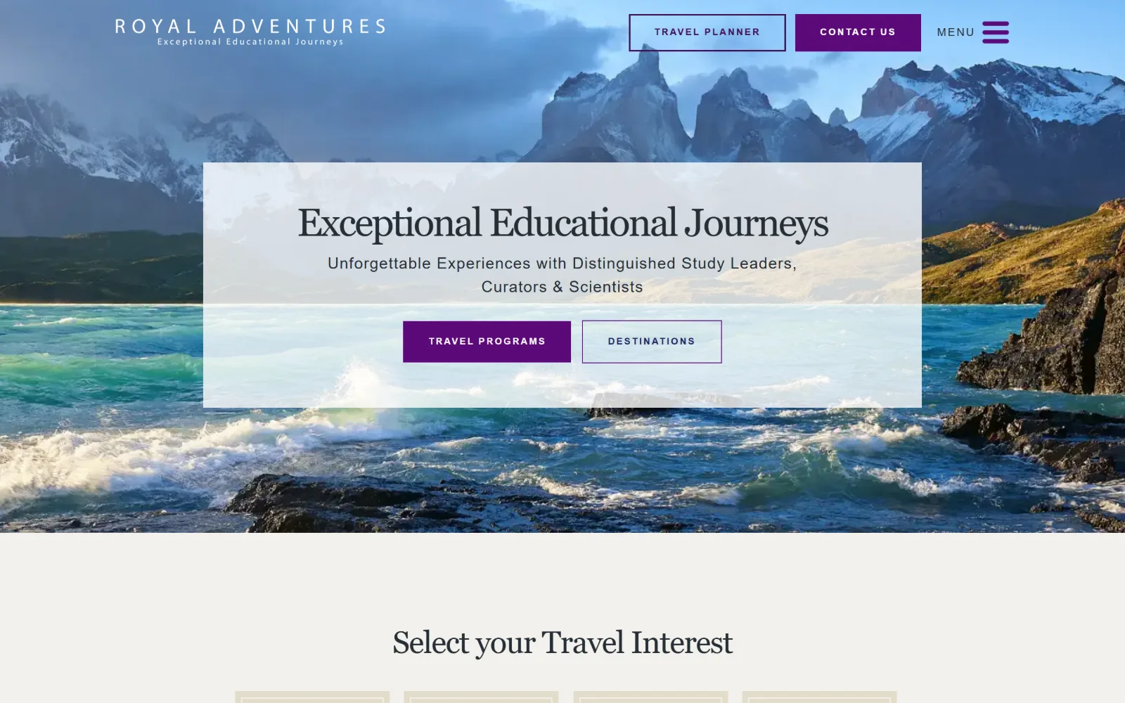
royaladventures.com
Patagonian peaks above turquoise surf, with a translucent white panel across the centre holding a serif headline and two purple buttons.
Type
Lustria 50px, -0.046em
Body
Montserrat 14px
Build
translucent hero panel, transparent header
Made on
WordPress
Colour
#ffffff #f3f1ec #5b0979
Type. Lustria at 50px with -0.046em tracking sets the headline, a serif with low contrast and sturdy slab-like serifs that holds up against a bright landscape. Montserrat handles the nav at 14px and buttons at 12px weight 600 tracked out to 0.167em. A Caveat script turns up once at 28px and belongs to a different page.
Colour. White at 155 percent, a warm grey #f3f1ec at 62.1 for the band below the fold, and a single violet #5b0979 at 0.7 percent carrying both the primary button and the nav links. Ink is #252e36. One accent used twice, against a photograph that already supplies turquoise and slate.
Layout. A translucent white panel roughly 1020px wide lies across the middle of the hero, holding the headline, subhead and two buttons with the image still visible through it. The header is transparent, wordmark left, two buttons and a MENU hamburger right. Below the fold a four card row sits on warm grey. Radius is 0.
The ask. Four asks: TRAVEL PLANNER outlined and CONTACT US filled in the header, then TRAVEL PROGRAMS filled and DESTINATIONS outlined inside the hero panel. The same outlined-plus-filled pairing runs twice at two scales within one viewport, which blurs which of the two pairs is meant to matter.
A translucent panel over the hero keeps a bright photograph visible while giving the type a reliable contrast floor without a full scrim.
How these were chosen
Sixteen US operators, and the photograph is doing nearly all of the selling: fourteen open on a full bleed image or video, and the interface around it is usually held to three colours so the picture stays the loudest thing on screen. Corner radius measures 0 on all sixteen, with rounding confined to buttons, and the display face is a serif on eleven, which is how travel agency website design signals price without printing one. What does not hold is the hero search bar. Backroads, Zicasso, Wilderness Travel and Extraordinary Journeys all ask where and when inside the image; RMI, Explorateur and Trip Concierge ask nothing at all and let a very long page do the qualifying. The real split is between operators selling a catalogue and operators selling a conversation, and the number of competing asks above the fold follows from that choice rather than from taste.
Finding travel agency sites that someone had actually designed took far longer than it should have. 30 candidates made the shortlist. 16 made the page.
Each one was opened and looked at properly: what the type is doing, where the colour gets spent, how the page is built, how it asks for the job. Nothing is here because it ranks. Nothing is here because an agency filed it under portfolio. Several well known names were left out for the plain reason that their site came out of the same template as everyone else's, and a few sites worth including did not survive a second look.
Where a site is only competent, it says so. The order is the order worth your time, best first.
Reviewed and selected by Larry W. Matthews for Websitely.