Pest Control Website Design: 12 of the Best for 2026
Everyone reaches for the same green or red. Twelve companies whose pest control website design looks considered before a visitor reads a word.
Shown
12 sites
Reviewed
28 candidates
Chosen on
The work, not the ranking
Updated
15 October 2026
01
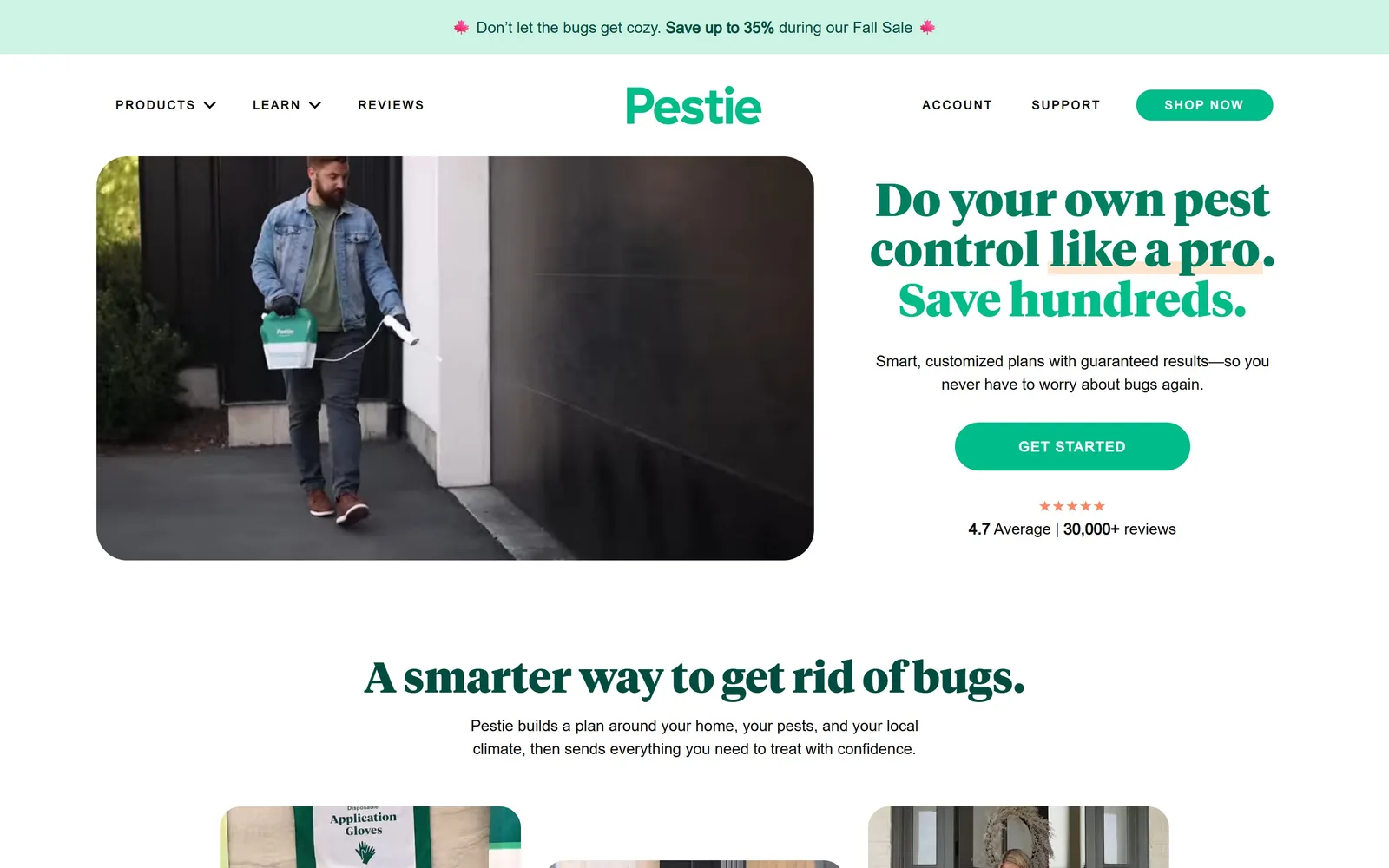
pestie.com
A pest control company that has decided to look like a skincare subscription, and pulls it off.
Type
Tiempos Headline 48px, 900 weight
Body
Neue Haas Unica 16px
Build
Split hero, three-card row beneath
Made on
Custom build
Colour
#008060 #00bc88 #ccf3e3
Type. Tiempos Headline does the talking, 48px at its heaviest 900 weight, lines packed close so three of them read as one solid shape. Everything else is Neue Haas Unica at 16px and stays out of the way. The serif is the entire argument. A geometric sans would have made this software, a script would have made it a family firm.
Colour. Two greens, two jobs. The deep #008060 is reserved for headline ink, the brighter #00bc88 for the one button, and a pale #ccf3e3 holds the sale strip above the nav. White does the rest, which is why the green registers at all.
Layout. The hero is two halves, video left, claim right, held in a 1280px column that leaves air down both sides. Below it the page settles into three 312px cards at a 24px gap. Nothing is centred for the sake of it.
The ask. Three nav items. One button, a 30px pill reading GET STARTED. The star rating sits under the button rather than beside it, so it reads as reassurance after the decision instead of noise before it. No phone number in the header, which for a mail-order product is the right call.
If you want out of the category, change the typeface before you change anything else. Almost every rival is set in the same bold sans.
02
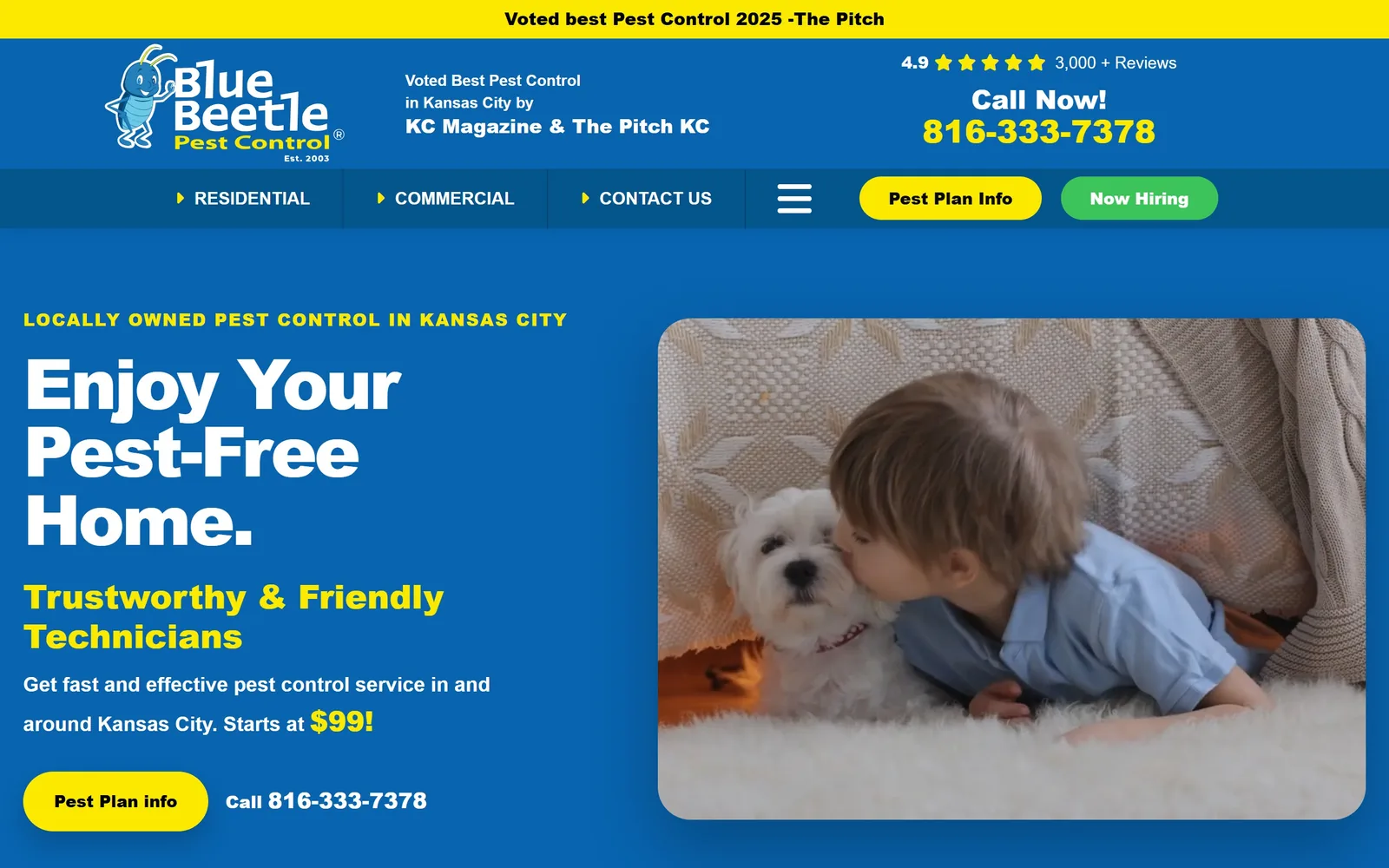
bluebeetlepest.com
Kansas City blue and a hard yellow, run at full volume, with a cartoon beetle fronting the whole thing.
Type
Montserrat 72px, 900 weight, -0.04em
Body
Montserrat
Build
Two-column hero, illustrated wordmark
Made on
WordPress
Colour
#0864af #fbe900
Type. Montserrat at 72px, 900 weight, tracked tight to -0.04em. The headline breaks over three short lines so it lands as a stack of blocks rather than a sentence you read left to right. Subheads drop to the mid thirties and keep the same weight, which is loud but consistent.
Colour. The blue #0864af owns the page. Yellow #fbe900 turns up on the wordmark, the phone number and the main button, and nowhere else, which is the discipline that stops the whole thing becoming a highway sign. Black text on the yellow button, not white, so it survives the contrast.
Layout. Uneven columns in the hero, roughly 600px of type against 734px of photograph, with a 58px gutter. Sections breathe at about 82px apart. The drawn beetle in the wordmark is carrying the real fleet of blue Volkswagen Beetles into the logo, and it gives a twenty-year-old local firm a character no photograph of a van could.
The ask. A fully rounded button for the pest plan, the phone number set beside it at the same size, and a second route in the nav. The site assumes you will ring rather than fill in a form, and it builds for that.
If you own something physical and odd, a branded fleet, a uniform, draw it. A drawing still works at logo size, a photograph does not.
03
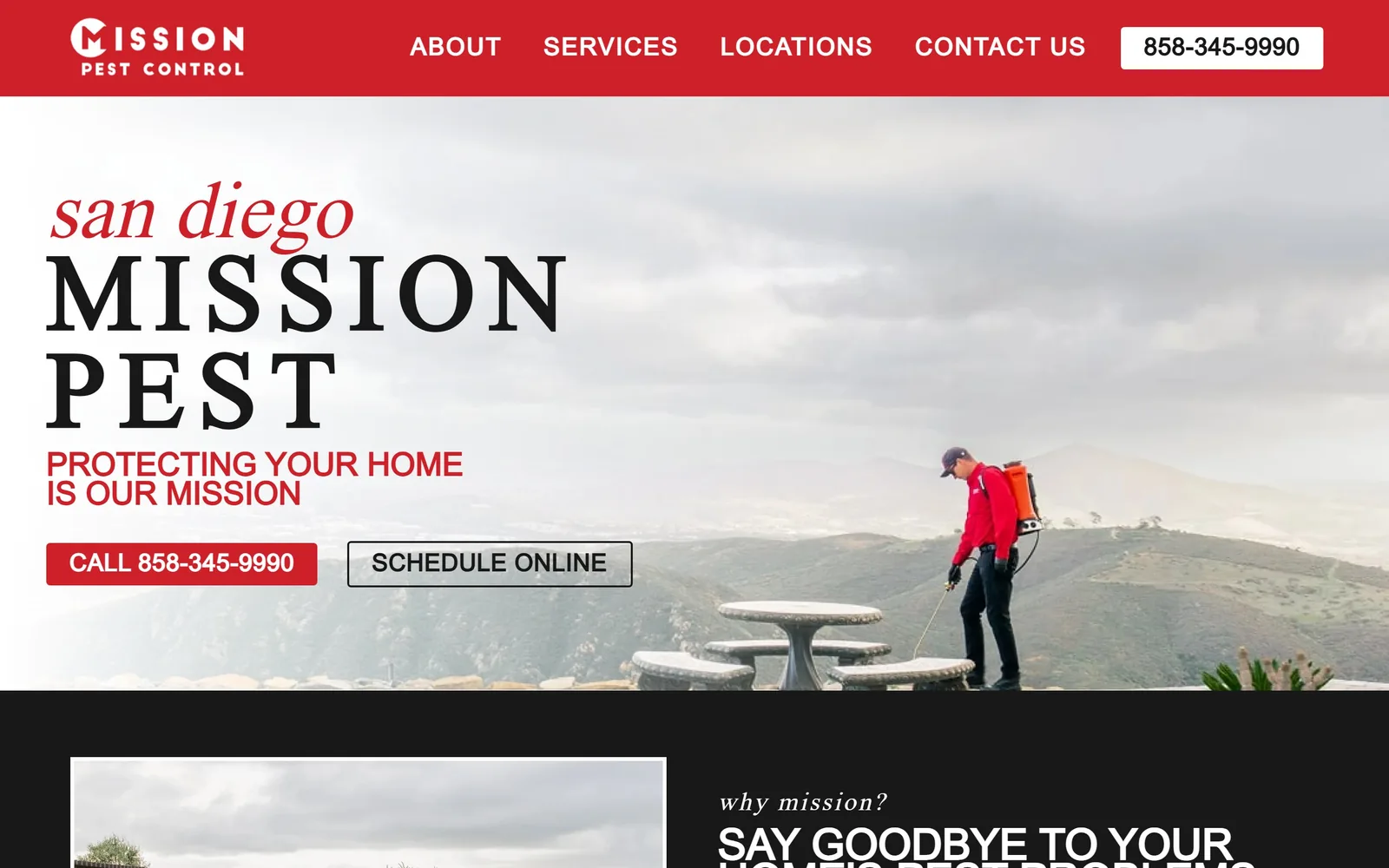
missionpestcontrol.com
A red italic serif whispering san diego over a black serif lockup, against a grey coastal sky.
Type
Poltawski Nowy 75px italic
Body
Lexend Exa 16px
Build
Masthead lockup over full-bleed photograph
Made on
Shopify
Colour
#ce2029 #181818 #ffffff
Type. Poltawski Nowy sets the city line at about 75px, italic, in red. The company name sits beneath it in a large roman serif with the letters opened right out, and the two together read as a masthead rather than a headline. Lexend Exa handles the rest, wide and a little technical, which is the most deliberate pairing in this set.
Colour. Red #ce2029 is rationed hard. It gets the nav bar, the italic line and the call button. White and a near black #181818 carry everything else, so the red never has to compete.
Layout. Full width, with the type anchored left and the technician small and far right in the frame. That placement is the whole trick. The photograph stays a backdrop and the words stay the subject. Below the fold it runs two 628px columns at a 48px gutter.
The ask. Two buttons, near square at a 4px radius, phone first and schedule second. No form in the hero, no discount, no badge wall. For a local firm that wants the call, this is restraint most competitors cannot manage.
Set your name as a masthead rather than parking a logo in the corner, and the hero stops needing a slogan to fill the space.
04
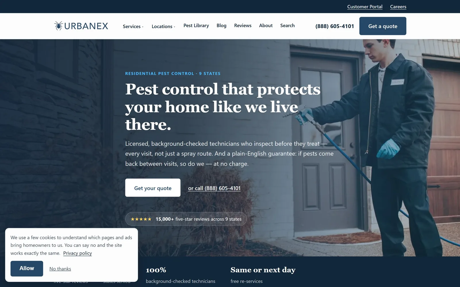
urbanexpro.com
A Georgia serif at 48px over a technician mid spray, which is not where you expect a serif in this trade.
Type
Georgia, about 48px
Body
system sans
Build
1150px column over full bleed photo, square corners
Colour
#13273a #264766
Type. Georgia at 48px in a semibold, three lines deep, and that choice is the whole personality of the page. Pest control almost always reaches for a heavy sans. A serif here reads as a service business rather than an exterminator, which is clearly the point. The eyebrow above it is set tiny in spaced blue capitals, and the body sits in the system stack at 19px.
Colour. A deep navy at #13273a tints the photograph and carries the lower band, with a lighter blue at #264766 behind it. There is no green and no red anywhere, which in this category is itself a statement.
Layout. The photograph fills the frame and the content sits in a 1150px column on the left, so the technician on the right is never covered. A star rating pill sits under the buttons, and a stats band starts just below the fold. Corners are square throughout.
The ask. Get your quote is a white filled button with a plain text alternative beside it, or call, with the number spelled out. Two routes, visibly ranked, and the guarantee is written into the body copy rather than shouted on a badge.
If everyone in your category uses the same kind of typeface, changing that one thing will do more for how you are perceived than any amount of new copy.
05
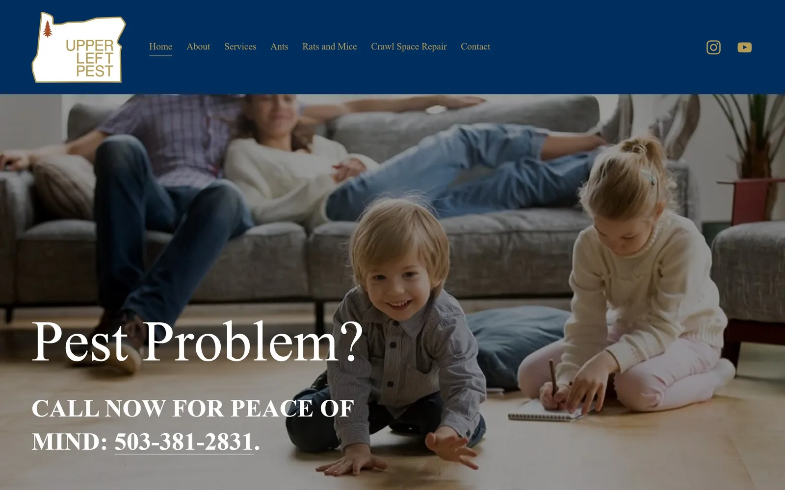
upperleftpest.net
Oregon as a logo, gold on navy, above a serif headline you could read across a room.
Type
High-contrast serif, about 106px
Body
Poppins 17px
Build
Full-bleed photograph, type set bottom left
Made on
Squarespace
Colour
#002e5e #b39a55 #010101
Type. A high-contrast serif takes the two-word hero to roughly 106px. The line beneath runs as small capitals with the phone number underlined inside it, so the call is part of the sentence rather than a button bolted on. Nav links sit at 17px in a 300 weight and stay quiet.
Colour. Three values and no more: white, a near black #010101 coming off the photograph, and navy #002e5e for the header band and the button. The muted gold #b39a55 on the nav links is the only warmth, which leaves the die-cut Oregon outline as the one mark that matters.
Layout. Type sits bottom left over the photograph instead of centred in it, so the family scene stays readable behind it. Sections are spaced about 173px apart, unusually generous for a one-location operator, and the button is left square. The whole page is short.
The ask. There is no form. A phone number, underlined, inside the headline. That is the entire conversion strategy and for a small operator taking quarterly work it is probably correct.
One good piece of regional artwork, drawn once and used as the logo, beats a row of trust badges for a local firm.
06
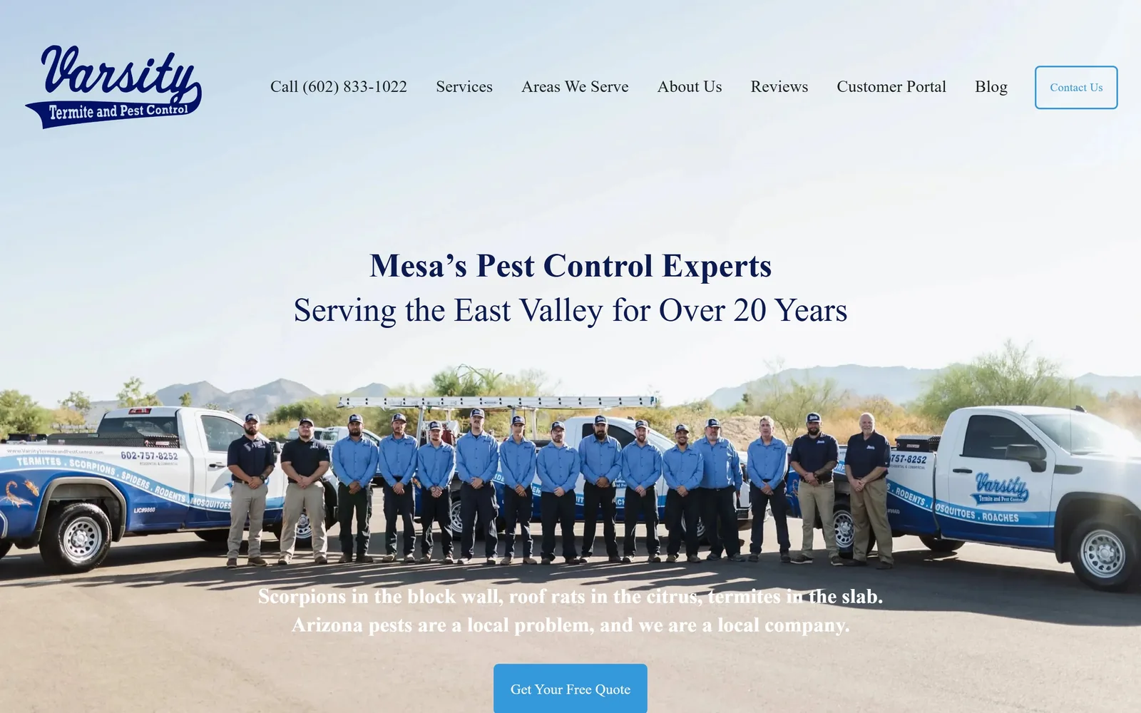
varsitytermiteandpestcontrol.com
A baseball script logo over a pale desert sky, with the whole crew lined up in front of two trucks.
Type
Serif, about 42px, navy
Body
freight-sans-pro 16px
Build
Type above photograph, single column
Made on
Squarespace
Colour
#0b1a51 #3498db #ffffff
Type. Rather than drop white type onto the image, the page sets a serif headline around 42px in navy on clean white above it, with a second line at 38px underneath. Body copy runs at 26px with an open 1.60 line height. The button breaks to Sanchez, a slab, which is a small inconsistency nobody will notice.
Colour. Navy #0b1a51 and white, with sky blue #3498db appearing only on the button. The pale sky in the photograph runs straight into the white of the page, so the join between image and layout disappears.
Layout. Headline above the photograph, not inside it, which buys contrast no overlay can fake. Sections sit about 180px apart and the page stops early rather than padding itself out with service cards. The hand-lettered varsity script in the corner is the only decoration and the only thing here that could not have come from a template.
The ask. One button under a line of copy naming scorpions, roof rats and termites in the slab. Naming the actual local pests does more work than the button does.
Put the headline on white above the picture rather than fighting it with an overlay, and you stop darkening photographs you paid for.
07
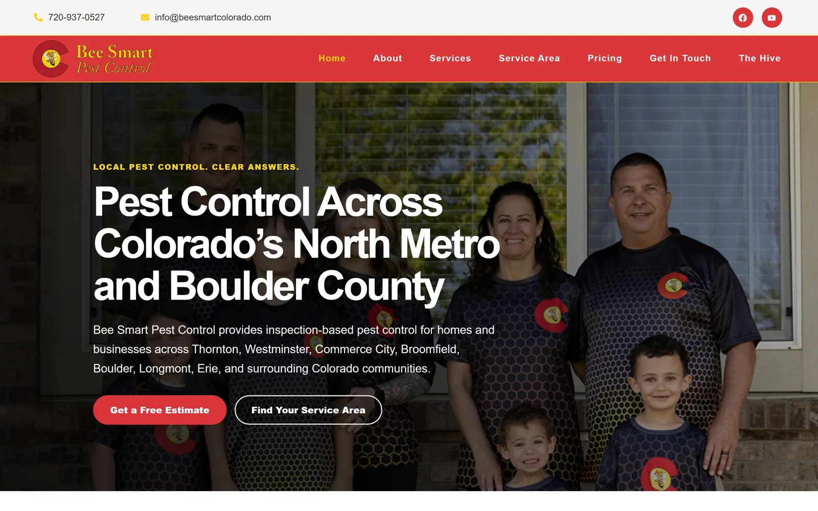
beesmartcolorado.com
Red and gold instead of the usual green, with the Colorado flag turned into a team uniform.
Type
Heavy grotesque, white on photograph
Body
Mulish
Build
Full-width portrait, type left
Made on
WordPress
Colour
#d9343a #ffffff
Type. A heavy grotesque runs the headline over three lines in white, with a short gold eyebrow above it in caps. Mulish takes the body copy, which names seven towns outright. Letting the geography do the positioning is better than any adjective would have been.
Colour. Red #d9343a runs the nav and the main button and is the only accent on the page. In a trade that reaches for green by reflex, that single decision does most of the differentiating. The Colorado C on the shirts picks the red back up, so the palette looks sourced rather than chosen.
Layout. Family portrait across the full width, type held to the left half. The photograph has been darkened to hold white text and it has gone flat in the process, which is the one place this page loses.
The ask. Two pills, deliberately unequal, solid red for the estimate and outlined for the service area. The hierarchy reads at a glance, which is more than most two-button heroes manage.
Take your accent colour from something real, a flag on your own shirts, and the brand stops being swappable with the firm down the road.
08
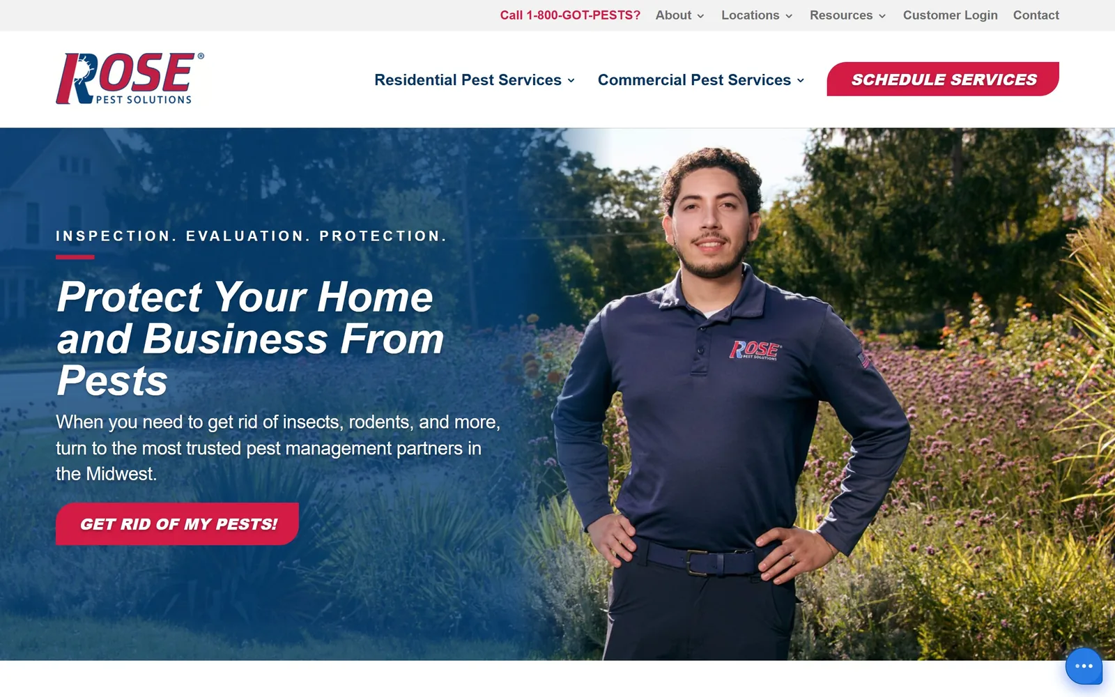
rose.us
An italic headline leaning forward over a technician in a wildflower meadow, in Midwest navy and red.
Type
Exo 54px italic, 700 weight
Body
source-sans-pro 24px
Build
Left text column, right photograph
Made on
WordPress
Colour
#d31b45 #053462 #ffffff
Type. Exo at 54px, 700 weight, italic, set on a flat 1.00 line height so three lines lock together. The italic carries into the button text too, which gives the hero a forward lean. Source Sans Pro beneath at 24px, tightened very slightly.
Colour. Red #d31b45 gets the eyebrow rule, the wordmark and the button. Navy #053462 holds the nav. Past the hero the page is almost entirely white, so a 165-year-old company reads current rather than heritage-heavy.
Layout. Text column pinned to the left third, photograph holding the right two thirds without interruption. The meadow of flowers behind the technician is making the environmental argument silently, where most of this trade would have written three paragraphs about it.
The ask. One button, GET RID OF MY PESTS, in plain words rather than brand language. Eyebrow, headline, button, in that order. It still beats a hero stuffed with certification marks.
Write the button in the words a customer would use. Brand voice on a call to action costs you clicks.
09
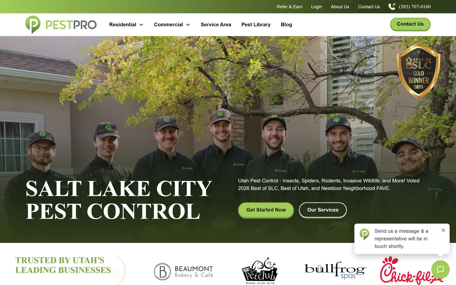
pestproutah.com
Seven technicians under an autumn tree, with the city name set across them in a tall serif.
Type
Serif, about 72px, uppercase
Body
Open Sans 16px
Build
Full-bleed team photograph, logo strip beneath
Made on
Webflow
Colour
#303d1a #a0cd58
Type. The city name runs about 72px, uppercase, in a serif, tightened slightly and broken over two lines. A serif at that size over a busy photograph is a risk and it holds. Open Sans does the supporting copy at 16px without drawing attention.
Colour. Two greens with a job each. Dark #303d1a as the overlay that makes the type readable, light #a0cd58 on the rounded button. Everything else is white, so the hero feels heavier than the rest of the page by design.
Layout. Below the fold it settles into two 608px columns at a 64px gutter, then three at 405px. Sections sit close together at around 32px, so the page moves quickly. Running a row of recognisable local client logos straight under the hero is the smartest thing here.
The ask. Primary button in pale green, secondary outlined beside it, phone number up in the bar. Standard, and executed cleanly rather than inventively.
Photograph your whole crew, all of them, on a real street. After that the stock technician with the clipboard is impossible to justify.
10
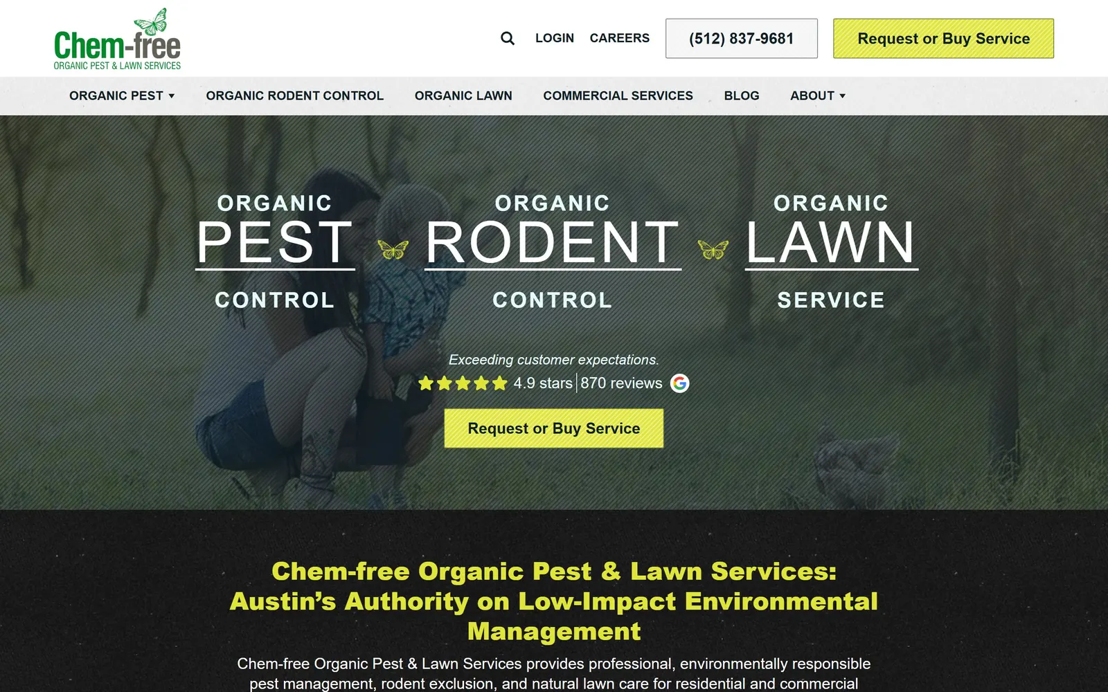
chemfreepestandlawn.com
Three services set as one typographic banner across the hero, divided by small butterflies.
Type
Oswald 74px, 300 weight, 0.05em, caps
Body
brandon-grotesque 20px
Build
Typographic lockup over photograph
Made on
WordPress
Colour
#e0e539 #0f2027
Type. Oswald at 74px in a light 300 weight, letterspaced out and set in caps, spells PEST, RODENT and LAWN across the hero with a rule under each. The words ORGANIC and CONTROL stack above and below in a smaller size, so the lockup reads as three columns rather than a sentence. Brandon Grotesque handles body and nav.
Colour. An acidic yellow-green #e0e539 on both buttons. It reads chemical rather than leafy, which is an odd choice for a company called Chem-free, but it is at least a choice. The page drops to a dark ground below the hero for the positioning line.
Layout. The hero lockup sits over a washed-out photograph that is the weak part of the page. Beneath it the layout runs an uneven five-track grid, 245px and 356px and 247px, which gives the sections some variety. Competent work rather than beautiful work.
The ask. Request or Buy Service, repeated in the header and the hero, nearly square at a 2px radius. Offering a purchase and a quote behind one button is doing two jobs with one word and slightly fudges both.
Set your services as the hero type instead of listing them in cards further down, and you answer what you do before anyone scrolls.
11
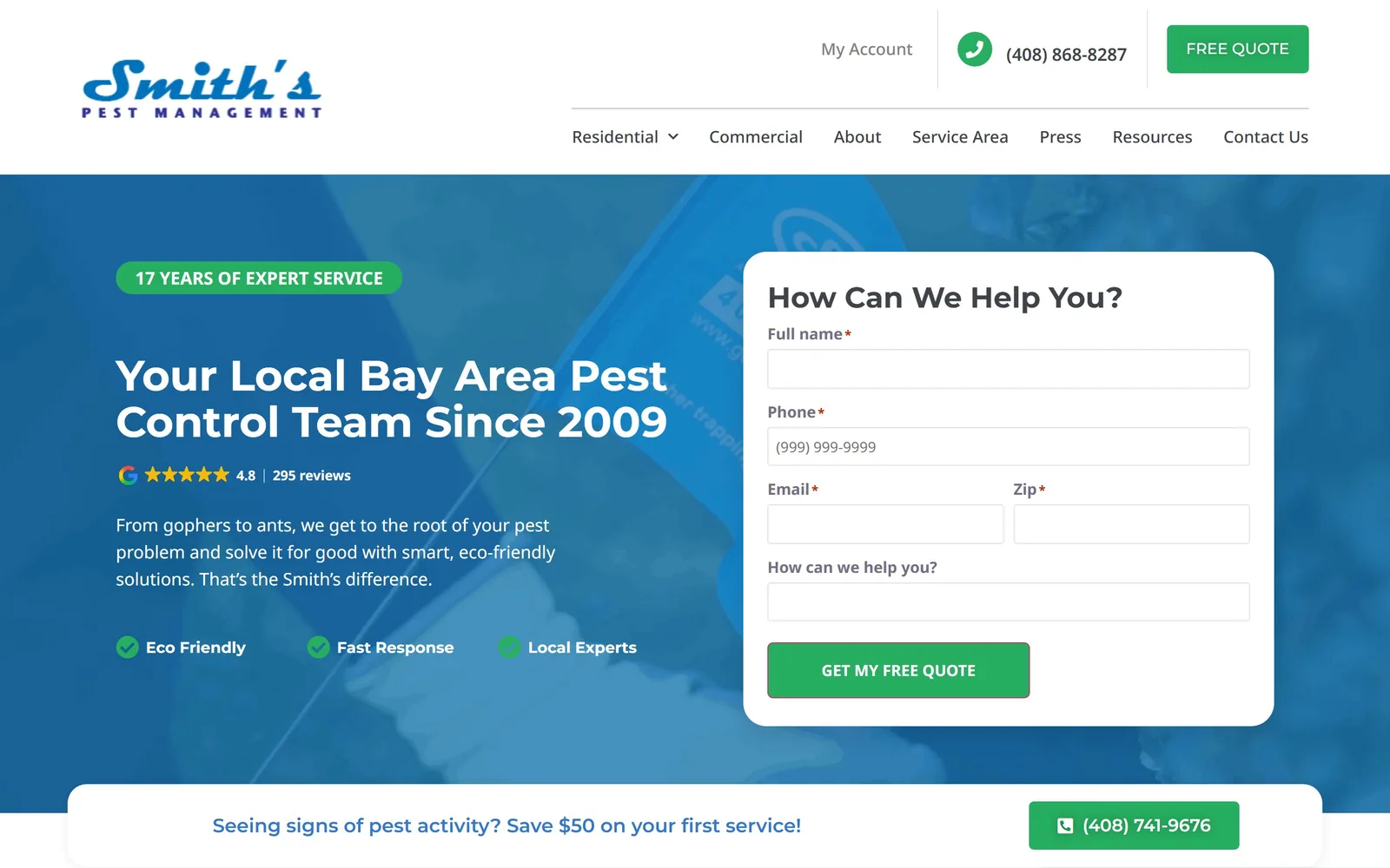
smithspestmanagement.com
A blue gradient, a quote form and a script logo, done neatly rather than memorably.
Type
Montserrat 44px, 700 weight
Body
Noto Sans 18px
Build
Split hero, quote form right
Made on
WordPress
Colour
#27ae60 #f1f1fa
Type. Montserrat at 44px, 700 weight, white on a blue gradient. Noto Sans at 18px for body, 17px grey for nav. It is all perfectly legible and none of it is doing anything you have not seen.
Colour. Green #27ae60 is the only accent, on the quote button and three small ticked proof points. The rest is white over a faint lilac-grey. Blue and green together is the most common pairing in this trade and it is used here without comment.
Layout. Straight two-part split, copy left and a white quote card right. The pill above the headline reading seventeen years of expert service is the one piece of real differentiation in the layout.
The ask. The form is the point. Five fields, name, phone, email, zip and a message, with the proof points sitting where the eye lands before it reaches them. Included here as the competent version of the lead-capture hero, worth studying for the form rather than the art direction.
If the hero is going to be a form, keep it to five fields and put your proof above it, not below.
12
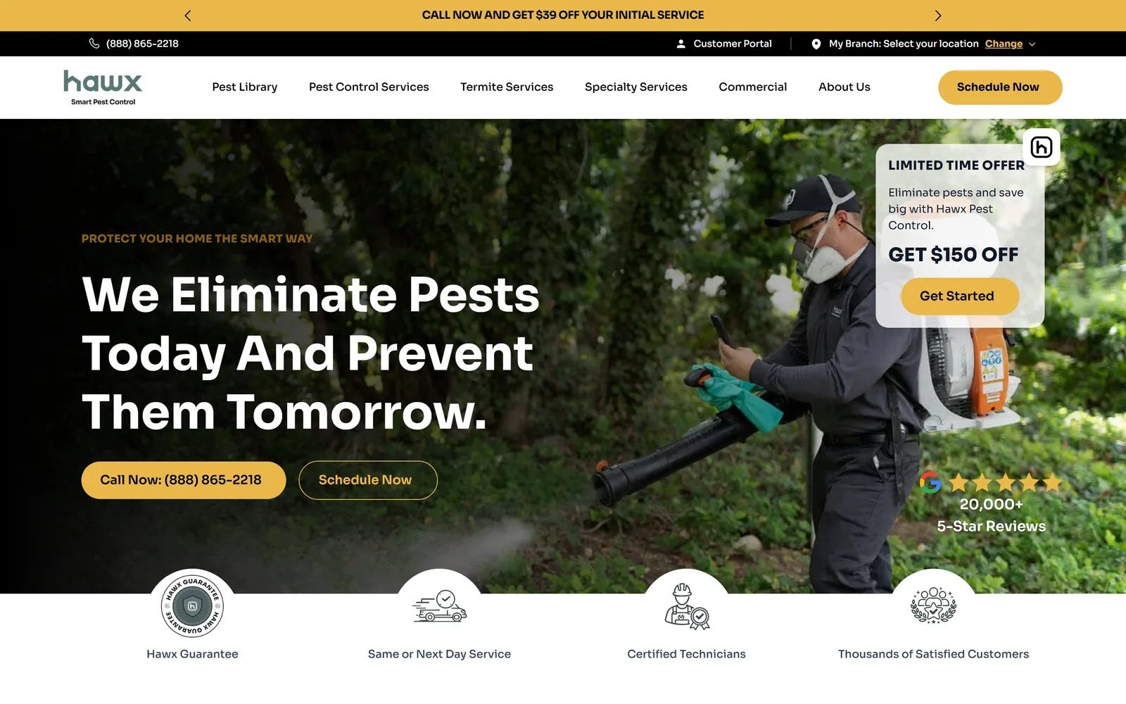
hawxpestcontrol.com
Sora at 60px in three short lines, with everything else on the screen tuned to a single gold.
Type
Sora, about 60px
Body
Sora
Build
full bleed photo, pill buttons, icon row breaking the fold
Made on
custom JS framework
Colour
#eab749 #1b1b18
Type. Sora carries the entire page, 60px bold for the headline and down through 30, 24 and 20px for everything under it. Breaking the line after Pests and again after Prevent gives three short lines that scan in a second, which matters more than elegance on a page people reach in a hurry.
Colour. A warm gold at #eab749 does all the work: the announcement strip, the Schedule Now pill, the Call Now button, the eyebrow and the review stars. The rest is white type on a dark garden photograph. One colour, used five times, and it never looks like five different decisions.
Layout. A fully rounded pill button sits in the nav, and the promotional card is parked in the top right where it overlaps the photograph but not the headline. Four icons in white circles run along the bottom edge, half in and half out of the hero, which ties the first screen to the second.
The ask. Call Now with the number in it is filled gold, Schedule Now is outlined beside it. Phone first, booking second, which is the right order for a trade people call when they are already annoyed. The Google rating sits bottom right with 20,000 reviews behind it.
Put the phone number inside the button rather than beside it, and the person who is already reaching for their phone does not have to look twice.
How these were chosen
Nearly every pest control site reaches for the same bold sans on the same green or red, which means the ones that pick anything else look considered before a visitor has read a word. These twelve American companies each made a decision worth stealing, and the notes under each one say what it was: the typefaces, where the colour is spent, how the page asks for the call. Useful whether you are briefing someone on pest control website design or building it yourself.
Finding pest control sites that someone had actually designed took far longer than it should have. 28 candidates made the shortlist. 12 made the page.
Each one was opened and looked at properly: what the type is doing, where the colour gets spent, how the page is built, how it asks for the job. Nothing is here because it ranks. Nothing is here because an agency filed it under portfolio. Several well known names were left out for the plain reason that their site came out of the same template as everyone else's, and a few sites worth including did not survive a second look.
Where a site is only competent, it says so. The order is the order worth your time, best first.
Reviewed and selected by Larry W. Matthews for Websitely.