Heat pump start-ups on one side, union mechanical contractors on the other. Across these fifteen, HVAC website design turns on who the fold is honest with.
Shown
15 sites
Reviewed
27 candidates
Chosen on
The work, not the ranking
Updated
15 October 2026
01
quilt.com
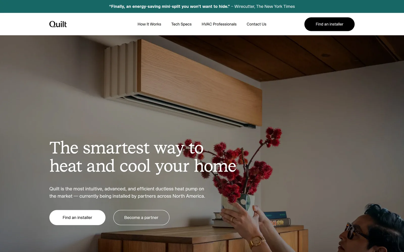
A wood-fronted mini-split sits above a white serif headline, with a Wirecutter pull quote running as a teal strip across the top.
Type
Quilt Serif, 60px
Body
Quilt Sans, 17px
Build
1440px frame, 1185px centre column, full-bleed photo hero
Made on
custom build
Colour
#fef9f3 #186767 #ffffff
Type. The headline runs in Quilt Serif at 60px, weight 400, tracked in slightly at -0.02em and set in sentence case across two lines. Body copy drops to Quilt Sans at 17px on a 1.55 line height, and nav labels sit at 14px. A house serif paired with a house sans is a real investment, and it is the main reason this does not look like a heat pump page.
Colour. The hero is a photograph, so the colour decisions live at the edges: a #186767 teal bar for the press quote, white type over the room, and a #fef9f3 warm off-white below the fold. Teal gets roughly 3% of the screen and does all the brand work. Both hero buttons are plain #ffffff rather than a brand fill, which is the restrained call.
Layout. A 1440px frame holds a 1185px centre column flanked by 64px rails. Press strip, then white nav bar, then a full-bleed photograph that runs well past the fold. Headline and sub sit at the lower left of the image with the buttons under them around 1080px down. Section padding below runs 126px and buttons are fully pill-shaped at 9999px.
The ask. Three asks above the fold: 'Find an installer' as a black pill in the header, then 'Find an installer' again in white and 'Become a partner' as an outline pill. The homeowner path and the installer path get equal weight, which is honest about who this business actually sells to. Nothing else competes and there is no phone number.
Commissioning a serif, then setting it at a restrained 60px over a real photograph of your product in a real room, buys more trust than any badge row.
02
harvest-thermal.com
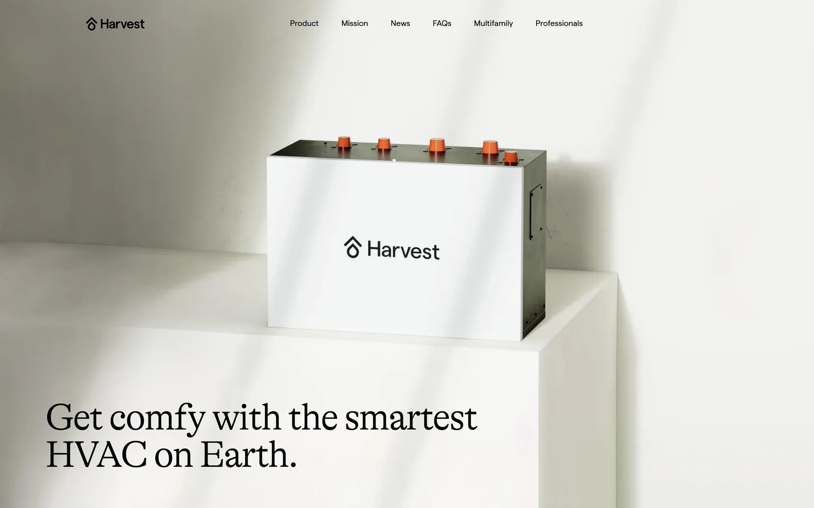
A white thermal battery with orange ports stands on a plinth in raking daylight, the headline set in a light serif below it.
Type
GT Alpina, 66px light
Body
Matter, 16 to 20px
Build
1280px container, product-above-headline hero
Made on
Webflow
Colour
#f9f6e4 #000000 #e2583a
Type. GT Alpina at 66px, weight 300, tracked at -0.033em. It is a serif with real stroke contrast, and the thin weight at that size reads as confidence rather than timidity. Secondary copy stays in the same face at 28px while small interface type switches to Matter at 14 to 20px. Two families, six sizes, no shouting anywhere.
Colour. Almost the entire screen is one colour, #f9f6e4, a warm paper cream the product was lit to match. Type is black. The only saturated thing on the fold is the row of five orange ports on top of the unit, so the accent is physical rather than CSS. Very few sites in this category let a photograph supply the brand colour.
Layout. A 1280px container, four 302px columns with 24px gutters below the fold. The hero inverts the usual order: product photograph on top taking roughly two thirds of the viewport, headline underneath at the lower left, nav floating at the top with no bar behind it. Section padding is 64px and every corner is square.
The ask. The fold asks for nothing at all. No button, no phone, no form, just 'Professionals' and 'Get Harvest' as plain nav links. The page trades immediate capture for the sense that the product deserves reading about, and saves the $8,750 figure for further down.
If the product photograph is good enough it can carry the fold alone, and the headline can sit quietly underneath it.
03
zerohomes.com
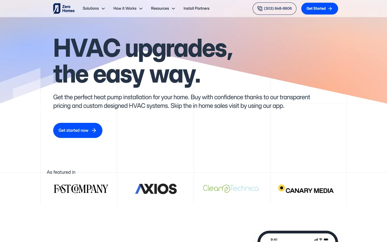
A 96px headline reading 'HVAC upgrades, the easy way.' sits over a pale blue-to-peach gradient wedge, with four press logos banded below.
Type
SFT Schrifted Sans, 96px bold
Body
SFT Schrifted Sans, 20px
Build
1140px container, four 285px columns, text-only hero
Made on
custom JS framework
Colour
#243346 #004fff #f5f7fa
Type. SFT Schrifted Sans at 96px, weight 700, tracked tight at -0.025em, in sentence case breaking after the comma. Body is the same family at 20px weight 500 in #2d445f, a softened navy rather than grey. The family runs from 112px down to 15px without ever bringing in a second face, which keeps a long page cheap to maintain.
Colour. #243346 deep navy for type, #004fff for the single button colour, and a pale gradient wash moving from cornflower on the left to peach on the right across a diagonal wedge. White and #f5f7fa hold everything else. That blue appears exactly twice above the fold, on 'Get Started' and 'Get started now', and nowhere else.
Layout. A 1140px container on a four-column grid of 285px tracks, with the faint column rules left visible as a design element. The hero is left-aligned text with no image beside it, which works because the type is large enough to fill the measure. Press logos sit in a bordered band around 890px down, section padding 96px, buttons fully rounded.
The ask. Two buttons saying effectively the same thing, 'Get Started' in the header and 'Get started now' in the hero, both in the same blue. A phone number sits in an outlined pill beside the header button. The press band immediately below is the only competition and it supports rather than distracts.
Leaving the layout grid faintly visible turns an empty right half of the hero into a deliberate choice instead of a gap.
04
dandelionenergy.com
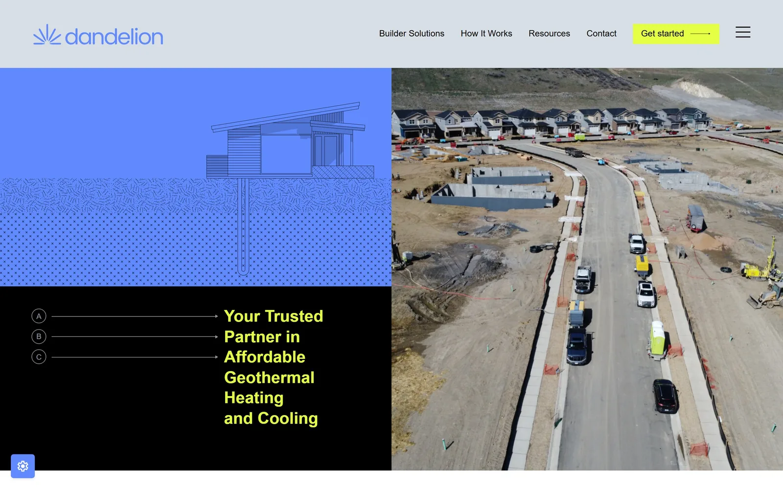
A four-panel hero: a cornflower drawing of a house and borehole, an aerial of homes under construction, acid yellow type on black.
Type
Inter Tight, 30px semibold
Body
Inter Tight, 16 to 18px
Build
50/50 split hero, stacked panels left, photograph right
Made on
WordPress
Colour
#608afd #e5ff44 #000000
Type. Inter Tight throughout, with the headline at 30px weight 600 in acid yellow, broken across six lines in a narrow column. Nav sits at 16px weight 450 and small labels go to 14px uppercase. Setting the headline small and letting the drawing talk is the opposite of what every other page here does, and it is why the composition reads as a diagram.
Colour. #608afd cornflower fills the upper left quarter, pure black the lower left, and #e5ff44 acid yellow carries the headline and the 'Get started' button. Yellow holds well under 1% of the screen and is still the loudest thing on it. The blue and black split is a brand decision, not a photo treatment, which is rare in geothermal.
Layout. Split at exactly half: the left column stacks a blue illustration over a black text panel, the right is a full-height photograph. Inside the black panel, three lettered markers A, B and C connect by thin rules to the headline. Content measures 720px, the nav is a separate grey strip above, and corners are square everywhere.
The ask. One button, 'Get started' in yellow with a long arrow, top right. The hero itself asks for nothing. A hamburger sits next to the button even at desktop width, which costs a little clarity for no obvious gain. The NBC and CBS logos wait until further down rather than crowding the fold.
A cross-section drawing of what you actually install explains the product faster than a photograph of a finished house ever will.
05
smartac.com
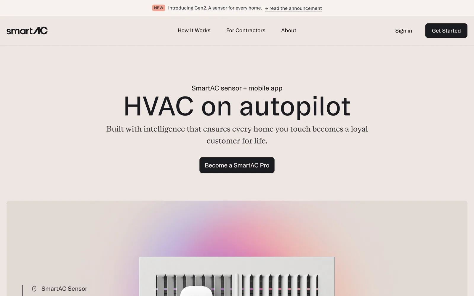
A centred black sans headline reading 'HVAC on autopilot' on a blush field, with a serif subhead and one dark button under it.
Type. Booton, a geometric sans, at 80px for the headline, centred and in sentence case. The subhead switches to ABCOtto, a serif, at 24px tracked at -0.02em. A serif subhead under a sans headline reverses the usual pairing and gives the sentence a conversational tone the headline alone would not carry.
Colour. #f0e6e1 blush covers the whole fold with #e3d9d4 a shade darker on the panel beneath. Type is #1b1c22, near black rather than true black. The only other colour is a soft pink and lilac glow bleeding out from behind the product photograph, plus an #f2a592 'NEW' pill in the announcement strip.
Layout. A 1440px frame with everything centred in a column of roughly 700px. The fold stacks announcement strip, hairline-ruled nav bar, eyebrow, headline, subhead, button, then the product photograph starting around 840px down and running off the bottom edge. Section padding is 64px and button radius is 8px.
The ask. One button, 'Become a SmartAC Pro', in near black, plus 'Get Started' in the header and a quiet 'Sign in' link. The ask targets contractors rather than homeowners and the copy says so outright: every home you touch becomes a loyal customer for life. Only the announcement bar competes.
A centred column on a single tinted field needs nothing else when the headline is three words long.
06
macmiller.com
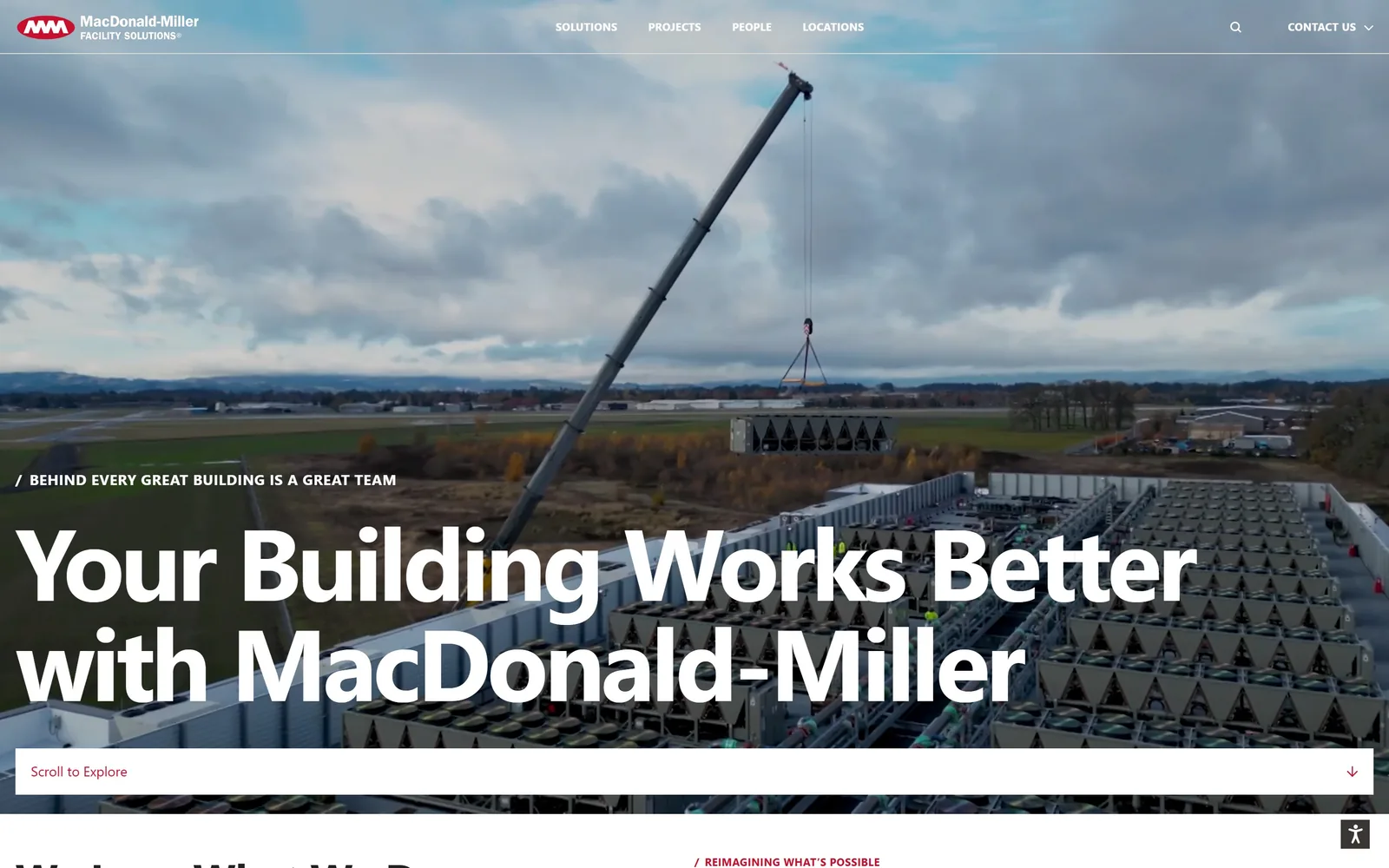
A crane lowers rooftop equipment onto a building while 'Your Building Works Better with MacDonald-Miller' runs in 104px white bold across the lower half.
Type
Roboto Bold, 104px
Body
Roboto, 16px
Build
Full-bleed video hero, left-aligned headline, pinned scroll bar
Made on
WordPress
Colour
#ffffff #222222 #c8102e
Type. Roboto Bold at 104px, tracked at -0.04em, two lines, title case. Above it a 15px uppercase eyebrow reading 'Behind every great building is a great team', preceded by a slash. Roboto is a default and they have not disguised it, but at 104px with the tracking pulled in it stops looking like a default and starts looking like a poster.
Colour. The hero is video, so the colour is whatever the sky gives: grey cloud, green field, galvanised steel. Brand red #c8102e appears in the logo, in the slash before the eyebrow, and in 'Scroll to Explore', adding up to under half a percent of the screen. Below the fold the page resolves to white and #222222.
Layout. Full-bleed 1440px video with no container inset, headline aligned hard left at the margin. A white 'Scroll to Explore' bar is pinned across the bottom of the viewport with a down arrow at its right end, which is an instruction rather than decoration. Section padding below tightens to 44px.
The ask. 'Contact Us' with a dropdown in the header is the only ask above the fold, in small uppercase, easy to miss. The scroll bar is the real call to action. For a contractor selling seven-figure mechanical packages that is the right trade, since nobody buys a chiller plant from a hero button.
When the sale takes six months, the fold's job is to show the scale of work, not to capture a lead.
07
sealed.com
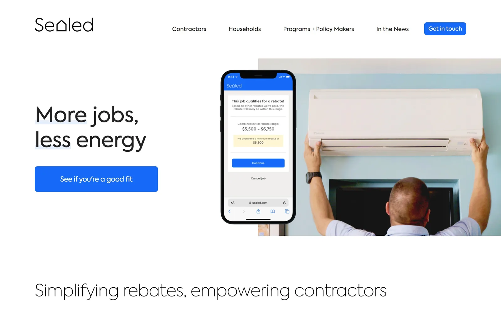
Black type reading More jobs, less energy at the left, a phone showing a rebate screen and a technician mounting a mini-split at right.
Type. Axiforma at 60px weight 500 for the headline, tracked slightly negative, over two short lines. Body runs 18px weight 400 with positive tracking at 0.028em in #555555. The lighter 300 weight turns up at 36 and 48px further down, so the page gets lighter as it descends, signalling hierarchy without much change in size.
Colour. White dominates completely. #156bf7 blue takes the one button and the phone screen's chrome, #f7f4f0 a warm off-white marks alternating bands, and #212121 carries type. The pale blue highlight behind the words 'More' and 'less' is the only decoration anywhere on the fold.
Layout. A 1440px container splits the hero roughly 40/60, text left and image right. The photograph is cropped to a rectangle starting around 230px down and bleeding off the right edge, with the phone mock overlapping its left side. Section padding is a generous 128px, button radius 8px, corners square elsewhere.
The ask. 'Get in touch' in the header and 'See if you're a good fit' as the hero button, both blue. The hero wording is a filter rather than a demand, which fits a business that only works with contractors who qualify. The phone mock showing a real $5,500 to $6,750 rebate range persuades harder than either button.
Showing the actual number your customer will see inside your app beats describing the benefit in a bullet list.
08
pearledison.com
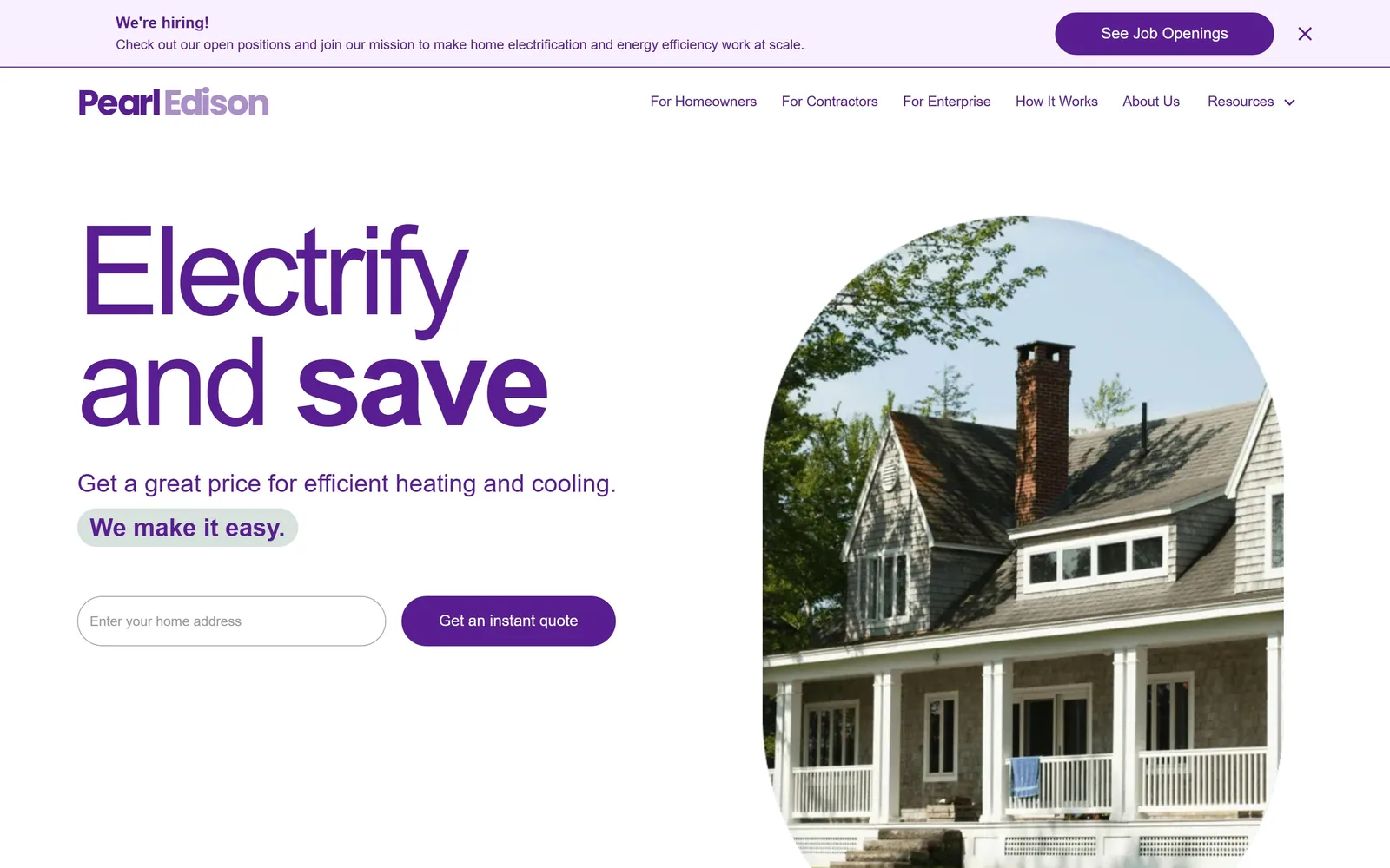
'Electrify and save' set in 128px purple Poppins beside an arch-cropped photograph of a shingled house with a brick chimney.
Type. Poppins at 128px, weight 300, tracked hard at -0.047em, with the word 'save' jumping to weight 700 at the same size. That weight contrast inside a three-word line is the entire typographic idea. Supporting copy drops to 26px and then 14px, so the gap between display and body is enormous and the page reads as one statement with footnotes.
Colour. #591e91 purple does everything: headline, body copy, nav, logo, button fill. White and #f4f3f2 carry the rest, with #f8efff lilac in the hiring banner and a #d8e2dc sage chip behind 'We make it easy.' Running every piece of text in the brand colour instead of black is a risk that works only because this purple stays readable at 14px.
Layout. A 1440px frame with a two-column hero at 908px and 227px and a 65px gutter. The photograph is cropped into a tall arch, flat at the bottom and rounded at the top, which softens an otherwise rectangular page. Buttons are fully rounded. A dismissible hiring banner takes the top 100px.
The ask. An address field and a 'Get an instant quote' button sit side by side around 890px down. That is the whole ask and it is the right one for a business whose pitch is instant pricing. Competing with it is 'See Job Openings' in the hiring banner, which is both larger and higher on the page than the actual conversion.
Putting one input in the hero and asking only for an address removes every reason not to start.
09
jaspr.co
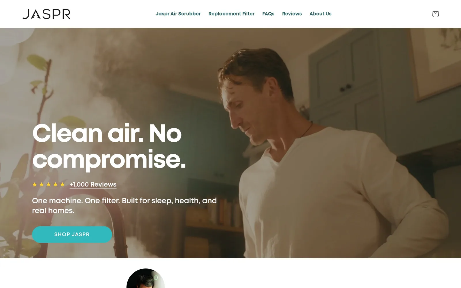
A man stands in a kitchen filling with haze while 'Clean air. No compromise.' sits in heavy white sans at the left.
Type
Mont Bold, 78px
Body
Mont Regular, 18px
Build
1440px frame, full-bleed video hero, left text block
Made on
Shopify
Colour
#31b8bc #072f30 #effbfa
Type. Mont Bold at 78px, tracked tight at -0.04em, split into two short sentences across two lines. Full stops inside a headline slow the reading down, which is the point. Body runs Mont Regular at 18px, and the button is Mont Bold at 15px uppercase with wide 0.067em tracking, the only place on the fold where letterspacing opens up.
Colour. The hero video is warm and desaturated, amber haze against sage cabinets, so the page lets it run and puts almost nothing on top. #31b8bc teal takes the 'Shop Jaspr' button, gold stars mark the review line, and below the fold it goes to white and #effbfa pale mint. Teal covers about half a percent of the screen.
Layout. A 1440px frame with the hero text block starting around 530px down at the left margin and the video bleeding full width behind it. A six-column grid at 231px with 10px gutters appears further down. Button radius is 8px. The first testimonial portrait pokes above the fold line at bottom centre as a scroll cue.
The ask. One button, 'Shop Jaspr', in teal. Above it a five-star row linking to '+1,000 Reviews', doing conversion work without looking like a button. A cart icon sits top right. For a single-product store that is the correct number of asks, which is one.
Putting the star rating directly between the headline and the button places proof exactly where hesitation happens.
10
runwise.com
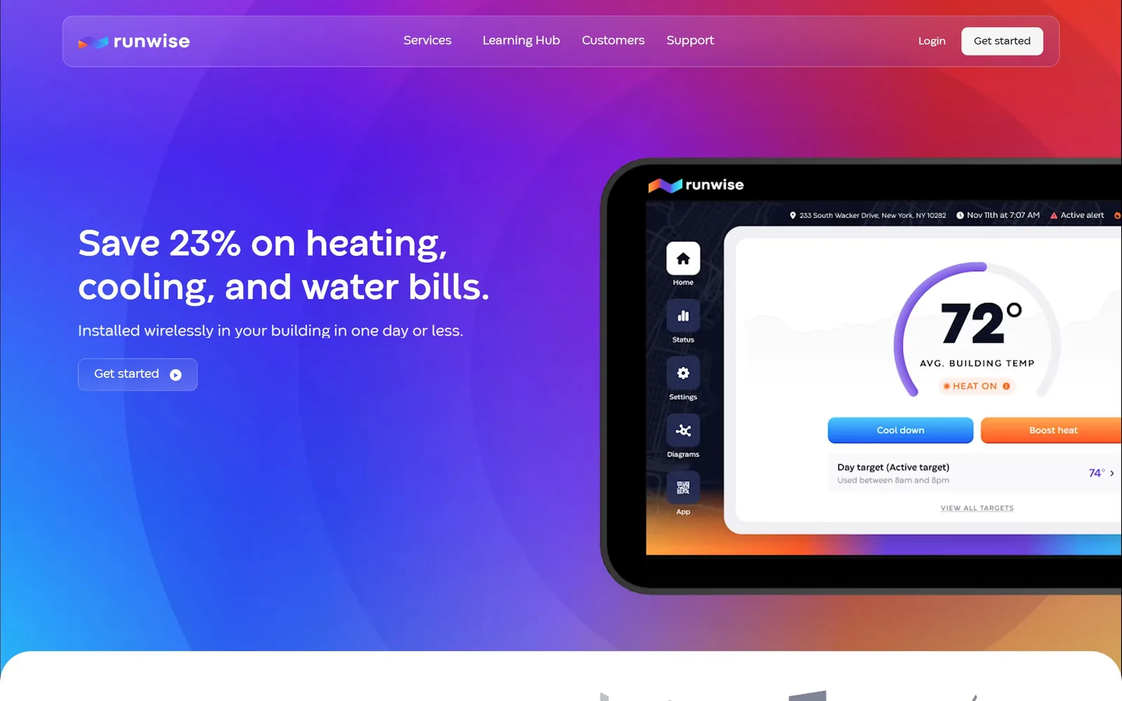
A blue-to-magenta gradient fills the hero with a tilted tablet showing a building dashboard reading 72 degrees average building temp.
Type
Codec Warm, 48px semibold
Body
Codec Warm, 16px
Build
1240px container, two 639px columns, floating nav capsule
Made on
custom build
Colour
#4a3df0 #c0267a #ffffff
Type. Codec Warm at 48px weight 600 for the headline, no tracking adjustment, two lines, with '23%' sitting inside the sentence rather than pulled out as a stat block. Body at 16px, nav at 16px, button at 14px weight 500. The type stays modest on purpose because the gradient and the device shot already carry the volume.
Colour. A full-bleed gradient running cornflower through violet to magenta, with a hot red corner at the top right, and white type over it. The dashboard inside the tablet brings its own palette, including a blue 'Cool down' button beside an orange 'Boost heat'. The DOM reports a dark red as dominant, but what you see is the gradient, so trust the gradient.
Layout. A 1240px container with two 639px columns. The nav sits inside a rounded translucent capsule floating on the gradient rather than in a bar, inset around 115px from each edge. The tablet is rotated a few degrees and cropped by the right edge. A white panel with a large corner radius slides up over the bottom of the gradient to end the fold.
The ask. 'Get started' appears twice, once as a white pill in the floating nav and once in the hero as an outlined pill with a play icon, plus a 'Login' link. The hero button is outlined rather than filled, making it quieter than the header one, which is the wrong way round when the hero carries the pitch.
A saturated gradient costs nothing to produce and separates you instantly from every competitor still photographing a boiler room.
11
gradientcomfort.com
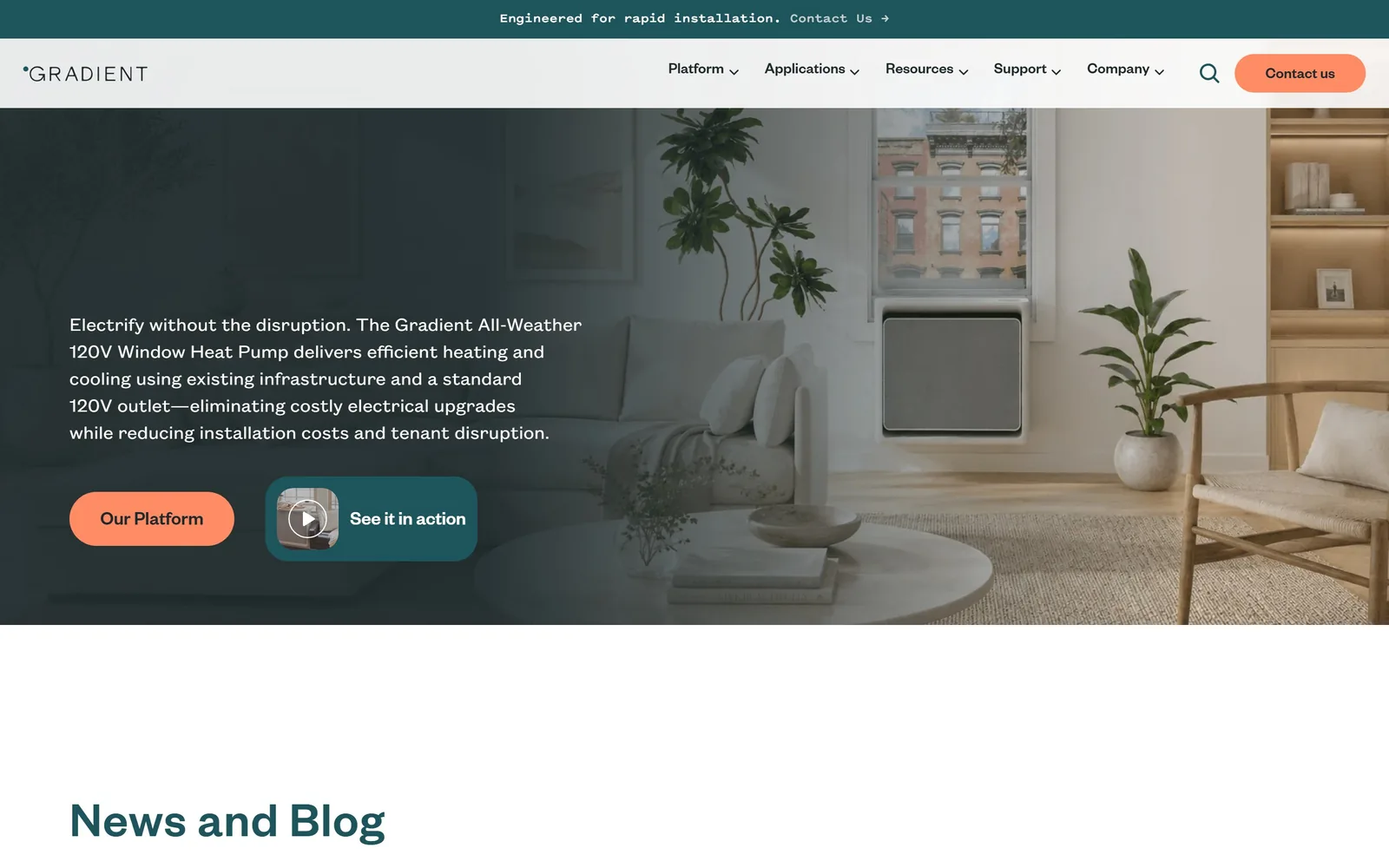
A styled living room with a window heat pump, darkened to deep teal on the left where a paragraph and two buttons sit.
Type
Founders Grotesk Medium, 52px
Body
Founders Grotesk Text, 20 to 24px
Build
1440px frame, full-bleed photo with left gradient wash
Made on
Framer
Colour
#0d3338 #ff8c65 #1e555c
Type. There is no headline on this fold, which is the most interesting decision on the page. A 24px paragraph in Founders Grotesk Text does the work instead, running five lines and naming the product in full as the Gradient All-Weather 120V Window Heat Pump. The announcement strip above is set in a monospaced face, and section headings below arrive at 52px in Founders Grotesk Medium.
Colour. #0d3338 deep teal washes the left half of the photograph in a gradient that fades to nothing by centre frame. #ff8c65 coral takes the two buttons and nothing else, roughly 1% of the screen. Coral on deep teal is a specific pairing rather than the default blue this category keeps reaching for.
Layout. A 1440px frame, photograph full bleed, text block pinned at the left starting around 460px down. Buttons are fully rounded. The second one is a teal rectangle containing a thumbnail and a play icon, so it reads as a video card instead of a button. Section padding is a tight 32px and the page runs 9518px long.
The ask. 'Contact us' as a coral pill in the header, 'Our Platform' as a coral pill in the hero, 'See it in action' as the video card, and 'Contact Us' again in the announcement strip. Four asks above the fold for a company selling to building owners is two too many, and not one of them says get a quote.
Skipping the headline and leading with a precise product sentence works when the product name is itself the differentiator.
12
jhkelly.com
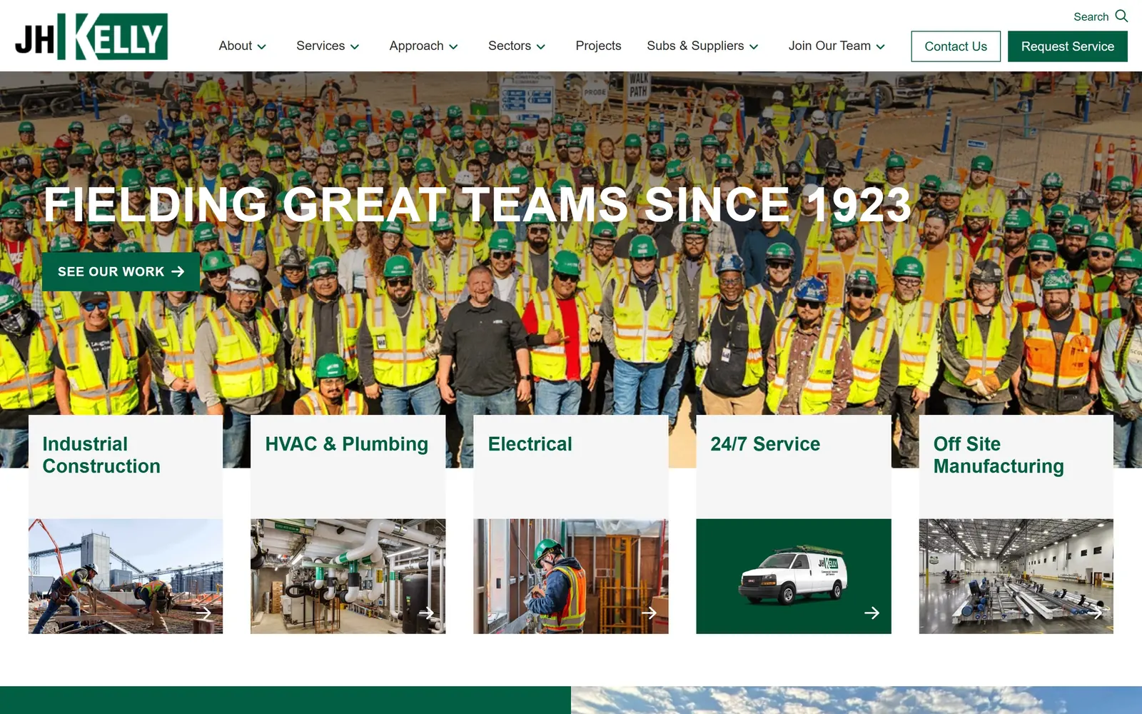
Several hundred workers in hi-vis vests and green hard hats fill the hero, with 'Fielding Great Teams Since 1923' in white caps across them.
Type
Ubuntu Bold, 60px uppercase
Body
Lato, 18px
Build
1440px frame, cropped photo hero with five overlapping cards
Made on
custom build
Colour
#016043 #ffffff #f5f5f5
Type. Ubuntu Bold at 60px, uppercase, with positive tracking at 0.01em, in a single line spanning nearly the full width. Body copy switches to Lato at 18px. Ubuntu is an unusual pick outside Linux branding and its slightly squared caps suit a construction company better than a neutral grotesque would.
Colour. #016043 forest green is the brand and it takes the logo block, the 'See Our Work' button, the 'Request Service' button, the card headings and one of the five service tiles. White and #f5f5f5 do the rest. The hi-vis yellow filling the photograph is accidental colour rather than brand colour, and it is working harder than either.
Layout. A 1440px frame with the hero photograph cropped to around 600px tall and five white service cards overlapping its bottom edge by roughly 90px, each carrying a label above a photograph. That overlap is the structural idea and it pulls the eye past the fold. Corners are square throughout and button radius is 0.
The ask. 'Request Service' solid green and 'Contact Us' green outline in the header, 'See Our Work' in the hero. Three asks, clearly ranked by fill weight. The five overlapping cards compete hard, but they are navigation rather than noise, since commercial visitors arrive already knowing which trade they need.
Overlapping the service cards onto the hero photograph turns the fold line into a deliberate edge instead of an accident of viewport height.
13
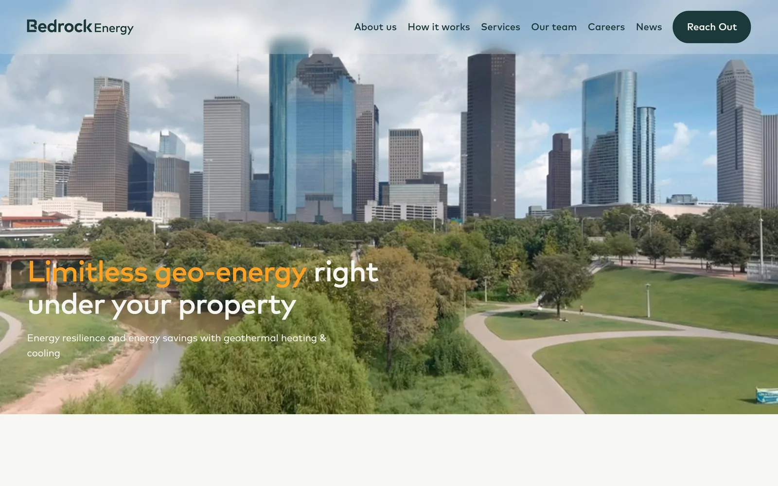
bedrockenergy.com
A drone shot of the Houston skyline over parkland, with 'Limitless geo-energy' in orange and 'right under your property' in white beneath it.
Type
Mark Medium, 54px
Body
Mark Regular, 18px
Build
1440px frame, full-bleed drone video, lower-left text block
Made on
WordPress
Colour
#f6f6f2 #1b3939 #f5a623
Type. Mark Medium at 54px, weight 550, tracked at -0.03em, across two lines where the first clause is coloured and the second is not. Body sits at 18px, white over the footage and #1b3939 below the fold. Mark is a humanist sans with open apertures, which keeps 54px legible over moving video where a tighter face would clog up.
Colour. Orange carries the first half of the headline and nothing else above the fold. Everything else is whatever the drone gives: green canopy, blue glass, grey cloud. Below the fold the page resolves to #f6f6f2 warm off-white with #1b3939 dark teal type. Splitting a headline into two colours mid-sentence is the one strong move here.
Layout. A 1440px frame with video bleeding full width and the nav floating on it with no bar behind. The headline block sits lower left from around 670px down with a small subhead under it. Section padding below the hero is a very generous 150px, which gives the page a slow, well-funded rhythm.
The ask. One button, 'Reach Out' in dark green, top right, and that is the lot. Six nav items compete with it. The hero makes no ask at all, which fits a company selling to developers and property owners rather than walk-ins, and which saves its funding figures for much further down.
Colouring only the first clause of a headline lets you emphasise a claim without introducing a second type size.
14
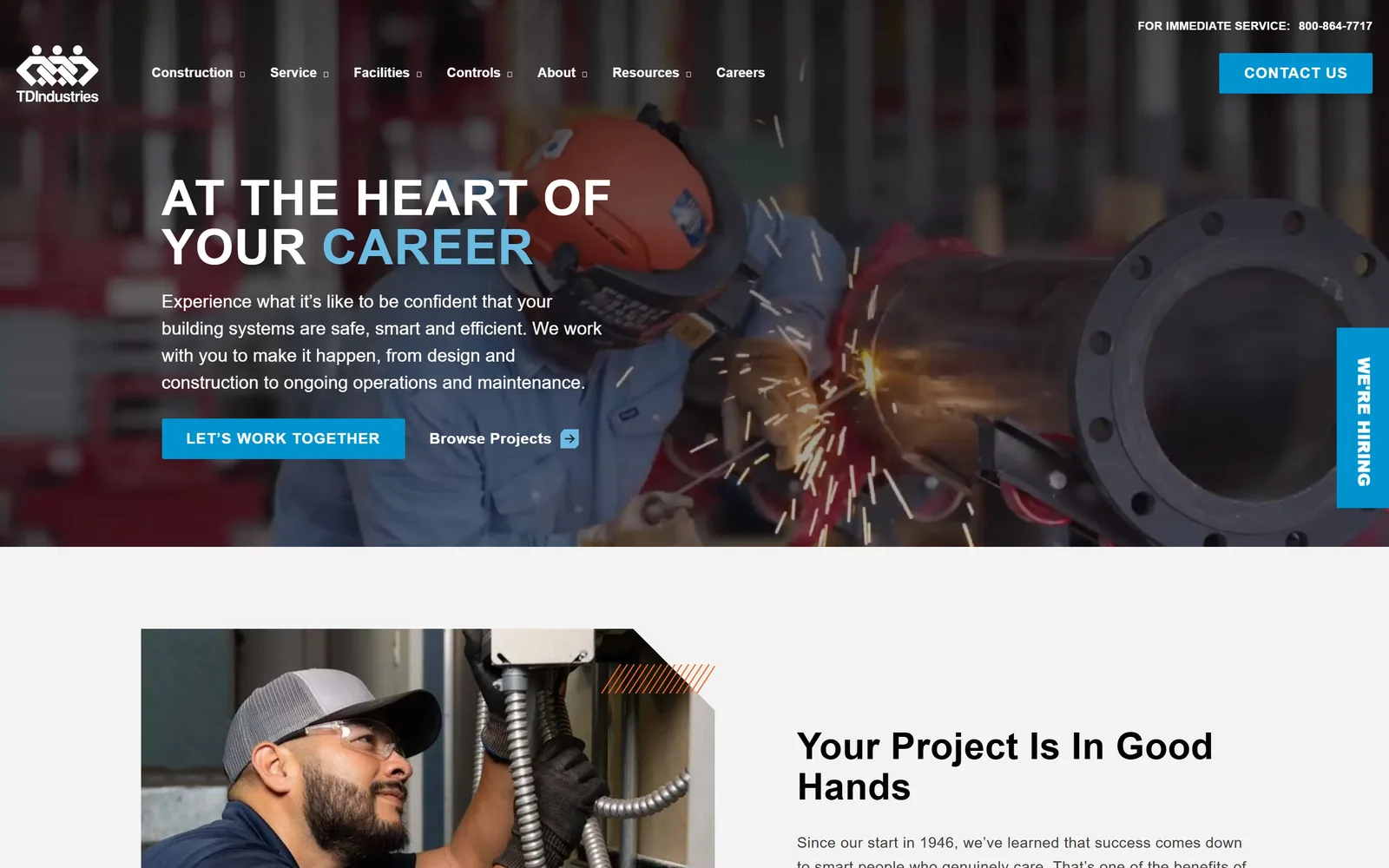
tdindustries.com
A welder works a flanged pipe in a shower of sparks, headline set in condensed white caps at the left.
Type
Roboto Condensed Bold, 60px uppercase
Body
Roboto, 22px
Build
1440px frame, cropped photo hero, left 40% text column
Made on
custom build
Colour
#0093d0 #005baa #f3f3f3
Type. Roboto Condensed Bold at 60px, uppercase, tracked at 0.017em, with the final word in #0093d0 blue. Body copy switches to regular-width Roboto at 22px, which is a sensible split: condensed for the shout, normal width for the sentence. The button repeats Roboto Condensed at 18px uppercase with wide 0.056em tracking.
Colour. #0093d0 cyan blue is the whole brand and it takes the header button, the hero button, the vertical hiring tab and one word of the headline. A darker #005baa turns up below. White and #f3f3f3 carry the body of the page. This is the default blue of the mechanical contracting category, executed cleanly rather than rethought.
Layout. A 1440px frame with the hero photograph cropped to about 640px and the text block in a left column of roughly 40%. A vertical 'We're Hiring' tab is pinned to the right edge at mid height. Below the fold a two-column section uses an angled corner cut on the image, the one piece of real visual personality. Section padding 100px, button radius 2px.
The ask. A phone number top right, 'Contact Us' in the header, 'Let's Work Together' as the hero button, 'Browse Projects' as a secondary link, and the hiring tab. Five asks, and the hiring tab is the only one with a fixed position, which tells you labour matters more than leads right now.
Condensed caps at 60px let a long headline fill a narrow column without dropping to a size that disappears into a photograph.
15
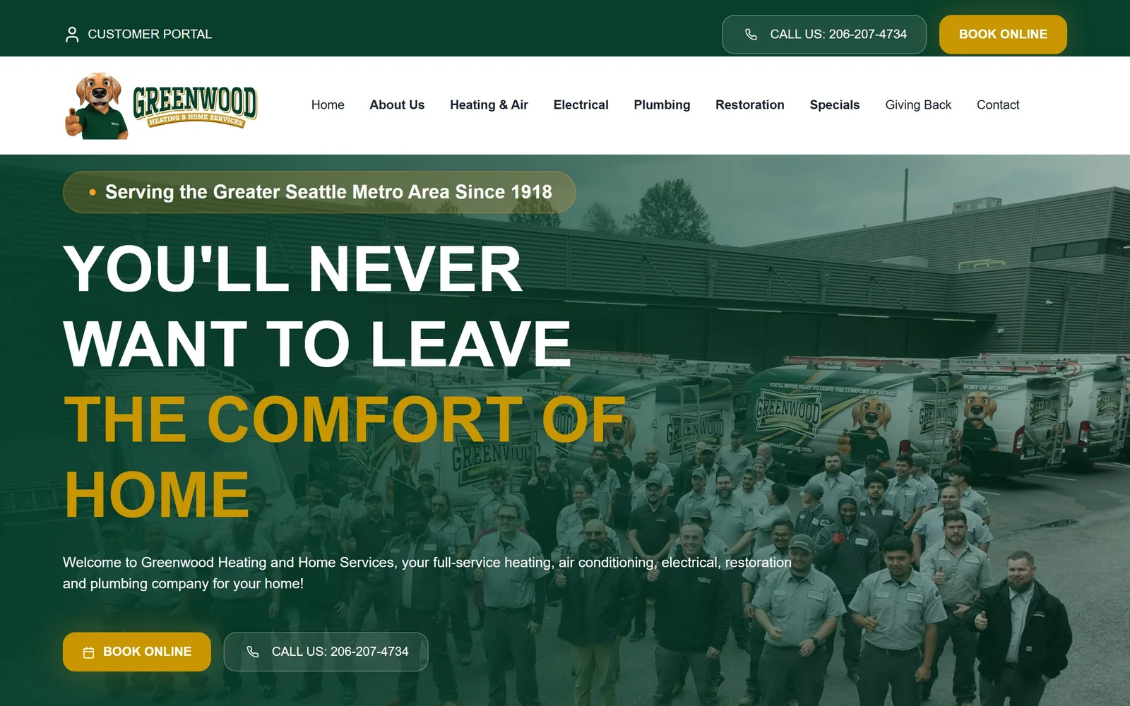
greenwoodheating.com
A company photograph of around fifty technicians in front of branded vans, with the headline half white and half gold laid over them.
Type
Figtree Bold, 48px uppercase
Body
Figtree, 18px
Build
1440px frame, three stacked bands, left-aligned hero text
Made on
Webflow
Colour
#073f2c #c89700 #f99e1f
Type. Figtree Bold at 48px, uppercase, across four lines, the first two white and the last two in #c89700 gold. Body copy drops to Figtree Regular at 18px and button labels sit at 16px uppercase. One family, three weights, no display face. For a local contractor that is a sensible budget decision, and Figtree beats the Open Sans this genre usually lands on.
Colour. #073f2c dark forest green for the utility bar and the photograph's overlay, #c89700 gold for the second half of the headline and the 'Book Online' buttons, #f99e1f a brighter orange for small accents. A white nav bar separates the two green zones. The green and gold runs from the logo through the page and onto the vans in the photograph.
Layout. A 1440px frame with a 256px and 1024px two-column structure below the fold. Three stacked bands above it: a dark green utility bar carrying the phone number, a white nav bar with nine items and the mascot logo, then the photograph. Hero text sits at the left from around 400px down. Button radius is 16px.
The ask. The phone number appears twice, 'Book Online' appears twice, and 'Customer Portal' once, all above the fold. A pill reading 'Serving the Greater Seattle Metro Area Since 1918' sits above the headline. Nine nav items is a lot, but a residential firm selling six trades has to list them, and the two repeated asks are the right two.
Photographing your entire crew in front of your own vans is a proof asset no stock library can sell you.
How these were chosen
Fifteen sites here, and they fall into two camps that barely acknowledge each other. On one side sit venture-funded heat pump, geothermal and controls companies selling a product; on the other, union mechanical contractors who have been piping buildings since the 1920s, with a few residential service firms in between. The pattern worth noticing is that the product companies almost never put a button in the hero, while the service companies put three or four, and both are right about their own buyer. What separates good hvac website design from the rest of this set is not budget, it is whether the fold is honest about how the sale actually happens. Read it best first: rank one is the one I would put in front of a client.
Finding HVAC sites that someone had actually designed took far longer than it should have. 27 candidates made the shortlist. 15 made the page.
Each one was opened and looked at properly: what the type is doing, where the colour gets spent, how the page is built, how it asks for the job. Nothing is here because it ranks. Nothing is here because an agency filed it under portfolio. Several well known names were left out for the plain reason that their site came out of the same template as everyone else's, and a few sites worth including did not survive a second look.
Where a site is only competent, it says so. The order is the order worth your time, best first.
Reviewed and selected by Larry W. Matthews for Websitely.