Funeral home website design turns on the first button, and the best of these twelve name a situation rather than an action. Pricing is often right there.
Shown
12 sites
Reviewed
26 candidates
Chosen on
The work, not the ranking
Updated
15 October 2026
01
earthfuneral.com
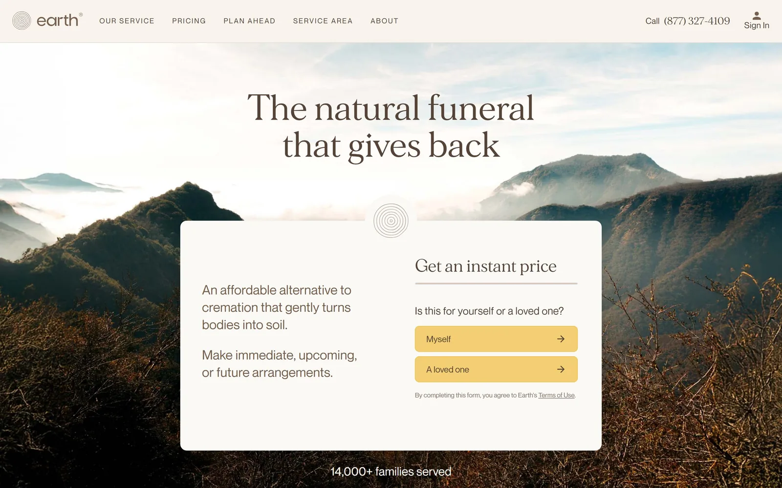
A misty mountain photograph behind a floating stone-grey card that opens the price quiz with two buttons.
Type. The headline is a quiet transitional serif at 64px, set in two centred lines with a touch of negative tracking at -0.011em and a warm brown around #544336 rather than black. Body copy and the nav run in a neutral geometric sans at 19 to 22px, letter-spacing barely open at 0.006em, sentence case throughout. The nav is the only uppercase on the screen, tracked out and small, so the serif gets the whole stage.
Colour. Hero photography carries real colour, so the interface stays out of the way: a #f4eee5 header band, a near-white #f6f3ee card, brown text. The single piece of saturation is the pair of buttercup buttons, roughly #f2cf72, covering maybe 4 percent of the viewport and sitting exactly where the next click goes. For a category that defaults to grey and navy, choosing a warm sand neutral and one yellow is a decision, not a preset.
Layout. Full-bleed photograph with the headline floating over the sky and a quote card bridging the fold, about 1070px wide and centred, split into a copy column and a form column at roughly 55/45. Corners are 24px, the only rounding on the screen apart from the buttons. A small ring mark sits half over the card's top edge to pin it to the photo. Below the card, a single line reads 14,000+ families served.
The ask. One ask, phrased as a question rather than a form: is this for yourself or a loved one, with Myself and A loved one as the two answers. Nothing else competes above the fold except a phone number in the top right and a Sign In link. There is no newsletter, no chat bubble, no cookie bar. The quiz replaces the contact form that every competitor leads with.
Turning the lead capture into a two-button question removes the dread of a form before anyone has typed a character.
02
after.com
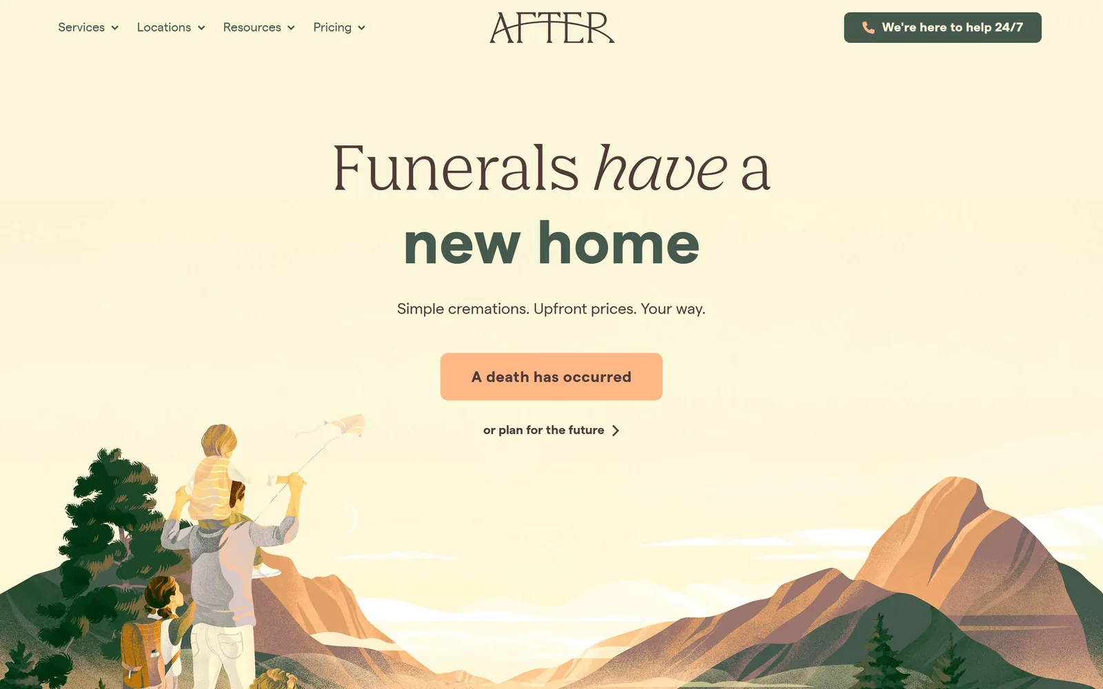
A pale yellow page with a drawn mountain scene rising from the bottom and a peach button under a two-weight headline.
Type
Humanist serif with italic, 80px
Body
Geometric sans, 16 to 20px
Build
800px centred column, illustrated base band, 10px radius
Made on
Webflow
Colour
#fbf6d9 #503a3a #ffb885
Type. The headline mixes faces on purpose: Funerals have a in a 80px humanist serif with a true italic on have, then new home in a heavy geometric sans at the same size and a deep green. Nav and button text are the same sans at 16 and 20px, 700 weight on the button with 0.02em tracking. The serif-to-sans switch mid-sentence does the work a colour change usually does.
Colour. The field is #fbf6d9, a pale yellow that reads as warm paper without going grey. Headline brown is #503a3a, the emphasis green is close to #3a5443, and the single accent is a peach #ffb885 on the button, repeated nowhere else. The illustration brings in dusty rose and sage, so the whole screen holds about five hues and no pure black.
Layout. Centred single column around 800px wide inside a 1440 frame, with the nav split left and a dark green pill holding the phone CTA at the top right. The illustrated landscape is a full-width band anchored to the bottom edge, so the hero has a floor rather than an image. Button radius is 10px. Headline, one line of subcopy, button, and a text link are the entire fold.
The ask. The primary button says A death has occurred, which is the sentence the visitor is living rather than marketing language. Underneath, a lighter link reads or plan for the future, splitting urgent from future without a second button fighting for weight. The header pill, We're here to help 24/7, carries the phone. Three asks, each at a different visual level.
Writing the button as the visitor's situation rather than an action verb sorts two very different audiences in one click.
03
meadowmemorials.com
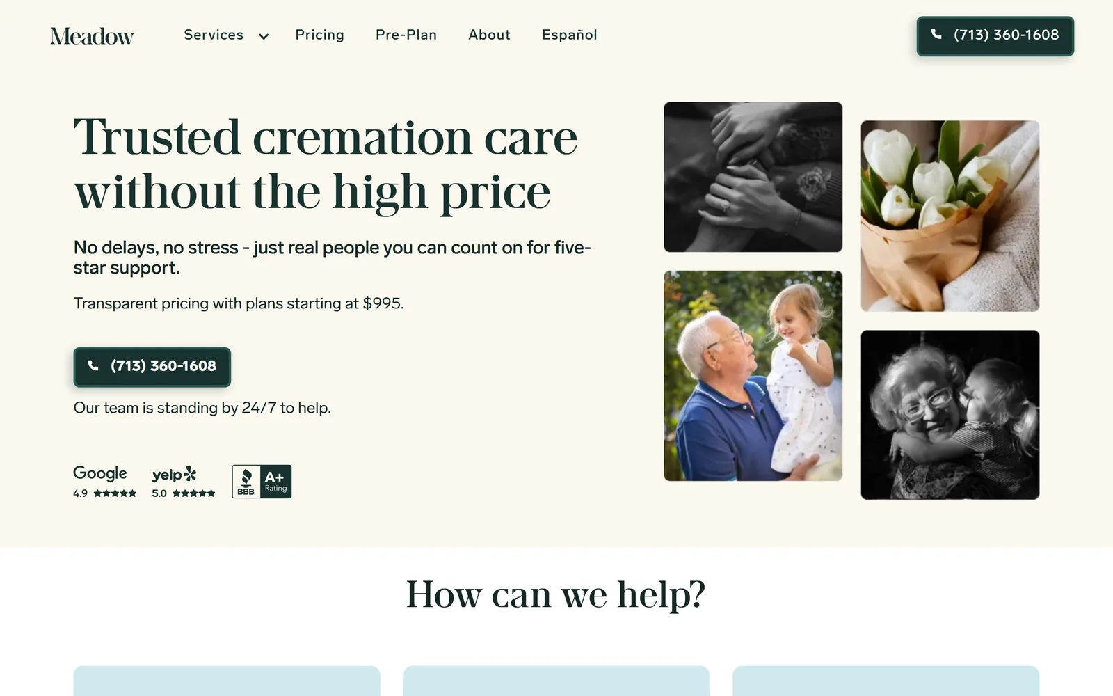
Left column of dark green type and a phone button, right column a four-photo mosaic mixing black and white with colour.
Type
Old-style serif, 64px
Body
Neutral grotesk, 16 to 18px
Build
1240px two-column, 2x2 photo mosaic, 8px radius
Made on
Webflow
Colour
#faf6ec #18322f #ffffff
Type. The headline is a high-contrast old-style serif at 64px with slightly open tracking at 0.022em, set in two lines and running wide across the column. Everything else is a neutral grotesk at 16 to 18px with mildly tight spacing at -0.009em, sentence case, no uppercase anywhere except the BBB badge. The logo repeats the serif at small size so the brand voice is one face.
Colour. A cream field around #faf6ec with every piece of text in one dark forest green, #18322f, including the button fill. The photo mosaic supplies the only other colour: two images converted to black and white, two left warm. Review badges add Google and Yelp colour at small size. One ink, one ground, and the pictures do the rest.
Layout. Two columns inside roughly a 1240px container, text left at about 52 percent and the mosaic right, four images in a staggered 2x2 with uneven heights and 8px radius. The phone button is 8px radius too, dark green, with the number as the label. Social proof sits at the bottom of the text column, directly under the fold line, so the first screen ends on evidence.
The ask. The ask is the phone number, printed twice, once in the header and once as the hero button, with Our team is standing by 24/7 to help as the reassurance line. A price, plans starting at $995, is stated before any click is requested. Nav items for Pricing and Pre-Plan carry the rest. No form, no chat.
Putting the price and the review scores on the first screen answers the two questions that otherwise cause a bounce.
04
better-place.com
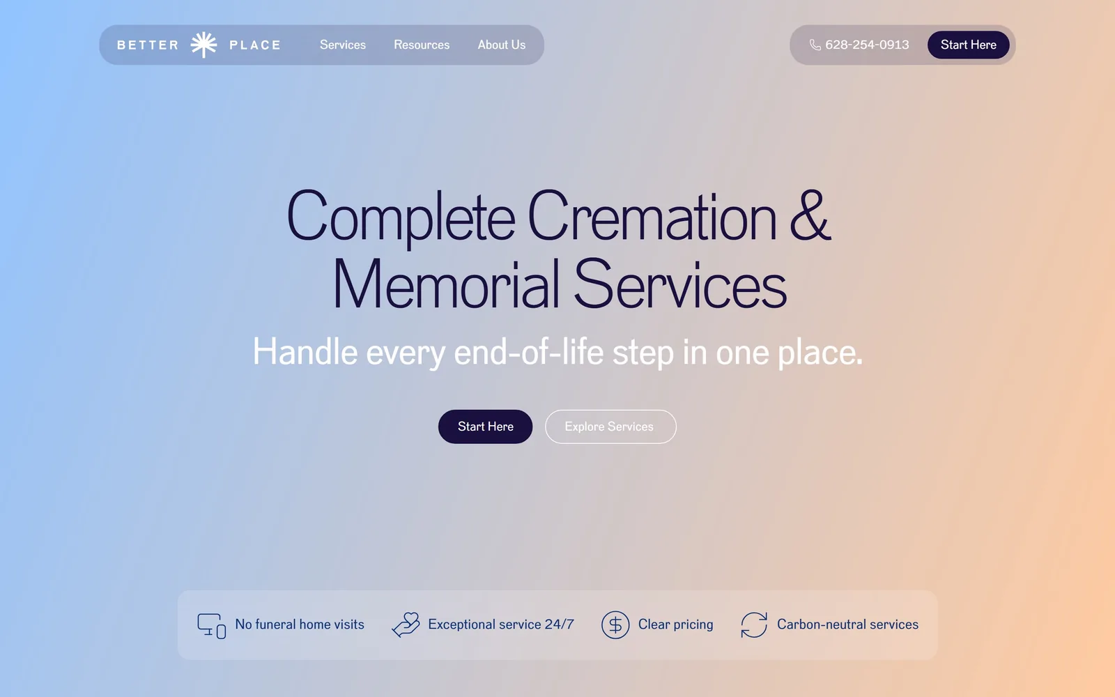
A blue to peach gradient fills the screen behind thin navy type, two pill buttons, and a glass strip of four benefits.
Type
Light grotesk, 88px
Body
Same grotesk, 16px
Build
1000px centred, floating pill nav, 24px radius
Made on
WordPress
Colour
#9cbcf0 #f0c49c #1a1040
Type. The hero is a light grotesk at 88px with tracking pulled in hard at -0.05em, so the two lines lock into a block despite the thin strokes. The subhead drops to the same face at 48px in white, and nav and body sit at 16px with neutral spacing. One typeface across the whole screen, carried by weight and size rather than contrast.
Colour. The background is a single diagonal gradient from a soft cornflower blue to a warm apricot, with no photograph at all. Text is #1a1040, a near-black violet that stays legible over both ends of the gradient. The primary button fills with that same violet. Nav and the benefit strip are frosted translucent panels, so the gradient shows through and nothing introduces a fourth colour.
Layout. Everything is centred in roughly a 1000px measure on a full-viewport gradient. The nav floats as a rounded pill rather than a bar, with a second pill at the right holding the phone number and Start Here. Buttons are 24px radius; the benefit strip at the bottom is a wide 24px panel holding four icon and label pairs. Below the fold there is nothing but gradient, which is the one weak spot.
The ask. Start Here appears twice, header and hero, with Explore Services as the outlined alternative beside it. The phone number sits in the header pill. The four-item strip, No funeral home visits, Exceptional service 24/7, Clear pricing, Carbon-neutral services, handles objections without stealing a click.
A gradient and one well-tracked typeface can carry a hero with no photography, which removes the stock-image problem entirely.
05
recompose.life
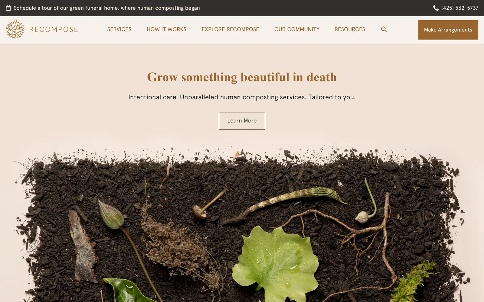
A wide overhead photograph of dark soil, leaves and roots sits under a short bronze serif headline and an outlined button.
Type. The headline is a bold old-style serif at 38px in bronze, deliberately small for a hero and centred. Subcopy runs in the same serif family at 25px, while nav and utility text switch to a neutral sans at 17 to 20px in uppercase. Keeping the headline at 38px rather than 80 lets the photograph be the loud element.
Colour. The page sits on #eee6de, a warm clay tint, with bronze #99662f for the headline, the Make Arrangements button and the logo mark. The top utility bar is near-black. The soil photograph brings deep browns and two greens, which is where the whole palette comes from. It reads as one material rather than a brand colour chosen in isolation.
Layout. Centred column about 900px wide on a 1440 frame, with the photograph running the full width below and bleeding off the bottom edge. The header is a solid band with a bronze CTA block at the far right, square cornered. The hero button is a 1px outlined rectangle with no fill and no radius, which matches the restraint of the rest.
The ask. Make Arrangements sits in the header as the only filled button. The hero offers a single Learn More, which is a soft ask for a service most visitors have never heard of. A tour booking line and the phone number run across the utility bar above. Three asks total, deliberately ordered from soft to committed.
When the product needs explaining, a small headline and a Learn More beat a hard conversion ask on the first screen.
06
laurelhillphl.com
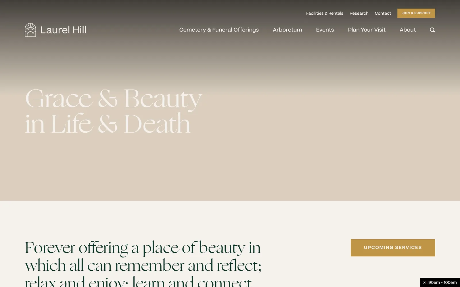
Grace & Beauty in Life & Death set in a huge pale display serif over a charcoal to sand vertical gradient.
Type
High-contrast display serif, 80px
Body
Geometric sans, 16px
Build
1180px container, two-tier nav, square corners
Made on
WordPress
Colour
#3a3630 #d7cab8 #c19546
Type. The hero is a high-contrast display serif at 80px, the kind with hairline joins and a flared ampersand, set in two left-aligned lines with no extra tracking. Body copy underneath is a neutral geometric sans at 16px in a deep green. Section headings return to the display serif at 48px, so the page alternates two voices cleanly rather than blending them.
Colour. The hero gradient runs from a near-black #3a3630 at the top to a warm sand around #d7cab8, with the headline in #f5f1ec so it fades toward the bottom of its own lines. Below the fold the ground becomes #f5f1ec and body type is a dark green #0e3529. The accent is an antique gold #c19546, used on the Join & Support button and the square Upcoming Services block, nowhere else.
Layout. Left-aligned hero inside roughly a 1180px container, with a two-tier nav: utility links and the gold CTA on the top row, primary nav below. Section blocks are square, no radius anywhere. The second band pairs a large serif statement at left with a gold CTA block floated right. One flaw: a developer breakpoint badge reading xl: 90em - 100em is still visible in the bottom right corner.
The ask. The gold Join & Support button sits top right and is about membership, not funerals. Upcoming Services is the second ask and points at the service calendar families actually search for. The funeral and cremation routes live in the nav under Cemetery & Funeral Offerings rather than in the hero, which is a choice that suits a cemetery, arboretum and funeral home sharing one site.
A display serif at 80px with a gradient behind it gives an old institution presence without a single period photograph.
07
thenaturalfuneral.com
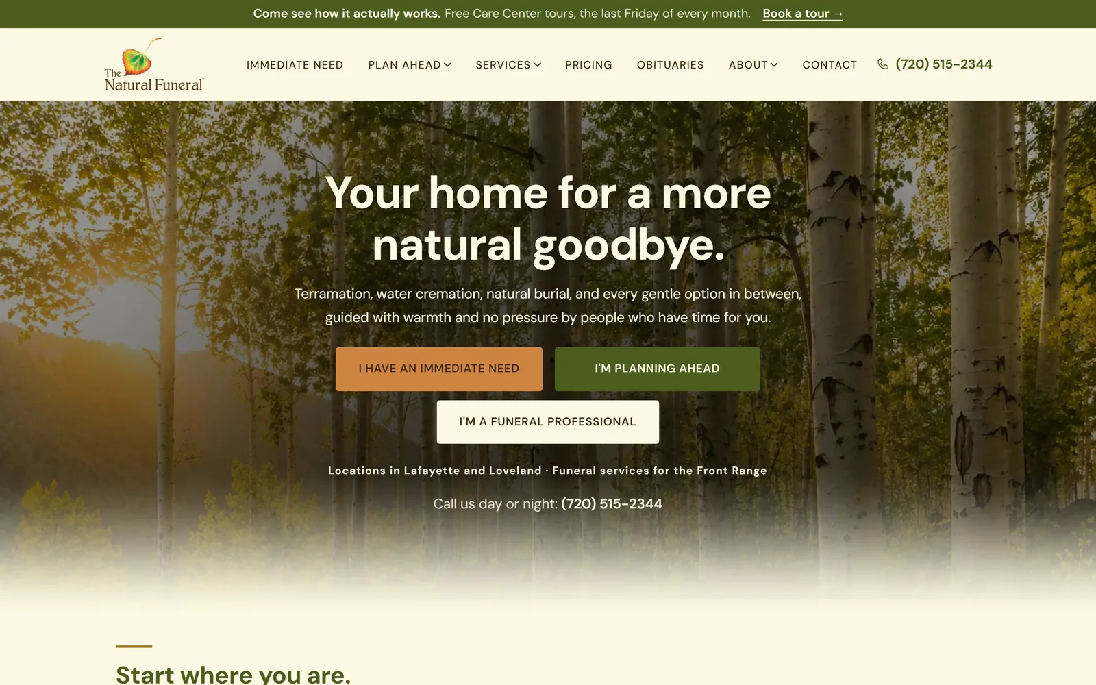
Aspen trunks fill the hero behind a cream headline and three stacked buttons that sort visitors by situation.
Type
Geometric sans bold, 59px
Body
Same sans, 18px
Build
900px centred, three-button split, square corners
Made on
Custom build
Colour
#fff9e3 #4b5d1f #cd853f
Type. The headline is a geometric sans at 59px, 700 weight, tracking tightened to -0.02em and set in two centred lines. Subcopy drops to 18px of the same family at regular weight. The nav and all three button labels are uppercase at 14 to 16px with 0.08em tracking, which is the only formal note on an otherwise plain-spoken page. One family doing everything, which keeps a busy hero calm.
Colour. Cream #fff9e3 runs through the header band, the headline and the third button, tying the interface to the sunlit aspens behind it. The two coloured buttons are an olive #4b5d1f and a terracotta #cd853f, roughly equal in area, which is how the page signals that neither route is the default. The photo is warm enough that the cream never reads as grey.
Layout. Full-bleed photograph with everything centred in about a 900px measure. Buttons are square cornered and sit in a 2-up row with a third centred beneath, a shape that mirrors the three audiences rather than a tidy grid. The photograph fades to cream at the bottom instead of a hard edge, so the next section starts without a seam. An announcement bar sits above the nav.
The ask. Three parallel asks, labelled I HAVE AN IMMEDIATE NEED, I'M PLANNING AHEAD and I'M A FUNERAL PROFESSIONAL, each a different colour weight. Under them, locations and Call us day or night with the number spelled out. The announcement bar adds a fourth, Book a tour. Busy, but each ask belongs to a different person, so they do not compete.
Sorting visitors by situation in the hero, with equal visual weight on each route, beats one generic Contact Us.
08
clearviewcremation.com
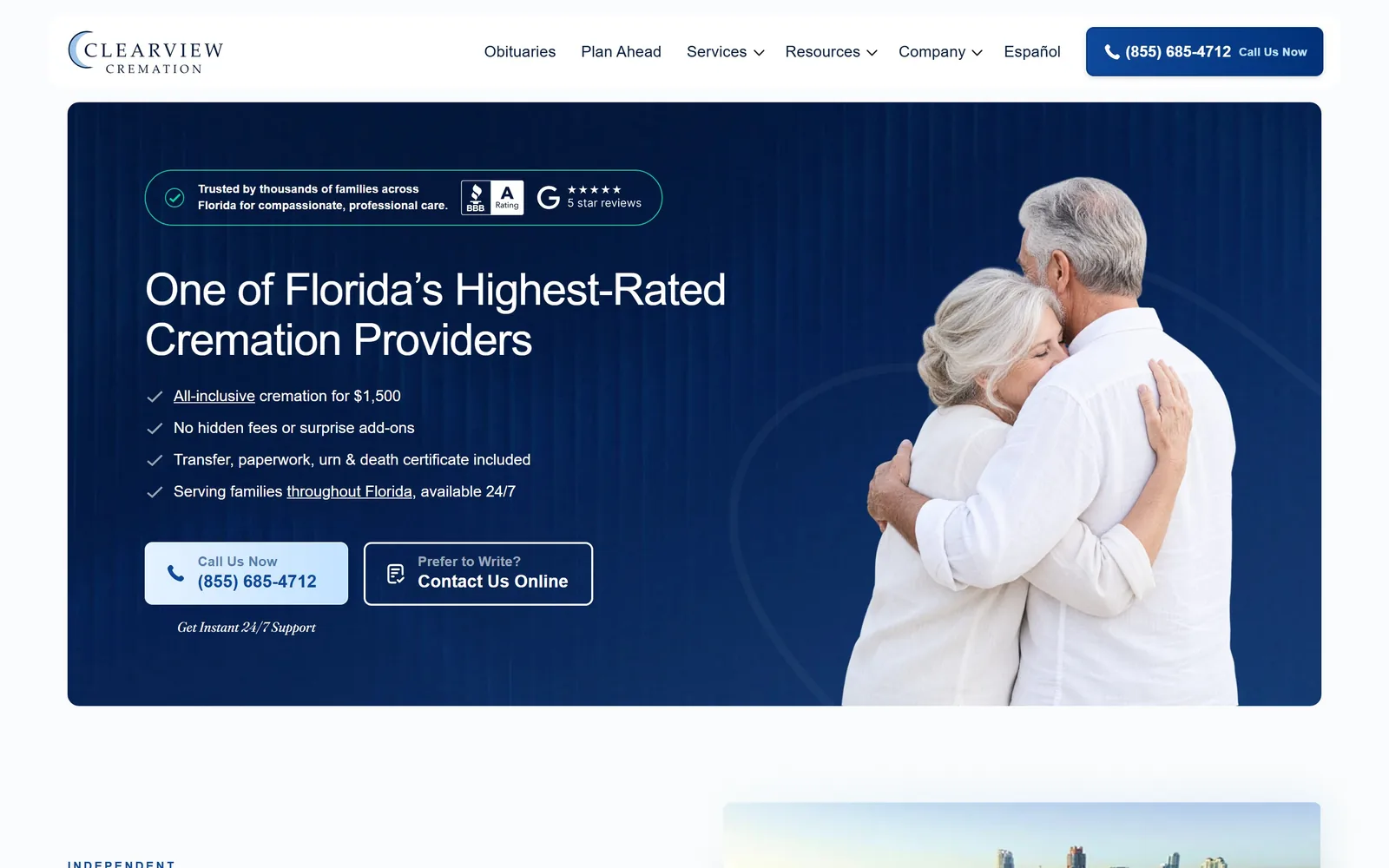
A rounded navy panel holds the headline, four ticked promises and two buttons, with a photographed couple cut into the right edge.
Type
Neo-grotesk, 46px
Body
Neo-grotesk, 16px
Build
1740px rounded panel, 45/55 split, 36px radius
Made on
Webflow
Colour
#f9fbfc #0b2a63 #dbe9fb
Type. The headline is a neo-grotesk at 46px with tracking at -0.02em, white on navy, set in two lines. The four proof lines sit at 16px in the same family with the key phrases underlined rather than bolded, which is unusual and works. One line under the buttons, Get Instant 24/7 Support, switches to an italic serif, the single decorative moment and arguably one too many.
Colour. The page ground is a very light blue-white #f9fbfc, and the hero is a deep navy panel with a subtle vertical texture, close to #0b2a63 with #003177 as the brand blue. The call button is pale blue #dbe9fb with navy text, so the brightest element is the phone number. A thin mint outline rings the trust badge at the top. Navy and one light blue, strictly held.
Layout. A rounded navy panel about 1740px wide inset from the page edges with roughly 36px radius, text in the left 45 percent and the photograph bleeding off the right edge. The header is a white floating bar with its own radius. Spacing inside the panel is generous, about 80px of padding, and the fold ends just below the panel so a second section peeks through.
The ask. The phone number appears three times above the fold: header button, hero button, and in the microcopy. Contact Us Online is the outlined secondary. BBB A rating and a five-star Google badge sit at the top of the panel before any copy. The all-inclusive $1,500 price is the first ticked line. This is a page built to generate calls and it does not pretend otherwise.
Stating the single price as the first bullet under the headline removes the biggest reason people keep shopping.
09
hollywoodforever.com
The screen splits into a blue-toned cemetery photo and an orange-toned sunset, each listing three destinations in thin caps.
Type
Thin geometric sans caps, 71px
Body
Humanist sans, 17px
Build
50/50 full-viewport split, translucent footer band
Made on
WordPress
Colour
#6f94b4 #d4702a #c9a227
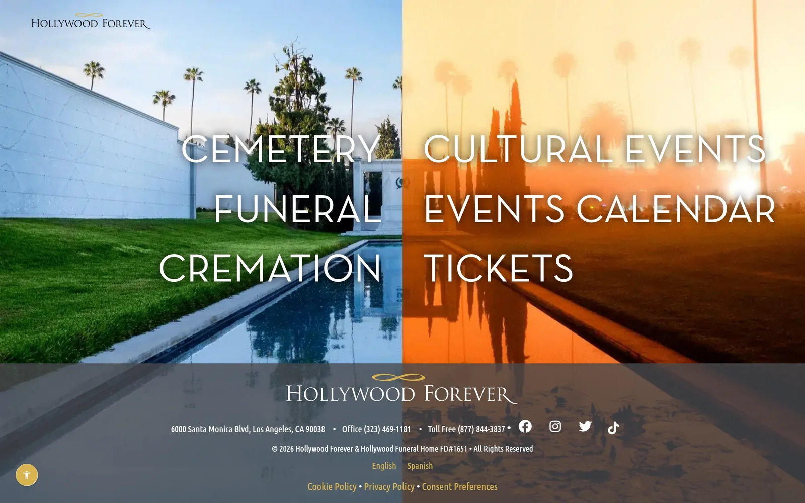
Type. All the menu type is a thin geometric sans at about 71px, uppercase, no tracking adjustment, white, stacked in three lines per side. The logo and the footer wordmark use a spaced classical serif with a gold infinity mark. Two faces only, with the sans doing every bit of navigation and the serif reserved for the name.
Colour. The same photograph is colour graded two ways: a cool daylight blue on the left for Cemetery, Funeral, Cremation, and a hot orange sunset on the right for Cultural Events, Events Calendar, Tickets. That split is the entire palette decision and it carries the business model, a working cemetery that also sells concert tickets. Gold #c9a227 on the logo and footer links is the only applied colour.
Layout. A true two-pane split at 50/50 across the full 1440 viewport, with each pane's labels centred in its own half and vertically centred as a group. The footer is a translucent grey band across the bottom holding the address, two phone numbers and language links. There is no scroll content above this: the whole page is a door.
The ask. Six links and no buttons. The ask is a choice between two moods, and the entry word ENTER sits in the markup behind it. Phone numbers are in the footer band, not the hero. For a business whose two audiences have nothing in common, splitting the screen rather than writing one compromised headline is the right trade.
When one business serves two unrelated audiences, a split-screen door beats a headline that tries to address both.
10
januarymemorials.com
A gouache illustration of guests raising glasses sits under a centred grotesk headline and two pill buttons.
Type
Neo-grotesk, 48px
Body
Neo-grotesk, 20px
Build
900px centred column, 999px pill buttons
Made on
Webflow
Colour
#faf6f1 #2d2d2d #3f5d4a
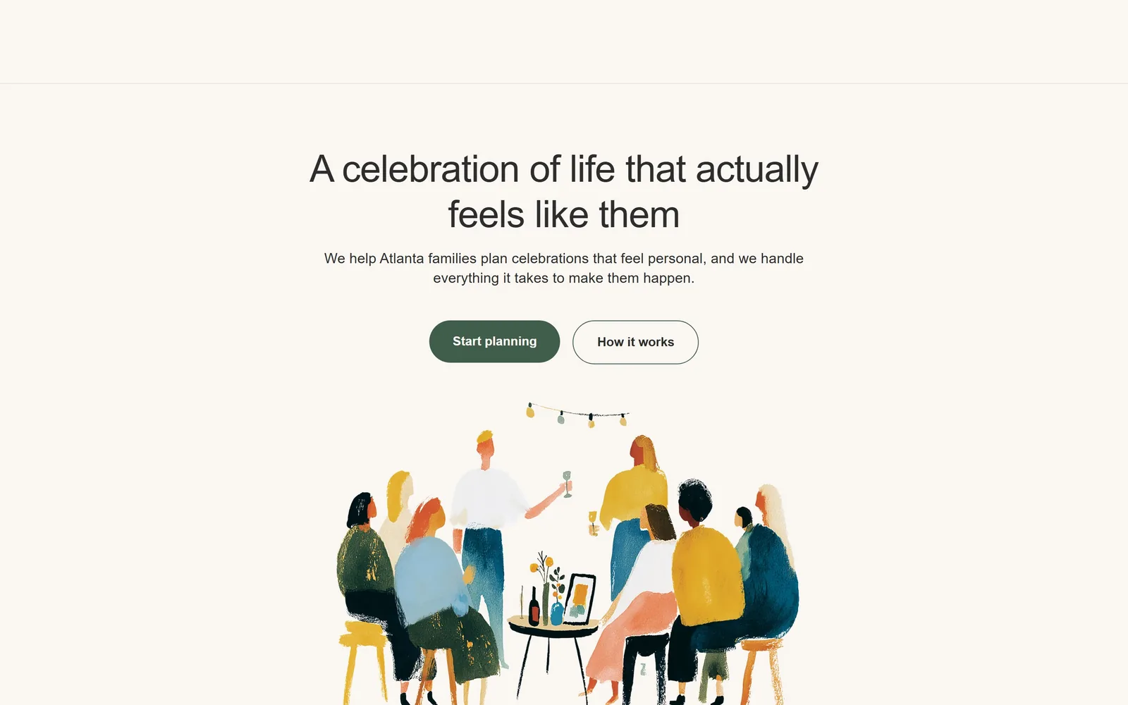
Type. The headline is a neo-grotesk at 48px with tracking at -0.015em, two centred lines, in a soft black #2d2d2d rather than true black. Subcopy runs at 20px in the same family at a comfortable 68-character measure. There is no serif anywhere, no uppercase, no italic. The restraint is the point: the illustration is the personality and the type stays quiet.
Colour. The ground is #faf6f1, a pale warm neutral. The primary button is a deep forest #3f5d4a, the secondary is an outlined pill in the same green. The illustration adds mustard, teal, coral and navy in flat gouache washes, which is where all the energy comes from. Without it the palette would be two greens and a neutral.
Layout. Centred single column about 900px wide, with a thin empty header band above a 1px rule, which is a visible gap since the logo does not render there. Buttons are fully rounded at 999px radius and sit side by side at centre. The illustration is centred below, roughly 800px wide, with plenty of air around it rather than cropped to full bleed.
The ask. Start planning is the filled button, How it works the outlined one, and nothing else asks for anything above the fold. No phone number, no chat, no badges. For a celebration-of-life planner rather than an at-need funeral home, the softer ask fits: nobody is calling this business at 3am.
Commissioned illustration lets a text-light hero feel specific where a stock photograph would make it generic.
11
altogetherfuneral.com
A blurred sunset gradient behind a slab-serif headline, with three white cards overlapping the fold line.
Type
Slab-ish serif, 40px
Body
Humanist sans, 18px
Build
1800px three-card grid, 32px gutters, 24px radius
Made on
Framer
Colour
#e8a08d #1f313a #177881
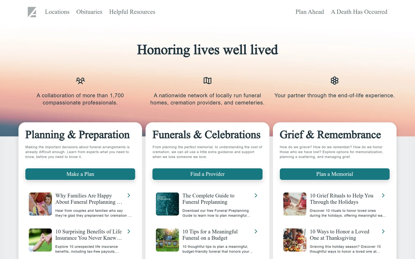
Type. The headline is a sturdy slab-ish serif at 40px in a dark slate, with the three card headings set in the same face at 32px. Body copy switches to a humanist sans at 18px with tracking opened to 0.04em, which keeps small grey text readable over a busy background. The pairing is conventional and done correctly rather than inventively.
Colour. The hero is a photographic gradient, slate blue at the top through salmon to pink, which is a risky choice that just about holds because the type sits in the lightest band. Text is #1f313a. The accent is a teal #177881 on all three card buttons, about the only saturated colour on the screen. Cards are plain white on a light grey #eef0f1 section below.
Layout. Three equal cards inside roughly a 1800px container with about 32px gutters, pushed up so their tops overlap the gradient and their bodies sit on the grey band. Card radius is 24px with a soft shadow. Nav is split left and right across a transparent bar. Each card runs heading, paragraph, button, then two linked articles with 48px thumbnails.
The ask. Three parallel buttons, Make a Plan, Find a Provider and Plan a Memorial, one per card, plus A Death Has Occurred in the top right of the nav. The six article links under the buttons compete directly with them for attention, which is the cost of putting content and conversion in the same card.
Overlapping the first content cards onto the hero pulls the second screen's worth of choices above the fold.
12
orderofthegooddeath.com
A blackletter and serif headline sits inside a thin arch outline on textured paper, under a black nav and an orange bar.
Type
Mixed blackletter and transitional serif, 50px
Body
Grotesk, 20px
Build
1240px centred column, arch motif, square corners
Made on
WordPress
Colour
#fffcf1 #1c1c17 #e8542a
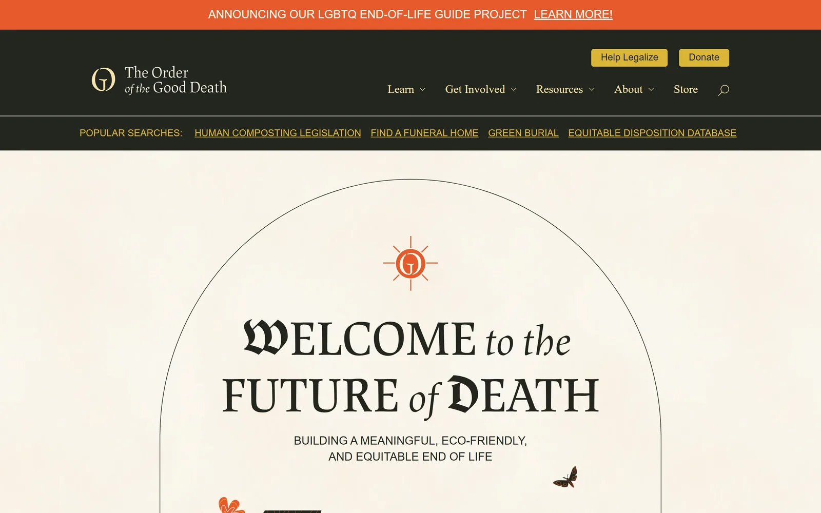
Type. The headline mixes three styles in one line: a blackletter W and D, small caps in a sharp transitional serif at 50px, and a cursive italic for to the and of. Tracking is opened to 0.05em so the caps breathe. Navigation and the strapline switch to a plain grotesk at 20px, uppercase for the strapline. It should be a mess and it is not, because only the two connecting words are italic.
Colour. The ground is a pale paper tint around #fffcf1 with a visible grain, and all type is a near-black #1c1c17. The announcement bar is a hot orange #e8542a, repeated in the sun mark and a small flower at the bottom edge. The nav bar is near-black with a mustard #dab636 on the two header buttons. Four colours, each with one job, and none of them the soft greens the category defaults to.
Layout. A single centred column about 1240px wide, with a 1px arch drawn behind the headline that acts as a frame rather than a container. The nav is a solid black band with a second row underneath holding four popular search links in mustard. Nothing is rounded. Illustrated moths and flowers are scattered at the edges at small scale, breaking the symmetry without crowding it.
The ask. Two header buttons, Help Legalize and Donate, both mustard, both about the cause rather than a service. The announcement bar carries a third ask. The row of popular searches, including Find a Funeral Home and Green Burial, does the real routing work and is more useful than most funeral home navigation. No phone number, no form.
A row of popular searches under the nav routes visitors faster than a dropdown menu ever does.
How these were chosen
Twelve sites here: eleven funeral homes, cremation providers, green burial operators and cemeteries running their own mortuary, plus one death-care nonprofit included for the quality of its typography. The thing that separates the good ones from the rest is not photography or colour, it is the first button: the strongest pages name the visitor's situation rather than an action, with A death has occurred, I have an immediate need, or a two-answer question standing in for a contact form. Pricing shows up above the fold on half of them, usually as a single number. Anyone briefing funeral home website design should notice how little the best examples rely on soft-focus stock imagery, and how much work one typeface at the right size is doing. Several were built on Webflow by small teams, which puts the standard within reach of an independent firm.
Finding funeral home sites that someone had actually designed took far longer than it should have. 26 candidates made the shortlist. 12 made the page.
Each one was opened and looked at properly: what the type is doing, where the colour gets spent, how the page is built, how it asks for the job. Nothing is here because it ranks. Nothing is here because an agency filed it under portfolio. Several well known names were left out for the plain reason that their site came out of the same template as everyone else's, and a few sites worth including did not survive a second look.
Where a site is only competent, it says so. The order is the order worth your time, best first.
Reviewed and selected by Larry W. Matthews for Websitely.