What 14 Venues Put First in Wedding Venue Website Design
Fourteen US barns, estates and halls. What separates good wedding venue website design is how fast you reach a date, a number and a plan.
Shown
14 sites
Reviewed
30 candidates
Chosen on
The work, not the ranking
Updated
15 October 2026
01
barnva.com
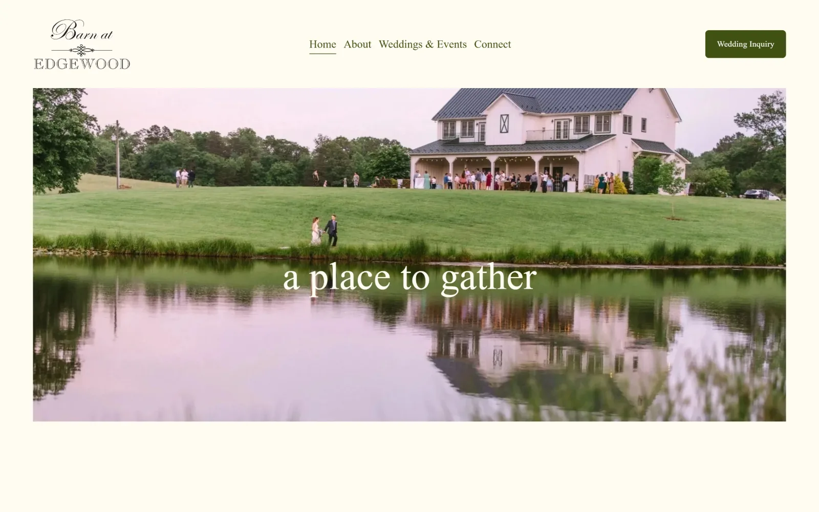
A pond reflects a white barn on a green rise, guests gathered on its porch, with the words a place to gather in white serif over the water.
Type
Pinyon Script 68px
Body
adobe-garamond-pro 19px / 1.80
Build
Inset hero photo, 1440px field, 155px padding
Made on
Squarespace
Colour
#fefbf2 #405012 #ffffff
Type. Pinyon Script at 68px sets the three words over the pond, a formal copperplate script rather than the usual wedding calligraphy default. Navigation and button both run adobe-garamond-pro, nav at 19px with a 1.80 line height and the button at 14px with 0.020em tracking. Two serifs, one ornamental and one workhorse, and no sans anywhere on the page.
Colour. The value #fefbf2 is the entire ground, measured at 285.6 percent coverage, with #405012 as the only other value at 1.3 percent. That olive carries the nav, the button fill and 41 characters of ink, while the hero line is set in the background cream itself. Every other hue arrives through the photograph: the grass, the pond, the pale sky.
Layout. The photograph is inset rather than full bleed, with a cream margin on three sides, so the header sits above it on flat colour instead of over it. Container is the full 1440px with 155px section padding and the document runs 5808px. Button radius is 6px, the only softened corner on the page. Four nav items sit centred, logo left, button right.
The ask. One ask, Wedding Inquiry, in an olive pill at top right, and it is the only button above the fold. No phone number, no pricing, no form embedded on the homepage. Four nav items and nothing competing for the click. For a venue booking roughly one event a weekend, a single enquiry route is the right amount of pressure.
Setting hero type in the page's background cream rather than white ties the overlay to the frame around the photograph.
02
thebarnatblackwalnutfarm.com
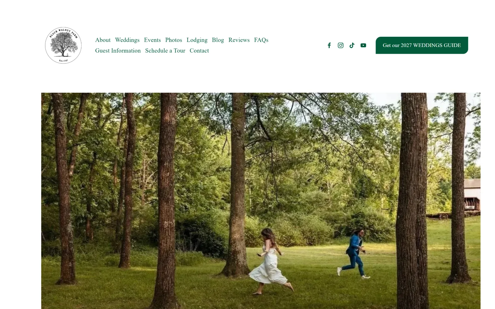
Two figures run across mown grass between tall pine trunks, one in a white dress and one in a blue suit, under a white header and a green pill button.
Type
Ovo, headline below the fold
Body
Archivo 18px / 300
Build
230px white header, contained photo, 16px button radius
Made on
Squarespace
Colour
#ffffff #035b3a
Type. Only two sizes were recorded, which is unusual: Archivo at 18px weight 300 with 0.010em tracking does all eleven nav items, and Almarai at 16px sets the button. The named display face is Ovo and the line it carries, about history meeting disco, sits below the captured frame. A light 300 weight at 18px across eleven links keeps a crowded menu from shouting.
Colour. Two values, #ffffff at 310.1 percent coverage and #035b3a at 0.5 percent. That forest green is the nav ink, the button fill and the whole brand, all 86 characters of it. Saturation comes from the photograph, which is almost entirely green itself, so accent and image sit in the same range rather than fighting each other.
Layout. A white band roughly 230px deep holds the mark at left, two rows of nav in the middle and the button at right, above a contained photograph with white margins. Container is 1440px with 223px section padding and the document runs 18108px, the deepest here. Button radius is 16px, a soft pill against otherwise square geometry.
The ask. Eleven nav items, which is a lot, and one button: Get our 2027 WEDDINGS GUIDE. Naming a year makes the ask concrete and dates the page honestly. No phone, no price, no enquiry form above the fold. Four social glyphs sit between the menu and the button, closer to the ask than to the logo.
Pulling your single accent colour out of the hero photograph means the brand green and the image green reinforce each other instead of clashing.
03
thewildwoodbarn.com
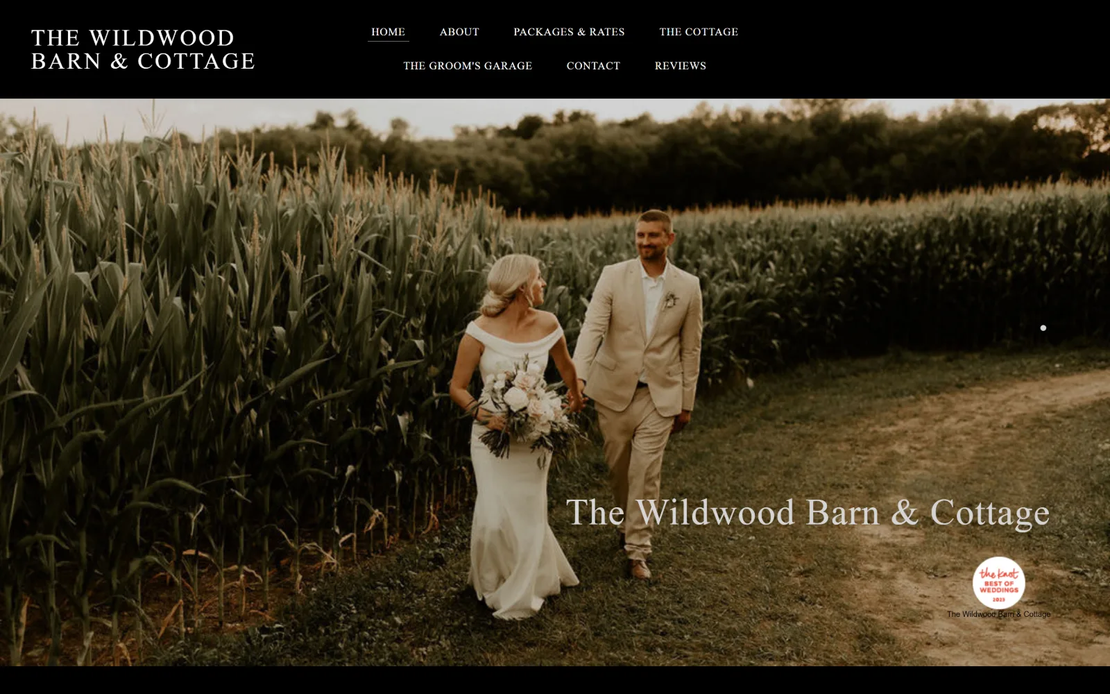
A couple walks a dirt track beside a tall corn field at dusk, the venue name in grey serif at lower right, under a solid black header bar.
Type
Alegreya SC 68px / 100
Body
Alegreya SC 34px / 300
Build
Black header, full-bleed photo, 1370px container
Made on
Not detected
Colour
#000000 #ffffff #767676
Type. Alegreya SC, a small-caps serif, runs the page in four weights: 68px at weight 100 for a two-character mark, 34px weight 300 across 514 characters of body, 30px uppercase at 0.080em and 14px at 0.050em for the seven nav items. Three more faces appear at 11px, Helvetica Neue, Cabin and Inconsolata, which is where the builder shows through.
Colour. Black at #000000 covers 109.1 percent, white 48 percent, and #767676 appears at 0.4 percent. White ink carries 621 characters against the dark ground. There is no accent value at all, so the warm straw and olive of the corn field is the only colour offered, and the black bar crops it hard at the top.
Layout. A black bar roughly 140px deep holds the stacked two-line wordmark at left and seven nav items wrapping over two rows in the middle, then the photograph runs full bleed below it. Content elsewhere sits in a 1370px container at 95 percent of viewport. Document height is 13609px, radius is 0 throughout and no button component exists.
The ask. The venue name sits over the image as a caption rather than a headline, with a Knot award badge beneath it and a slider dot at the right edge. No button, no phone, no form. Contact and Reviews are two of seven nav words at the same 14px as everything else, so nothing is prioritised.
A black header bar lets a dark, warm photograph start at full strength instead of fading into a white page above it.
04
renbackbarn.com
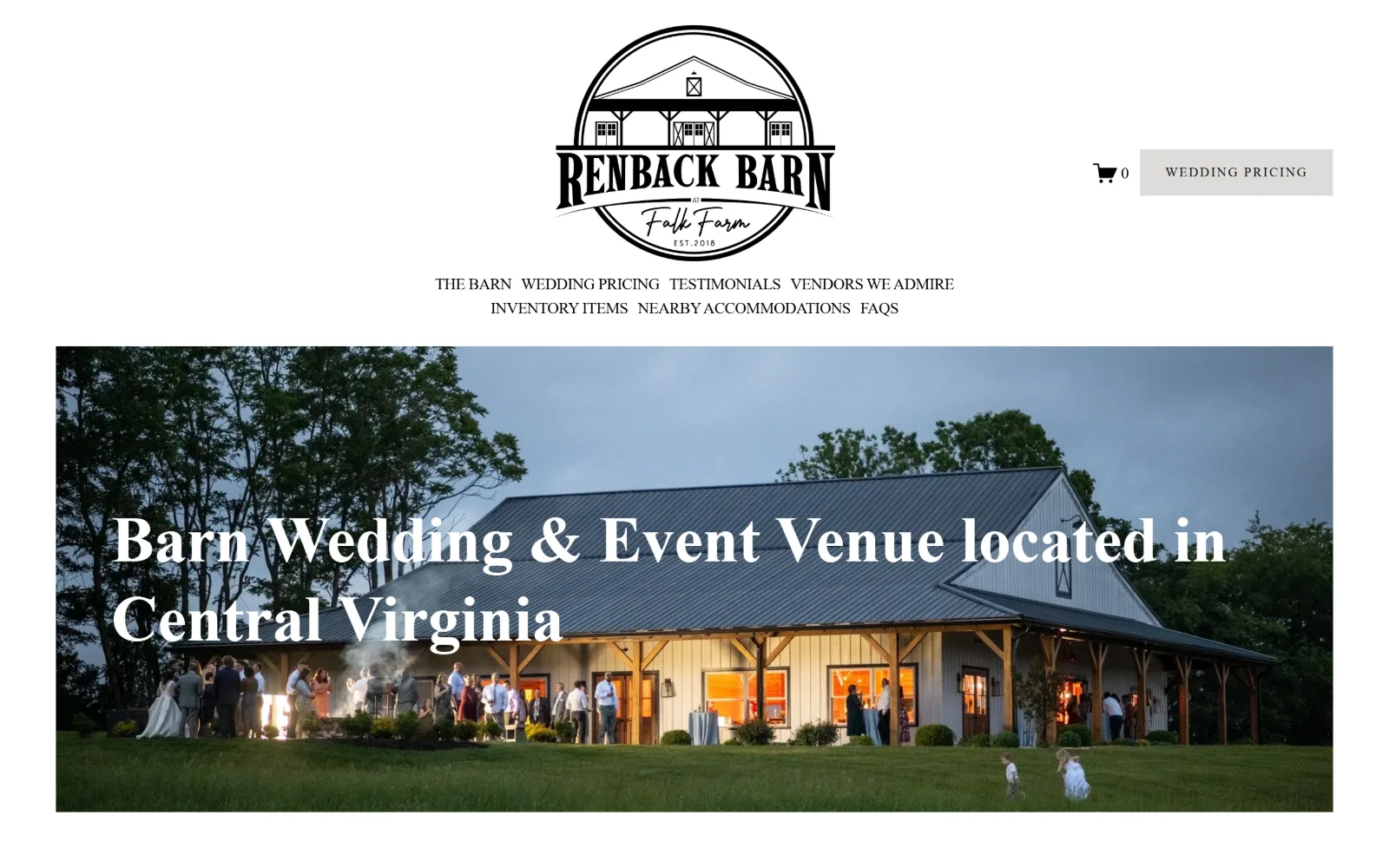
A lit timber barn at blue hour with guests on the lawn, the words Barn Wedding and Event Venue in white serif across the middle of the picture.
Type
operetta-12 67px
Body
farm-new 17px uppercase
Build
Centred logo, two-row nav, 359px padding
Made on
Squarespace
Colour
#ffffff #dddcda #000000
Type. Everything measured is farm-new, a soft serif, at two sizes only: 17px uppercase with -0.030em tracking across seven nav items, and 13px at a wide 0.140em for the button. Negative tracking on uppercase at 17px is an odd call, since caps usually need letting out, and it makes the two-row menu read tighter than it should. The hero line is operetta-12 at roughly 67px.
Colour. White at 294.6 percent coverage and #dddcda at 0.4 percent, a pale warm grey used only as the button fill. Ink is #000000 on 92 characters and #0d0d0d on 30. There is no colour in the interface at all, so the orange window light and the blue dusk sky in the photograph do every bit of the chromatic work.
Layout. The circular logo is centred at the top with the menu wrapping onto two centred rows beneath it, which pushes the photograph down by roughly 390px. Section padding is 359px, the largest here, and the document runs 6364px. The image is inset with white margins at left and right rather than bleeding. Radius is 0.
The ask. Wedding Pricing is both the button and the second nav item, so the same ask appears twice within 300px. A cart glyph beside it shows zero. Publishing price before enquiry inverts the usual venue pattern and filters hard, which for a barn booking a limited number of Saturdays is a reasonable trade.
Leading with pricing instead of an enquiry form filters out budget mismatches before anyone sends a message you have to answer.
05
thekingriverranch.com
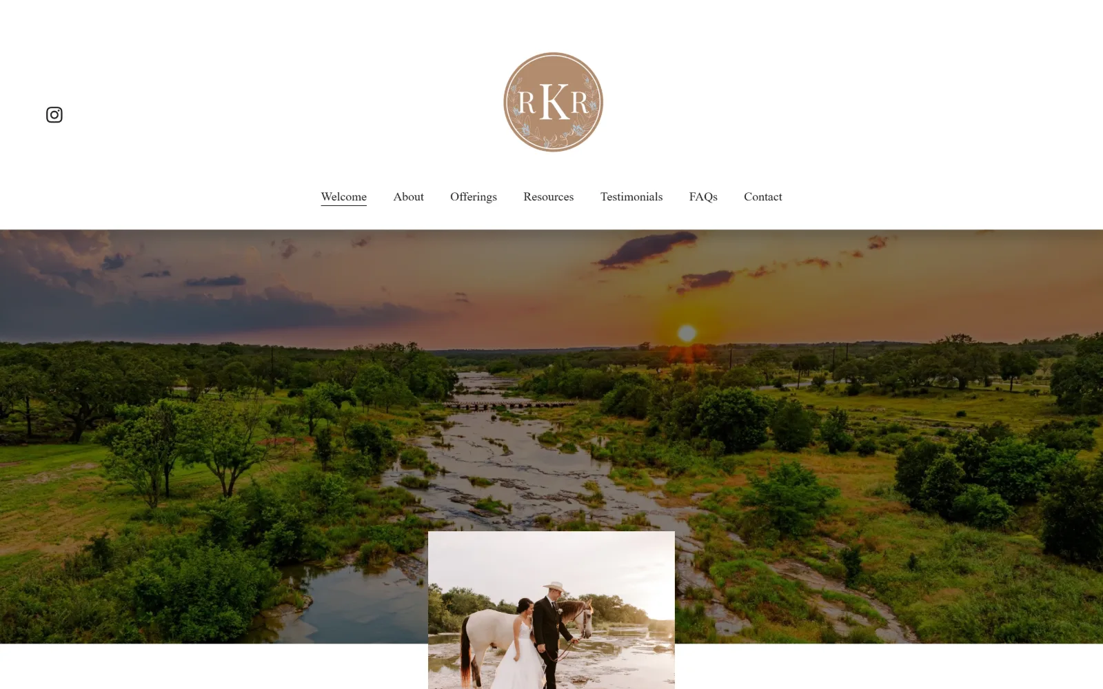
An aerial of a shallow river winding through hill country at sunset, with a small inset photo of a couple leading a horse laid over the lower edge.
Type. PT Serif at 23px with 1.50 line height carries 282 characters of body, and the same family drops to 16px for the seven nav items. Crimson Text handles display at 37px with -0.020em tracking. Two serifs close enough in colour to read as one, which is why the 37 to 23 to 16 scale has to carry all the hierarchy by itself.
Colour. Four values and no hue: #ffffff at 169.9 percent, #f5f5f5 at 101.4 percent as the body ground, #d9d9d9 at 46.8 percent and #000000 at 30.1 percent, with 447 characters of black ink. The sunset in the aerial, all peach and gold, is the only saturated thing present, and a strictly neutral grey ramp is what allows that.
Layout. A tall white header carries the circular monogram centred above a seven-item menu, with an Instagram glyph pinned at far left. Below it the aerial runs full bleed and a second, smaller photograph is laid over its bottom edge, breaking the seam between hero and next section. Section padding is 300px, the document 4972px, radius 0.
The ask. No button and no phone in the header, but a price of $5,250 appears further down, which is rare in this category. Contact is last of seven nav items and the black square-cornered button component sits below the fold. Publishing a number instead of a form moves the qualifying step off the page entirely.
Overlapping a second photograph across the base of a full-bleed hero hides the section seam and pulls the eye down past the fold.
06
thebowerybarn.com
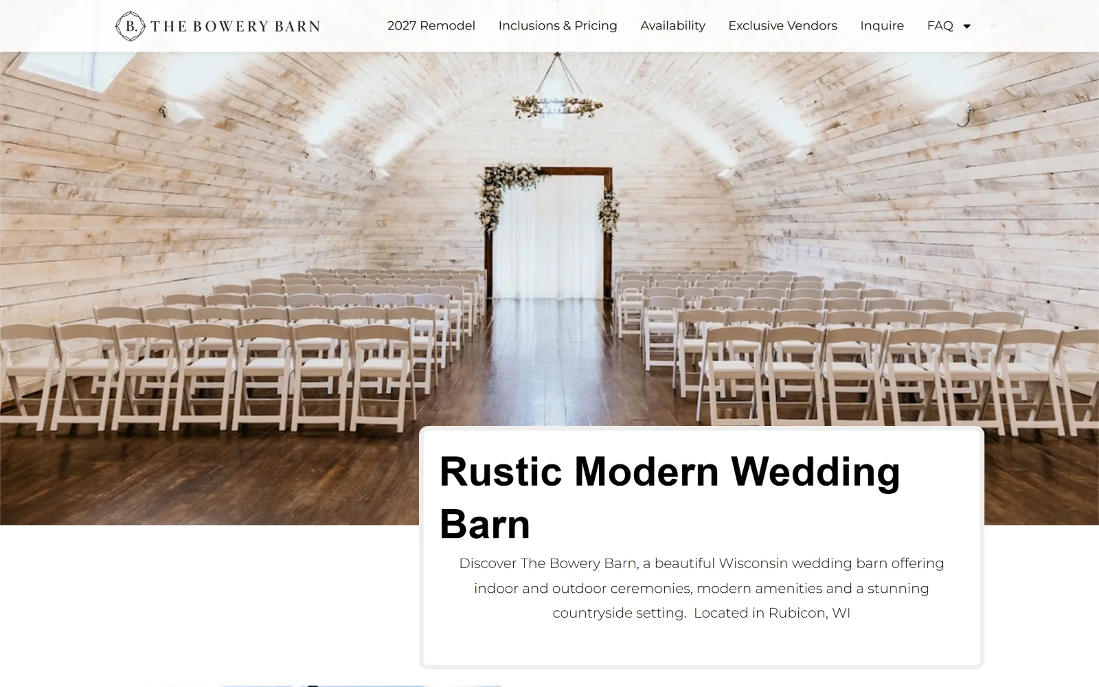
Rows of white folding chairs face a floral arch inside a pale arched barn, with a white card carrying the headline crossing the lower edge.
Type
Hoefler Titling 53px / 600
Body
Montserrat 18px / 300
Build
75px header, full-bleed interior, overlapping white card
Made on
WordPress
Colour
#ffffff #efeeec #000000
Type. Hoefler Titling at 53px weight 600 sets the headline in the card, stepping down through 36, 29 and 25px for the sections below, while Montserrat at 18px weight 300 carries 850 characters of body at a loose 1.80 line height. Pairing a high-contrast titling serif with a geometric sans at light weight is the one typographic decision here, and the leading is what makes it readable.
Colour. Two values only: #ffffff at 112.9 percent coverage and #efeeec at 0.4 percent. Every one of the 1087 characters of ink is #000000. No accent, no brand hue, no grey. The barn interior supplies the whole palette, pale bleached boards against a dark walnut floor, and the white card sitting on it reads as a hole cut in the photograph.
Layout. A white header about 75px deep runs the full 1440px above a full-bleed interior shot. The headline sits in a white card overlapping the bottom edge of that photograph, placed right of centre rather than in the middle, with its corners softened. Six nav items, no container narrowing, document height 8541px.
The ask. Inquire is one of six nav words and there is no button component anywhere on the page. Inclusions & Pricing and Availability rank ahead of it, and 2027 Remodel leads the menu, which tells a couple the building is changing before it tells them anything else. The page sells readiness rather than urgency.
A white card overlapping the base of a hero image gives headline copy a readable ground without dimming the photograph behind it.
07
wildwoodfamilyfarms.com
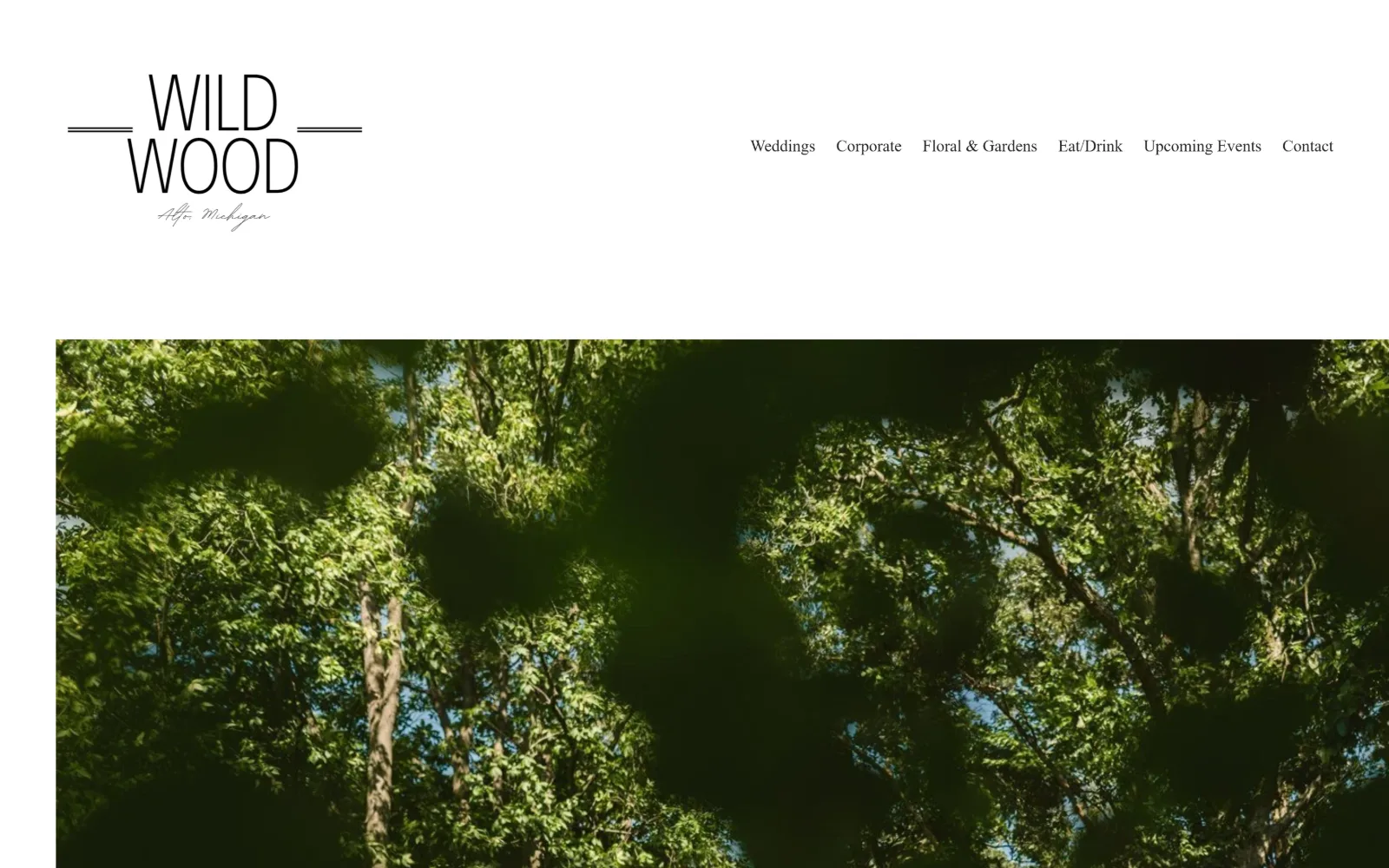
A thin wordmark with rules either side sits on white above a wide photograph looking up into sunlit tree canopy, six nav words at the right.
Type
Wordmark with flanking rules
Body
Poppins 17px / 300
Build
380px white header, inset photo, 304px padding
Made on
Squarespace
Colour
#ffffff #212121 #666666
Type. Poppins at 17px weight 300 does all six nav items and 15px weight 500 with 0.020em tracking does the button. That is the entire recorded system, two sizes of one geometric sans, with a script line under the wordmark reading Alto, Michigan. The light 300 weight at 17px is near the limit of legibility and it is what gives the header its thinness.
Colour. A single value: #ffffff at 300 percent coverage, with #212121 on 64 characters of nav ink and white on the 15 characters of button text. The button fill is #666666, a plain mid grey. No brand colour of any kind exists, so the greens of the canopy photograph are the only saturation, and they are very saturated indeed.
Layout. Roughly 380px of white sits above the photograph, more empty header than almost any venue here, with the stacked wordmark at far left and the menu pushed to the far right. The image is inset by about 60px on each side rather than bleeding. Container is 1440px with 304px section padding and the document runs 15955px.
The ask. No button above the fold, no phone, no price. Weddings leads a six-item menu that also carries Corporate, Floral & Gardens and Upcoming Events, so the venue names four businesses before it asks for anything. The grey button lives further down the page.
Leaving 380px of white above the hero makes a thin wordmark read as deliberate restraint rather than an undersized logo.
08
heritageweddingbarns.com
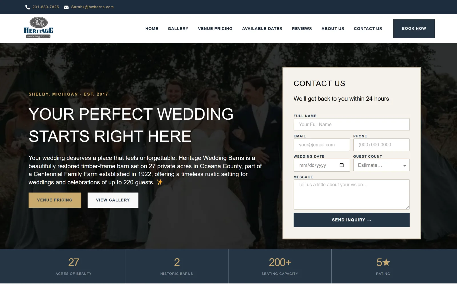
A darkened photo of a wedding party walking under trees sits behind a cream contact form panel at right, with four navy stat tiles below.
Type
Playfair Display 50px uppercase
Body
Cormorant Garamond 19px
Build
60/40 hero split, inline form, four-cell stat band
Made on
WordPress
Colour
#f8f8f8 #263545 #c9a96e
Type. Playfair Display at 50px uppercase sets the headline, Cormorant Garamond at 19px with -0.011em tracking runs 485 characters of body, and Plus Jakarta Sans at 13px weight 600 uppercase handles nav and the 12px button. Fraunces turns up at six further sizes from 62px down to 20px. That is four families, which is two more than the page needs.
Colour. Six measured values on a #f8f8f8 ground: white at 84.8 percent, #faf7f2 and #f5f2ec at around 9 percent each, black at 8.9 and #263545 at 8.1. The navy carries the stat band and the button, and #c9a96e, a muted gold, appears on 97 characters as the eyebrow and the pricing fill. Navy and gold is the oldest pairing in this category.
Layout. A utility bar carries phone and email above a white header with seven nav items and a navy Book Now. The hero splits roughly 60 to 40, photograph at left with the headline over it, cream enquiry panel at right. A four-cell stat band closes the fold. Container 1440px, radius 0 on every button, document 7516px.
The ask. Five asks compete above the fold: phone, email, Book Now, Venue Pricing and View Gallery, plus a six-field form with a Send Inquiry button. Price is published at $6,600 and $9,000. That is more pressure than anything else here, and the form sitting in the fold rather than on a contact page is why it holds together.
Putting the enquiry form in the hero rather than on a contact page removes a click, which matters when the competition is a menu item.
09
thebarnsofkanak.com
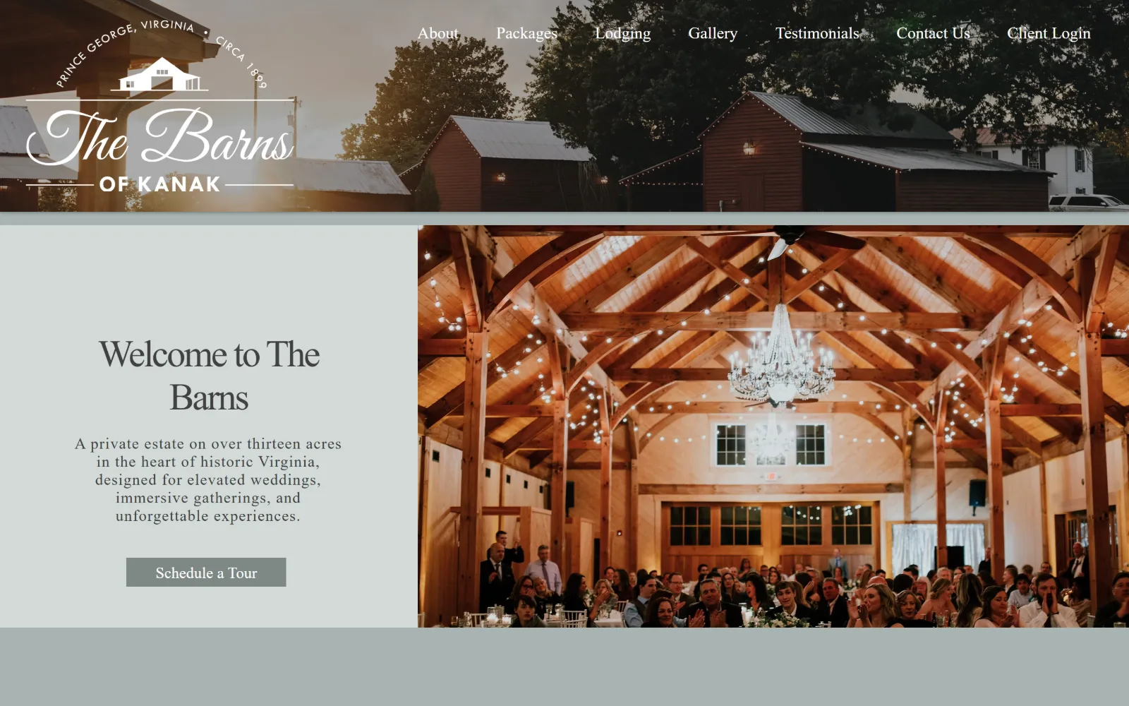
A sage panel carrying Welcome to The Barns and a tour button sits left of a photograph of a timber-framed hall with a chandelier and seated guests.
Type
Wix script, Great Vibes fallback, 48px
Body
brandon-grot-w01-light 20px
Build
310px photo header, two-thirds split, sage bands
Made on
Wix
Colour
#a8b4b2 #d2dad8 #7e8785
Type. The display face is a Wix-hosted script falling back to Great Vibes, set at 48px with -0.050em tracking, doing calligraphy duty on two words. Body is brandon-grot-w01-light at 20px, and a Tw Cen MT substitute runs nav at 21px and 274 characters of body at 0.050em. Obfuscated font names are the clearest builder tell on this page.
Colour. Five values with real coverage: #a8b4b2 at 100 percent, a grey-green that is the whole page ground, #d2dad8 at 28.9 percent, white at 15, #2a2d2d at 15 and #7e8785 at 0.5 as the button fill. Ink is #414141 across 367 characters. Three greys in one sage family, with the warm timber of the hall the only thing opposing them.
Layout. A photographic header strip about 310px deep carries the logo at left and seven nav items across the top, then the page splits: a pale sage column at left holding centred copy and a button, a photograph filling the right two thirds. A sage band closes the fold below. Full 1440px, radius 0, document 5585px.
The ask. Schedule a Tour sits in a grey rectangle under four lines of copy, the only ask in view. No phone, no price, no form. Client Login is last of seven nav items, which tells booked couples the site doubles as a portal. One button and no competition, though its fill is barely darker than the panel it sits on.
Running the logo over a photographic header strip rather than flat colour gives a page builder layout a custom edge for no extra structure.
10
wagonwheelbarn.com
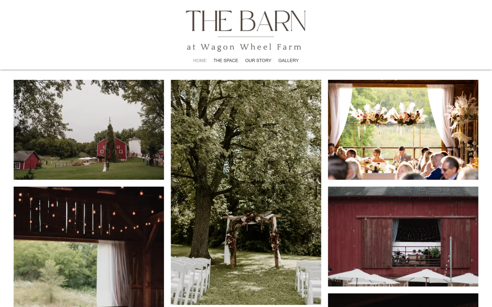
A centred wordmark and four nav words sit above a five-image mosaic of a red barn, a tree-shaded ceremony arch and a lit reception interior.
Type
Playfair Display caps wordmark
Body
Avenir LT Light 13px
Build
225px header, five-tile mosaic, 20px gutters
Made on
Wix
Colour
#ffffff #cccccc #2f2e2e
Type. One size was measured on the whole page: avenir-lt-w01_35-light1475496 at 13px weight 400, used four times for the menu. The wordmark is drawn, Playfair Display capitals letterspaced wide over a rule with the farm name in a wide-tracked sans beneath. A homepage carrying 29 characters of live text is a photographic index, not a document.
Colour. White at 200 percent coverage and #cccccc at 48.5 percent, with ink in #2f2e2e on 25 characters and #a0a09f on four. No accent, no brand colour, nothing. The red barn running through three of the five tiles is effectively the palette, and because the interface is pure neutral it reads as a chosen brand red rather than a coincidence.
Layout. A white header about 225px deep sits above a mosaic: a tall centre column flanked by two stacked tiles at left and two at right, gutters of roughly 20px. Nothing is cropped to a uniform aspect ratio, so the rhythm is irregular. Container is the full 1440px, radius 0, document height 7333px. Four nav items is the shortest menu here.
The ask. Four words, Home, The Space, Our Story and Gallery, with no Contact among them. No button, no phone, no price, no form. The page asks for nothing at all above the fold, which is the most extreme position in this set and leaves the mosaic to do the convincing unaided.
An irregular photo mosaic with no uniform crop reads as a portfolio rather than a template, and needs no headline to explain itself.
11
thebarnatmirrorlake.com
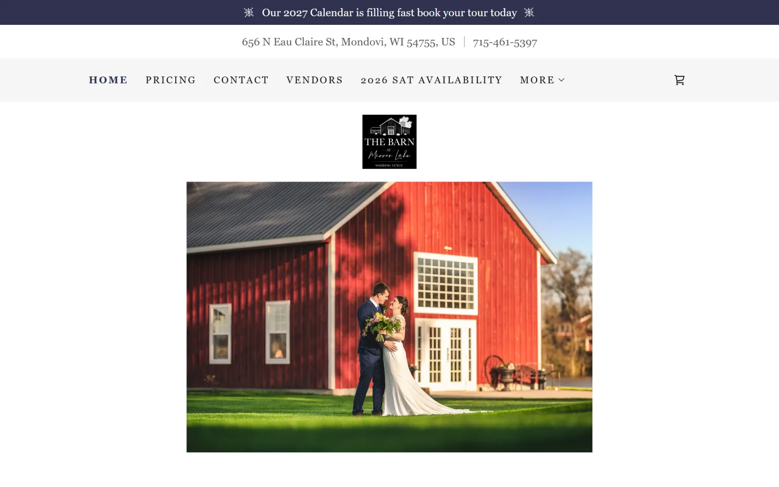
A red barn at golden hour with a couple on the lawn sits in a contained photo below a small black logo tile, an address line and a navy promo bar.
Type
Dancing Script 55px
Body
Gentium Basic 20px / 1.50
Build
Three stacked header bars, contained 830px photo
Made on
Not detected
Colour
#ffffff #2f324f #5e5e5e
Type. Gentium Basic does nearly everything at 20px with 1.50 line height, 1013 characters of it, in #5e5e5e. The same face handles nav at 20px and an 18px uppercase cut at a very wide 0.143em. Dancing Script appears once at 55px. Setting navigation at the same size as body text flattens the page, though the wide-tracked caps rescue the section labels.
Colour. White dominates at 403.4 percent coverage, with #f6f6f6 at 4.4 percent and #2f324f, a deep navy, at 2.6 percent on the promo bar. Body ink is #5e5e5e across 959 characters, a mid grey rather than black, and nav is #1b1b1b. The red barn and green lawn in the single contained photograph carry all of the saturation.
Layout. Three stacked bars open the page: a navy promo line, a white address and phone line, then a grey nav strip, roughly 210px before any image. The logo sits as a small black tile centred below all three, and the photograph is contained at about 830px wide with white either side. Section padding 40px, document 11042px, radius 0.
The ask. Phone sits in the second bar, the promo line pushes tour booking for a 2027 calendar, and Pricing is second in the menu with figures of $5,500, $6,500 and $3,000 published further down. A cart glyph sits at far right. Four separate asks stack before the first photograph, which is a lot of bar for one fold.
Naming the calendar year in a promo bar dates the page honestly and creates urgency without a countdown or a discount.
12
disenhousefarm.com
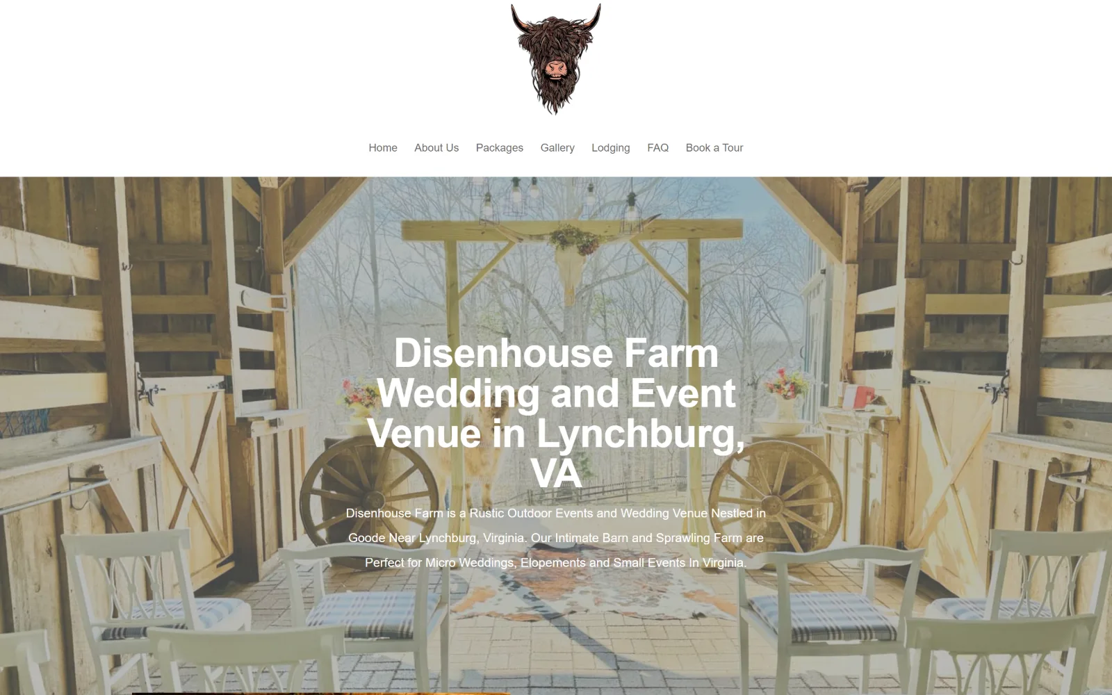
A highland cow logo tops a thin white header above a barn interior framing a timber arch, with four lines of white heading set over the picture.
Type. Josefin Sans at 52px weight 600 with -0.019em tracking sets the four-line heading, dropping to 30px at -0.033em below, while Open Sans at 16px weight 500 runs 1133 characters at a very loose 2.00 line height. Josefin Sans is a geometric art deco face and it argues with the rustic photography behind it, which is the clearest mismatch on this page.
Colour. One measured value, #ffffff at 197.5 percent. Ink splits across #666666 on 920 characters, white on 269, #333333 on 51 and #000000 on 48 for the nav. No accent colour exists anywhere. The hero photograph is pale and wintry, bleached timber and bare trees, so white heading type over it needs the full weight 600 to hold.
Layout. The logo is centred alone in about 185px of white, with seven nav items on a second centred row beneath it, before a full-bleed background image begins. Heading and supporting paragraph are centred over that image rather than aligned to an edge. Container is 1440px, radius 0, and the document is only 3680px, among the shortest here.
The ask. No button, no phone, no price. Book a Tour is last of seven nav items and Packages sits third. The heading is the page title written out as a full sentence, location and all, which is a search-first decision rather than a design one, and it costs the hero its only chance at a voice.
A geometric sans over rustic timber photography reads as borrowed, so match the display face to the building before chasing a trend.
13
rushmoreestate.com
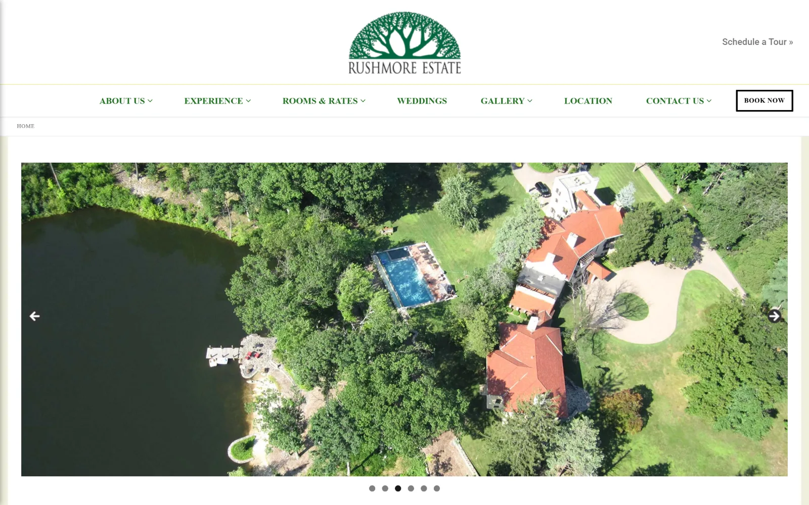
Six slider dots sit under a contained aerial of a tiled-roof estate beside a lake, below a tall white header carrying a green tree logo.
Type
Beau Rivage 52px
Body
Baskervville 20px / 1.80
Build
Centred logo, ruled nav bar, breadcrumb, contained slider
Made on
WordPress
Colour
#ffffff #efefdc #207021
Type. Baskervville at 20px with 1.80 line height carries 239 characters, and Baskerville, the system cut, does nav at 16px weight 600 uppercase and the button at 12px with 0.042em tracking. Beau Rivage, a script, appears at 52px across 80 characters, and Roboto turns up twice at 16px. Four faces where two would do, which is what a theme default tends to produce.
Colour. White at 149.4 percent and #efefdc, a pale yellow-green, at 86.5 percent are the grounds, with #872f0b at 0.7 percent. Nav ink is #207021 and the script lines are #0f7525, two different greens doing the same job within 80 characters of each other. Body is #333333. The aerial brings terracotta roofs that nothing in the interface answers.
Layout. The logo sits centred in roughly 160px of white with a Schedule a Tour link floated right at the same height, then a full-width green-ruled nav bar, then a breadcrumb strip reading HOME. The slider image is contained at about 1500px with six dots beneath it. Container 1380px at 96 percent, radius 1px, document 5221px.
The ask. Book Now sits in a black-outlined box at the end of the nav bar, with Schedule a Tour floated above it in the logo band, so two tour asks compete within 150px of each other. Four of seven nav items carry dropdown arrows. The breadcrumb reading HOME on the homepage is the sort of detail a theme supplies and nobody removes.
Two tour buttons within 150px of each other split the click rather than doubling it, so keep one and give the other job to the menu.
14
canaansprings.com
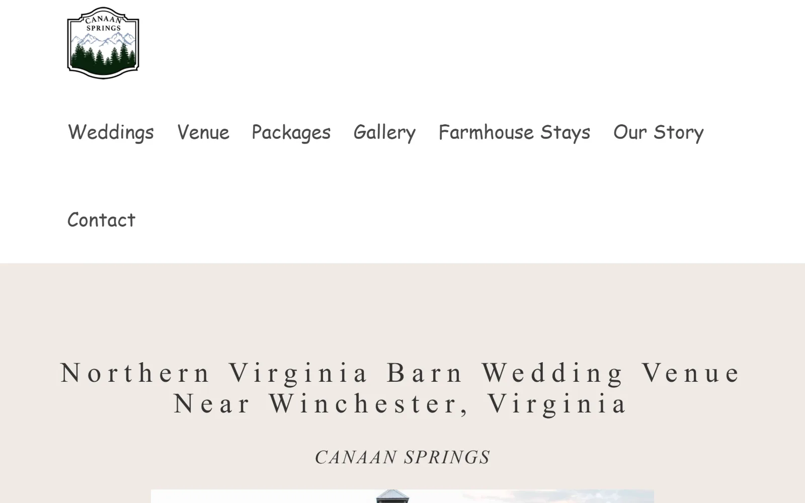
A white screen holds a small crest logo and two rows of rounded nav words above a wide-letterspaced serif heading on a warm grey band.
Type
Lora 50px / 0.240em
Body
Poppins 19px
Build
520px white header, two-row nav, centred band heading
Made on
WordPress
Colour
#efeae4 #ffffff #899bb5
Type. Lora at 50px with an extreme 0.240em tracking sets the heading, pushing a two-line title across almost the full container so it reads as signage rather than a sentence. Nav is Great Vibes at 34px, falling back to Comic Sans MS, which is what the capture shows. Body is Poppins at 19px with 0.026em, and Montserrat at 16px handles a 0.188em uppercase label.
Colour. Four values: #efeae4 at 323.8 percent as the body ground, white at 26.2, #f4f1ed at 10.4 and #899bb5, a dusty blue, at 0.6 percent. Ink runs #444444 on 311 characters, #333333 on 62 and #494949 on 59, three greys within twenty points of each other doing three different jobs for no visible reason.
Layout. Roughly 520px of white opens the page before any content: a small crest at left, then seven nav items wrapping onto two rows with Contact stranded alone on the second. The heading sits on a warm grey band below, centred, with the venue name in italic caps beneath it. Container 1380px at 96 percent, radius 0, document 11877px.
The ask. No button, no phone, no price above the fold. Contact is seventh of seven and sits alone on its own row by accident of wrapping. Weddings leads the menu and Farmhouse Stays sits fifth, so the second revenue line is visible early, which is the one clear decision in this header.
A webfont with a cursive fallback can land as Comic Sans when it fails to load, so pick a fallback from the same genre as the face.
How these were chosen
Fourteen venues, and the pattern that holds across almost all of them is the photograph doing the selling while the interface gets out of the way. Half hold to neutrals alone, only two soften a corner anywhere on the page, and just one sets its display in a sans. What does not hold is the idea that wedding venue website design means a full-bleed hero with a form on it. Only one of these puts an enquiry form in the fold. Four publish a price. Six ask for nothing above the fold at all, no button, no phone, no form, and two of those are the quietest pages here. The real split is between venues selling a date and venues selling a place, and the header height tells you which is which before you read a word.
Finding wedding venue sites that someone had actually designed took far longer than it should have. 30 candidates made the shortlist. 14 made the page.
Each one was opened and looked at properly: what the type is doing, where the colour gets spent, how the page is built, how it asks for the job. Nothing is here because it ranks. Nothing is here because an agency filed it under portfolio. Several well known names were left out for the plain reason that their site came out of the same template as everyone else's, and a few sites worth including did not survive a second look.
Where a site is only competent, it says so. The order is the order worth your time, best first.
Reviewed and selected by Larry W. Matthews for Websitely.