A Face-Only View of Plastic Surgery Website Design: 16 Sites
Sixteen US facial, oculofacial and hand practices. Plastic surgery website design judged on a first screen that usually reaches for a gallery.
Shown
16 sites
Reviewed
41 candidates
Chosen on
The work, not the ranking
Updated
15 October 2026
01
oklandfacialplasticsurgery.com
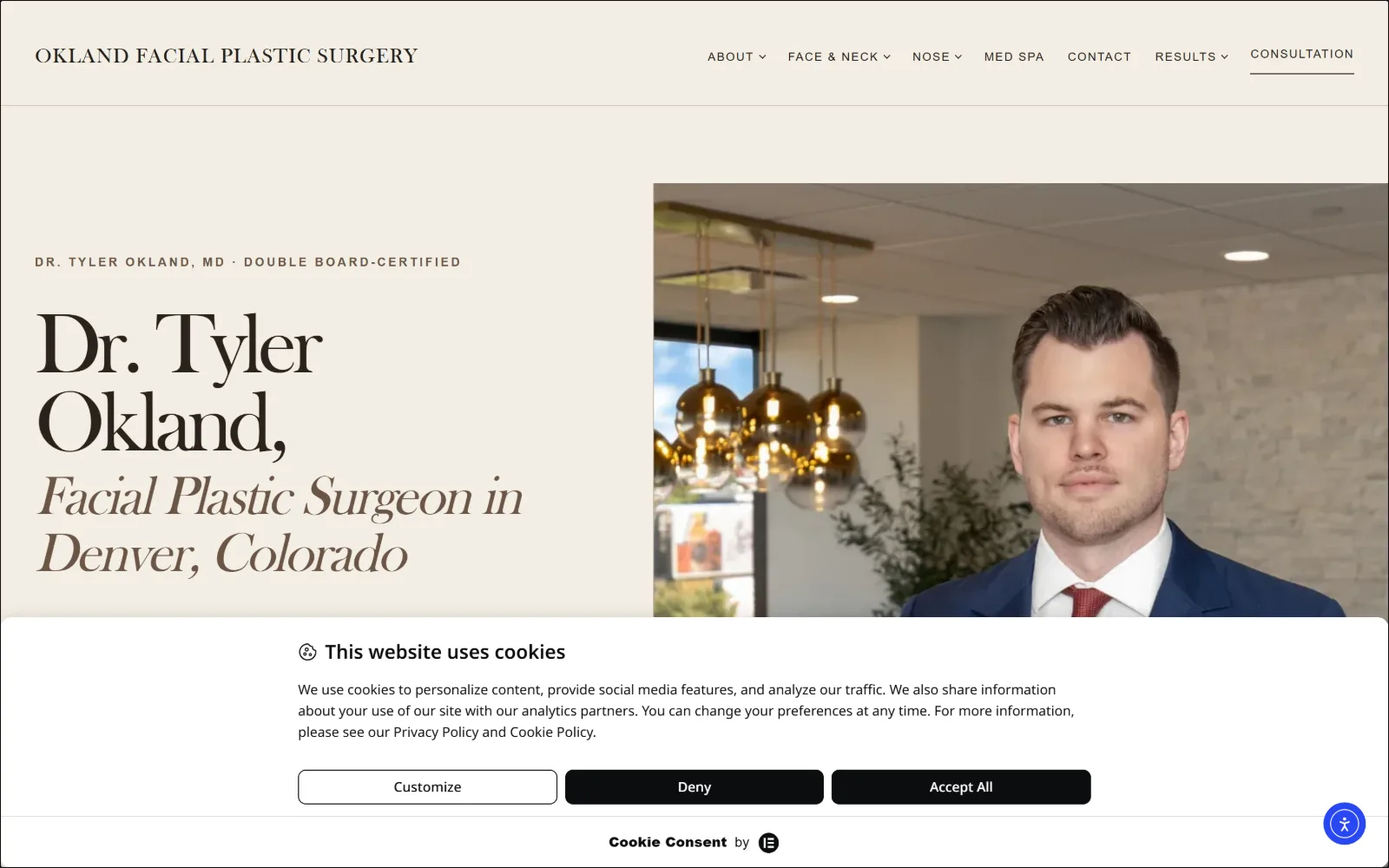
Cream page split down the middle: a huge serif name at left, a suited portrait bleeding off the right edge, cookie bar across the foot.
Type
old-style serif 90px, -0.055em
Body
Avenir Next 17px/1.65
Build
50/50 split, photo full bleed right, 70px section padding
Made on
WordPress
Colour
#f3eee4 #000000 #e9dfd0
Type. The display face is a high-contrast old-style serif running at 90px with -0.055em tracking, so the name closes up into a single mass, then relaxes into an italic cut at 55px for the location line. Body is Avenir Next 17px on 1.65 leading, and the kicker above is 13px at 0.190em uppercase. Two voices, held far apart in size.
Colour. A warm neutral ground of #f3eee4 carries 209 points of coverage with #e8e4de and #e9dfd0 as the panel steps, black for the serif, and a single muted olive #4f5944 as the only saturated value on the page. Nothing bright competes with the photograph, which supplies the navy and the skin tone instead.
Layout. A clean vertical split: text block left on the cream field, photograph bleeding to the right edge with no inset or radius. Section padding sits at 70px, the header is a thin single row with the wordmark at far left and a short nav right, and CONSULTATION is set apart from the rest by an underline instead of a button.
The ask. One ask only. SCHEDULE A CONSULTATION is the sole labelled action, with no phone number in the header and no secondary offer above the fold. The cookie banner currently occupies the lower third, which is the one thing competing for attention in this frame.
Setting a display serif at 90px with heavy negative tracking turns a long name into a shape, which is why one accent colour is enough.
02
advancedfacialplastic.com
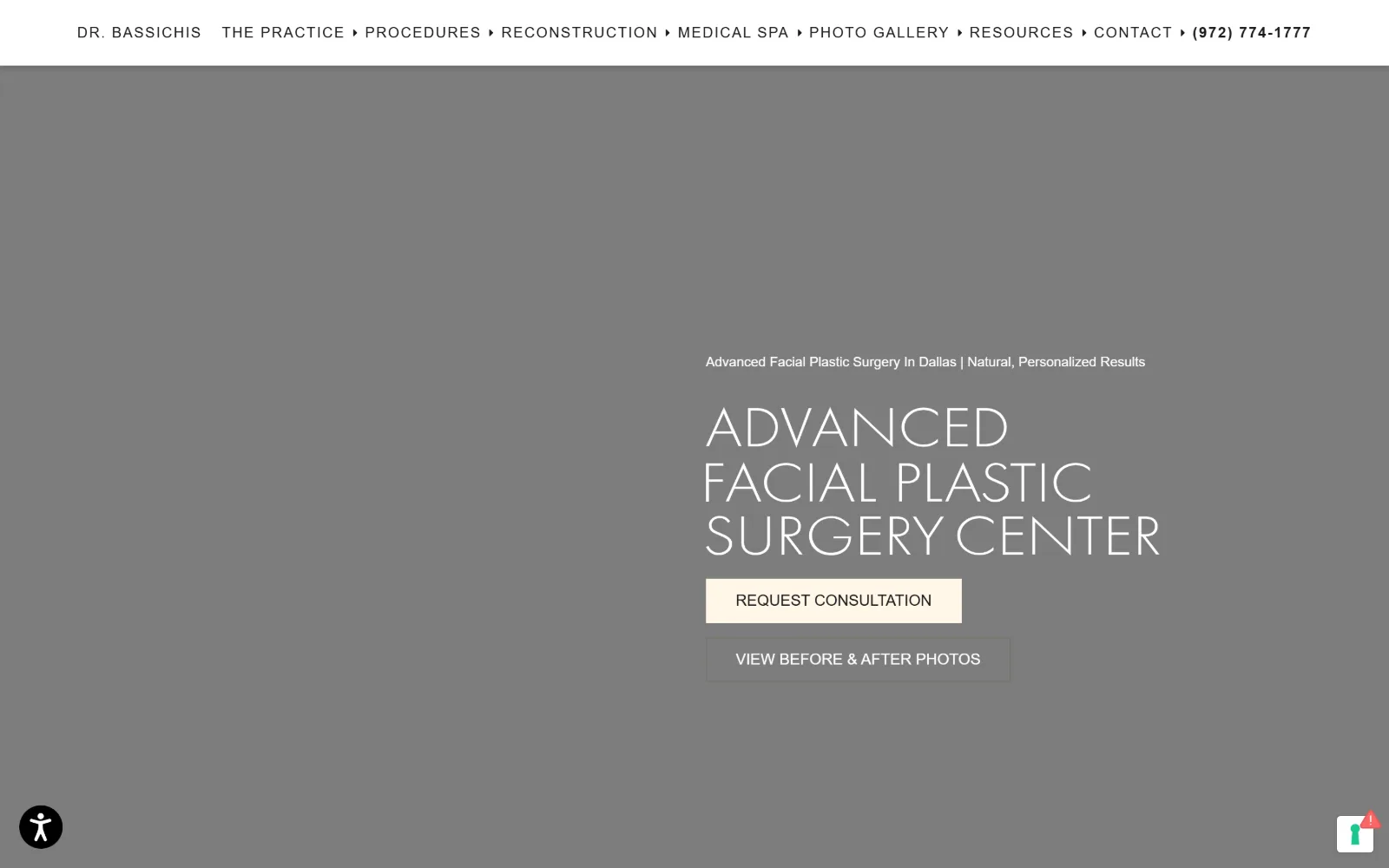
White nav strip over a grey hero, the practice name in three lines of thin wide caps, a cream button and an outlined one beneath.
Type
geometric sans 56px uppercase, light
Body
century-gothic 16px/1.75
Build
full-width white header, full-bleed hero, right-of-centre content
Made on
WordPress
Colour
#ffffff #1a1a1a #fff7e8
Type. Everything is one geometric sans. The hero name runs at 56px uppercase at a light weight with the counters left wide open, nav items at 15px uppercase on 0.100em tracking, and body at 16px on 1.75 leading. A 14px capitalised line sits above the display as a descriptor, so the scale jumps straight from 14 to 56 with nothing in between.
Colour. Two values do the work: #ffffff for the header band and #1a1a1a for every nav item and body line. The only other entry is #fff7e8, a pale cream used once, on the primary button. The hero itself is a flat grey video frame, so the cream reads as the single warm point in the whole composition.
Layout. A full-width white header row runs edge to edge above a full-bleed hero, with the hero content pushed right of centre rather than middled. Buttons are square-cornered rectangles at identical width, stacked with a small gap. Nine nav items plus the phone number fill a single line with no second tier.
The ask. Two asks, ranked by fill rather than position. REQUEST CONSULTATION takes the cream fill, VIEW BEFORE & AFTER PHOTOS sits directly below it as an outline, and the phone number is set in bold at the end of the nav where it reads as the third option.
Ranking two CTAs by fill weight alone, at the same width and stacked, keeps the hierarchy readable without resorting to different colours.
03
ortmdsurgery.com
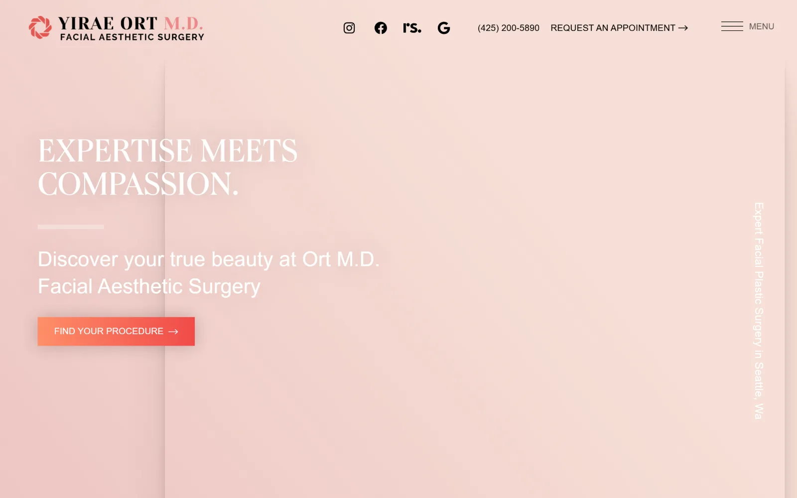
Blush pink field with no imagery: white serif caps two lines deep, a short rule, a sans subhead and one coral gradient button at lower left.
Type
serif caps 60px, 1.0 leading
Body
proxima-nova 20px
Build
full-bleed colour field, content in left third, 100px padding
Made on
WordPress
Colour
#ffffff #f8d9d2 #f4694f
Type. The headline is a serif set in caps at 60px with a 1.0 line height, light weight, letters spaced naturally so the two lines stack as a block. Beneath it the supporting line switches to a humanist sans at 37px, and nav and button labels drop to 16px uppercase at 0.011em. The serif-to-sans handoff is the only typographic event on the screen.
Colour. Close to monochrome. The ground is a pale blush that darkens slightly left to right, type is pure white, and the sole saturated element is the coral-to-red gradient on the button, echoed by the red mark inside the wordmark. A vertical rule and rotated side caption sit a few percent off the ground colour.
Layout. A single full-height colour field with 100px section padding and content locked to the left third, leaving two thirds empty. A faint vertical seam runs down at roughly a fifth of the width. The header is one row: wordmark left, social icons and phone centre, hamburger right. The button has square corners.
The ask. FIND YOUR PROCEDURE is the hero ask and the only coloured element on the page, which makes it unmissable. REQUEST AN APPOINTMENT and the phone number sit in the header as plain text with an arrow, deliberately quieter than the button below.
A large empty colour field with one gradient button is a hierarchy device: if only one element is saturated, placement stops mattering.
04
seattlefaceandskin.com
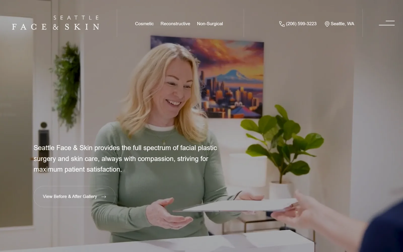
Video of a receptionist handing over a folder fills the frame, with a letterspaced wordmark, three category links and a ghost button.
Type
letterspaced sans caps wordmark
Body
Montserrat 24px/1.6, weight 300
Build
full-bleed video, overlaid header with vertical rules, 30px padding
Made on
WordPress
Colour
#ffffff #cfc6b8 #9bae93
Type. The wordmark is set in widely letterspaced caps across two lines, with SEATTLE small above and FACE & SKIN large below. Everything else is one light sans: a 24px/1.6 introduction paragraph at weight 300 and 16px nav items. The capture also records a 45px serif display at weight 300 further down, so the serif is held back for section headings.
Colour. There is no flat colour anywhere above the fold. The entire palette comes from the footage, a warm studio neutral with sage green from the clothing and the plant, and all type and the button outline are white. Vertical hairline rules separate the header into three zones.
Layout. A full-bleed video hero with the header laid over it, divided by thin vertical rules into wordmark, nav and contact. Copy sits in the lower left quadrant at roughly a third of the width, section padding is a tight 30px, and the ghost button is a plain rounded outline with no fill.
The ask. The hero asks for one thing, View Before & After Gallery, which sends people to proof rather than a form. The phone number and city sit in the header as plain labelled text, so booking is a second step reached through the menu.
Pulling the whole palette from the hero footage and setting every overlay in white removes the need to pick brand colours for the fold.
05
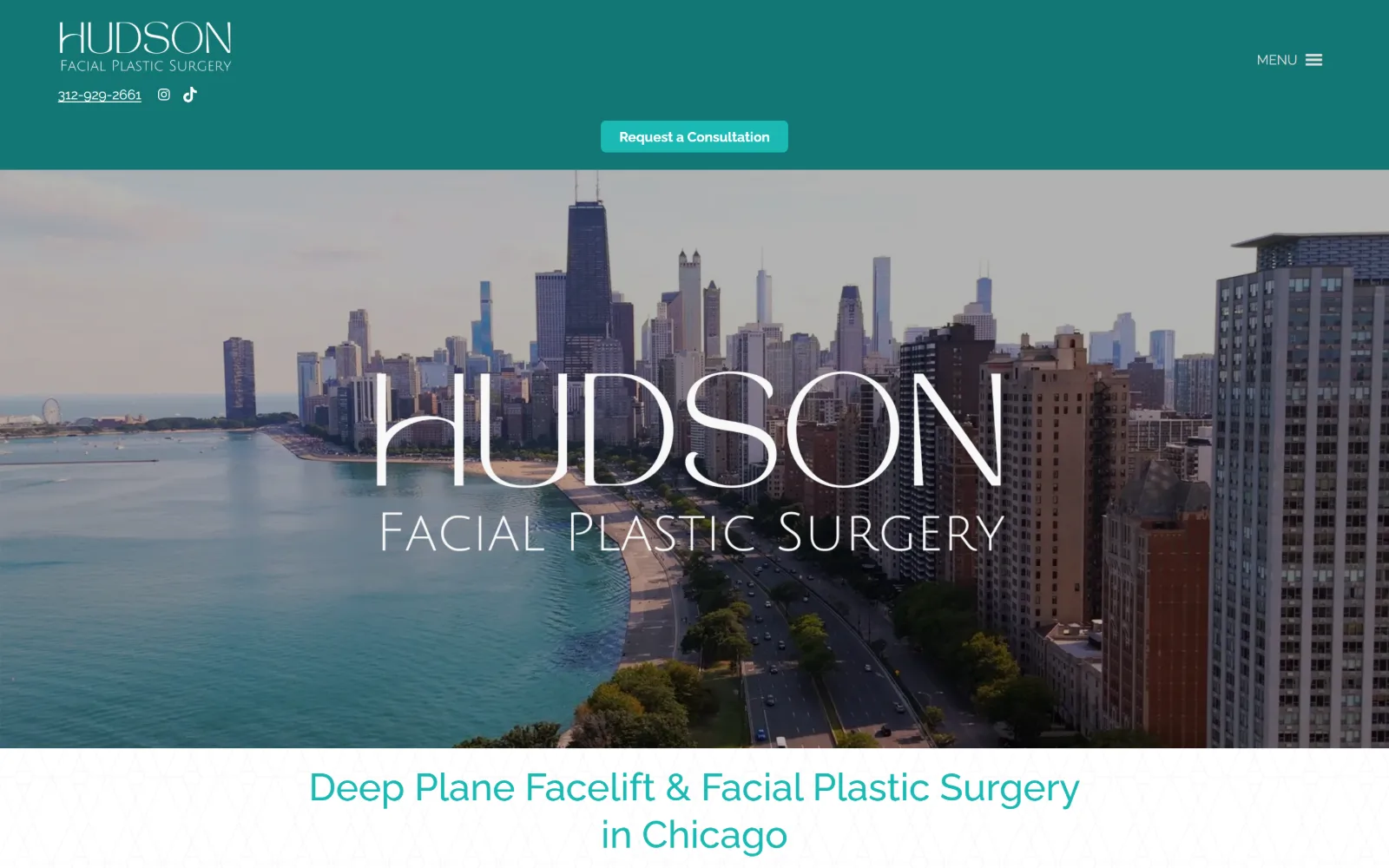
hudsonfacialplastics.com
Deep teal header band above aerial video of the Chicago lakefront, a thin-stroke wordmark centred over the skyline, teal heading below.
Type
thin display sans caps, wide tracking
Body
Raleway 16px/1.6
Build
solid header band over full-bleed video, 5px button radius
Made on
WordPress
Colour
#1aa29e #137774 #1bb9b4
Type. The wordmark is a very light display sans in caps, tracked wide, with FACIAL PLASTIC SURGERY set smaller in the same face directly under HUDSON. Body text is Raleway at 16px on 1.60 leading, the section heading below the hero runs at 40px weight 500, and button labels are 14px bold. The thin caps against the city photograph is the whole identity.
Colour. Teal carries the brand across several steps: #1aa29e for the header band, #137774 on the darker elements and #1bb9b4 on the button, against #ffffff type and a near-black for body copy. The lake and sky supply the only other hues, and they sit close enough to the teal that the band reads as an extension of the photograph.
Layout. A solid colour header roughly 200px deep holds the wordmark, phone, social icons and a centred pill button, with the video hero beneath it running full bleed. Below that a white band carries a centred heading over a faint geometric pattern. Button corners are rounded at 5px.
The ask. Request a Consultation sits centred in the header band as a filled pill, so it holds the same position at every scroll depth. The phone number is set directly under the wordmark as an underlined link, and the rest of the navigation is folded behind a MENU toggle.
Putting the one CTA inside a solid brand band above the media keeps it legible regardless of what the video behind it is doing.
06
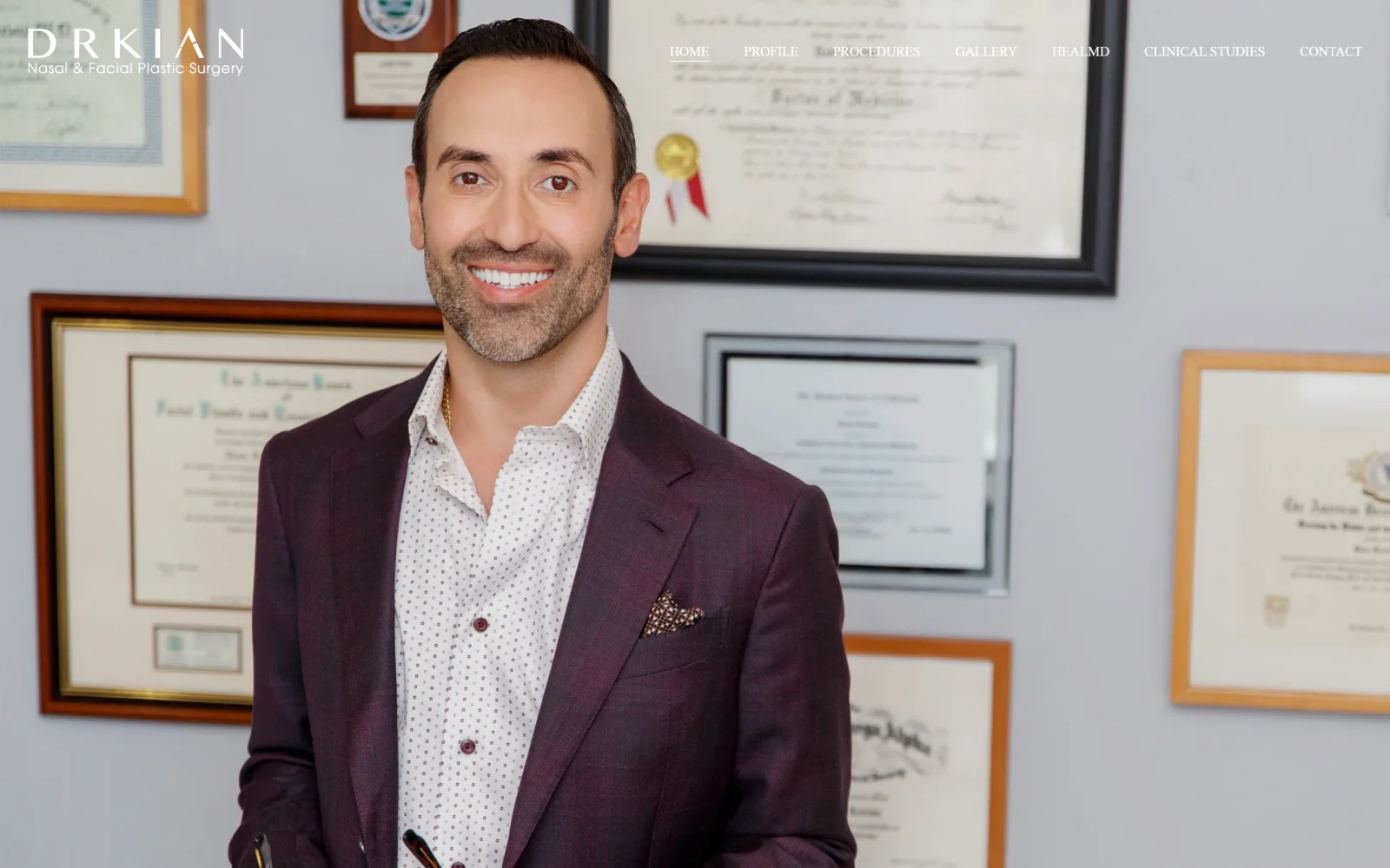
drkian.com
Full-bleed photograph of the surgeon in a plum jacket before a wall of framed diplomas, white wordmark left, seven nav items right.
Type. Poppins does everything, which on a black page reads as restraint rather than default. Section headings run at 46px and 36px at weight 500 with 0.010em tracking, body is 17px at weight 300 on a generous 1.87 leading, and nav items sit at 14px weight 500. The light body weight is what keeps long paragraphs readable on black.
Colour. The measured palette is a single value, #000000 at full coverage, with white type over it and a #d9d9d9 button. Every other colour on screen comes from the photograph: the plum jacket, the gold seal on the certificate, the warm wood frames. The page carries no brand accent of its own.
Layout. The hero is the photograph, edge to edge, with the header floating over it and no bar behind. Section padding below runs to 108px, which gives the black sections room to read as deliberate rather than unfinished. The button has 0px radius, so every rectangle on the page is hard-cornered.
The ask. No button competes in the hero at all. Navigation carries GALLERY and CONTACT as plain links, the header is sticky so those stay reachable, and the actual booking ask is deferred to a later section rather than stacked over the portrait.
Letting the hero photograph supply every colour, and pairing it with one sans at three weights, is how a black page avoids looking like a template.
07
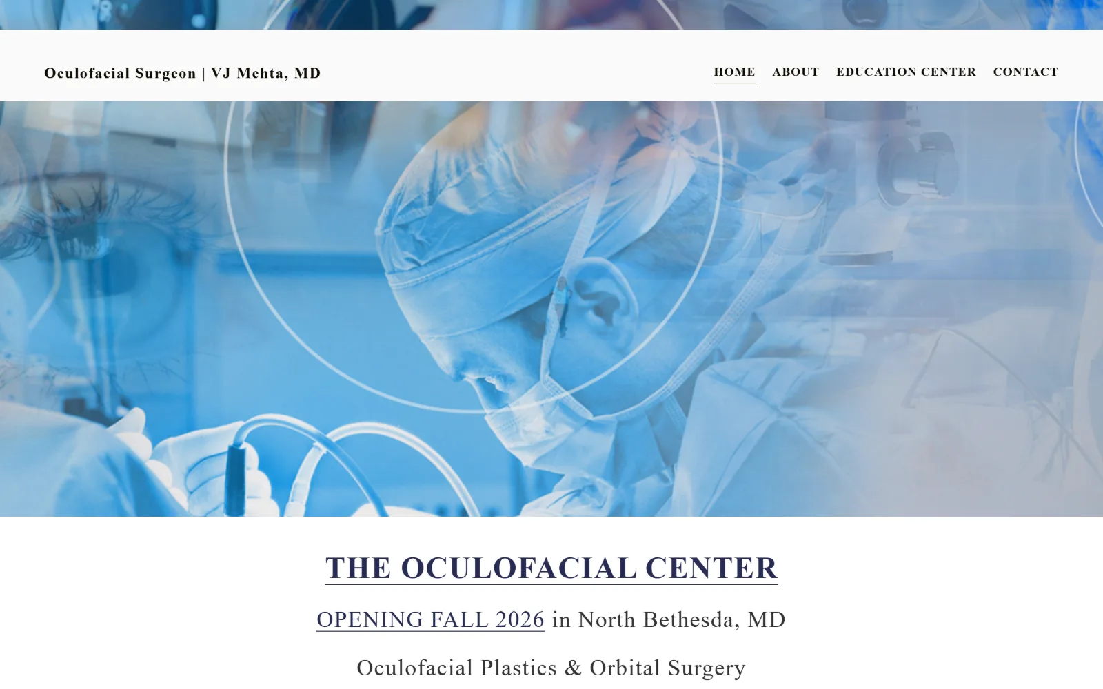
mehtafacialplastics.com
Blue-washed montage of an operating microscope, a masked surgeon and a close-up eye behind a white header, serif heading centred below.
Type. A serif with slightly flared stems carries the headings: THE OCULOFACIAL CENTER in caps, and the practice line at 30px with 0.039em tracking and a tight 0.97 line height. Nav is the same serif at 16px bold, 0.063em, uppercase. Setting navigation in the display face rather than a neutral sans is the decision that gives the page its tone.
Colour. Almost nothing is flat colour. The ground is #fafafa, the single accent is a warm amber #f9b862 reserved for the button, and all the blue on screen is the duotone wash over the photographic collage. Heading colour is a near-black #1c1c1c against that off-white, giving high contrast where it counts.
Layout. A full-bleed photographic band roughly 60 percent of the viewport deep, with a white header strip laid over its top edge rather than above it. Below, content is centred in a narrow measure with 132px section padding. Buttons are rounded at 10px, the only soft corner on the page.
The ask. The page asks for patience rather than a booking: OPENING FALL 2026 is the primary message, with CONTACT in the nav and an amber button further down. Four nav items total, no phone number in the header, which suits a practice that is not open yet.
Setting the nav in the display serif rather than a neutral sans makes a four-item menu feel like part of the identity instead of furniture.
08
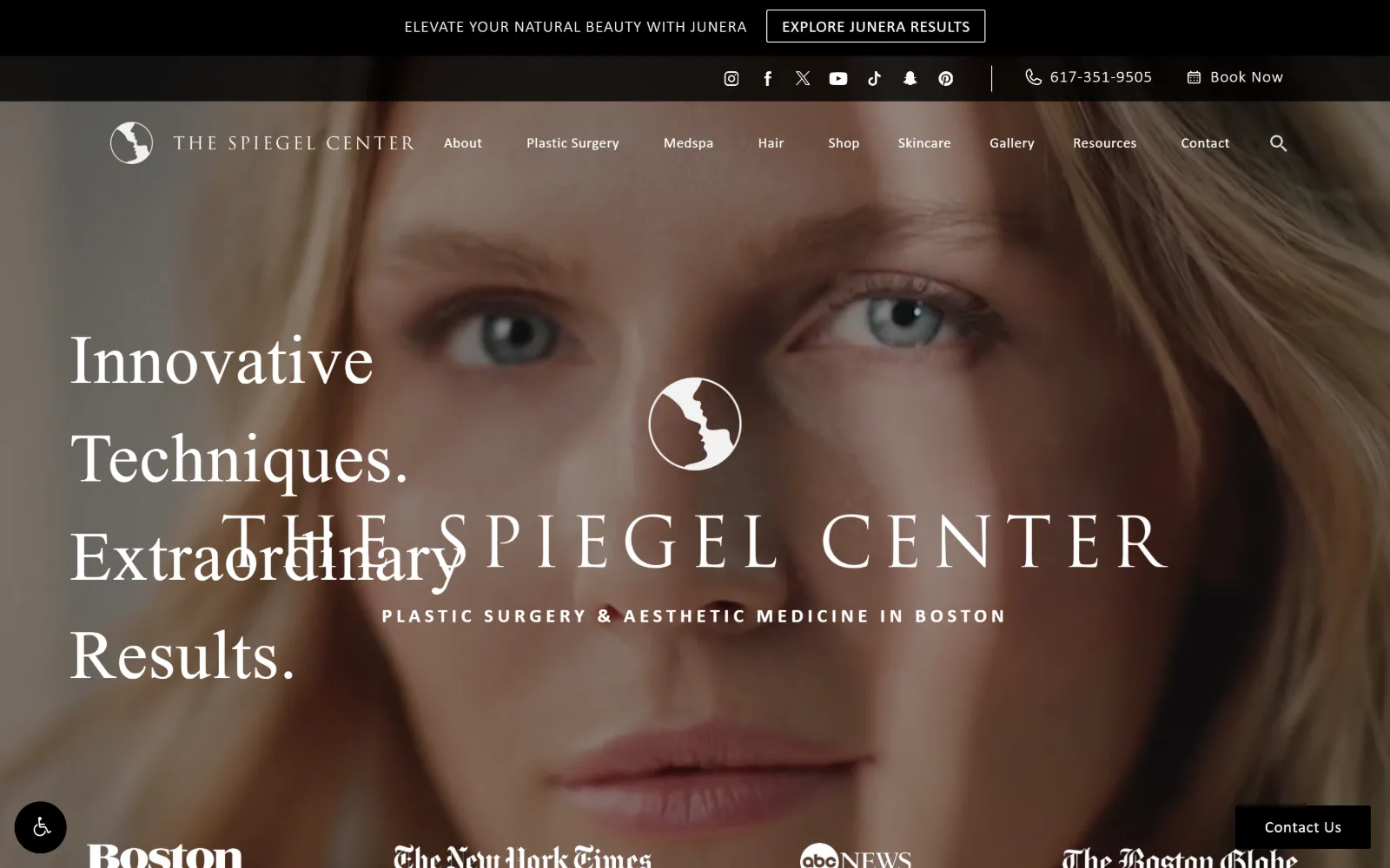
drspiegel.com
Macro portrait behind two stacked black bars, a left serif headline overlapping a centred inscriptional wordmark, press logos at the foot.
Type
transitional serif 72px, 1.0 leading
Body
sans 20px uppercase, 0.220em
Build
two stacked bars over transparent header, full-bleed hero, 2px radius
Made on
WordPress
Colour
#ffffff #222222 #999999
Type. Two serifs are at work and they collide in this capture. The left headline is a transitional serif at 72px on a 1.0 line height, while the centred wordmark is an inscriptional roman in caps at 0.011em. Supporting text is a plain sans at 20px uppercase on an unusually wide 0.220em, and nav sits at 15px. The spread between the tracking values is extreme.
Colour. Grey-scale by design: #ffffff type, #222222 for the hero ground and the upper bar, #999999 across the midtones and #000000 on button fills. The photograph is colour-graded warm so the skin tone is the only hue in the composition, and the press logos below are all monochrome.
Layout. A promotional bar and a social bar stack above a transparent header, which puts three rows of furniture over the photograph before any content starts. The hero is full bleed, headline left, wordmark centred, and press logos sit in a four-up row along the bottom edge. Button radius is 2px.
The ask. Many asks at once: a promo button in the top bar, a phone number, Book Now, Shop in the nav and a fixed Contact Us tab at lower right. The phone number is given equal visual weight to the booking link, so neither leads.
Stacking a promo bar, a social bar and a transparent nav over one photograph costs you the headline, which is where this capture shows text colliding.
09
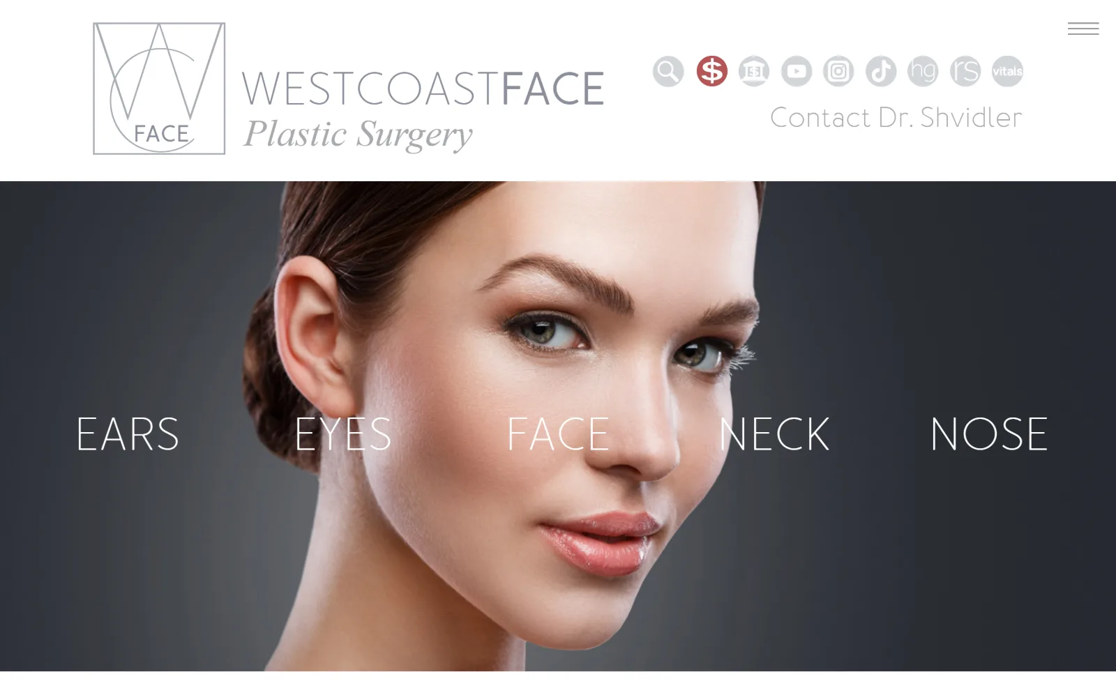
westcoastface.com
Three-quarter studio portrait on a graphite ground, with five words, EARS EYES FACE NECK NOSE, spaced across the middle of the image.
Type
Cormorant Infant 70px, -0.014em
Body
rounded sans 60px caps, light
Build
white header strip, full-bleed portrait, single word row at midpoint
Made on
WordPress
Colour
#ffffff #c3c4c8 #3a3d42
Type. The hero is a light serif at 70px with -0.014em tracking, while the five navigation words are set in a rounded sans at 60px in caps at a light weight, evenly tracked across the full width. The wordmark pairs flat grey caps with a grey italic serif beneath. Three faces on one screen is a lot, and the rounded sans is what carries the idea.
Colour. Barely any colour at all: #ffffff for the header and the overlay words, #c3c4c8 for the grey tones, and a graphite gradient behind the portrait that darkens at the edges. One red circular icon in the social row is the only saturated pixel, which makes it read as a payment link rather than part of the brand.
Layout. A white header strip with the logo at left and a stack of circular icons at right sits above a full-bleed portrait. The five words form a single horizontal row at the vertical midpoint, spanning edge to edge with the face positioned between the middle two. No cards, no grid, no corner radius anywhere.
The ask. The navigation is the conversion device: each anatomical word is a route into a procedure area. Contact Dr. Shvidler sits in the header as plain grey text, and there is no filled button or phone number above the fold.
Using body-part words as the primary navigation, laid across the image at one size, replaces a procedures dropdown with something people can scan in a second.
10
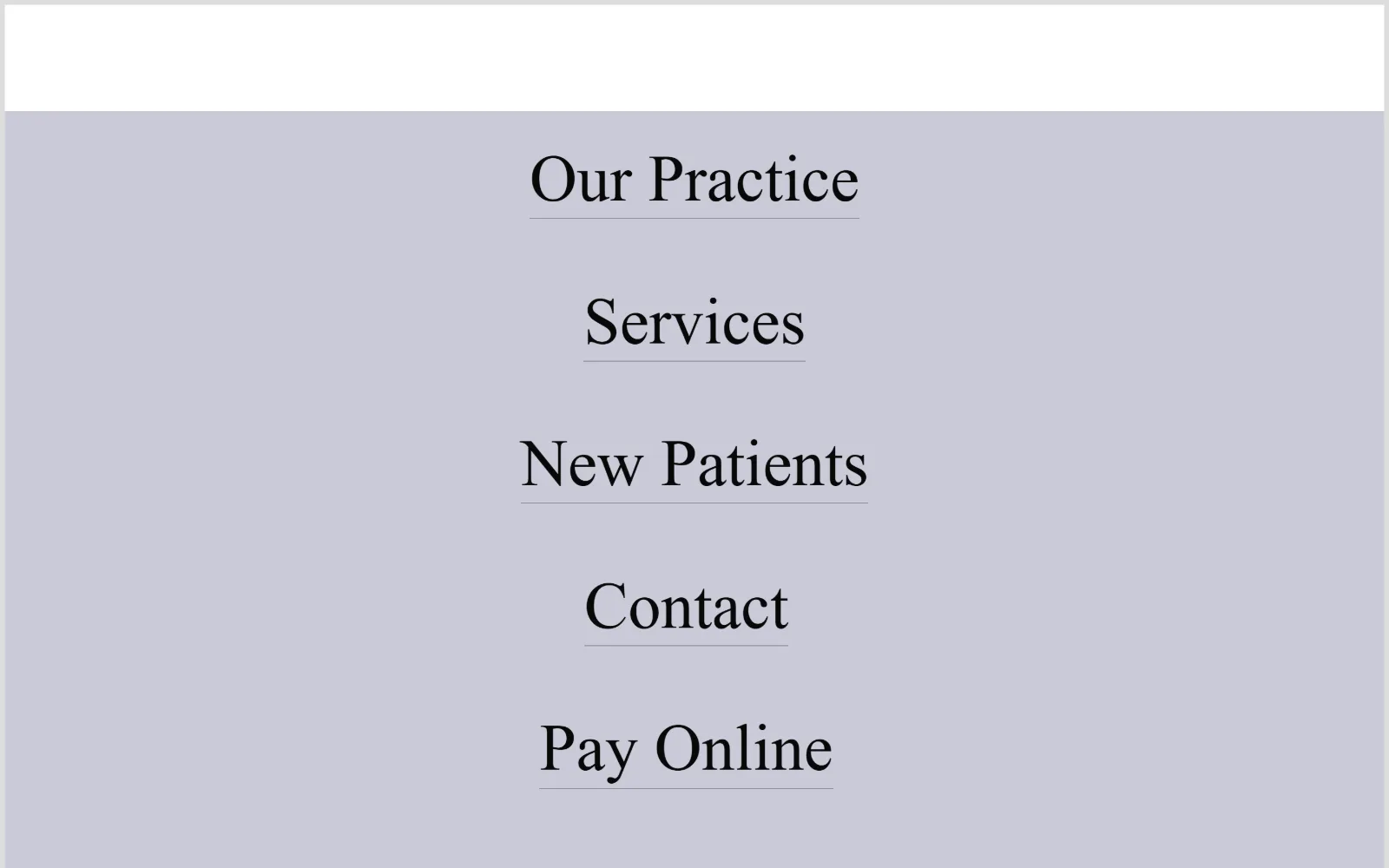
eliteoculoplastics.com
Pale lavender-grey field holding nothing but five underlined serif links, stacked and centred, under a narrow white band at the top.
Type
garamond-premier-pro-display 68px
Body
garamond-premier-pro 18px/1.6, 0.020em
Build
white band over full-height colour field, centred link stack
Made on
Squarespace
Colour
#cacbd8 #dddddd #ffffff
Type. One face at one weight, a Garamond-style display serif at 42px for the links and 68px at the largest step, with body copy at 18px on 0.020em tracking and 1.60 leading. There is no sans anywhere and no bold. The underline beneath each link is the only emphasis mechanism on the page.
Colour. Three close neutrals and nothing else: a #dddddd base, a #cacbd8 lavender-grey for the hero field and #ffffff for the band above. A soft #a4c6ea blue appears further down. Saturation is almost absent, which leaves the black serif doing all the contrast work.
Layout. A fixed white band roughly 125px deep sits above a full-height colour field with the links centred and generously leaded apart. No grid, no cards, no imagery, no corner radius. The whole homepage is a table of contents rather than a pitch.
The ask. Nothing is sold above the fold. Contact and Pay Online sit in the stack as peers of Our Practice and Services, which treats an existing patient settling a bill as equal in weight to a new enquiry. There is no button, no phone number and no form anywhere on the first screen.
A homepage that is only a centred link list is a defensible choice when every visitor already knows the practice and just needs a destination.
11
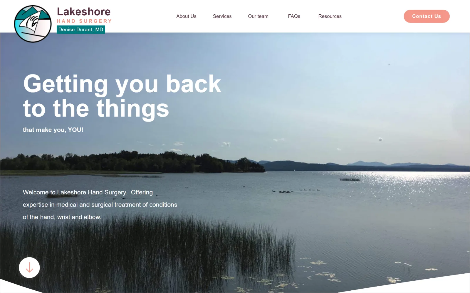
lakeshorehandsurgery.com
Wide photograph of a calm lake with reeds in front, a heavy white headline upper left, and a coral pill button in the white header.
Type
Montserrat 33px bold
Body
Montserrat 19px/2.0, weight 500
Build
white header bar, full-bleed photo clipped on a diagonal, 150px padding
Made on
WordPress
Colour
#553043 #f59689 #007c80
Type. Montserrat at every size, which suits the plain-spoken copy. The headline runs at 33px bold over two lines with a smaller bold line beneath it, body sits at 19px weight 500 on a doubled 2.00 line height, and nav items are 15px weight 500. One label is tracked out to 0.280em uppercase, the only typographic flourish in the set.
Colour. A plum #553043 carries the wordmark and the nav, coral #f59689 fills the button, and a teal #007c80 appears in the logo badge. Three brand colours is more than most of the set carries, and the lake photograph is cool enough that the coral stands clear of it.
Layout. A white header bar with the roundel logo at left, five centred nav items and a pill button at right, above a full-bleed landscape photograph. Section padding runs to 150px and the hero is clipped at the bottom by a shallow diagonal, which is the only non-rectangular edge on the page.
The ask. Contact Us is the single ask, set as a 23px-radius coral pill in the header where it is the only filled element. There is no phone number above the fold, and the circular down arrow at lower left invites scrolling rather than clicking.
A cool landscape photograph lets a warm accent colour carry the only button without any outline or shadow to separate it.
12
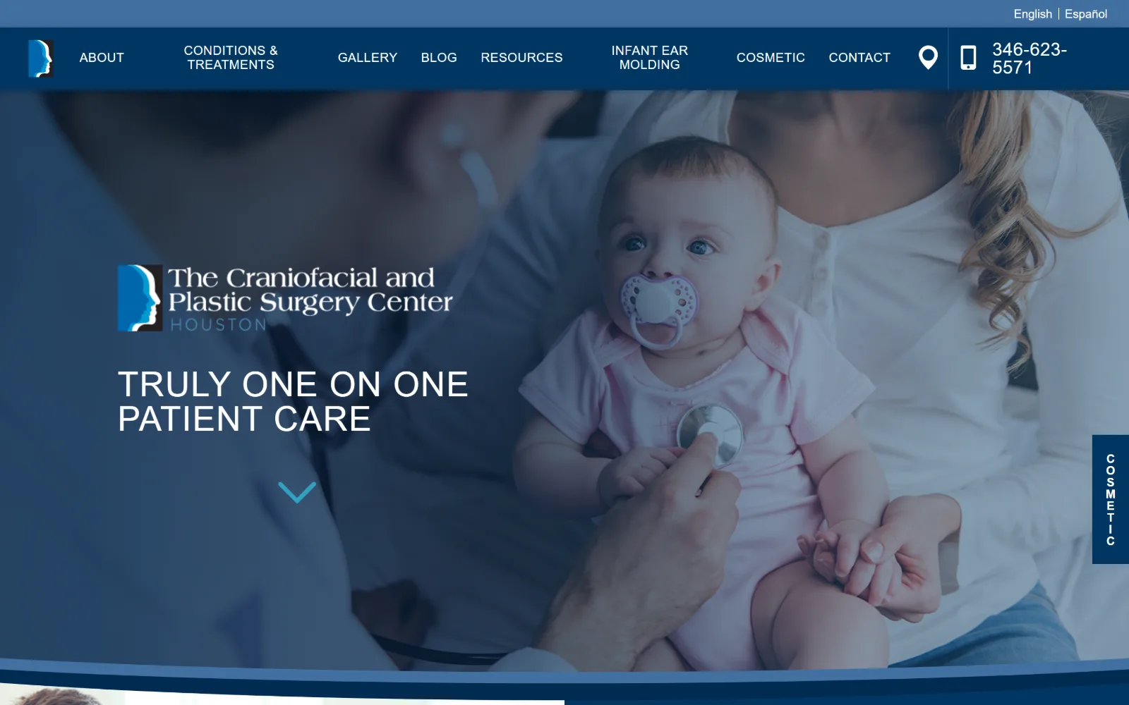
houstoncraniofacial.com
Navy-tinted photograph of an infant being examined, logo and a wide-tracked white headline at left, deep blue nav bar across the top.
Type
scandia-web 44px uppercase, 0.030em
Body
scandia-web 17px/1.47
Build
blue nav row, washed photo hero with curved base, 60px padding
Made on
WordPress
Colour
#003763 #4270a1 #ffffff
Type. The headline is a neutral grotesque at 44px, weight 500, uppercase, tracked to 0.030em and set on a 1.0 line height so the two lines sit close. Nav items are a different sans at 16px uppercase, 0.025em. Body copy runs at 17px on 1.47 leading. The uppercase display with open tracking is the whole typographic idea.
Colour. Two blues and white: #003763 for the navigation bar and the wash over the photograph, #4270a1 as the lighter step in the logo and the chevron, and #ffffff for all type at 64 points of coverage. The photograph is tinted to the darker blue, so there is no competing skin tone or background colour.
Layout. A thin language bar sits above a deep blue nav row around 90px tall, with the hero photograph beneath it carrying a colour wash and a curved bottom edge that cuts into the next section. Section padding is 60px, and a vertical COSMETIC tab is pinned to the right edge.
The ask. The phone number is the loudest element in the header, set at a large size next to a handset icon, which fits a practice where parents are calling rather than filling in forms. The vertical COSMETIC tab is the only other persistent ask.
Tinting a photograph to the darker brand blue lets white headline type sit anywhere over it without a scrim or a drop shadow.
13
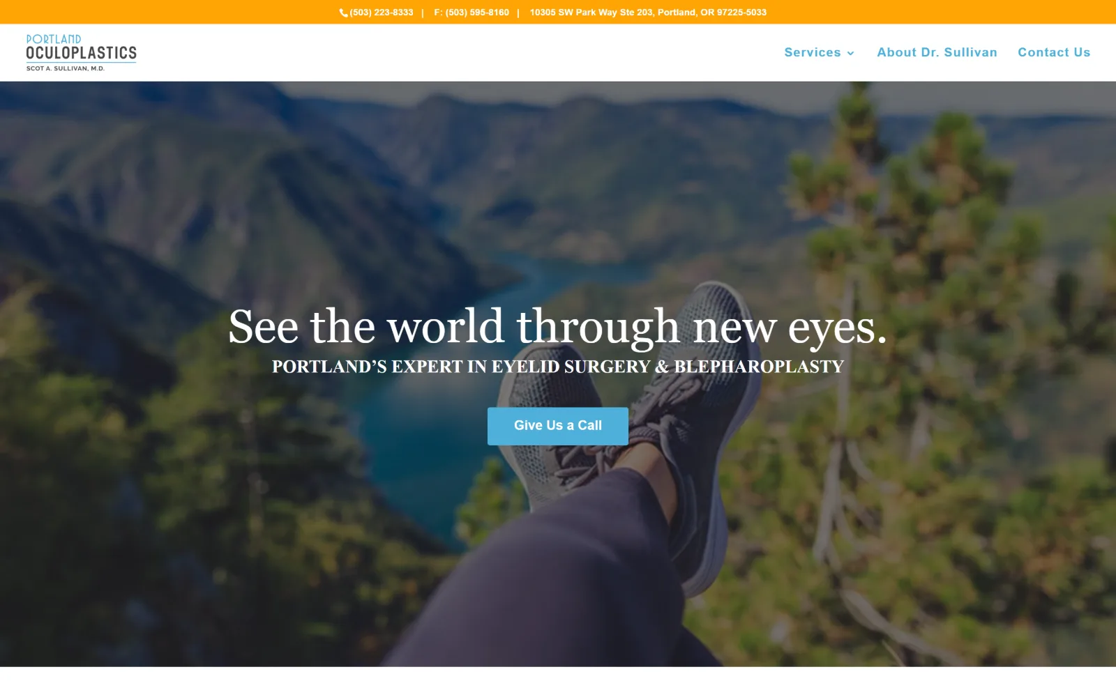
portlandoculoplastics.com
Hiker's trainers propped over a river gorge fill the hero, with a white serif headline, caps subhead and light blue button stacked centrally.
Type
Georgia 60px, 1.0 leading
Body
Raleway 17px/1.8
Build
orange utility bar, sticky white nav, full-bleed photo hero, 3px radius
Made on
WordPress
Colour
#ffa404 #4eb0da #ffffff
Type. Georgia at 60px on a 1.0 line height carries the headline, with the subhead below it in caps in the same serif. Body switches to Raleway at 17px weight 500 on a roomy 1.80 leading, and nav items are Raleway 16px bold at 0.063em. Using a system serif at display size is an unfashionable choice that reads as calm here.
Colour. White dominates at 198 points of coverage across the page below. The orange #ffa404 top bar is the strongest value on screen and it is given to contact details, while a sky blue #4eb0da handles the nav links and the button. The photograph supplies the greens and the river blue.
Layout. A full-width orange utility bar sits above a white header with the logo left and three nav items right, then a full-bleed photographic hero with all content centred over it. Button radius is 3px and the header is sticky, so the bar scrolls away while the nav stays.
The ask. Give Us a Call is the hero button, and the phone and fax numbers plus the street address are already set in the orange bar above the nav. The page treats a telephone call as the conversion, with no form or booking widget above the fold.
If the phone call is the conversion, give the number the brightest band on the page and make the hero button say call rather than book.
14
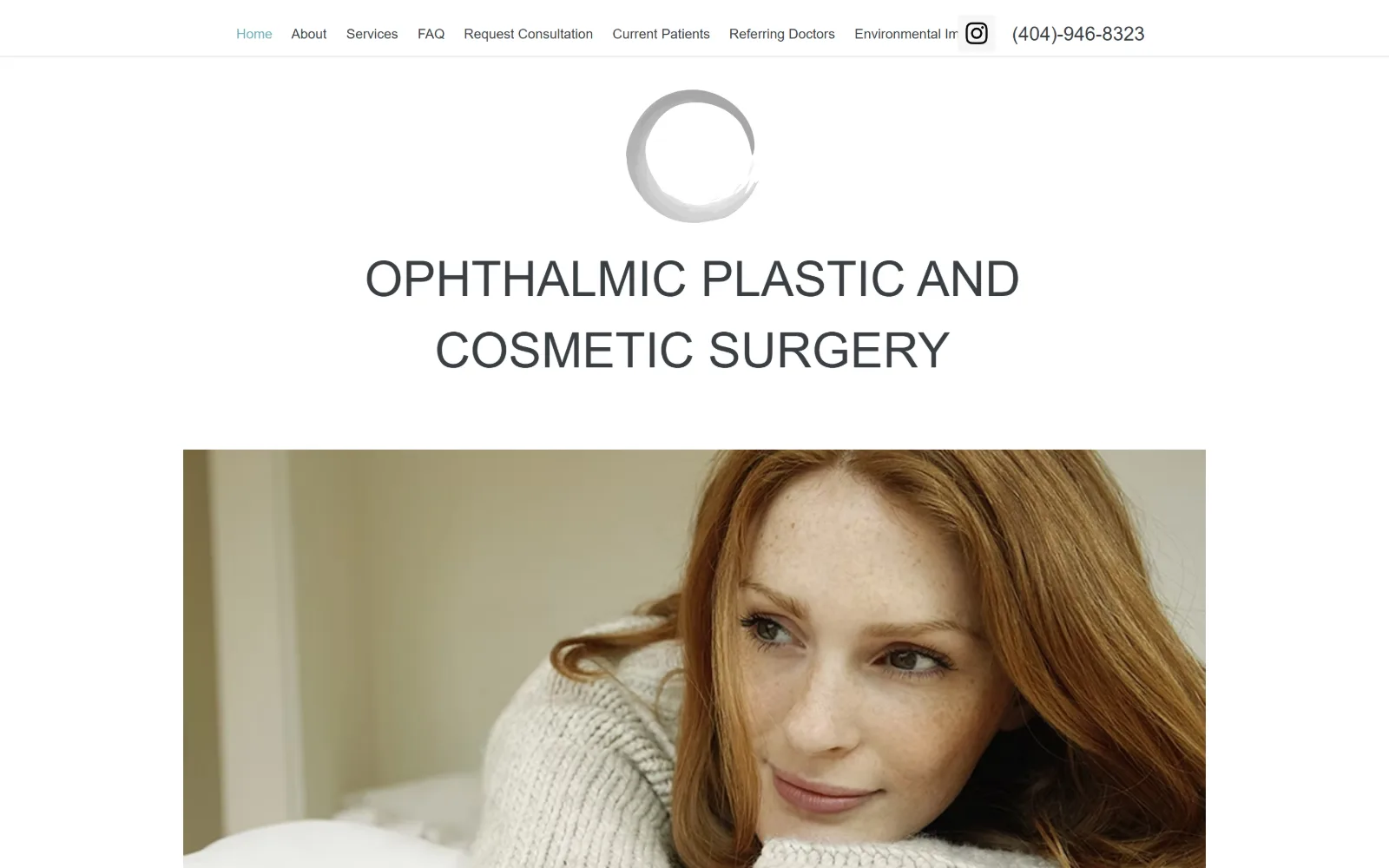
eyelidatl.com
Grey brushstroke circle mark centred above two lines of light grey caps on white, with a wide inset photo of a woman in a cream knit below.
Type
light geometric sans 42px caps
Body
brandon-grot-w01-light 22px/1.5
Build
centred narrow column, inset photo with white margins
Made on
Wix
Colour
#ffffff #f6f6f6 #2f2e2e
Type. A light geometric sans runs the whole page, with the centred title at 42px in caps and a 51px step recorded above it, all at weight 400 so the caps stay airy rather than shouty. Body sits at 22px on 1.50 leading, which is large for body copy and reads as deliberate. Nav drops to a plain 14px Open Sans.
Colour. Effectively two values: #ffffff at 253 points of coverage and #f6f6f6 for the alternating band, with #2f2e2e type. There is no brand accent at all, so the photograph and the grey brushstroke mark carry the only tone. The active nav item is tinted pale blue, which is the single piece of colour in the header.
Layout. Everything is centred in a narrow column: mark, then title, then a wide inset photograph with clear white margins on both sides rather than running full bleed. The header is a single 14px row with the items left-aligned and the phone at the end. No radius, no cards, no overlay.
The ask. Request Consultation sits inside the nav row as a plain text link alongside Current Patients and Referring Doctors, and the phone number closes the row. There is no button anywhere above the fold, which puts enquiry and existing-patient traffic on the same footing.
Insetting the hero photograph with white margins on both sides, rather than bleeding it, keeps a centred layout feeling like a printed page.
15
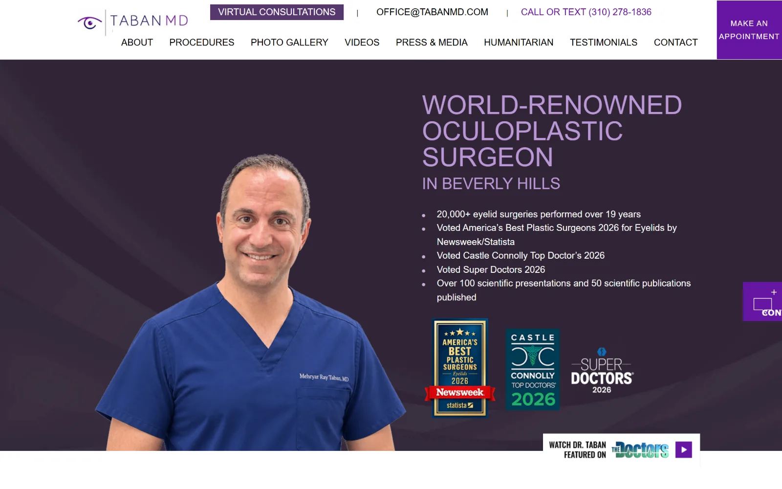
tabanmd.com
Purple hero with the surgeon cut out in blue scrubs at left, a lilac condensed headline at right, credential bullets and three award badges.
Type
Oswald 48px uppercase
Body
system sans 25px/1.5
Build
two white header rows, full-bleed purple hero, cut-out portrait left
Made on
WordPress
Colour
#6616a2 #57386f #ffffff
Type. Oswald, a condensed sans, is set at 45 to 48px in caps for the headline, which is how five words fit on three lines without shrinking. The supporting copy switches to the system stack at 25px on 1.50 leading, and nav items are Oswald at 17px uppercase on an unusually tall 3.53 line height, which is what gives the nav row its depth.
Colour. A purple family does everything: #6616a2 on the buttons and the headline tint, #57386f in the darker gradient behind the portrait, against #ffffff and #f9f9f9 for the page below. The scrubs blue and the gold and green award badges are the only values outside the purple range.
Layout. A white utility row and a white nav row stack above a full-bleed purple hero, with a cut-out portrait at left and a text column at right. Buttons are hard-cornered at 0px radius, and a purple MAKE AN APPOINTMENT block is pinned to the top right corner with a second tab floating at mid-right.
The ask. Four competing asks in the header alone: Virtual Consultations, an email address, a call-or-text number and the pinned appointment block. The credential bullets and three award badges below act as a fifth, pushing authority instead of action.
A condensed sans in caps lets a long specialism headline hold three lines at 45px, but it only works if the body text switches to a wider face.
16
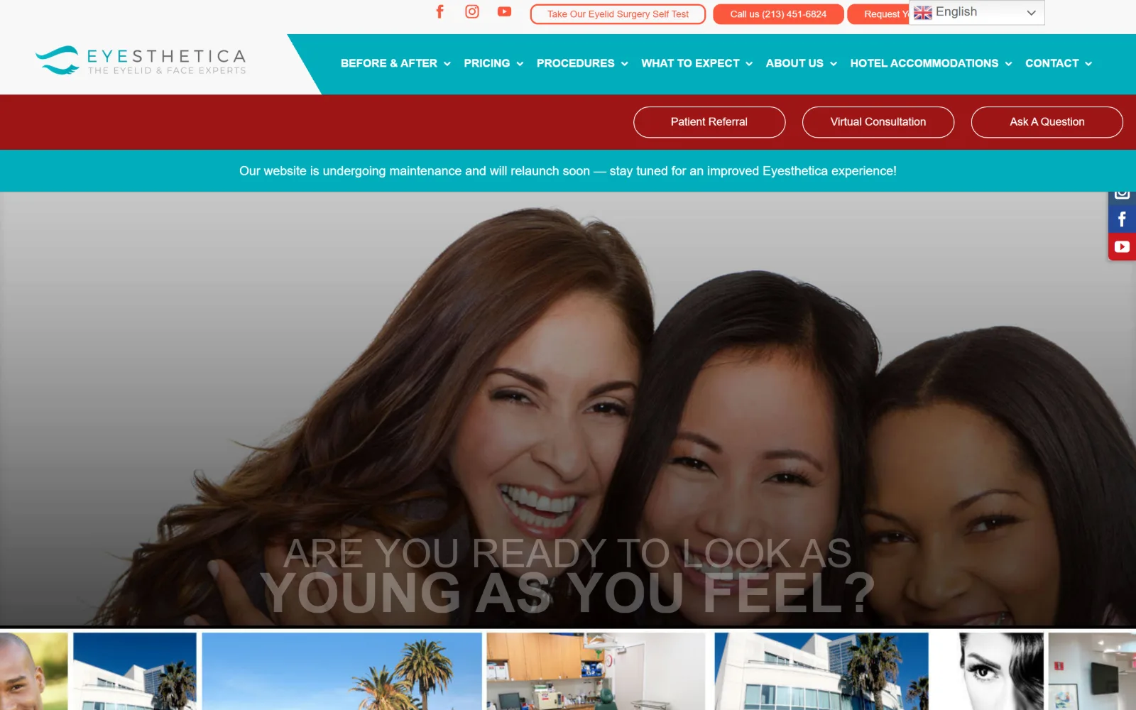
eyesthetica.com
Teal nav band, a red button row and a maintenance notice sit above a greyed hero of three women laughing, headline caps overlapping mid-fade.
Type
Lato 70px bold, 0.34 leading
Body
Lato 16px/1.44, weight 500
Build
four stacked bands over full-bleed hero, fixed social rail, 10px radius
Made on
WordPress
Colour
#01adbc #fc583d #f8f8f8
Type. Lato at every size, with the headline at 70px bold on a 0.34 line height that pulls the two caps lines almost on top of each other, and a 50px regular step above it. Body runs at 16px weight 500 on 1.44 leading, nav at 14px bold uppercase. The crushed leading is what causes the overlap visible in this capture.
Colour. Four strong colours compete: a teal #01adbc across the nav band, a deep red on the button row, an orange-coral #fc583d on the primary button, and white and #f8f8f8 behind the content. Three of those are at full saturation, which is why no single element reads as the accent.
Layout. Four stacked horizontal bands before the hero even starts: social and utility row, teal nav, red CTA row, then a teal notice strip. The hero photograph runs full bleed beneath them with a thumbnail strip below, and a vertical social rail is fixed to the right edge. Buttons are rounded at 10px.
The ask. Seven asks sit above the hero: a self-test, a phone number, a request link, patient referral, virtual consultation, ask a question and the nav itself. Request Your Appointment takes the coral fill, but it is cropped by the language selector in this frame.
Stacking four full-width bands before the hero forces every CTA to compete at the same weight, and a crushed line height makes it worse.
How these were chosen
Every practice here works on the face, the eyes or the hands: facial plastic, oculofacial, craniofacial and hand surgery, with no body work in the set. That narrows what the design has to do, and it shows. Fourteen of the sixteen lead with a single photograph or video and lay the type straight over it, because a face is the proof and a cropped portrait carries a hero on its own. The pattern that does not hold is the accent colour. Half of these pages run on neutrals and borrow every hue from the image; the rest commit to teal, purple, blush or orange and build the button from it. Sites that bleed before-and-after sliders across the fold were left out, as was any frame that failed to load. If you are judging plastic surgery website design, watch how many asks sit above the hero: the restrained ones carry one, the crowded ones carry seven.
Finding facial plastic surgery sites that someone had actually designed took far longer than it should have. 41 candidates made the shortlist. 16 made the page.
Each one was opened and looked at properly: what the type is doing, where the colour gets spent, how the page is built, how it asks for the job. Nothing is here because it ranks. Nothing is here because an agency filed it under portfolio. Several well known names were left out for the plain reason that their site came out of the same template as everyone else's, and a few sites worth including did not survive a second look.
Where a site is only competent, it says so. The order is the order worth your time, best first.
Reviewed and selected by Larry W. Matthews for Websitely.