Dermatology Website Design Across 15 Medical Practices
Fifteen US medical and Mohs practices rather than cosmetic clinics. Dermatology website design that photographs the room and the people in it.
Shown
15 sites
Reviewed
37 candidates
Chosen on
The work, not the ranking
Updated
15 October 2026
01
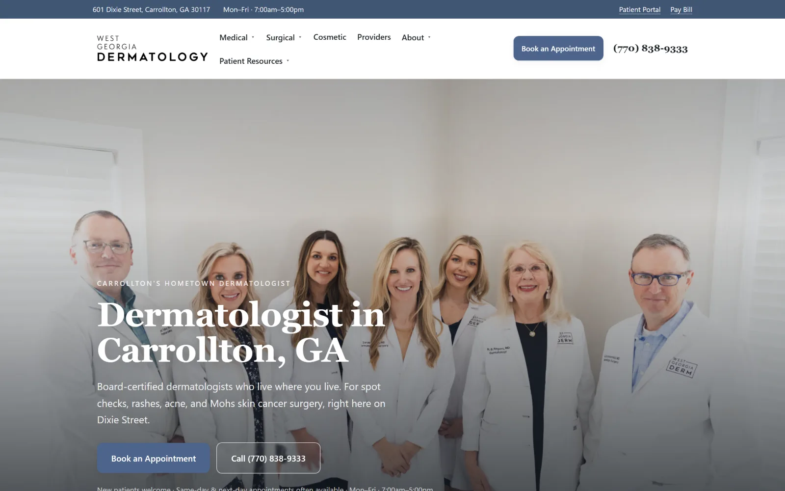
westgaderm.com
A seven-person team in white coats stands against a pale wall behind a serif headline reading Dermatologist in Carrollton, GA.
Type
Fraunces 62px, 550, -0.01em
Body
Inter Tight 19px/1.65
Build
full-bleed team photo, 1140px container
Colour
#faf8f3 #20262b #405674
Type. Fraunces carries the hero at 62px, weight 550, pulled in slightly at -0.01em, and the same face drops to 38px for section heads. Inter Tight handles everything else at 19px with 1.65 leading, and the eyebrow line sits in spaced small caps at 15px. One serif for voice, one grotesque for information, with no third face anywhere.
Colour. Four values do the work: a warm #faf8f3 page ground, #20262b for the header bar and body ink, white reversed out of the hero, and #405674 with #4c648c for links and the booking button. Saturation stays inside that single slate blue, which is why the photograph behind the type reads as the colour event on the page.
Layout. A 1140px container, 79 percent of the viewport, keeps text measures short while the hero photograph runs full bleed behind them. Section padding is 88px, the grids below are four up at 32px gaps and three up at 18px, and nothing is rounded: corner radius is zero throughout, including both hero buttons.
The ask. Two asks sit side by side under the hero copy, Book an Appointment on a blue field and Call (770) 838-9333 outlined in white, and the same pair repeats in the header with the number set in a serif. A utility bar above carries the street address, opening hours, Patient Portal and Pay Bill.
Pair one serif for voice with one grotesque for information, then hold every accent to a single hue so the photograph carries the colour.
02
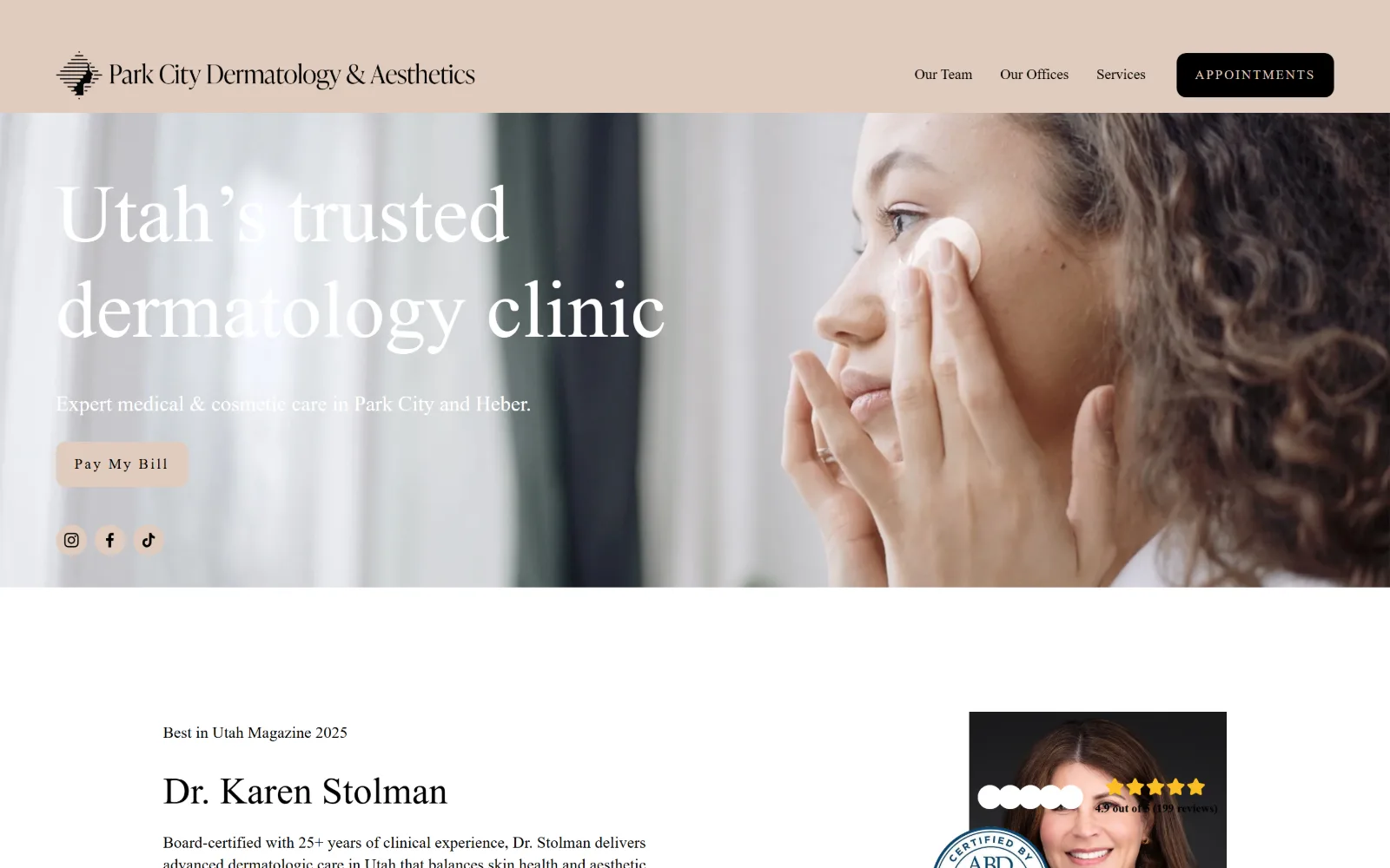
parkcitydermatology.com
A woman applies cream to her cheek in a sunlit room, with an 84px serif line reading Utah's trusted dermatology clinic across the left.
Type
IvyPresto Display 84px/1.18, weight 300
Body
degular-text 17px/1.4
Build
full-bleed hero photo, 1440px fluid grid
Made on
Squarespace
Colour
#757263 #e1ccbe #000000
Type. The headline runs at 84px in IvyPresto Display at weight 300, leading 1.18, with no tracking applied, so the hairline strokes do the work rather than sheer size. Degular Text drops body copy to 17px at 1.4, and the Pay My Bill button sets 13px at 0.15em, a deliberate jump in tracking that marks small type as a label.
Colour. Four muted values: a #757263 olive-grey ground, #e1ccbe sand across the header band and in button text, black for body ink and button fills, white for hero type. The accent is the sand, and it shows up only in that header band and in small type, so nothing on screen competes with the photograph.
Layout. Squarespace's 26 column fluid grid at 11px gutters, a full 1440px container and 117px section padding. The hero photograph is full bleed under a sand header band, the headline is set hard against the left margin, and a 10px button radius is the only softened corner on an otherwise square page.
The ask. Appointments sits in a black box at top right and is the only booking ask above the fold. The single hero button underneath the headline reads Pay My Bill, an unusual choice: it serves existing patients, and new ones are sent back up to the header. Three social icons follow below it.
A display serif at 84px in a light weight reads as confidence rather than volume, as long as every accent around it stays desaturated.
03
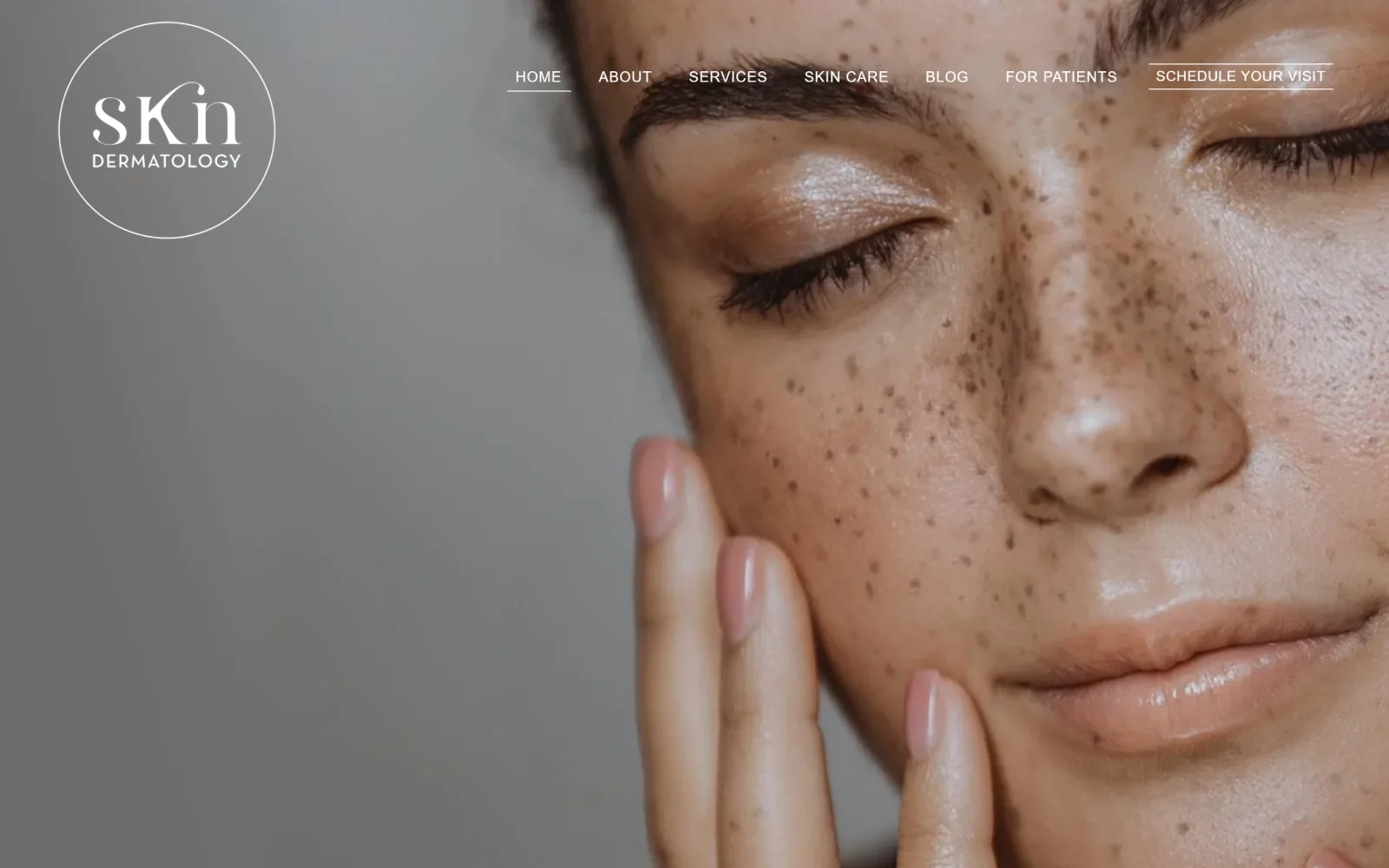
skndermatology.com
A full-bleed close-up of a freckled face fills the frame, with a circular SKN wordmark at top left and a thin uppercase nav across the top.
Type
circular logo lockup, display serif
Body
Neutra Text TF 15px, 0.05em caps
Build
full-bleed portrait, 1440px, 26 col grid
Made on
Squarespace
Colour
#ffffff #afafaf #313e54
Type. Only three sizes appear above the fold. The nav sets 15px uppercase at 0.05em in Neutra Text TF, a geometric face with a tall x-height, the Schedule Your Visit link matches it at 14px with a hairline underline, and the circular lockup sets the practice name in a contrasting display serif. There is no headline at all.
Colour. Two values carry the whole view: white type over a grey studio backdrop measured at #afafaf. No accent colour appears anywhere above the fold, which leaves the skin tones in the photograph as the only saturation on screen. For a practice whose subject is skin, that is the correct thing to spend the colour budget on.
Layout. A full 1440px container on Squarespace's 26 column grid with zero gutters, so the photograph runs edge to edge with no letterboxing. The header floats over it with no background fill and no dividing rule, corner radius is zero apart from the circular logo lockup, and the page continues for 8214px.
The ask. One ask, Schedule Your Visit, set at the end of the nav and underlined rather than boxed. No phone number, no address, no second button, no banner. The restraint is a real risk, since a visitor who wants to call has to scroll, but it keeps the hero photograph completely unbroken.
When the product is skin, let a full-bleed portrait carry the page and cut the header back to a single underlined link.
04
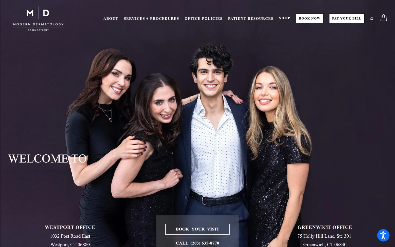
moderndermct.com
Four clinicians in black stand against a deep aubergine backdrop, with WELCOME TO in a white serif low at the left and booking buttons below.
Type
high-contrast serif caps, 44px/1.5
Body
Spectral 18px/1.8
Build
full-bleed group portrait, 26 col grid
Made on
Squarespace
Colour
#000000 #ffffff
Type. The hero sets WELCOME TO at 44px in a high-contrast serif, caps, leading 1.5, spaced loosely enough that the two words read as a label rather than a headline. Navigation and buttons drop to 13px at weight 600 with 0.1em tracking, and Spectral runs body copy at 18px with 1.8 leading, a very open measure for a medical page.
Colour. Two values and nothing else: #000000 and #ffffff, measured at 104 and 198 coverage. The aubergine behind the group is photographic rather than a declared brand colour, which is why the buttons are plain black boxes and white outlines. A palette this narrow puts all the warmth into the photograph.
Layout. Squarespace's 26 column grid at 11px gutters, 1440px full-width container, 133px section padding and zero radius on every button. The hero photograph runs full bleed with a sticky header over it, and the band at the bottom splits into Westport and Greenwich address blocks either side of a centred booking stack.
The ask. Four asks compete above the fold: BOOK NOW and PAY YOUR BILL in the header, then BOOK YOUR VISIT and CALL (203) 635-0770 stacked over the photograph, plus a shop cart icon. The two office addresses flank them, so the fold doubles as a contact card for a two-location practice.
Black and white only, with the colour left entirely to the photograph, stops a four-button fold from reading as clutter.
05
washingtonsqderm.com
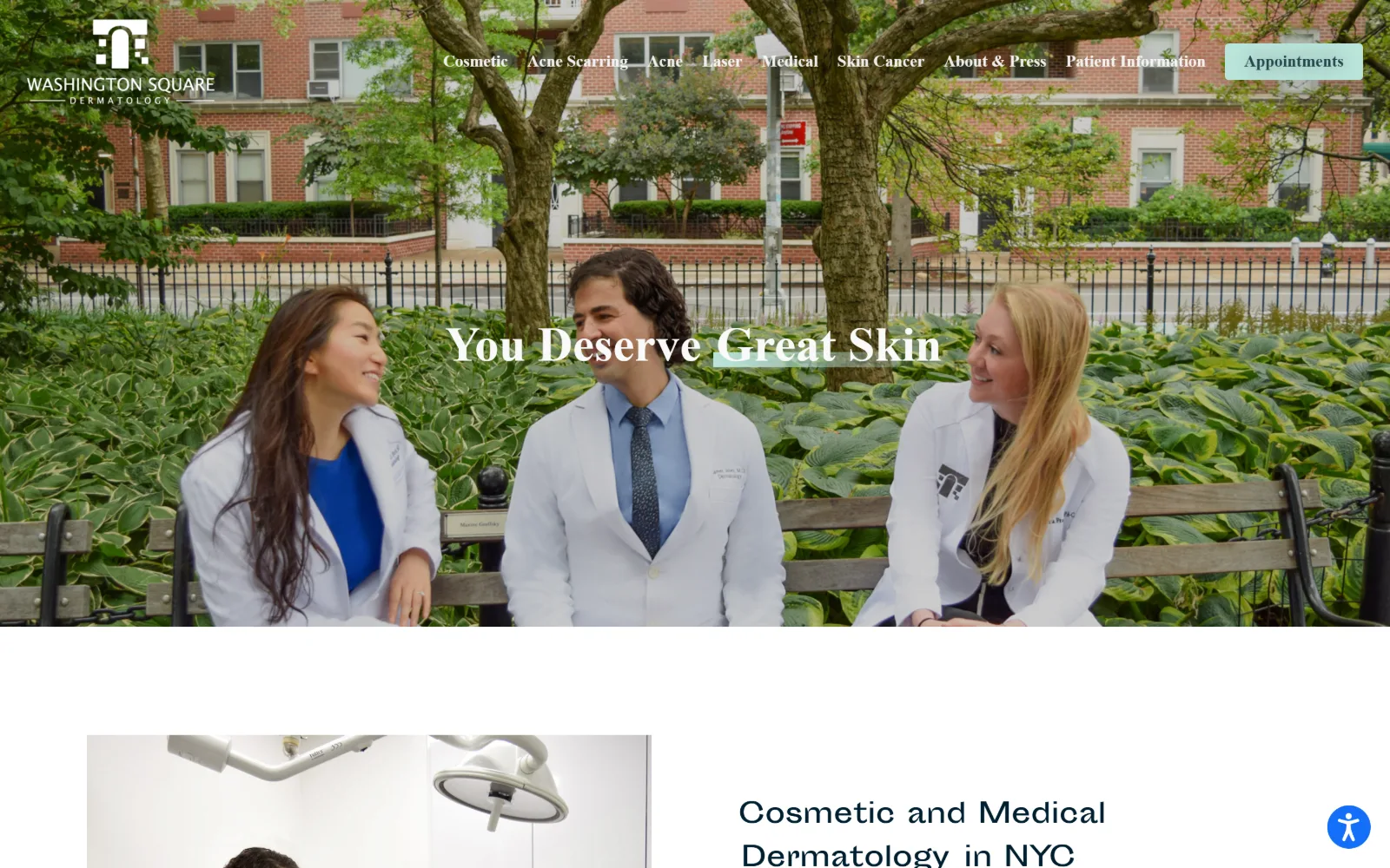
Three clinicians in white coats sit on a park bench under trees, with You Deserve Great Skin in a white serif centred across them.
Type
serif 50px, leading 0.68
Body
Montserrat 19px/1.79
Build
full-bleed hero video, 1440px
Made on
WordPress
Colour
#000000 #eaeaea #001f30
Type. The headline sets at 50px with leading crushed to 0.68, one line of a high-contrast serif with a pale mint highlight under two of its words. Nav items run 17px at weight 600 and body copy 19px with 1.79 leading. That leading figure is the giveaway: this type was set to sit on a photograph, not to wrap.
Colour. Three values dominate: #000000, #eaeaea as the body ground and white. Body ink is #001f30, a near-black navy rather than true black, and the only accent is the mint highlight behind two hero words, repeated in the Appointments button. Everything else is greyscale, so the mint reads as emphasis.
Layout. A 1440px full-width container with no grid declared. The hero video runs full bleed under a header that has no fill, and the band below drops into a two-up of a treatment room photograph and a heading. Corner radius is zero everywhere, and the page runs 9155px deep.
The ask. A single Appointments button in pale mint sits at the end of a nine-item nav, and that is the whole ask above the fold. The nav is doing the conversion work instead, listing Cosmetic, Acne Scarring, Acne, Laser, Medical and Skin Cancer as separate entry points rather than funnelling everyone into one form.
Crushed hero leading at 0.68 only survives on one line; pair it with a greyscale palette and let a single highlight carry the emphasis.
06
lmmedicalnyc.com
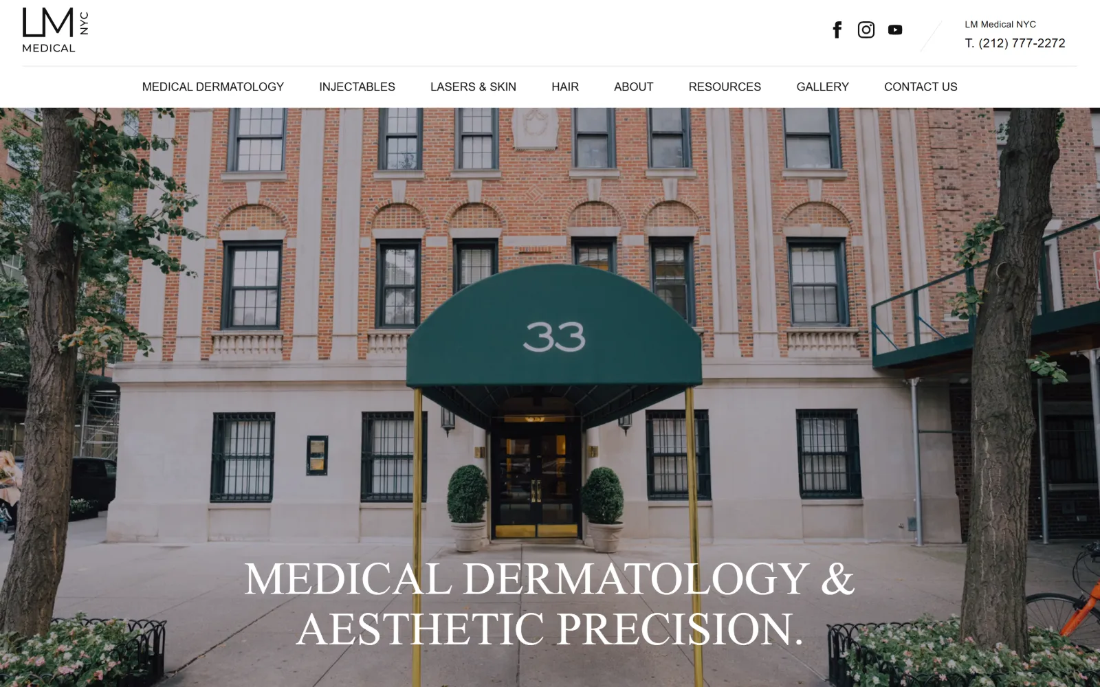
A green awning over a townhouse entrance fills the frame, with MEDICAL DERMATOLOGY & AESTHETIC PRECISION in white caps across the bottom.
Type
high-contrast serif caps, 60px/1.10
Body
Montserrat 16px, 0.02em
Build
full-bleed hero video, 1440px container
Made on
WordPress
Colour
#f0f0f0 #ffffff #111111
Type. The hero line sets at 60px, uppercase, leading 1.10, in a high-contrast serif with sharp unbracketed serifs that the measured font stack does not account for. Everything else, nav at 15px and the phone line at 16px with 0.02em tracking, is a plain grotesque. One expressive face, one neutral face, no middle tier at all.
Colour. Effectively two values, #f0f0f0 and white, with #111111 ink. No brand accent is declared anywhere. The green of the awning and the gold of the door frame are photographic, and because the chrome around them is colourless, those two notes end up reading as the practice's colours without ever being set in CSS.
Layout. A 1440px full-width container with 75px section padding, a two-up 675px grid below the fold and a four-up at 330px. The header is a thin white bar with the logo at left and social icons and phone at right, sitting above the hero footage rather than over it. Corner radius is zero throughout.
The ask. The phone number, (212) 777-2272, is the primary ask and sits in the header beside the practice name; there is no booking button above the fold at all. Eight nav items split the work into Medical Dermatology, Injectables, Lasers & Skin and Hair, doing triage that a single button cannot.
Declaring no accent colour lets a photograph's own palette brand the page, as long as the surrounding chrome stays strictly neutral.
07
idahodermatology.com
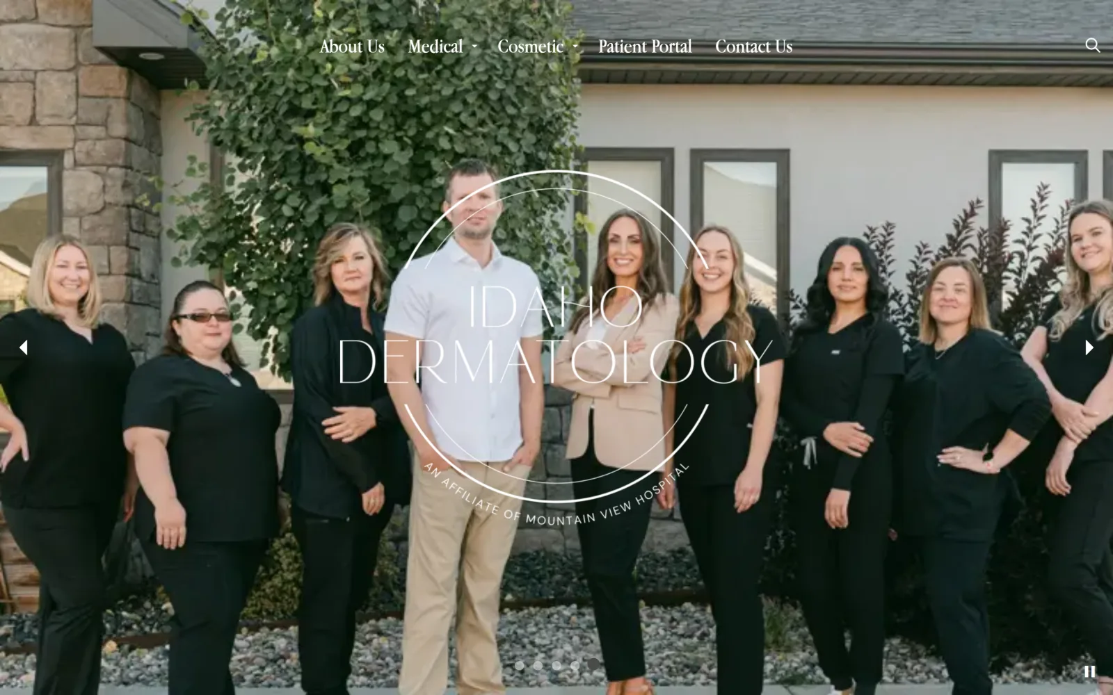
Nine staff members in black scrubs stand outside a stone and stucco clinic, with a thin circular IDAHO DERMATOLOGY monogram over the centre.
Type
light serif monogram, stretched caps
Body
serif 26px, -0.006em
Build
full-bleed photo slider, 1440px
Made on
Framer
Colour
#dfdcd5 #9f755f #4b4b4b
Type. Everything above the fold is one face: a light serif at 26px for nav items and 20px beneath, tracking pulled in marginally at -0.006em. The circular monogram stretches those same letterforms wide across two lines. No bold weight appears anywhere, and that is what keeps a nine-person group photograph from reading as corporate.
Colour. A warm grey #dfdcd5 body ground carries the page, with #9f755f tan as the accent and #c4bdaf in small type. Ink is #4b4b4b rather than black, and white appears only in the hero overlay. Four low-saturation values, all inside a stone and clay range lifted from the building behind the team.
Layout. Built in Framer at a full 1440px container with 60px section padding and a sticky header that floats over the photograph with no fill behind it. The hero is a slider running full bleed with arrows at both edges and a pause control at bottom right, and the page continues for 7991px below.
The ask. No booking button and no phone number appear above the fold; five nav items and a search icon are the entire ask. Patient Portal does double duty as the practical entry point for existing patients. The slider's pause control is the only other interactive element competing with the nav.
Set a whole fold in one light serif at two sizes and a staff photograph starts reading as the brand rather than as stock.
08
brooklyn-dermatology.com
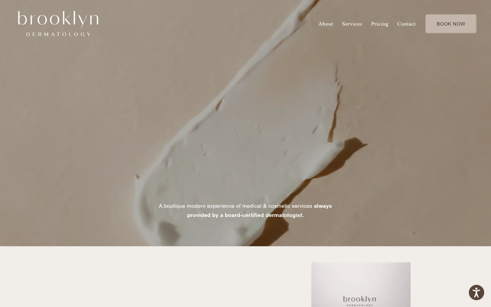
A close crop of cream smeared across a taupe surface fills the hero, with a lowercase brooklyn wordmark top left and a sand BOOK NOW button.
Type
light serif wordmark, lowercase
Body
Helvetica Neue 16px/1.7
Build
full-bleed hero photo, 1440px, 26 col
Made on
Squarespace
Colour
#3a342c #f1ede9 #c4b7aa
Type. The wordmark sets lowercase in a wide light serif with DERMATOLOGY tracked far out beneath it, and that pairing repeats on the product tin further down the page. Lora at 16px with 0.03em handles headings, Helvetica Neue at 16px with 1.7 leading handles body, and a 10px label line sits at 0.3em tracking.
Colour. Four values: #3a342c as a warm near-black, #f1ede9 as the off-white band under the hero, white, and #c4b7aa at 0.3 percent coverage, which is the BOOK NOW button and nothing else. The accent occupies the smallest surface on the page, and it is the only thing the eye settles on.
Layout. Squarespace's 26 column grid with zero gutters, a 1440px container and 139px section padding. The hero photograph runs full bleed with a sticky header over it; the button carries a 6px radius while everything else stays square. The page is short at 3447px, which suits a four-item nav.
The ask. One button, BOOK NOW, in sand at the top right, over a four-item nav that includes Pricing, which most dermatology practices bury. Nothing else asks for anything above the fold: no phone number, no form, no promotional banner. A single positioning line sits centred low over the photograph.
Give the accent colour to one small button and nothing else, and a four-item nav outperforms a header packed with options.
09
mountainwestdermatology.com
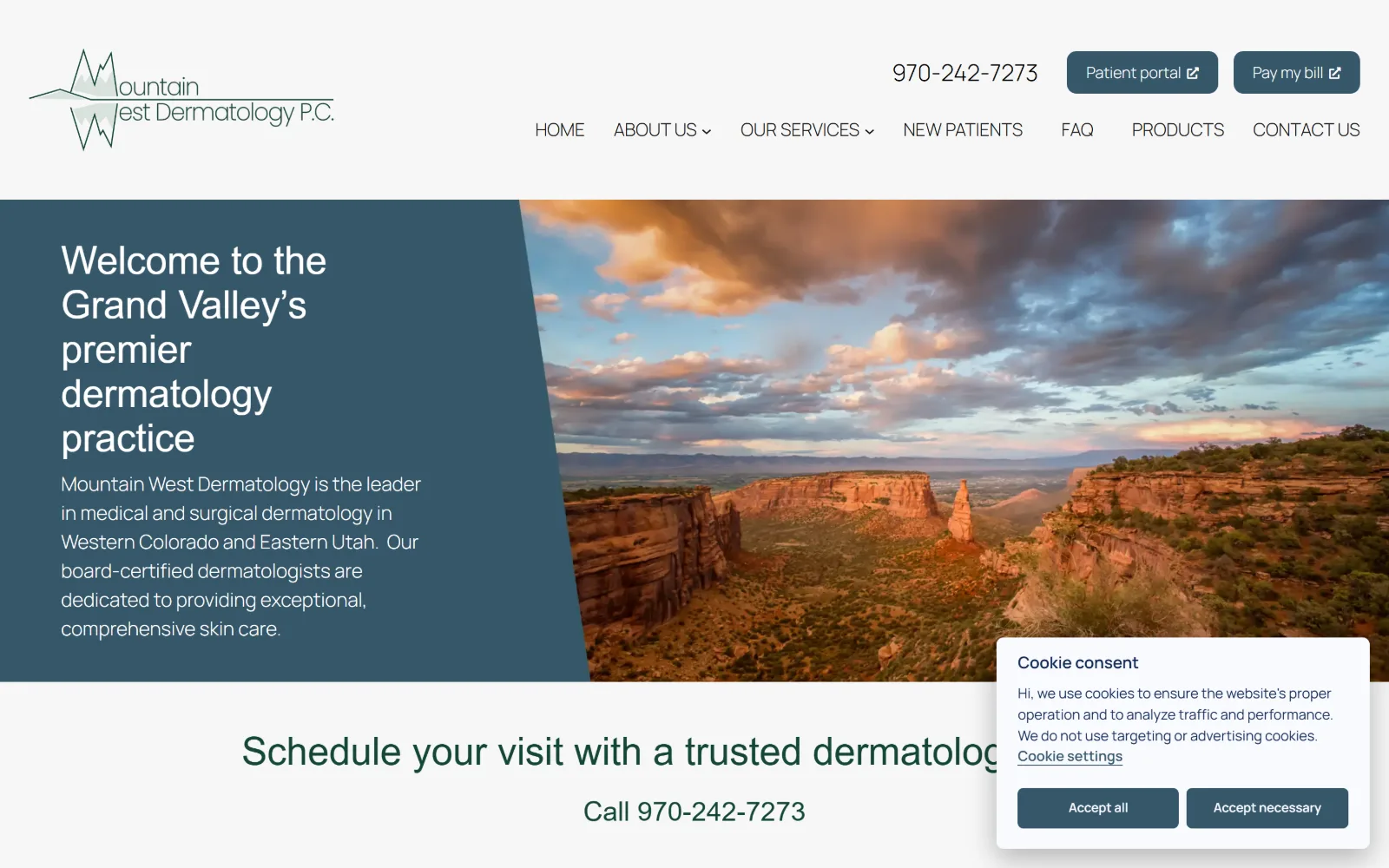
A slate panel holding a welcome headline meets a sunset canyon photograph along a diagonal edge, with a cookie card over the lower right.
Type
Raleway 40px, -0.003em
Body
Manrope 20px/1.5, weight 300
Build
diagonal panel split, 1440px
Made on
WordPress
Colour
#f7f7f7 #36576a #144736
Type. Raleway sets the display at 40px with tracking at -0.003em and steps down to 28px and 24px, while Manrope carries body and nav at 20px and 18px, weight 300, leading 1.5. The nav is uppercase and the headline is not, and the weight stays light throughout, which stops a 40px headline from crowding its panel.
Colour. A #f7f7f7 page ground with #eeeeee section bands, #36576a slate for the hero panel and #144736 green for the headings beneath it. Two cool hues rather than one, with the canyon photograph supplying the orange that neither of them covers. Ink is #111111, and no third accent is introduced below the fold.
Layout. The structural move is the diagonal: the slate panel takes the left 42 percent and cuts across the photograph at an angle instead of meeting it on a straight vertical. Full 1440px container, no declared grid, zero radius, and the band below centres a scheduling line and phone number across the full width.
The ask. Patient portal and Pay my bill sit as the two header buttons with the phone number set large beside them, and a Schedule your visit line repeats that same number directly under the hero. Three asks, two of which are the same number, so the page is effectively asking for a call.
An angled edge between a colour panel and a photograph gives a stock landscape a structure that a straight vertical split cannot.
10
rendermatology.com
A bright reception desk with REN lettering on the back wall sits behind a translucent white panel carrying an all-caps line and a black button.
Type
ITC Avant Garde Gothic 50px, 0.06em caps
Body
Futura PT 16px, 0.063em
Build
full-bleed photo, floating white panel
Made on
WordPress
Colour
#f2ece1 #241f1c #ffffff
Type. ITC Avant Garde Gothic Pro at 50px, weight 300, uppercase, tracked out to 0.06em with 1.5 leading, so the headline occupies two full lines of air. Futura PT handles the nav at 16px with 0.063em and the button at 20px pushed to 0.15em. A single geometric sans family, differentiated by tracking alone.
Colour. Three values: #f2ece1 cream at the highest coverage, white and black. Ink is #241f1c rather than pure black, which softens the body copy by a shade. No accent hue exists at all, so the black button is the only hard contrast on a page otherwise built from cream and photographic neutrals.
Layout. A 1440px full-width container with the logo centred and the nav split five items left, five right, an arrangement that costs header height but reads as a masthead. The hero photograph runs full bleed with a translucent white panel floating over its lower half. Corner radius is zero everywhere.
The ask. SCHEDULE YOUR APPOINTMENT in a black box is the single ask inside the hero panel. The competing paths all sit in the nav, Deal Days, Shop and Spa among them, and no phone number appears above the fold, which pushes every visitor toward that one button.
Differentiate one geometric sans by tracking alone, 0.06em in the headline against 0.15em in the button, instead of adding a second face.
11
childrensdermatology.com
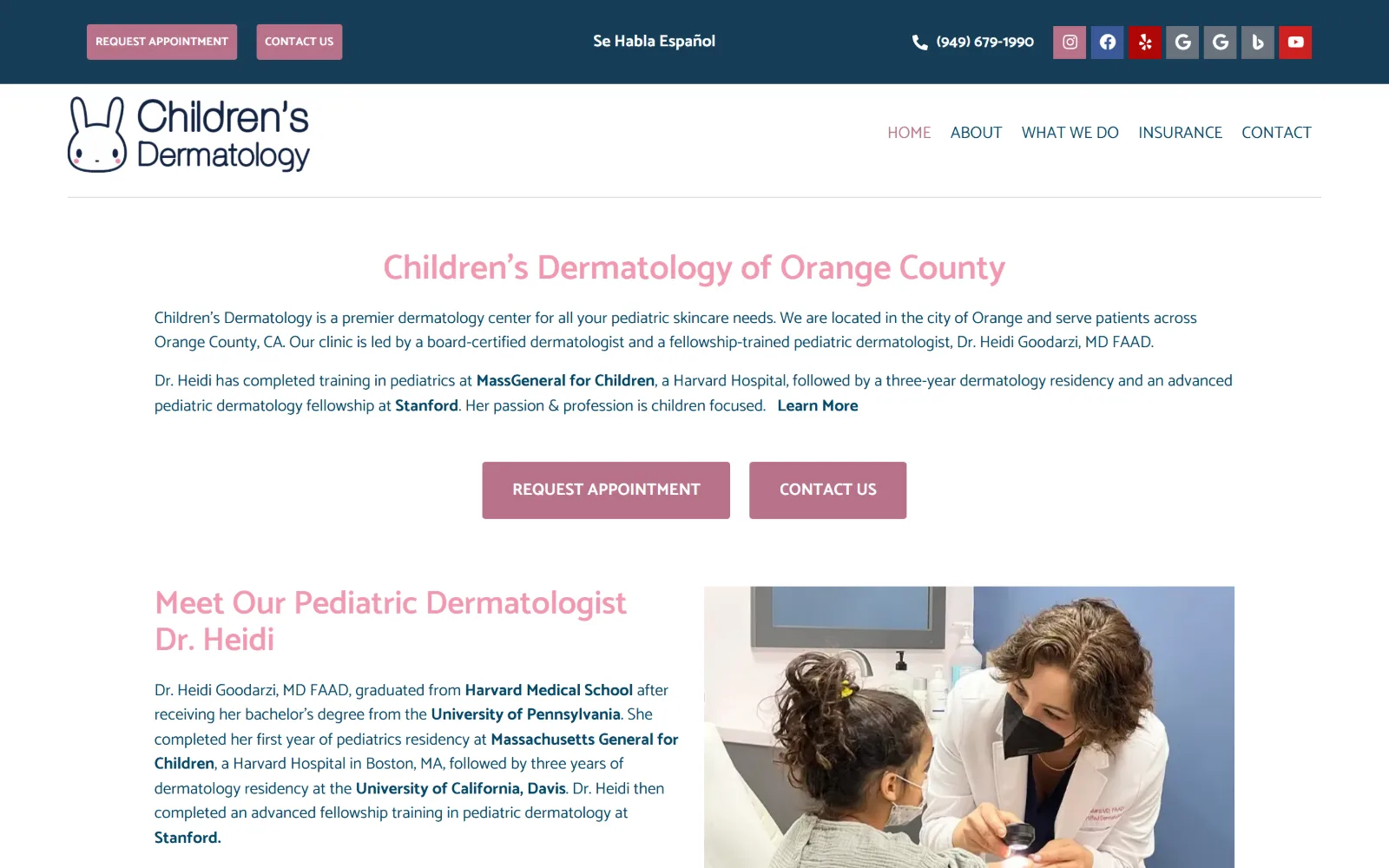
A cartoon rabbit logo sits beside a pink headline on white, with two rose buttons centred and a clinician examining a child photographed below.
Type
Catamaran 36px, weight 600
Body
Catamaran 17px/1.5
Build
centred column, 1440px, navy utility bar
Made on
WordPress
Colour
#044667 #b8728a #ffffff
Type. Catamaran does everything here: 36px and 34px at weight 600 for headings, 17px at 1.5 leading for body, 12px bold uppercase for buttons. The headline is set in the same rose as the section titles rather than in ink, which is a risk at 36px, and it holds because the paragraph under it is a solid #044667 navy.
Colour. Six values are measured but three matter: a white ground, #044667 navy for all body copy, and #b8728a rose for headings and buttons. The navy utility bar across the top anchors the rose, which would otherwise read as purely decorative. Saturation sits entirely inside that one pink.
Layout. A full 1440px container with no declared grid and only two flex rows: a navy utility bar carrying phone, a Spanish-language note and seven social icons, then a centred text column, then a two-up of copy and photograph. The page is short at 3334px and buttons carry a 3px radius.
The ask. Five asks sit above the fold. REQUEST APPOINTMENT and CONTACT US appear twice, once small in the utility bar and again as large centred buttons, with the phone number set beside them. The duplication suits a parent arriving mid-task, though it does halve the weight of each.
A pink carrying headings and buttons needs a dark navy under the body copy, or the page reads as decoration instead of a clinic.
12
happyskindermatology.com
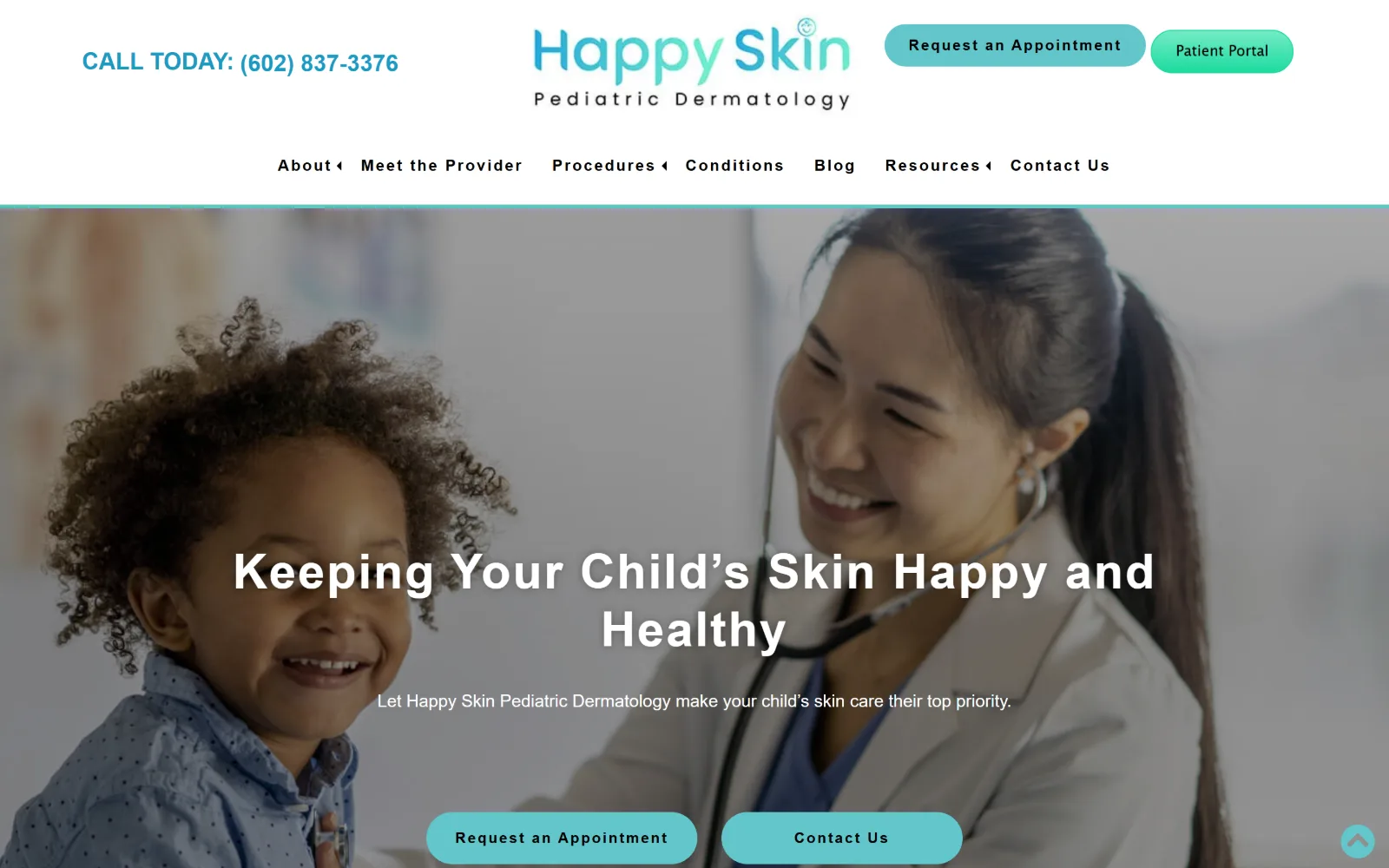
A smiling toddler and a clinician with a stethoscope fill the hero photograph, with a white headline and two rounded teal buttons centred over it.
Type
Poppins 50px, 700, 0.04em
Body
Poppins 18px/1.6
Build
full-bleed hero photo, two-row header
Made on
WordPress
Colour
#62c6cc #e1f7f3 #333333
Type. Poppins at 50px, weight 700, tracked out to 0.04em for the hero, stepping through 40px and 24px, with 18px at 1.6 leading for body copy. The button label sets 15px bold at 0.133em, far looser than the headline, so the small type reads as a deliberate label rather than as a shrunken heading.
Colour. Three values: white, #e1f7f3 as a pale mint band and #62c6cc teal across both buttons and the logo gradient. Ink is #333333 rather than black. The teal is the only saturated colour on the page and it appears twice above the fold, in the Patient Portal pill and in the hero buttons.
Layout. A 1440px full-width container with the logo centred and the phone number set opposite it, then a second row carrying seven nav items. That two-row header spends roughly 230px before the photograph starts. The hero runs full bleed, and the buttons carry a 35px radius, the roundest in this set.
The ask. Four asks compete: Request an Appointment and Patient Portal in the header, then Request an Appointment again and Contact Us over the photograph, with the phone number set large at top left. Repeating the primary button is the clearest signal of what the practice actually wants.
Fully rounded buttons and one saturated teal read as pediatric without resorting to cartoon type or primary colours.
13
dermatologyandmohs.com
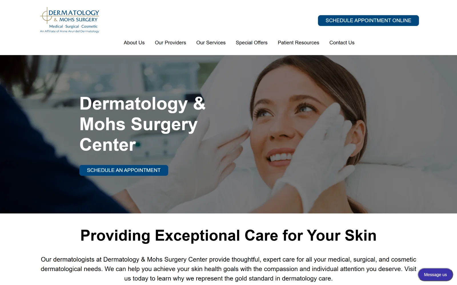
A gloved clinician examines a smiling patient's cheek in a treatment chair, with a three-line white headline and a blue button over the photograph.
Type
Roboto 56px, 700, 1.16
Body
Roboto 20px/1.5
Build
full-bleed hero photo, 1200px container
Made on
WordPress
Colour
#00467f #ffffff #000000
Type. Roboto at 56px, weight 700, leading 1.16 for the hero and 48px for the section head beneath it, with 20px body at 1.5. No tracking adjustment anywhere and no second typeface. It is the default pairing, and the page earns it back through size contrast rather than through any styling of the letterforms.
Colour. Two values carry the page: white and #00467f navy, which fills both buttons and sits in the logo. Body ink is plain black. There is no secondary accent, no tint band and no grey panel, so the navy is unmistakably the action colour everywhere it appears, including the chat tab.
Layout. A 1200px container at 83 percent of viewport, narrower than most of this set, with 42px section padding and a two-column 418px and 700px grid at an 82px gap below the fold. The hero photograph is full bleed. Buttons carry an 8px radius and the header stacks logo and CTA above a centred six-item nav.
The ask. SCHEDULE APPOINTMENT ONLINE sits top right in navy, SCHEDULE AN APPOINTMENT repeats over the photograph, and a Message us chat tab floats at the lower right. Three asks, two of them identical in wording, and no phone number anywhere above the fold.
A default system sans is defensible when size contrast does the work: 56px against 20px, one accent colour, nothing else styled.
14
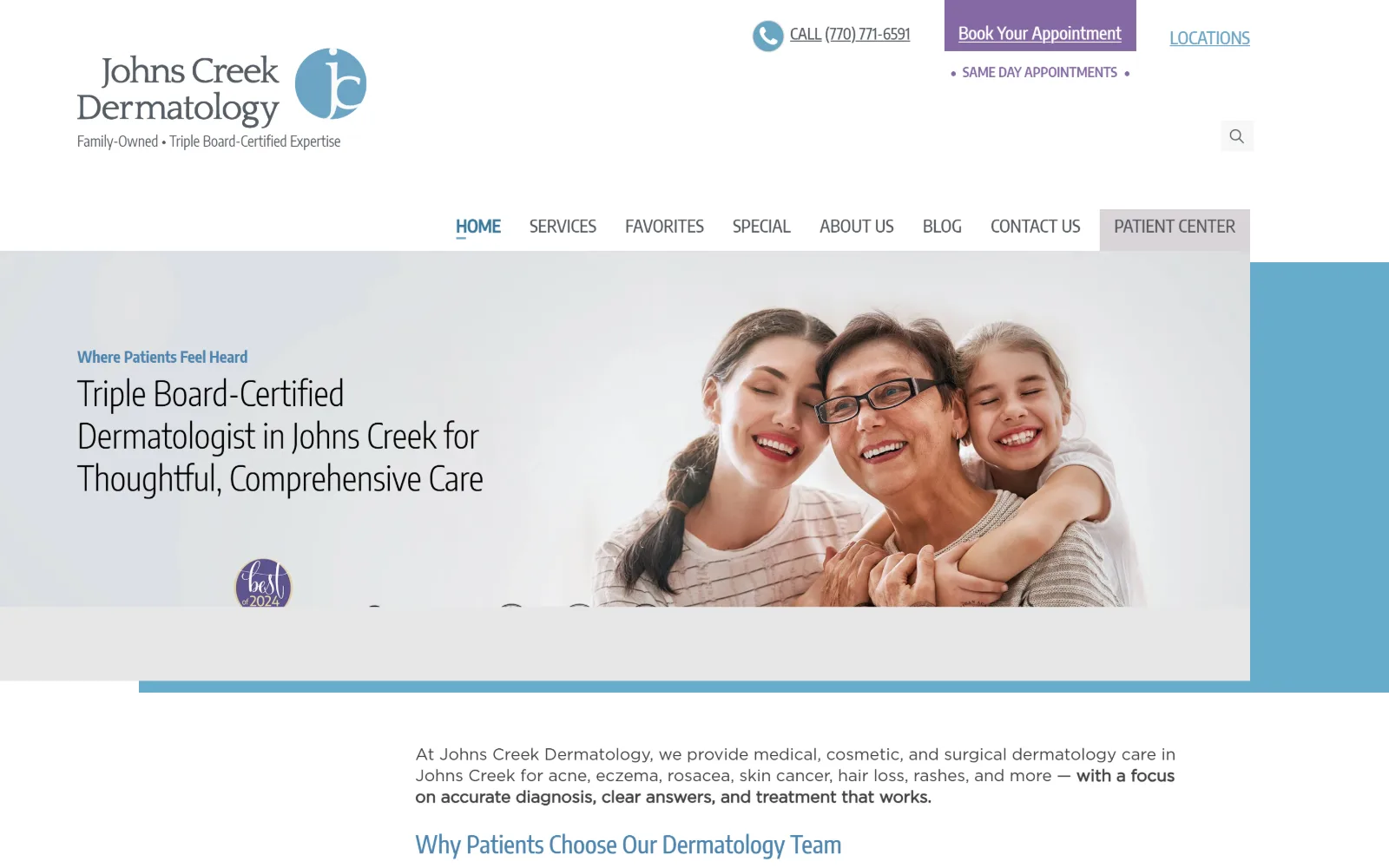
johnscreekdermatology.com
A family of three embrace in a soft-lit photograph beside a condensed headline, with a blue block and a Best of 2024 badge at the right edge.
Type
Encode Sans Condensed Light 35px
Body
Gotham Book 17px/1.29
Build
inset hero panel, 1300px container
Colour
#8469a3 #414141 #e6e6e6
Type. Encode Sans Condensed Light sets the headline at 35px across three lines, with Gotham Book at 17px and 1.29 leading for body. Condensed display against a wider body face is an unusual direction and it pays off here because the headline is long: eleven words fit across three lines without any reduction in size.
Colour. Measured coverage is thin because the view is mostly photograph and white: #e6e6e6 grey, #8469a3 purple on the booking button and the award badge, and #d9d4d7. Body ink is #414141. The purple appears exactly twice, and a blue block at the right edge is the only other saturated element.
Layout. A 1300px container at 90 percent of viewport. The header stacks three rows, logo and CTA, then a search field, then a nine-item nav, so the hero band does not begin until roughly 290px down. The hero itself is an inset panel with a blue block protruding at the right, not a full-bleed image.
The ask. Book Your Appointment in purple, the phone number underlined beside it, LOCATIONS at the far right and a SAME DAY APPOINTMENTS line under the button. Four asks inside one 180px band, which is crowded, though the live underlined phone number is still the strongest single signal there.
A condensed display face buys room for a long, specific headline, which outperforms a short generic one at the same column width.
15
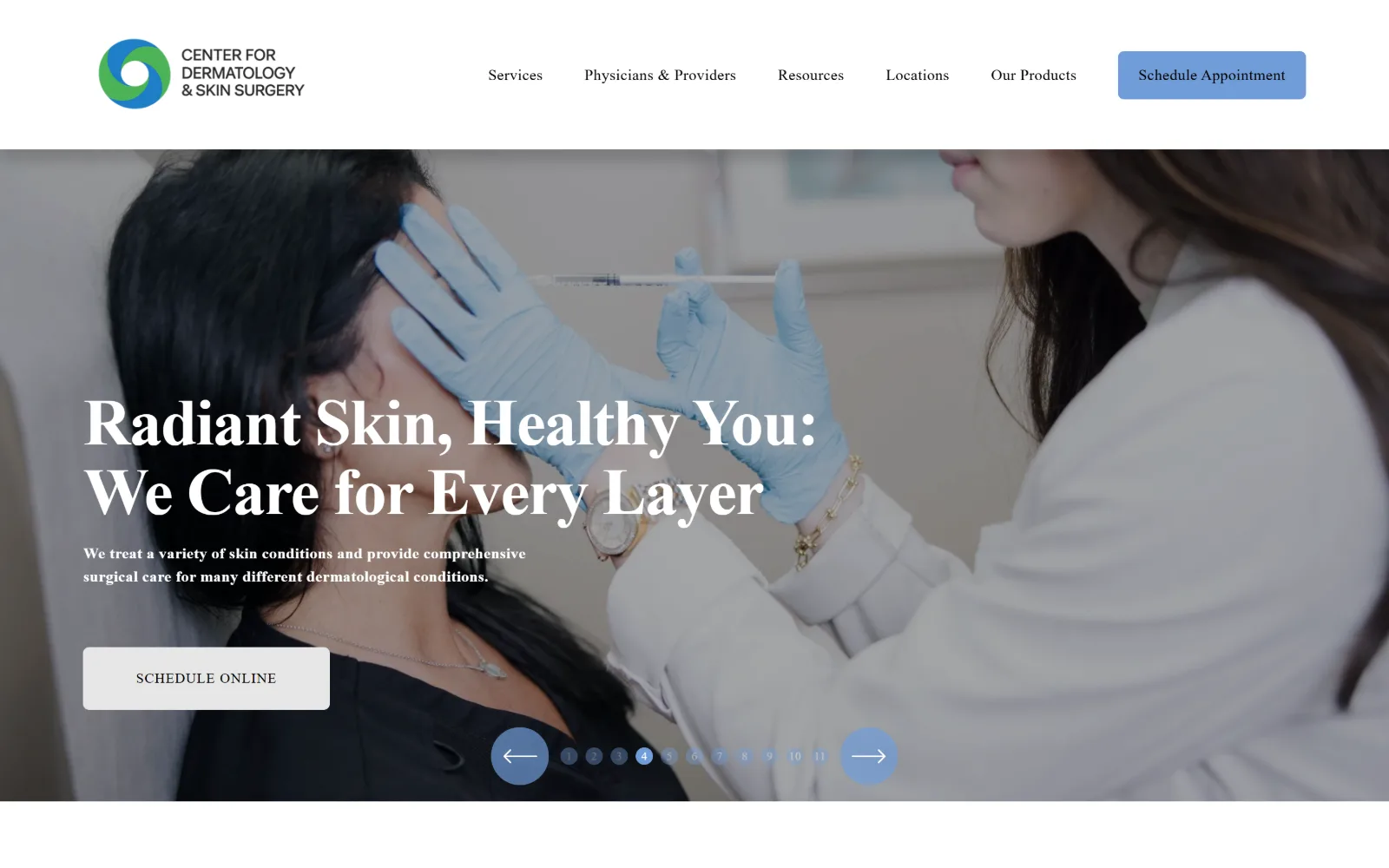
centerfordermatologynj.com
Blue-gloved hands guide a syringe toward a reclining patient, with a large serif headline, a grey Schedule Online button and eleven slider dots.
Type
Adobe Caslon Pro, -0.02em
Body
Open Sans 16px/1.5, 0.02em
Build
full-bleed hero slider, 1440px, 26 col
Made on
Squarespace
Colour
#000000 #719dd9 #e6e6e6
Type. Adobe Caslon Pro sets the hero at 33px measured, though it renders far larger on screen, with tracking pulled to -0.02em and a bold caption line beneath it. Open Sans handles nav, body and buttons at 16px with 0.02em and 1.5 leading. The serif does all the voice work and the sans never rises above 16px.
Colour. Four values: black at very high coverage because the hero photograph dominates, white, #e6e6e6 for the hero button fill, and #719dd9 on the Schedule Appointment button and the slider controls. That blue also sits in the logo mark, so the one saturated hue ties the chrome back to the brand.
Layout. A 1440px container with 155px section padding and three-up grids at 20px gaps below the fold. The header is a solid white bar above a full-bleed hero slider, whose eleven numbered dots and two circular arrows sit centred at the bottom edge. Buttons carry a 6px radius.
The ask. Schedule Appointment in blue at top right, SCHEDULE ONLINE in grey over the photograph, and eleven slides each carrying their own message. The slider is the real problem: a visitor sees one of eleven, and the hero ask can change underneath them before they have read it.
An eleven-slide hero means ten of your messages go unseen; if a headline matters, make it static and move the rest down the page.
How these were chosen
These fifteen are medical, surgical, Mohs and pediatric practices rather than cosmetic storefronts, which rules out most of what passes for dermatology website design: no body contouring offers, no before-and-after slider sitting in the hero. What holds across the set is restraint with colour. Most of them run two or three values and let the photograph supply every other hue, and two declare no accent at all. What does not hold is the type. There is no shared convention here: an 84px display serif in Park City, a condensed light sans in Johns Creek, a 50px geometric separated from its own buttons by tracking alone in Franklin, and a plain Roboto pairing in Annapolis that works purely on size contrast. The builds at the top are mostly Squarespace, handled closely enough that they read as one designer's work rather than a template, which is why they rank where they do.
Finding dermatology sites that someone had actually designed took far longer than it should have. 37 candidates made the shortlist. 15 made the page.
Each one was opened and looked at properly: what the type is doing, where the colour gets spent, how the page is built, how it asks for the job. Nothing is here because it ranks. Nothing is here because an agency filed it under portfolio. Several well known names were left out for the plain reason that their site came out of the same template as everyone else's, and a few sites worth including did not survive a second look.
Where a site is only competent, it says so. The order is the order worth your time, best first.
Reviewed and selected by Larry W. Matthews for Websitely.