Law Firm Website Design: 15 Modern Examples (2026)
Almost none of these fifteen firms photograph a lawyer. Law firm website design that hands one sentence the whole fold instead of a slider over a skyline.
Shown
15 sites
Reviewed
30 candidates
Chosen on
The work, not the ranking
Updated
15 October 2026
01
mto.com
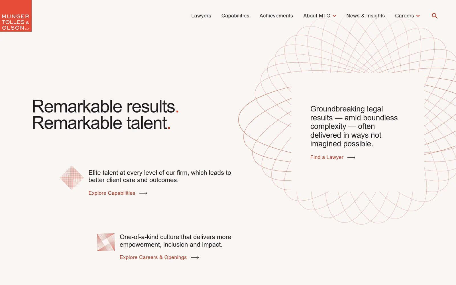
Warm off-white page, a red wire-frame loop drawn at right, and two black sentences each closed by a red full stop.
Type
Neue Haas Grotesk, 56px
Body
Neue Haas Grotesk Display, 24px light
Build
1440px full bleed, two-column hero, no photography
Made on
WordPress
Colour
#f9f6f3 #231f20 #db341f
Type. The headline is Neue Haas Grotesk at 56px, weight 500, tracked in to -0.03em so the two lines lock up tight. Both sentences end on a period coloured #db341f, and that period is the only ornament on the page. Supporting copy drops to 24px at weight 300 and the nav sits at 16px, so the scale jumps from 56 straight to 24 with nothing between. A grotesque this plain only survives when the spacing is this deliberate.
Colour. The field is #f9f6f3, a warm paper white rather than #ffffff, and it covers almost the whole fold. Ink is #231f20, near black but never black. Red #db341f appears exactly three ways: the logo block top left, the two full stops, and the link text. Well under one percent of the pixels, carrying all of the brand.
Layout. Full-bleed 1440px container with the hero split roughly 45/55 between the headline column and the line drawing. Section padding is 50px and no element has a corner radius. Above the fold: the claim, two linked value statements with small spirograph marks, and a 'Find a Lawyer' link sitting inside the drawing itself.
The ask. There is no button anywhere. Four text links with arrows do the work: Find a Lawyer, Explore Capabilities, Explore Careers & Openings, and the nav. Find a Lawyer is the one that matters and it sits in the optical centre of the right-hand drawing. For a firm that does not pitch, this is the correct amount of asking.
One accent colour used three times reads as more expensive than a page covered in brand colour.
02
cravath.com
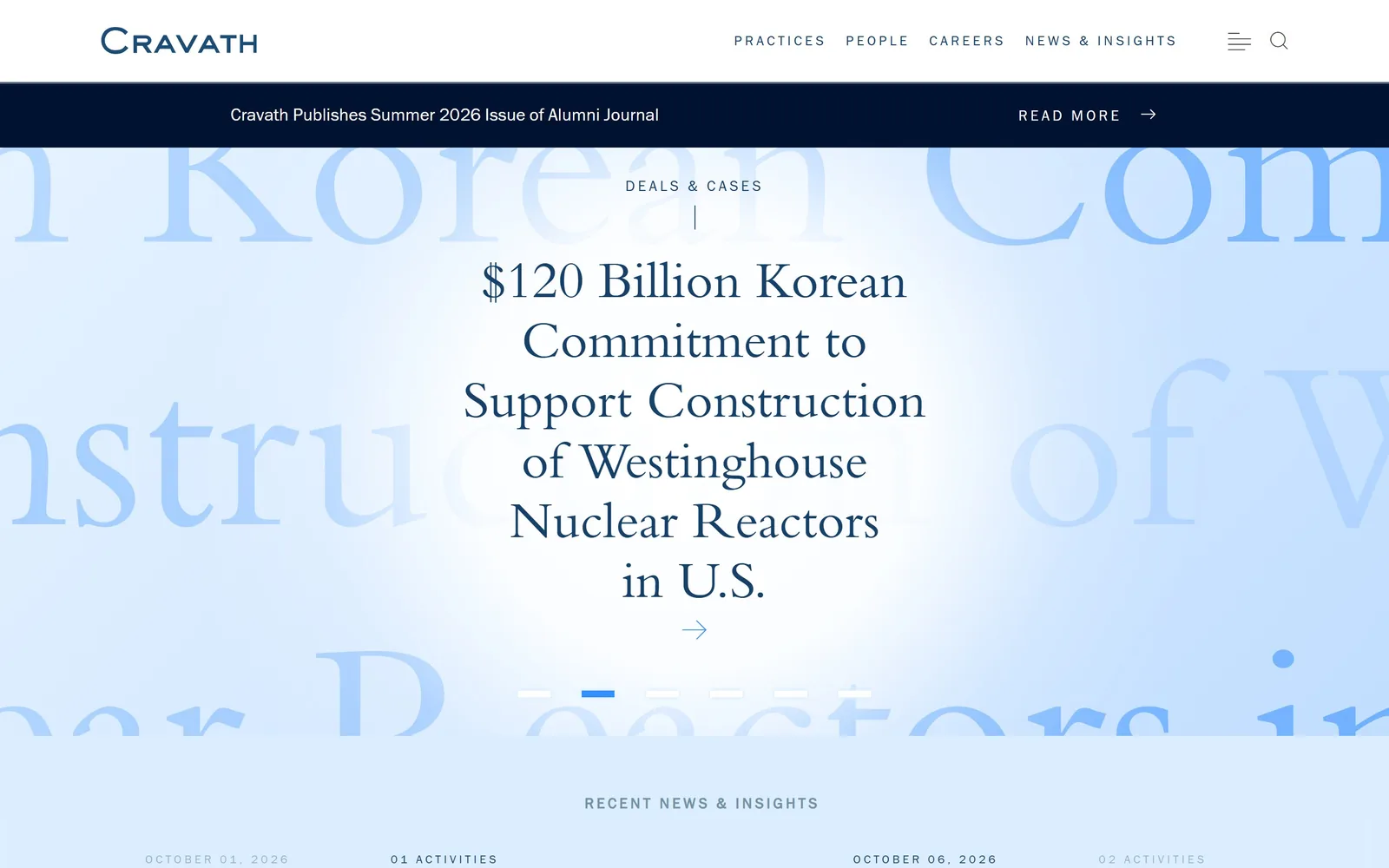
A navy serif deal headline floats over giant pale-blue words from the same sentence, blown up and bled off both edges.
Type
Bembo, about 55px, plus 256px ghosted type
Body
Franklin Gothic ITC, 12 to 15px uppercase
Build
centred full-bleed slider, 1440px, no imagery
Made on
custom build
Colour
#dbeeff #15406a #348ffe
Type. The headline is Bembo or a very close cut, set around 55px in navy across five lines with generous leading. Behind it the same words run at roughly 256px in pale blue, cropped hard by the viewport. Everything else, nav and date stamps, is a condensed gothic at 12 to 15px, uppercase, widely letterspaced. Serif for content, sans for furniture, no third face invited.
Colour. A gradient from #dbeeff into #f2f9ff with a white glow behind the headline, ink at #15406a, and the oversized background type in #348ffe knocked back to near transparent. A black #011230 announcement bar sits between the nav and the hero. Not one warm value anywhere.
Layout. Centre axis for everything, no container rule, the hero running the full 1440 and about 800 tall. Seven slider dots under the headline and 'Recent News & Insights' beginning exactly at the fold line. Zero corner radius, zero cards, zero images.
The ask. The page asks for almost nothing. One arrow under the headline, a 'Read More' on the announcement bar, and the nav. The slider rotates through six deals, so the pitch is the work rather than a form. A firm this old can get away with that. Most cannot.
Setting the same words twice, once to read and once at 256px to look at, turns a text hero into an image.
03
keker.com
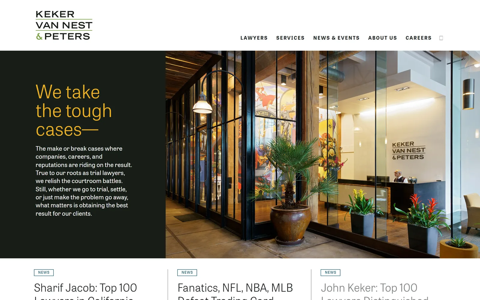
Dark green panel with a yellow three-line headline at left, a photograph of the firm's own lobby filling the right.
Type
tablet_gothic, 56px light
Body
tablet_gothic, 19px
Build
1260px container, 34/66 split hero
Made on
custom build
Colour
#171e17 #f0b11d #ffffff
Type. The headline is tablet_gothic at 56px, weight 300, three short lines in #f0b11d that end on an open dash pulling you into the paragraph. That paragraph is the same family at 19px, white, line height 1.3, in a narrow measure of about eight words. Nav is 15px bold uppercase, tracked out 0.12em. One family covers display, body and nav, separated by weight alone.
Colour. Near-black green #171e17 holds the left of the screen, the photograph carries the warm browns and plant greens on the right, and #f0b11d yellow is reserved for the headline. The logotype repeats that yellow-green in its ampersand. The photo supplies the palette, which is why the flat panel can afford to be this dark.
Layout. 1260px content width, 88 percent of the viewport, hero split 34/66 with a hard vertical edge and no gutter between the halves. Below the fold a three-up news row divided by thin vertical rules. Nothing is rounded.
The ask. Nothing is asked above the fold. No button, no form, no phone number. The five nav items are the entire conversion layer and the three news headlines below are the proof. A firm hired for bet-the-company cases is right to make you come to it.
A photograph of your actual office beats any stock handshake, and it hands you a colour palette for free.
04
boundless.com
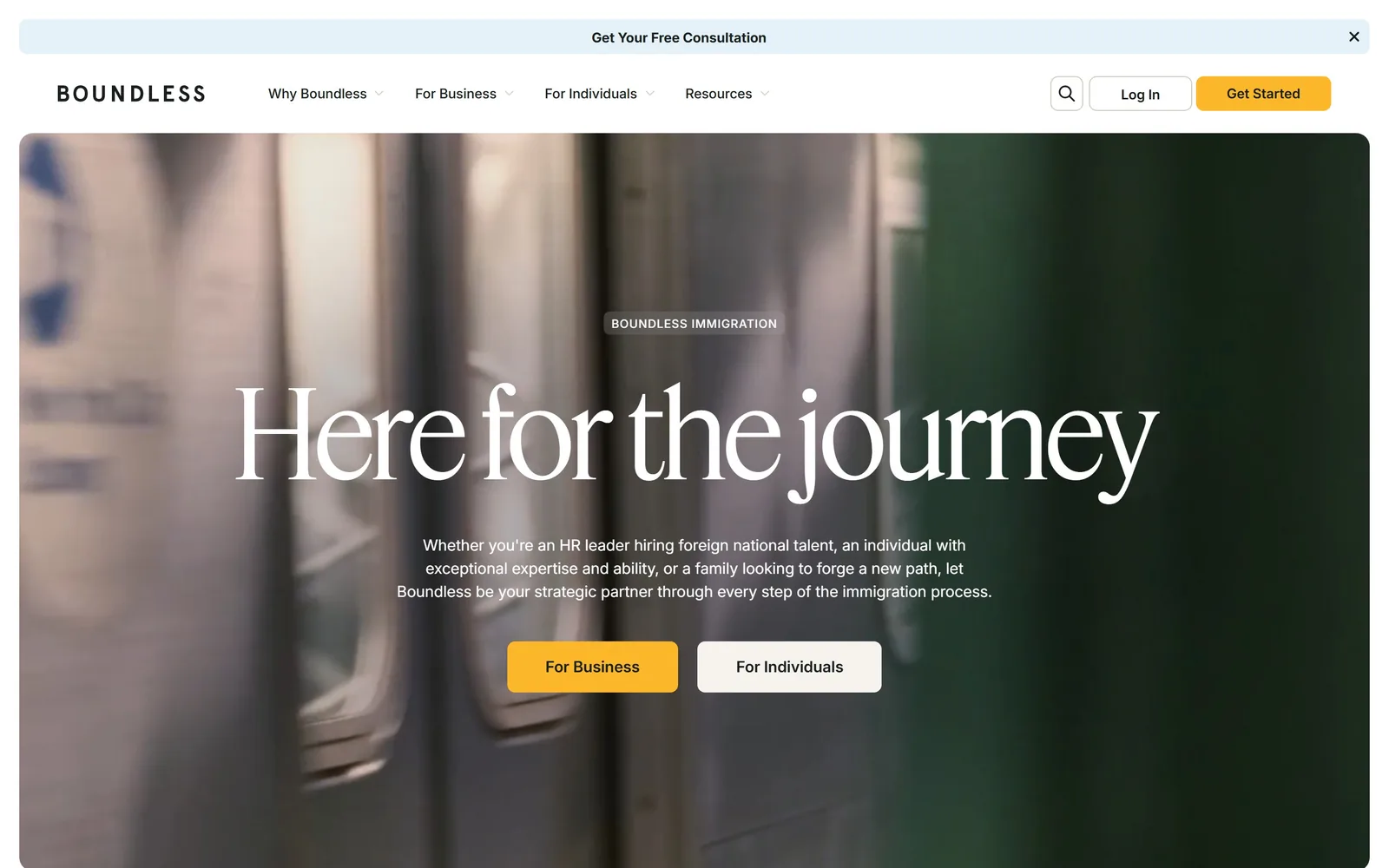
A blurred subway car in motion fills a rounded hero, with 'Here for the journey' across it in a huge white display serif.
Type
Feature Display, 126px
Body
Inter, 16 to 18px
Build
inset rounded hero, three-column 453px grid
Made on
Webflow
Colour
#ffffff #fdb72a #c2dff2
Type. The headline is Feature Display at 126px, tracked -0.03em, high contrast with long tapering terminals, and set in sentence case rather than title case, which keeps it sounding like a person. Body is Inter at 16 to 18px. A fashion-magazine serif against a plain interface sans is the entire brand expression.
Colour. White page, a muted green and taupe video supplying almost all the colour, and #fdb72a yellow on the primary button and the top strip. Pale blues #c2dff2 and #e5f1f9 take over further down. The yellow occupies well under one percent of the fold and still gets looked at first.
Layout. The hero is inset from the page edges with a visible corner radius, so it reads as a card rather than a background. Content below runs on a three-column 453px grid with 20px gaps. Sticky header, two-level nav, promotional strip above it.
The ask. Four asks compete above the fold: 'Get Your Free Consultation' in the top strip, 'Get Started' in the header, then 'For Business' and 'For Individuals' side by side under the subhead. The paired hero buttons are a segmentation decision and they are the right two. The strip and the header button are noise stacked on top.
Insetting a video hero with a corner radius makes it feel designed rather than merely large.
05
selendygay.com
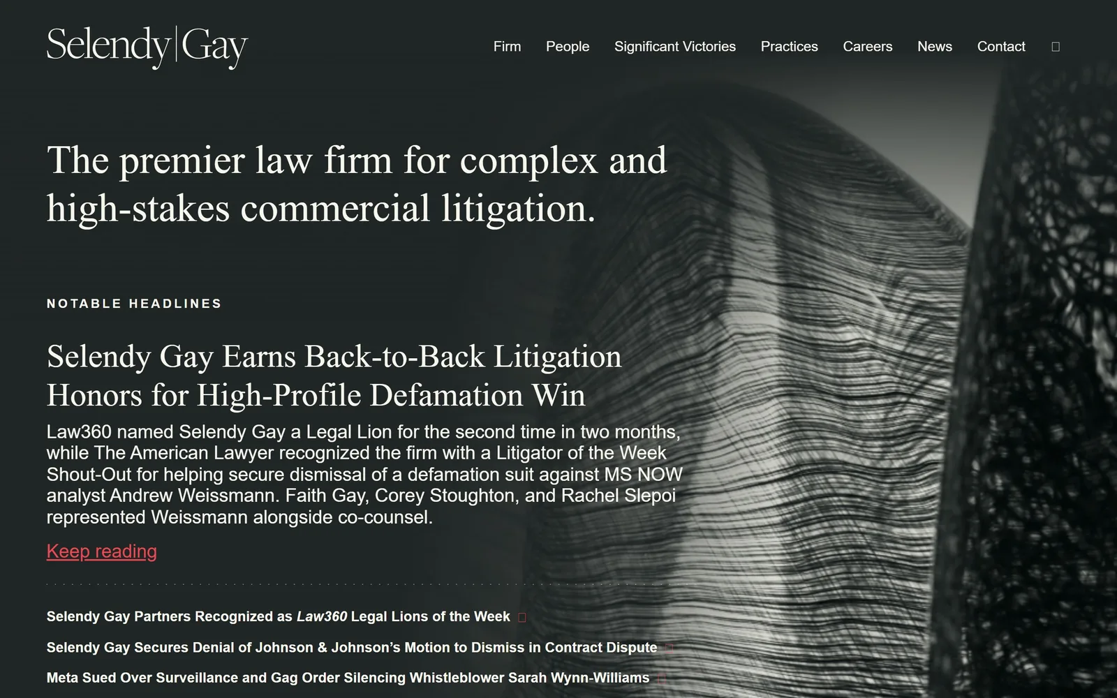
A black and white sculpture photograph at right, cream serif headline and news items on a near-black field at left.
Type
Freight Display Pro, 52px
Body
Mr Eaves XL Sans, 18px
Build
full-bleed split, 175px section padding
Made on
custom build
Colour
#202625 #f7f7ed #ef4852
Type. Freight Display Pro sets the claim at 52px and the lead news headline at 42px in cream #f7f7ed with a 1.2 line height. Body and the headline list switch to Mr Eaves XL Sans at 18px, with the eyebrow 'NOTABLE HEADLINES' at 16px uppercase on wide tracking. Old-style serif for claims, humanist sans for facts, applied without exception.
Colour. Two values do nearly everything: #202625 charcoal for the field, #f7f7ed for type. The only break is #ef4852 red on 'Keep reading' and on the small link markers. The artwork is monochrome, so it never argues with either.
Layout. Full 1440 width, sticky header, and 175px of section padding, the most generous spacing on this page. The hero stacks claim, eyebrow, one long news item with a three-line summary, then three more headlines in a smaller bold list. Text holds the left 60 percent while the image bleeds off the right.
The ask. One link above the fold: 'Keep reading', red and underlined. Everything else is navigation. The page is betting that a general counsel shopping for a defamation litigator will read the case summary instead of filling in a form, and it gives that summary four full lines of space.
Two colours plus one accent will carry an entire homepage if the photography is monochrome.
06
gunder.com
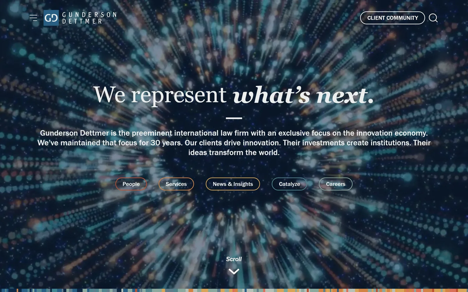
A radial burst of coloured light fills the screen behind a white serif line that ends in italic, with five outlined pill links below.
Type
transitional serif, 70px with italic
Body
Franklin Gothic, 25px
Build
full-bleed video hero, centred axis, 20px pills
Made on
custom JS framework
Colour
#102744 #eceded #d18446
Type. The headline is a transitional serif at 70px, roman for 'We represent' and italic for 'what's next.', so the emphasis is built into the typeface instead of a colour. The paragraph beneath is Franklin Gothic at 25px medium across three centred lines. Pill labels sit at 18px. Serif display over a grotesque body is the oldest pairing there is and it still reads as serious.
Colour. The video carries the colour: deep navy at the centre with teal, orange and cream streaks radiating outward. Type is #eceded, an off-white that stops the contrast turning brutal. The five pills are outlined in five different colours sampled from the footage, and a strip of colour blocks runs along the bottom edge.
Layout. Full bleed 1440, every element centred on one axis, 30px section padding. The headline sits at roughly 40 percent height so the dark centre of the burst backs it. The pills carry a 20px radius and are the only rounded things on the page.
The ask. Five pill links, People, Services, News & Insights, Catalyze and Careers, plus a 'CLIENT COMMUNITY' button top right and a 'Scroll' prompt. That is a lot of equal-weight choices and none of them is contact. For a firm whose clients are founders and venture funds, routing to People and Careers first is defensible.
Pulling your accent colours out of the hero video makes the interface look like it belongs to the image.
07
lehotskycohn.com
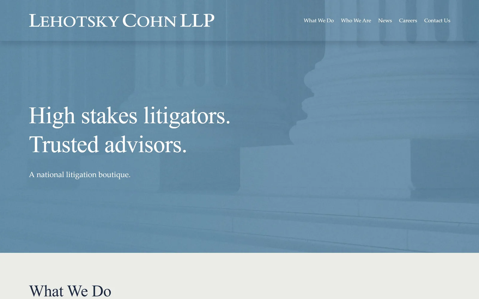
Supreme Court columns flooded with one flat slate blue, a two-line white serif headline sitting low on the left.
Type
Libre Baskerville, 71px
Body
Palatino, 23px
Build
full-bleed duotone hero, 123px section padding
Made on
Squarespace
Colour
#6f93ae #1c2940 #ebece7
Type. Libre Baskerville at 71px, tracked -0.01em, sets the two headline sentences in white at equal visual weight. The sub-line 'A national litigation boutique.' drops to 23px Palatino, a big enough step down that it never competes. The logotype uses small caps. All serif above the fold, no sans invited.
Colour. The photograph is pushed to a single slate around #6f93ae with almost no tonal range left, so it works as a flat field rather than a picture. White type on it, #1c2940 navy for text below, #ebece7 for the next band. The duotone is the whole colour strategy.
Layout. Full 1440 hero about 900 tall, type aligned to a left margin near 125px and set low at roughly 55 percent height. Section padding below runs to 123px. Squarespace underneath, with nothing in the output that gives it away.
The ask. No button and no form above the fold. 'Contact Us' is the last nav item and a phone number waits in the footer. The hero sells positioning and nothing else. For a boutique that gets hired on referral that is honest, though one contact link in the hero would have cost nothing.
Crushing a photograph to a single flat hue turns generic architecture into a brand colour field.
08
fenwick.com
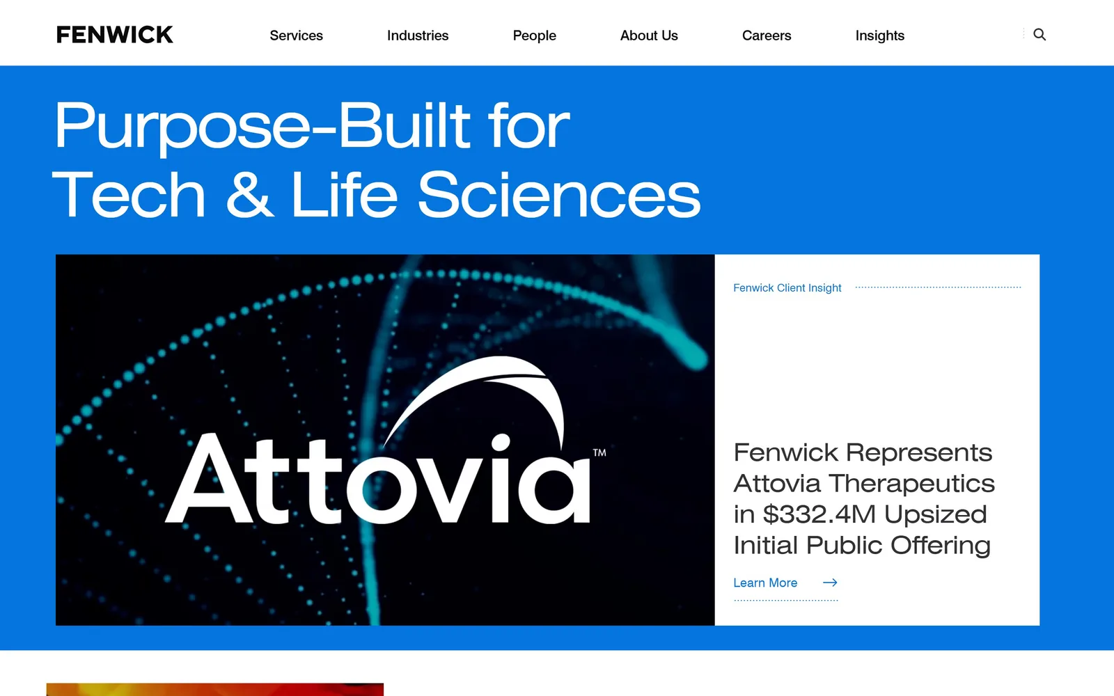
A full-width cobalt band carrying an 80px white headline, with a client deal card inset underneath it.
Type. The headline is a Helvetica-class grotesque at 80px, weight 500, tracked -0.035em, two lines in title case. Nav runs the same face at 20px regular, deal copy inside the card at 32px. No serif anywhere and no second family: three sizes of one sans doing the whole page.
Colour. #0475de cobalt covers around 42 percent of the fold, white takes the rest, and the deal card drops in a near-black image panel. Ink is #313134 and #0a0a0a. One saturated blue at that volume is a gamble that pays off because nothing else on the fold is coloured.
Layout. 1320px container at 92 percent of the viewport, headline hard against its left edge, then a two-panel card below: image left, text right, square corners. The white header bar floats above the blue rather than sitting on it. Above the fold you get the positioning line and one named client deal with a dollar figure attached.
The ask. One 'Learn More' link under the deal headline with a dotted underline marking it, plus the six-item nav. The real conversion device is the rotating list of named deals, Figma, Wiz, CoreWeave, each with a number next to it.
Naming the client and the deal size does more for credibility than any adjective you could put in a headline.
09
coblentzlaw.com
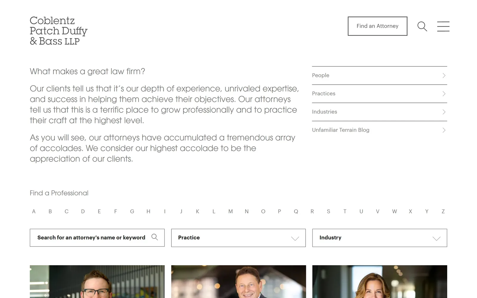
No image at all: a question in 24px grey type, three paragraphs of answer, and an attorney finder with an A to Z row.
Type
ITC Avant Garde Gothic, 24px
Body
Graphik, 16px
Build
1440px, two-column text hero, A to Z attorney finder
Made on
WordPress
Colour
#ffffff #767676 #4e4e4e
Type. ITC Avant Garde Gothic sets the entire hero at 24px, weight 400, in #767676 grey, with its single-storey a and perfectly circular o on full display. The logotype stacks the same face on three lines. Form labels switch to Graphik at 16px bold. Using a geometric display face at near-body size for hero copy is an odd call that works because the measure is wide and the leading is 1.33.
Colour. White page, grey type, nothing else. #767676 for the hero copy, #4e4e4e for the link list, hairline rules between the right-hand nav items. The only colour on the fold arrives from the attorney photographs cropping in at the bottom edge.
Layout. 1440px wide, two columns: a text column running to about 1250px on the left and a 570px link stack on the right divided by hairlines. Below that sits 'Find a Professional', a full A to Z row, then three filter fields. Everything square.
The ask. 'Find an Attorney' sits in a bordered box in the header, then the whole search apparatus repeats above the fold with an alphabet, a keyword field, a practice dropdown and an industry dropdown. The page has decided visitors arrive looking for one named lawyer, and it is probably right.
Opening with a question your client is actually asking beats opening with a claim about yourself.
10
kaplanhecker.com
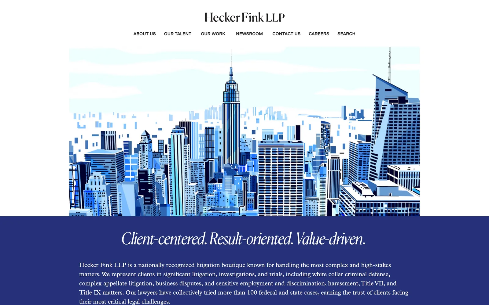
A flat illustrated Manhattan skyline in six blues, sitting over an indigo band that carries an italic serif tagline.
Type
Canela, about 33px italic
Body
Plantin, 18px
Build
970px container, centred, illustrated hero
Made on
custom JS framework
Colour
#253178 #e6e5e0 #a92338
Type. The logotype and tagline are Canela, a high-contrast display serif, the tagline set around 33px in italic and spaced so its three phrases read as one line. Body copy is Plantin at 18px with a 1.5 line height. Nav is Replica at 13px bold uppercase. Three faces, each given exactly one job.
Colour. The illustration runs a tight blue ramp from near-white sky down to almost black windows. The band beneath is #253178 indigo across roughly 37 percent of the capture, carrying white type. A #a92338 red turns up further down. None of this palette came out of a stock photo.
Layout. 970px container, only 67 percent of the viewport, which is unusually narrow and leaves white margins either side of the illustration. Centred logotype above a centred nav row, then the illustration, then the indigo band. 32px section padding, square corners throughout.
The ask. Nothing above the fold asks for anything. 'Contact Us' is the fifth of seven nav items, set at the same 13px as the rest. The pitch is three paragraphs of practice description inside the indigo band. Sparse, and consistent with a boutique that picks its clients.
A commissioned illustration gives you a hero nobody else can buy, and it ages better than a skyline photograph.
11
guptawessler.com
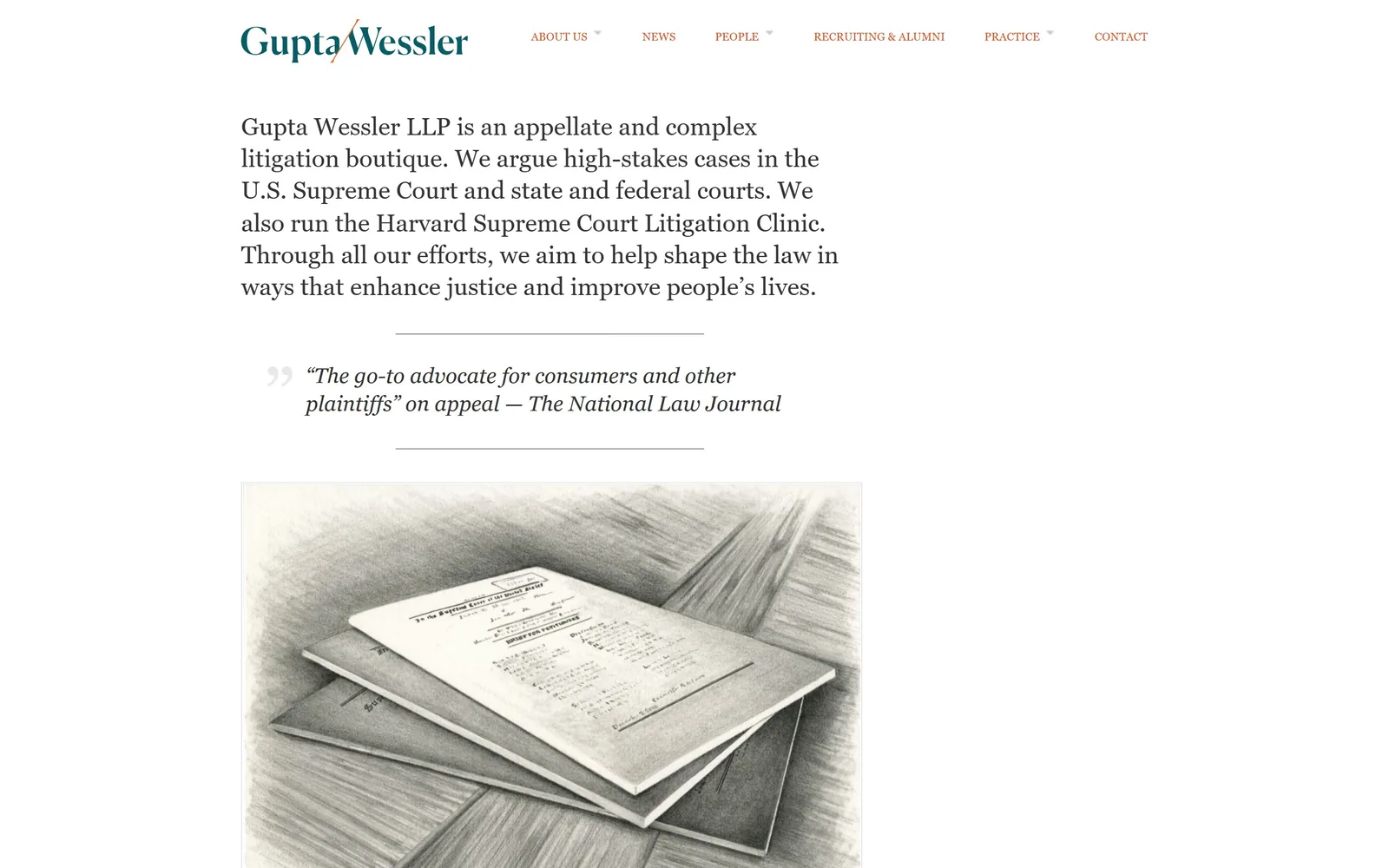
White page, a 26px serif paragraph as the entire hero, and a pencil drawing of Supreme Court briefs below it.
Type
transitional serif, 26px
Body
same serif, 19px italic for quotes
Build
single text column, hand-drawn illustration, no hero image
Made on
WordPress
Colour
#ffffff #333333 #dd5424
Type. The hero is a single paragraph in a transitional serif at about 26px, #333333, line height 1.3, measure around 55 characters. A pull quote beneath goes italic at 19px with a light grey opening quote mark. Nav is tiny next to it, 12px uppercase in orange-red. The size gap between that paragraph and everything else is the whole hierarchy.
Colour. #ffffff everywhere, #333333 for the paragraph, #555555 for the quote, teal green in the logotype and #dd5424 for the nav links. The drawing is graphite grey. Four values in total and two of them exist only as type.
Layout. No declared container, with the text column starting around 345px from the left and ending near 1200px. The illustration below sits in a fixed panel roughly 1150px wide. Section spacing is loose and nothing is boxed, carded or shadowed.
The ask. No button, no form, no phone number above the fold, just a seven-item nav. A National Law Journal quote is the only persuasion and it is placed directly under the description. For an appellate shop fed by referrals from other lawyers, being uninterested in leads is the correct posture.
If your opening paragraph is good enough, set it at 26px and delete the hero image.
12
hueston.com
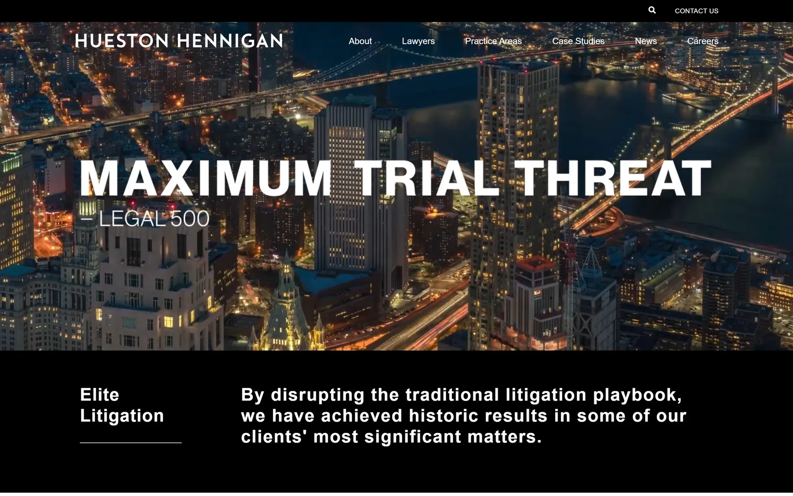
Night aerial footage of lower Manhattan with 'MAXIMUM TRIAL THREAT' across it in heavy white caps, credited to Legal 500.
Type
Neue Haas Grotesk Display, uppercase display size
Body
Neue Haas Grotesk, 32px semibold
Build
full-bleed video hero over a black two-column band
Made on
WordPress
Colour
#000000 #ffffff #c6c6c6
Type. Neue Haas Grotesk Display sets the pull quote in uppercase at display size, bold, with the attribution 'LEGAL 500' beneath it in a far lighter weight at roughly half the size. Body below runs 32px at weight 600 with 0.01em tracking. One family throughout, with all contrast carried by weight and case.
Colour. Pure #000000 and #ffffff, with the night footage supplying amber street lights and a dark blue river. Black covers more of the capture than anything else. There is no accent colour at all, which is rare here and clearly on purpose.
Layout. 1440 full bleed, video hero around 880 tall, then a hard black band split two ways: an 'Elite Litigation' label on the left under a short rule, three lines of copy on the right. 50px section padding, five flex rows, no radius anywhere.
The ask. 'CONTACT US' appears twice, in the utility bar and again in the main nav, both small. No button and no form. The conversion work happens further down in a rotating wall of client quotes. The hero sells one idea and trusts it to land.
Quoting a directory ranking instead of writing your own headline lets someone else make the boast for you.
13
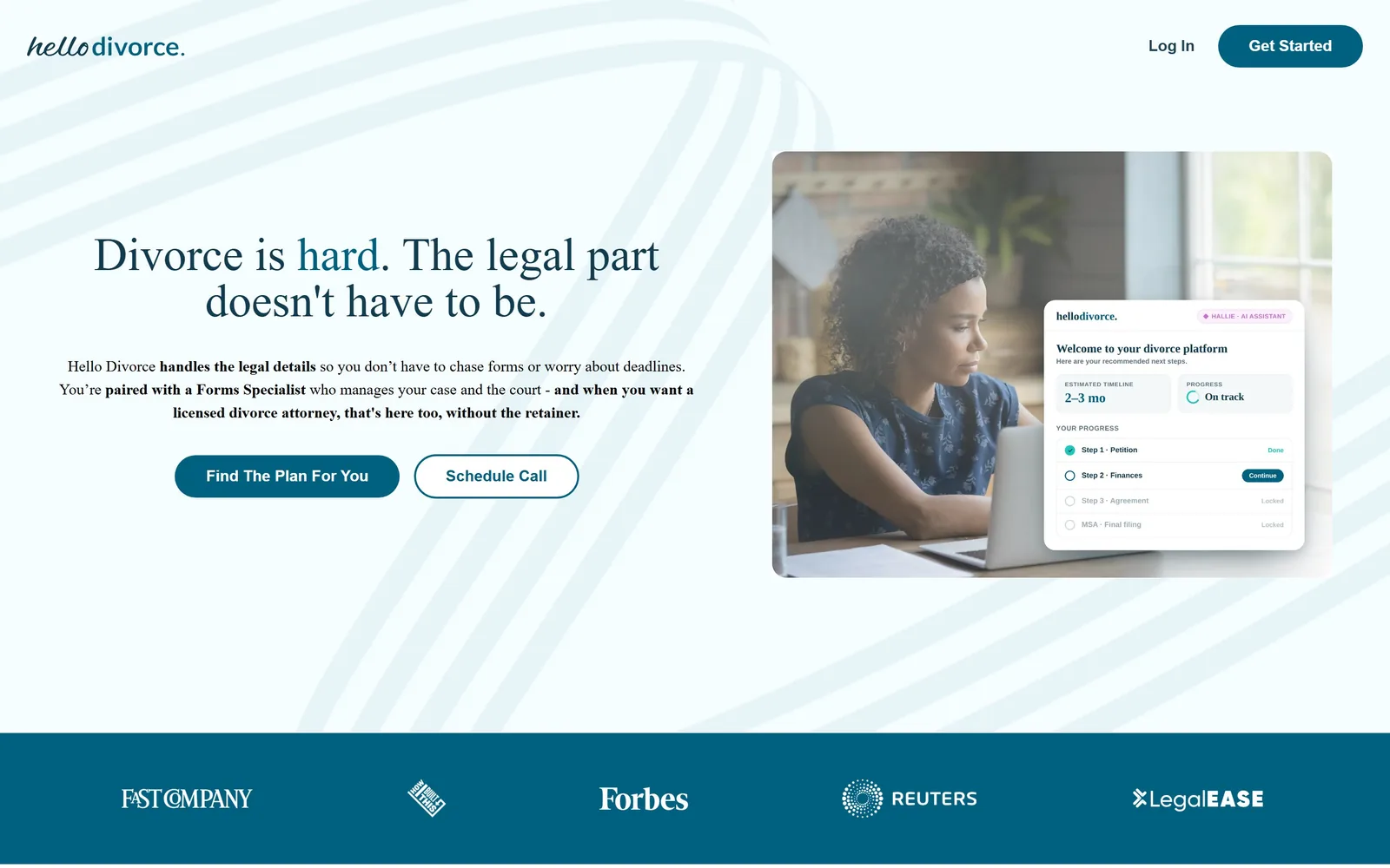
hellodivorce.com
A pale blue page with a serif headline, a photograph of a woman at a laptop, and a product dashboard card overlapping it.
Type
Spectral, 48px
Body
Nunito, 14 to 16px semibold
Build
1440px, 55/45 hero, overlapping product card, press band
Made on
custom build
Colour
#f6fdff #113b4e #006080
Type. Spectral sets the headline at 48px, with the word 'hard' coloured #006080 inside an otherwise navy line. Nunito handles body and buttons at 14 to 16px semibold, with key phrases bolded mid-paragraph. A literary serif over a rounded sans is the softest pairing on this page, which is the point when the product is a divorce.
Colour. Background #f6fdff with faint swooping line graphics, headline ink #113b4e, primary action #006080 teal, and a #1cc7bb mint inside the product card. The press band across the bottom is solid teal with white logos. Cool and clinical rather than warm, which stops it tipping into sentiment.
Layout. 1440 full width, hero split 55/45 between copy and image, 100px section padding. The product screenshot is a rounded card overlapping the photograph, with a four-step progress checklist visible inside it. Buttons are fully rounded at 100px radius.
The ask. Five asks on the fold: 'Get Started' in the header, 'Find The Plan For You' and 'Schedule Call' side by side, 'Log In', and the press band as proof. The two hero buttons split self-serve from assisted, which is the actual decision a visitor is weighing.
Showing the product interface in the hero answers 'what do I actually get' before anyone has to click.
14
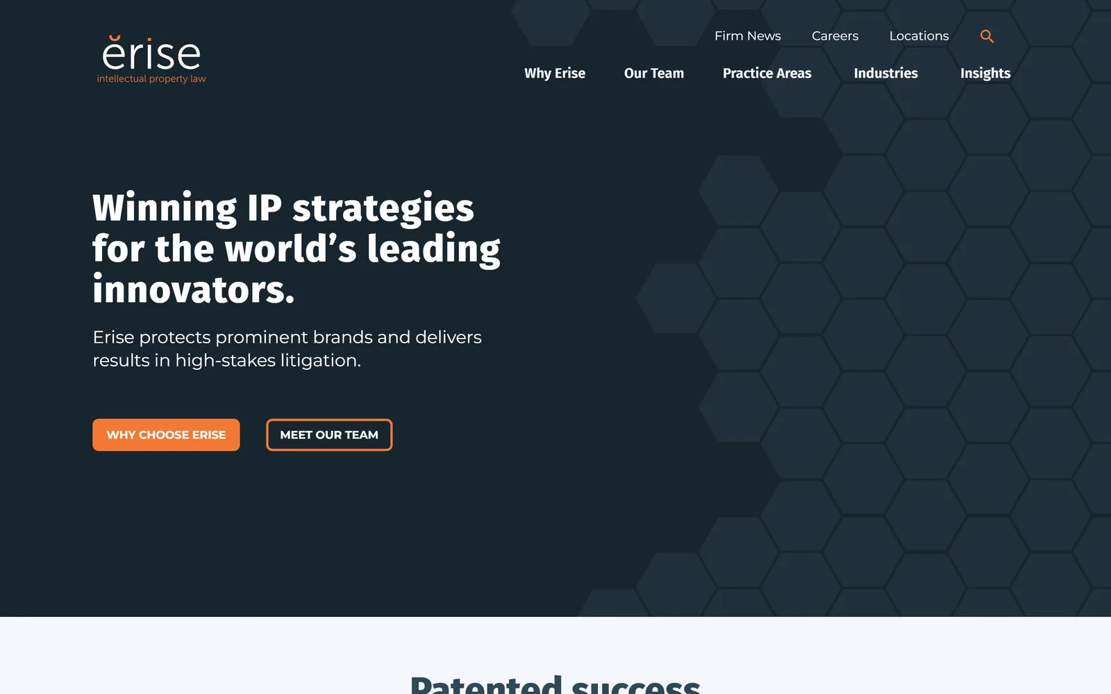
eriseip.com
Dark slate field with a faint hexagon lattice, a three-line white headline, and two buttons in orange.
Type
Fira Sans, 48px extrabold
Body
Montserrat, 16 to 22px
Build
full-bleed dark hero, patterned right third, 8px buttons
Made on
WordPress
Colour
#17252e #f47835 #f4f7fc
Type. The headline is Fira Sans at 48px, weight 800, three lines closed with a full stop. Subhead and nav run Montserrat at 16 to 22px regular, button labels at 14px bold uppercase. That headline weight is the only heavy thing on the page and it carries the hero on its own.
Colour. #17252e slate fills the fold, with the hexagon lattice drawn one shade lighter so it registers as texture rather than pattern. #f47835 orange takes the primary button and the search icon, white carries the type, and a #f4f7fc panel starts at the fold line. The orange gets about half a percent of the screen.
Layout. Full-bleed hero around 1080 tall, content left-aligned at roughly 170px, the hexagon field weighted to the right third so it never sits behind type. Buttons carry an 8px radius, the only rounding present. Two-row nav, utility links above, main nav below.
The ask. Two buttons, 'WHY CHOOSE ERISE' filled orange and 'MEET OUR TEAM' outlined, giving a clear primary and secondary. No phone number, no form. For a patent boutique selling to in-house counsel, pointing at credentials and people before a contact form is the right order.
A filled button next to an outlined one tells the visitor which of the two you think they should press.
15
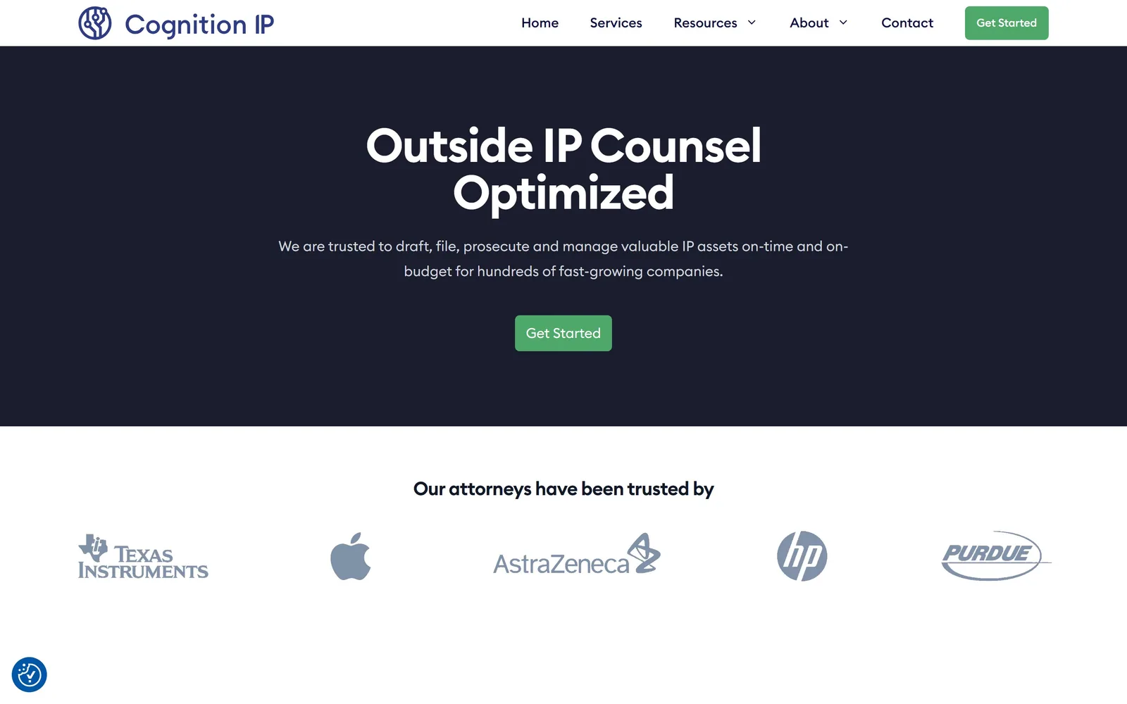
cognitionip.com
A dark navy band with a centred two-line headline, one green button, and a row of client logos beneath it.
Type
Euclid Circular B, 60px bold
Body
Euclid Circular B, 18px
Build
1440px centred hero band, logo wall, 96px padding
Made on
WordPress
Colour
#191d2d #4da86a #ffffff
Type. Euclid Circular B runs the whole page: headline at 60px weight 700 on two centred lines, subhead at 18px with a loose 1.78 line height in #d1d5db, section heading below at 36px weight 800. A geometric sans at every level reads efficient rather than distinctive, and that is the trade this page made.
Colour. #191d2d navy for the hero band at around 27 percent coverage, white below it, #4da86a green on both buttons, #0c1043 for nav type. The grey ramp from #1f2937 down to #6b7280 for body text is a framework default and it shows.
Layout. 1440 full width with 96px section padding, hero band about 670 tall and everything centred on a single axis. Buttons have a 6px radius. Below the fold sits a five-logo client row at even spacing. This is the standard software homepage structure applied to a law practice.
The ask. 'Get Started' twice, in the header and again dead centre of the hero, both green, with nothing else competing. The logo row immediately below, Texas Instruments, Apple, AstraZeneca, HP and Purdue, is the proof element. Clear, if borrowed wholesale.
Repeating one button label in the header and the hero, with nothing else asking, makes the next step unmissable.
How these were chosen
Fifteen homepages here, running from hundred-lawyer litigation boutiques and Silicon Valley corporate shops to two consumer legal services that sell a flat fee instead of an hourly rate. The thing that surprised me is how few of the good ones photograph a lawyer at all: Munger Tolles draws a red wire loop, Cravath sets a deal headline over its own words blown up to 256px, Keker gives half the screen to a picture of its lobby. If you are commissioning law firm website design, the lesson repeats on almost every entry below. Pick one sentence worth reading and hand it the whole fold. The firms that hedged, with a rotating slider over a skyline, all ended up looking like each other.
Finding law firm sites that someone had actually designed took far longer than it should have. 30 candidates made the shortlist. 15 made the page.
Each one was opened and looked at properly: what the type is doing, where the colour gets spent, how the page is built, how it asks for the job. Nothing is here because it ranks. Nothing is here because an agency filed it under portfolio. Several well known names were left out for the plain reason that their site came out of the same template as everyone else's, and a few sites worth including did not survive a second look.
Where a site is only competent, it says so. The order is the order worth your time, best first.
Reviewed and selected by Larry W. Matthews for Websitely.