18 Engineering Website Design Examples From Real Firms
Eighteen US structural, civil and MEP firms. Engineering website design judged on whether the work or the org chart gets the first screen.
Shown
18 sites
Reviewed
30 candidates
Chosen on
The work, not the ranking
Updated
15 October 2026
01
mka.com
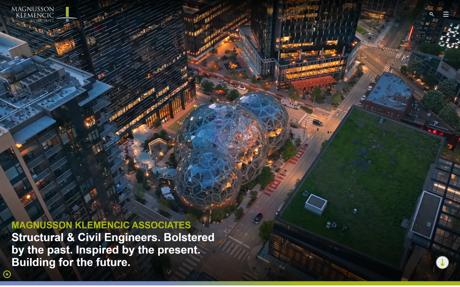
An aerial night photograph of the Seattle Spheres fills the frame, with the firm name in lime above a four-line white statement at the lower left.
Type
futura-pt 50px, weight 700
Body
futura-pt 24px, weight 100
Build
full-bleed video, 12-column 106px grid
Made on
WordPress
Colour
#1f1f1f #ffffff #1d2a48
Type. Everything is futura-pt and nothing else. The hero statement runs 35px at weight 700 in white, the measured scale above it reaches 50px, and a 24px cut at weight 100 handles the lighter supporting lines. One geometric sans across display, a 32px nav and body keeps a page of dense project data reading as a single voice.
Colour. A ground of #1f1f1f covers 49 percent of the page, white 14.2 and a navy #1d2a48 6.2 percent for the band below. The only saturation the brand supplies is #aaba0a, a lime appearing across just 30 characters of ink, which is the firm name over the photograph. Every other warm value belongs to the lit windows in the image.
Layout. The video runs full bleed behind a sticky header carrying only the wordmark, a search glyph and a burger, so the whole 1440 viewport goes to the picture. Text anchors bottom left rather than centred. Below the fold the content drops into a 12-column grid of 106.25px tracks with a 15px gutter, and corner radius is 0 throughout.
The ask. Nothing on the first screen asks for a form. The one measured control is Pause Background Video, which is a player button rather than an ask, and no phone number sits in the header. The $100+ billion figure further down does the credentialling. Contact lives behind the burger, so the homepage functions as a portfolio door.
One typeface and an accent used on roughly thirty characters is enough branding when the photography is carrying the persuasion.
02
delve.com
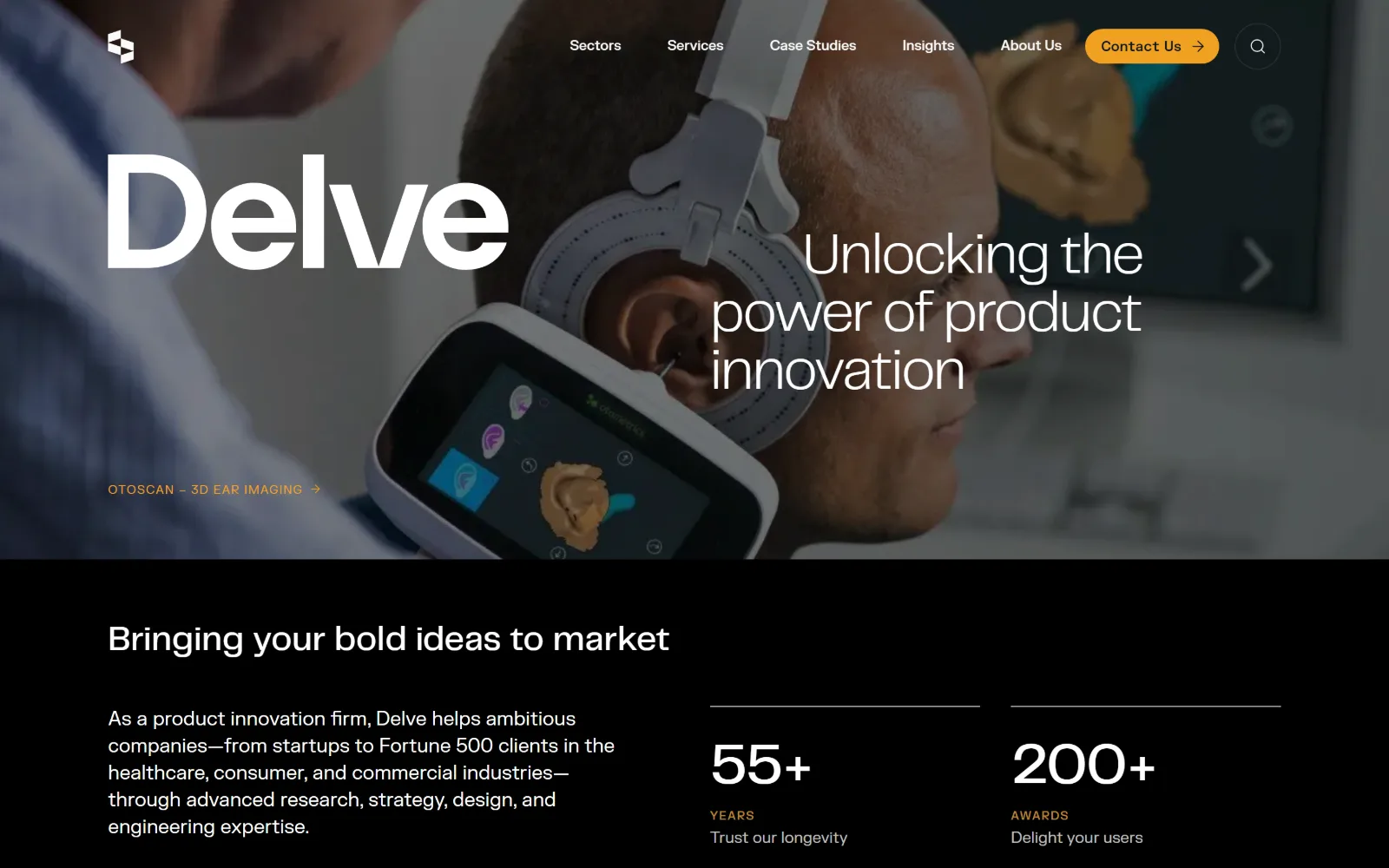
A photograph of a man in a 3D ear-scanning headset runs edge to edge, with the firm's five-letter name set huge in white across the left half.
Type
PPTelegraf 60px, -0.025em
Body
FK Grotesk 20px / 1.40
Build
full-bleed photo, 1280px container, 12-col grid
Made on
custom JS framework
Colour
#0a1717 #ffffff #f1a122
Type. Two families, deliberately paired: PPTelegraf at 60px with -0.025em tracking for display, and FK Grotesk at 20px on 1.40 for body, with a SemiMono cut at 14px handling the kicker label under the image. The wordmark is set far larger than the headline beside it, so brand and claim sit at different levels of attention instead of competing.
Colour. Four values. White and black both carry high coverage, the lower slab is #0a1717 at 63.4 percent, and the single accent is #f1a122, an amber reserved for the header pill, the kicker and the small YEARS and AWARDS captions. That is 24 characters of orange across the entire first screen.
Layout. A full-bleed photograph above, then a hard cut to the #0a1717 slab with no gradient between them. The container is 1280px, 89 percent of the viewport, running a 12-column grid of 72px tracks at 32px gutters. Buttons take a 9999px radius while every panel edge stays square, so the only curve on the page is the one ask.
The ask. One button, Contact Us, sitting in the header as an amber pill with an arrow, and it is the only filled element above the fold. The statistics beneath, 55+ years and 200+ awards, do the reassurance work that testimonials would elsewhere. No phone number, no form and no second ask anywhere on the screen.
Setting the wordmark larger than the headline lets a short brand name act as the hero graphic when the photograph behind it is busy.
03
sgh.com
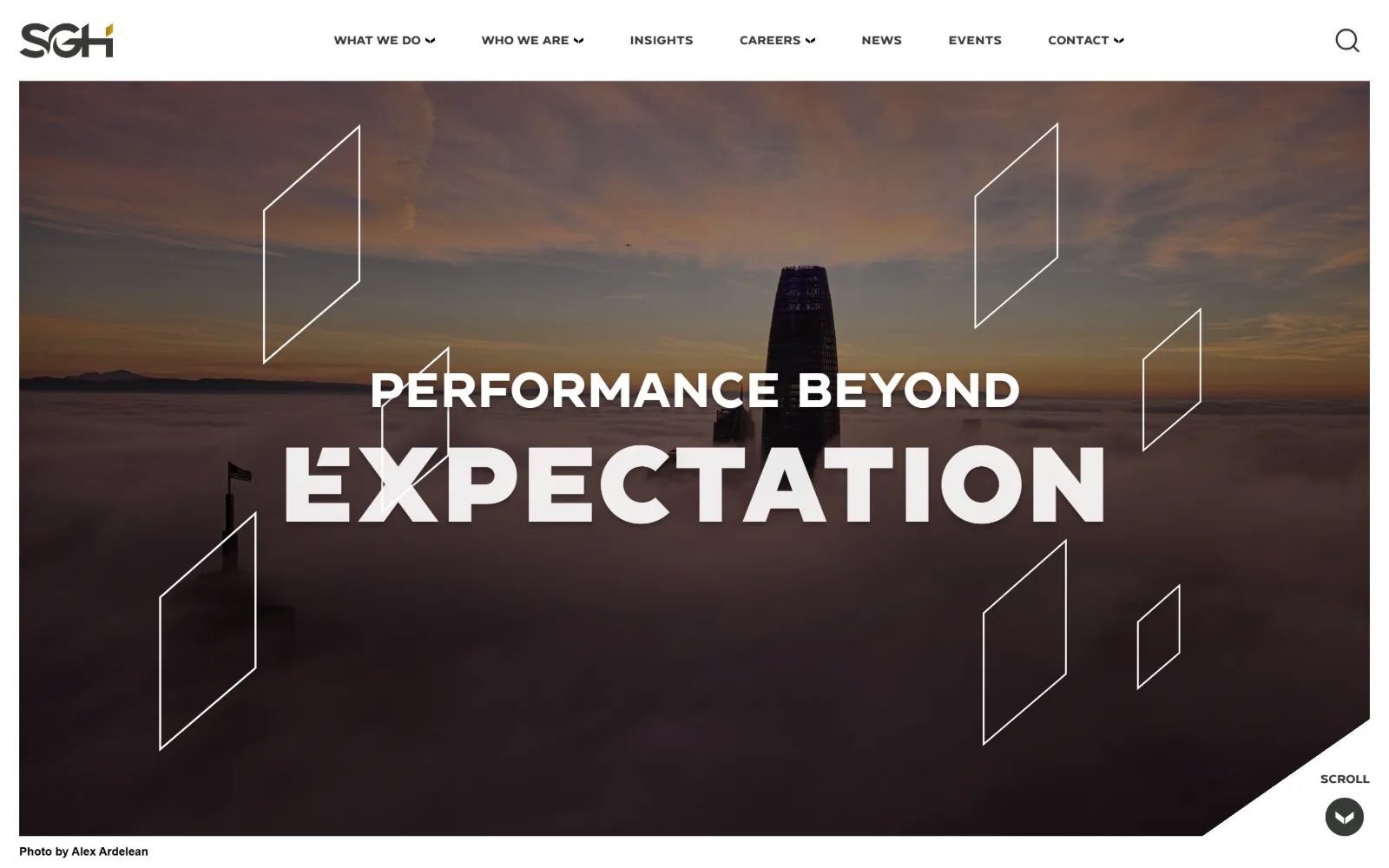
A skyscraper rising out of fog at sunset carries two lines of white uppercase display type, with thin outlined parallelograms over the image.
Type
ConneqtBlack 110px uppercase / 0.86
Body
trade-gothic-next-condensed 28px
Build
framed full-bleed photo, 56px padding
Made on
WordPress
Colour
#ffffff #00634f #004860
Type. ConneqtBlack at 110px, uppercase, line height 0.86, carries the second line; the first runs 60px in the same family so the pair reads as one block with a sharp size step between them. Navigation is ConneqtBold 12px uppercase at 0.020em on 2.50 line height. Below the fold a condensed trade-gothic-next-condensed at 28px appears 21 times as the workhorse.
Colour. White dominates at 287 coverage and the photograph supplies all the warmth. Behind it sit a dark green #00634f at 26.5 percent, #373a36 at 14.1 and a deep teal #004860 at 11.4 doing most of the ink. A gold #d29f1c covers 0.2 percent, which is the hairline inside the logo mark and nothing else on the page.
Layout. A white header bar seven items wide sits above the photograph rather than over it, so the image reads as a framed panel instead of a background. Section padding is 56px and radius 0. The lower right corner of the hero is cut on a diagonal to carry the SCROLL control, and a photographer credit is set in the margin beneath.
The ask. Nothing asks for a sale on the first screen. The only measured call to action, JOIN OUR MAILING LIST, sits far below. Seven top-level items including CAREERS, NEWS and EVENTS mean the page is routing hiring candidates and clients at the same time rather than funnelling either of them.
A 110px line at 0.86 line height over a low-contrast photograph needs no overlay panel, because the fog already supplies the separation.
04
desimone.com
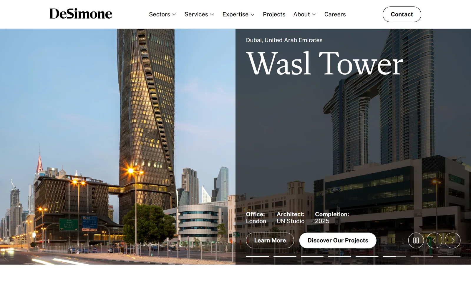
Two tower photographs sit side by side under a white header, with a project name set in a large serif over the darker right-hand image.
Type
FlechaS 100px / 0.90
Body
Public Sans 18px
Build
50/50 split, 1440px, 104px padding
Made on
custom JS framework
Colour
#ffffff #000000 #e5e5e6
Type. FlechaS at 100px on 0.90 line height carries the project name, a high-contrast serif doing the job a logotype normally does. Everything else is Public Sans at 18px: the Office, Architect and Completion labels at weight 700, body at 400, nav at 16px. One serif, one grotesque, and no third voice anywhere.
Colour. Three measured values and no brand accent at all: #ffffff at 141 coverage, #000000 at 60.6 and #e5e5e6 at 19.3 for the quiet separators. Ink runs 825 characters of pure black against 43 of white. All the saturation comes from the two photographs, the blue dusk sky on the left and the sodium street lighting below it.
Layout. A hard 50/50 vertical split of the viewport, one photograph each side, with the metadata and buttons set on the right panel. The white header is a fixed band above the split. Container is 1440px at full width with 104px section padding, feeding a 12-column grid and a 272/544/272 arrangement below. Buttons are fully rounded pills.
The ask. Two buttons compete directly, Learn More and Discover Our Projects, side by side at the same size with only fill separating them, and a Contact pill top right makes three. Slider controls and seven progress dashes sit beneath, so the hero is also announcing that six more projects are queued behind this one.
Splitting the viewport in half and running the caption on the darker photograph removes any need for a scrim over the imagery.
05
kpff.com
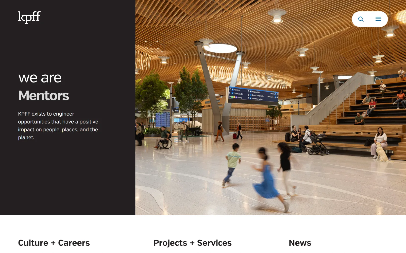
A near-black panel on the left holds the words we are Mentors beside a full-height photograph of a timber-ceilinged airport concourse.
Type
verb 52px, -0.038em
Body
verb 18px / 1.56
Build
vertical split at 530px, full-height photo
Made on
WordPress
Colour
#231f20 #ffffff #c4c4c4
Type. Verb throughout, with negative tracking at every size: 52px at -0.038em for the statement, 32px bold at -0.003em for the headings below, 18px at -0.006em on 1.56 for body. The headline splits across two weights, light for we are and bold for Mentors, so a single word carries all of the emphasis without a size change.
Colour. A ground of #231f20 at 158.8 coverage, white ink at 90.3 and #c4c4c4 at 28.3 as the only middle tone. No accent colour was measured at all. Against that restraint the photograph is the entire colour story: warm cedar slats, green planting and a child in a cobalt dress crossing the terrazzo floor.
Layout. An exact vertical split at roughly the 530px mark, flat near-black on the left and photograph on the right, running full viewport height with no container margin. Search and burger controls float in a white rounded panel over the image instead of sitting in a header bar. Three equal headings follow below. Radius 0.
The ask. No button was measured anywhere, no phone number and no form. Navigation collapses to a burger even at 1440px wide. What the page offers instead is three doors of equal size, Culture + Careers, Projects + Services and News, which puts recruitment on exactly the same footing as business development.
Setting half a sentence light and the other half bold builds hierarchy into a two-word headline without changing size or colour.
06
ghtltd.com
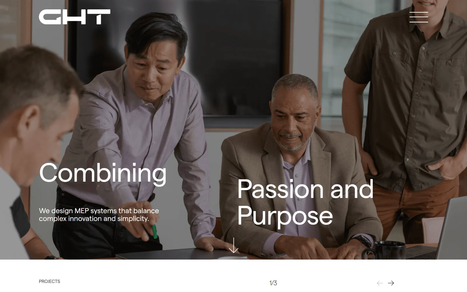
Four colleagues around a laptop fill the frame, with the words Combining and Passion and Purpose placed at two different heights over the photograph.
Type
Matter 82px, -0.018em
Body
Matter 28px, weight 300
Build
full-bleed photo, 1280px container, 154px padding
Made on
WordPress
Colour
#ffffff #323430
Type. Matter at 82px with -0.018em tracking, set as two staggered blocks rather than one left-aligned stack, with a 28px weight 300 line of body dropped between them. The whole page stays in Matter: 68px, 24px, 22px, 20px and a single 14px uppercase label. The staggering is what makes a one-weight page feel composed rather than flat.
Colour. Two values and nothing more: white at 55.6 percent coverage and #323430 at 44.4, a warm near-black that also carries 258 characters of ink. No accent was measured. Every colour in the frame belongs to the photograph, the lilac shirt and the tan jacket, which is a risk the page takes knowingly.
Layout. Full-bleed photograph under a sticky header holding only a wide GHT wordmark and a burger. The content container is 1280px, 89 percent of the viewport, with 154px section padding, the most generous measured in this group. A white strip below the hero carries PROJECTS, a 1/3 counter and arrows, feeding two-column grids of 600px and 590px tracks.
The ask. No button on the first screen and no measured call to action at all. The only interactive promise is the slide counter reading 1/3 and a pair of arrows beneath it. A consultancy selling on relationships is betting the visitor will scroll, and the 154px padding below says it expects them to.
Staggering two display lines at different heights keeps a face-heavy photograph readable without dimming the image behind a scrim.
07
dimin.com
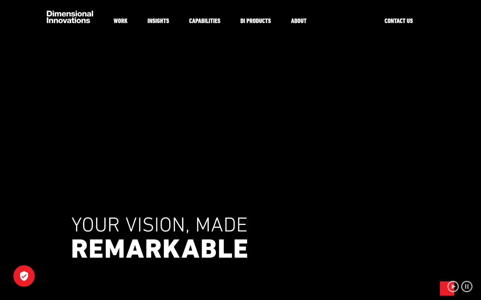
A black field with six nav items in condensed white caps across the top and the words YOUR VISION, MADE REMARKABLE stacked at the lower left.
Type
DINNextLTProCondensed 69px uppercase
Body
DINNextLTPro 16px / 1.60
Build
full-viewport black hero, 1440px, radius 0
Made on
Not detected
Colour
#000000 #ffffff #ed1c24
Type. DINNextLTProCondensed, uppercase, does all the display work: 69px at weight 700 for the second line against a lighter 30px above it, plus 28px and 20px registers used six times each. Body switches to the unextended DINNextLTPro at 16px on 1.60. Condensed caps are what let a six-item nav and a wordmark share one line without crowding.
Colour. White at 122.2 coverage, black at 50 and #ed1c24 at 22.3, a hard red that is the only chromatic value on the site. It fills the play and pause controls bottom right, the privacy badge bottom left and every button, all at radius 0. Body ink is a soft #767676 rather than black, which stops paragraphs competing with headings.
Layout. The hero is a full-viewport black field, with the background video not yet painted at the moment of capture. Nav sits flush to the top left beside the wordmark, the headline anchors to the lower left, and transport controls pin to both bottom corners. Container is 1440px at full width and radius is 0 everywhere, buttons included.
The ask. CONTACT US sits at the far right of the nav as plain text rather than a filled button, so nothing competes with it visually, and the measured call to action is scroll down. Six items including DI PRODUCTS route a visitor who might be buying a service or a product, which is why neither is forced into the hero.
Condensed uppercase at two weights lets a long nav and a two-line headline share one typeface without either losing its own register.
08
walterpmoore.com
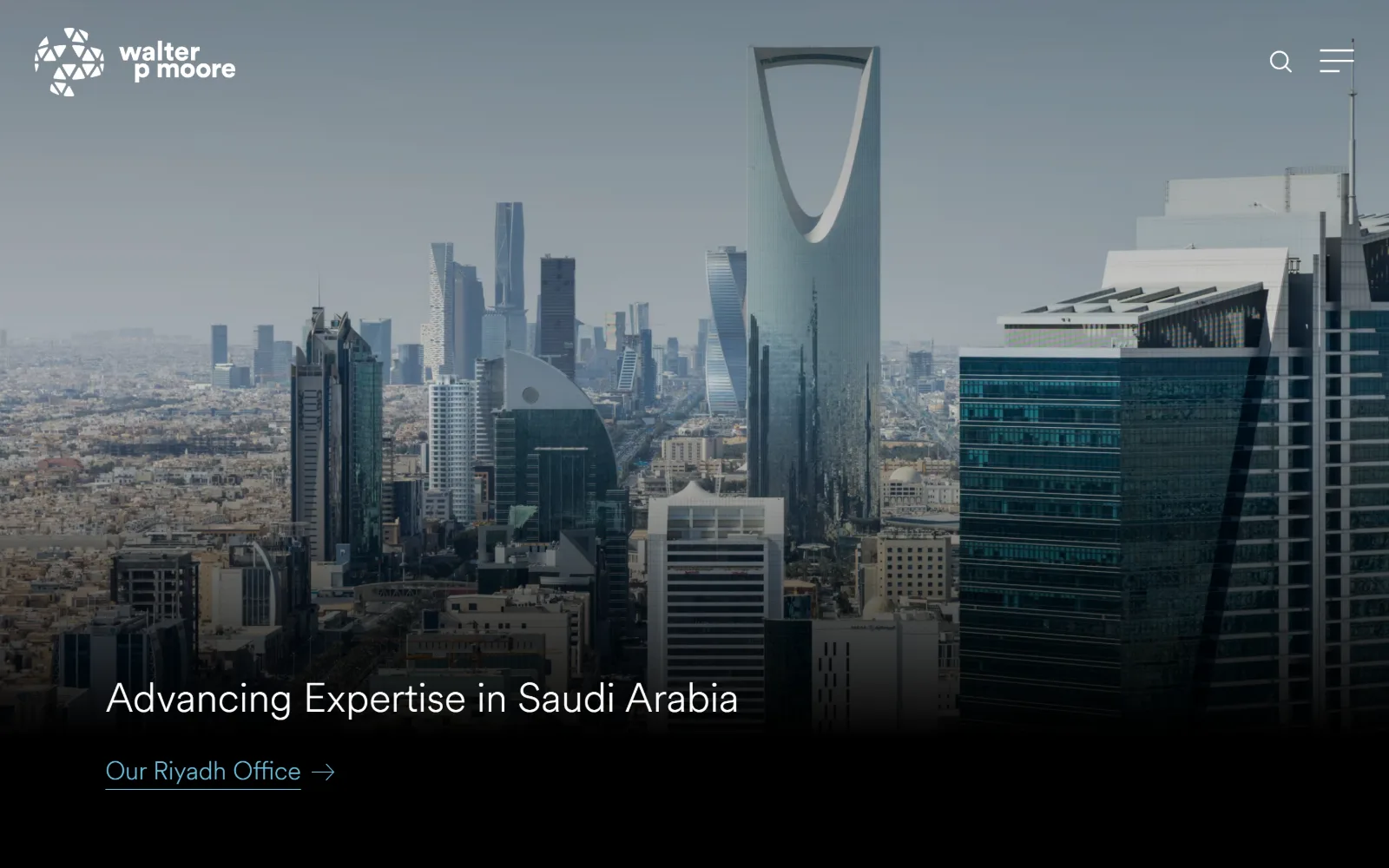
A hazy photograph of the Riyadh skyline fades into solid black at the bottom, where one white line and an underlined pale blue link sit.
Type
Circular 42px, weight 300
Body
Circular 26px, weight 300
Build
full-bleed video fading to black, 111px padding
Made on
Not detected
Colour
#000000 #ffffff #6cbfdd
Type. Circular at weight 300 throughout: 42px for the headline, 34px for nav items, 26px and 16px below. No bold anywhere, no tracking adjustment and no uppercase. A light geometric sans at 42px is a quiet choice for a firm of this size, and that restraint is most of what separates the page from a stock skyline treatment.
Colour. The measured palette is a single value, #000000 at 362.8 coverage, because the photograph dissolves into the page background instead of ending on an edge. The ink carries the rest: white across 382 characters and a pale blue #6cbfdd across 74, which underlines Our Riyadh Office. That blue is the only colour the site owns.
Layout. A full-bleed video hero under a sticky header holding only the wordmark, a search glyph and a burger, all in white. Section padding is 111px, radius 0, and the body background is pure black. The hero text sits at the lower left inside the region where the image has already faded out, so no overlay or scrim is required.
The ask. There is no button and no measured call to action. The single ask is a text link, Our Riyadh Office, underlined in pale blue with an arrow. The hero runs as a slider, so this is one of several regional stories rotating through. Nothing is requested of a visitor until they open the burger menu.
Fading a photograph into the page background colour gives you a full-contrast text area with no visible panel or gradient edge.
09
degenkolb.com
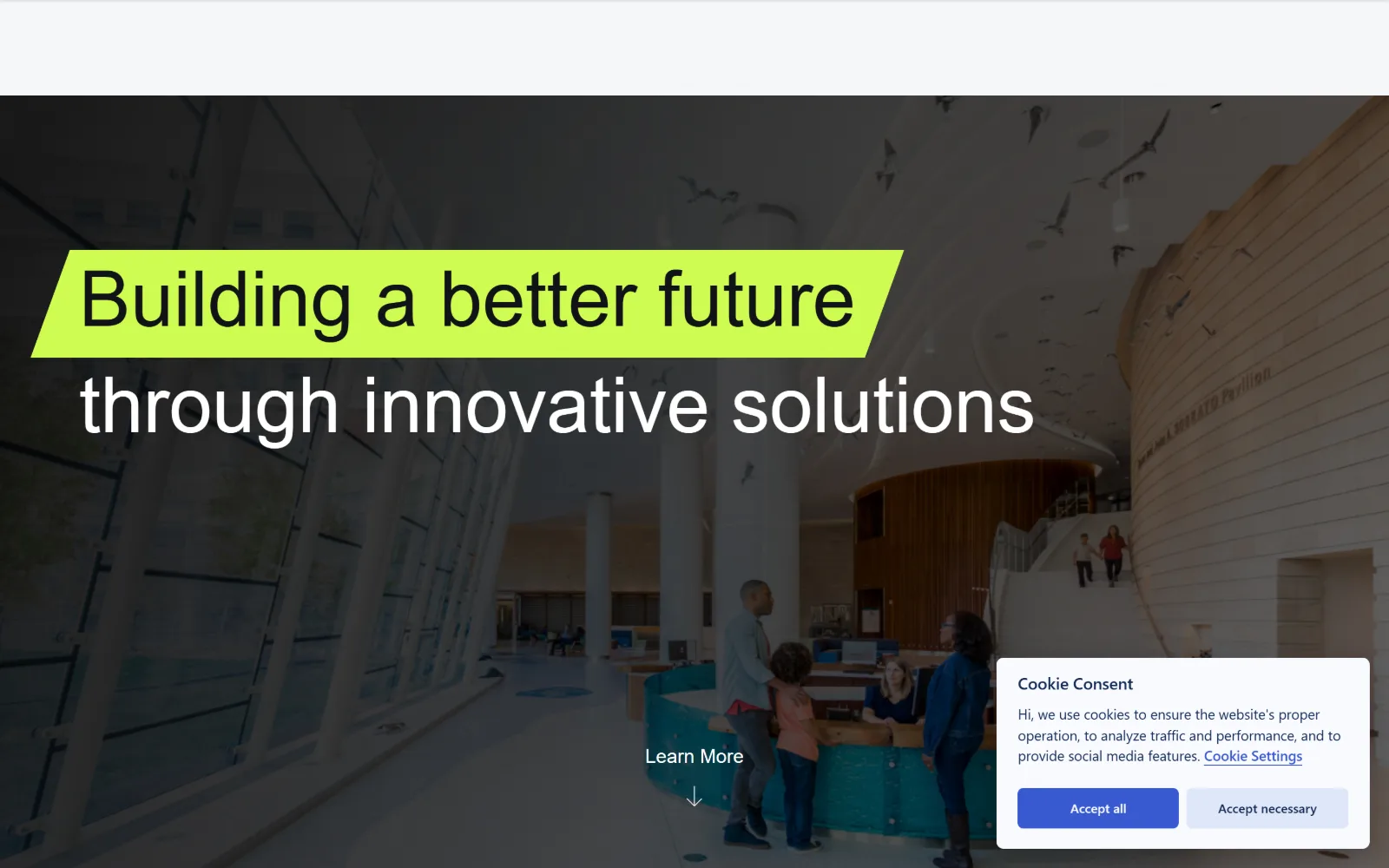
A wide interior shot of a museum atrium sits behind two display lines, the first knocked out in black on an acid lime highlight bar.
Type
Plus Jakarta Sans 80px
Body
Plus Jakarta Sans 24px / 1.50
Build
full-bleed photo, 72px padding, slanted highlight bar
Made on
WordPress
Colour
#f6f7f9 #121317 #cffc51
Type. Plus Jakarta Sans at 80px handles both display lines, one at weight 500 and one at 400, with a 48px register used four times below and a 24px uppercase label at weight 700. There is no serif and no second family. The jump from 80px straight down to 24px is steep, and that is what gives the opening line its force.
Colour. Six values, and the one that matters covers 1.1 percent: #cffc51, an acid lime used as a highlight bar behind the first line only. The ground is #f6f7f9 at 100 coverage, ink #121317 at 49.9, dividers #e2e4e9 at 40.7 and a blue #3859d0 at 0.3 belonging to the cookie bar. Nothing else on the page is saturated.
Layout. Full-bleed photograph beneath an empty white header band, which reads as unfinished in this capture. Section padding is 72px and radius is 0 on everything including the lime bar, whose ends are cut on a slant rather than squared off. A cookie consent panel sits over the lower right quarter of the image.
The ask. A single Learn More with a downward arrow sits centred at the foot of the hero, which makes it a scroll prompt as much as a click target. No phone number, no form and no filled button. The cookie panel is the only element demanding a decision above the fold, and that is a cost the design did not choose.
A highlight bar on one line and not the next is a cheaper emphasis device than changing weight, size or colour across a headline.
10
barr.com
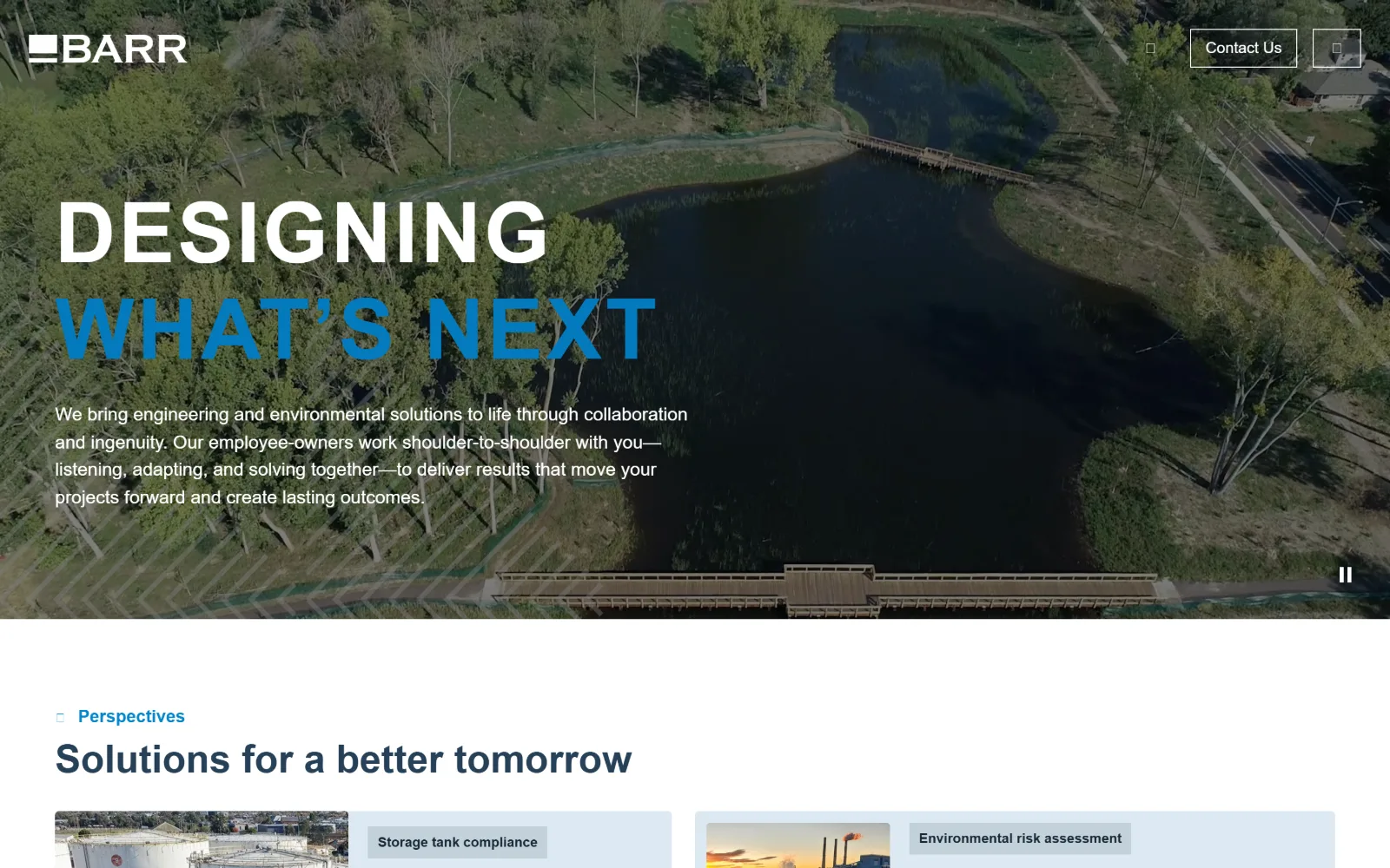
A restored pond and boardwalk seen from the air sit behind DESIGNING in white and WHAT'S NEXT in bright blue, stacked at the left.
Type
Roboto Condensed 87px, +0.034em
Body
Inter 19px / 1.50
Build
full-bleed video, 1440px, 88px padding
Made on
WordPress
Colour
#000000 #dde9f2 #264057
Type. Roboto Condensed at 87px, weight 700, with positive tracking of 0.034em, which is unusual on a condensed face and keeps the two stacked words from reading as one mass. Body is Inter at 19px on 1.50, and the section heading below runs Inter at 40px bold. Two sans families, one condensed and one not, each kept to its own job.
Colour. Black at 35.7 percent coverage, a pale #dde9f2 at 18.9 for the panels below and #c3d2db at 0.8. The ink carries the brand instead: #264057 across 547 characters of navy, and #047abe for the bright blue filling the second headline word and the Perspectives kicker. The aerial photograph itself is left close to unsaturated.
Layout. Full-bleed video hero running roughly three quarters of the viewport height, then a hard edge to white. Container is 1440px at full width, section padding 88px, radius 0. Below the fold a two-column grid of 639 and 663px tracks holds cards where the image and its caption panel sit side by side rather than stacked vertically.
The ask. One Contact Us button, outlined rather than filled, top right. No phone and no form above the fold. The second headline line is set in the accent blue but is not a link, so the page spends its strongest colour on emphasis instead of on an ask, and the cards below carry the real navigation.
Positive tracking on a bold condensed face at 87px stops stacked lines merging, and costs nothing against the space condensing saves.
11
auduboncompanies.com
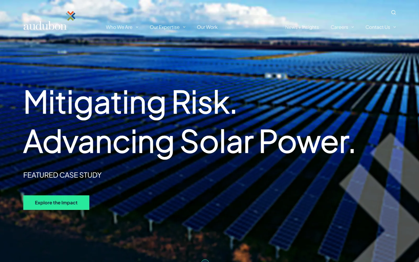
An aerial photograph of a deep blue solar farm runs full width, with two large white lines and a mint green button set at the left.
Type
Plus Jakarta Sans 104px
Body
Plus Jakarta Sans 24px
Build
full-bleed photo, floating nav, 100px padding
Made on
WordPress
Colour
#ffffff #c2d4e2 #0b2439
Type. Plus Jakarta Sans Light at 104px, used seven times across the page, carries the display lines, with a 32px Medium register nine times and 24px and 18px Regular for body. A capitalised 16px at weight 300 handles the nav. Naming the 104px cut Light while setting it at weight 700 is a quirk, but the result reads wide and open rather than heavy.
Colour. White at 100 coverage, a pale blue #c2d4e2 at 16.3 and #27ea9c at 1.8, a mint green that fills the button and shows in 18 characters of ink. Deep navy #0b2439 carries 859 characters, the most used ink on the page. The solar array supplies the blue, so the brand only has to supply the green.
Layout. Full-bleed photograph with the logo and nav floating directly over it, no header bar at all. Section padding is 100px and radius 0, so the button is a hard rectangle. A two-column split of 783 and 496px tracks runs below the fold. A large angled version of the logo mark sits as a watermark in the lower right of the image.
The ask. One button, Explore the Impact, mint on navy ink, under a FEATURED CASE STUDY label. That label is the point: the ask leads to work rather than to a contact form. Contact Us sits in the nav as the secondary route, and the hero is a slider, so further case studies follow behind this one.
Labelling the hero as a featured case study turns a single button into a content promise rather than a sales ask.
12
shive-hattery.com
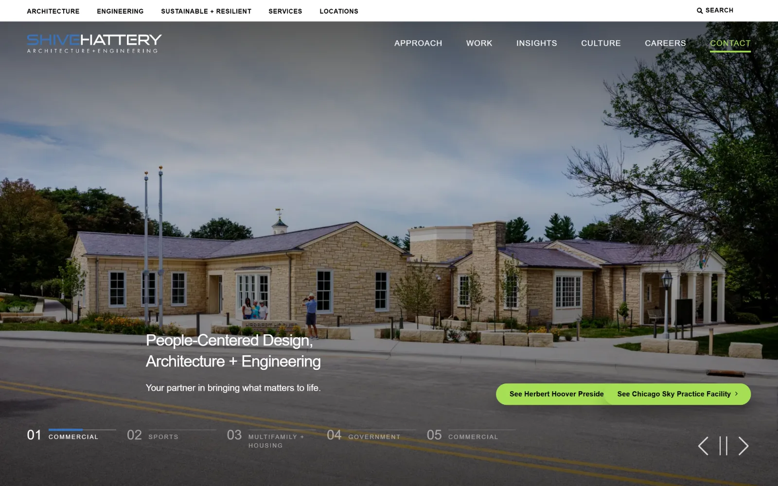
A limestone civic building under grey cloud fills the frame, with a two-line white heading low left and a lime pill of two slide links at right.
Type
Montserrat 30px, -0.034em
Body
Montserrat 17px / 1.50
Build
two-row header, full-bleed slider, 100px padding
Made on
WordPress
Colour
#ffffff #3e3f43 #a6de55
Type. Montserrat at every size, with the display set at only 30px, weight 300 and -0.034em tracking, which is small for a hero and leaves the photograph as the subject. Body is 17px on 1.50 in grey #75767a. The system earns its keep in the small sizes: 14px uppercase at 0.069em and a 13px at 0.227em, very wide tracking for category labels.
Colour. White at 100 coverage, a slate #3e3f43 at 47.8 for the hero ground, #a6de55 at 2.8 as the lime accent and a link blue #3673bf at 0.1. The lime fills the paired slide buttons at 25px radius and underlines CONTACT in the nav, which is the only place colour marks a destination rather than decorating one.
Layout. Two stacked header rows, a thin bar of five discipline links above the main six-item nav, both sitting over the photograph. The slider index runs across the bottom as five numbered categories. Container is 1440px, padding 100px, and the grids below run 250/1090px and a 12-column of 85px tracks at 20px gutters.
The ask. Two project links share a single lime pill, so one shape carries two asks. CONTACT is underlined in the nav. The five numbered slide categories across the foot, from Commercial to Government, are the real conversion device, letting a visitor self-select a sector before clicking anything at all.
Numbering hero slides by sector lets a multi-market firm show a visitor the category they came for without opening a menu.
13
terracon.com
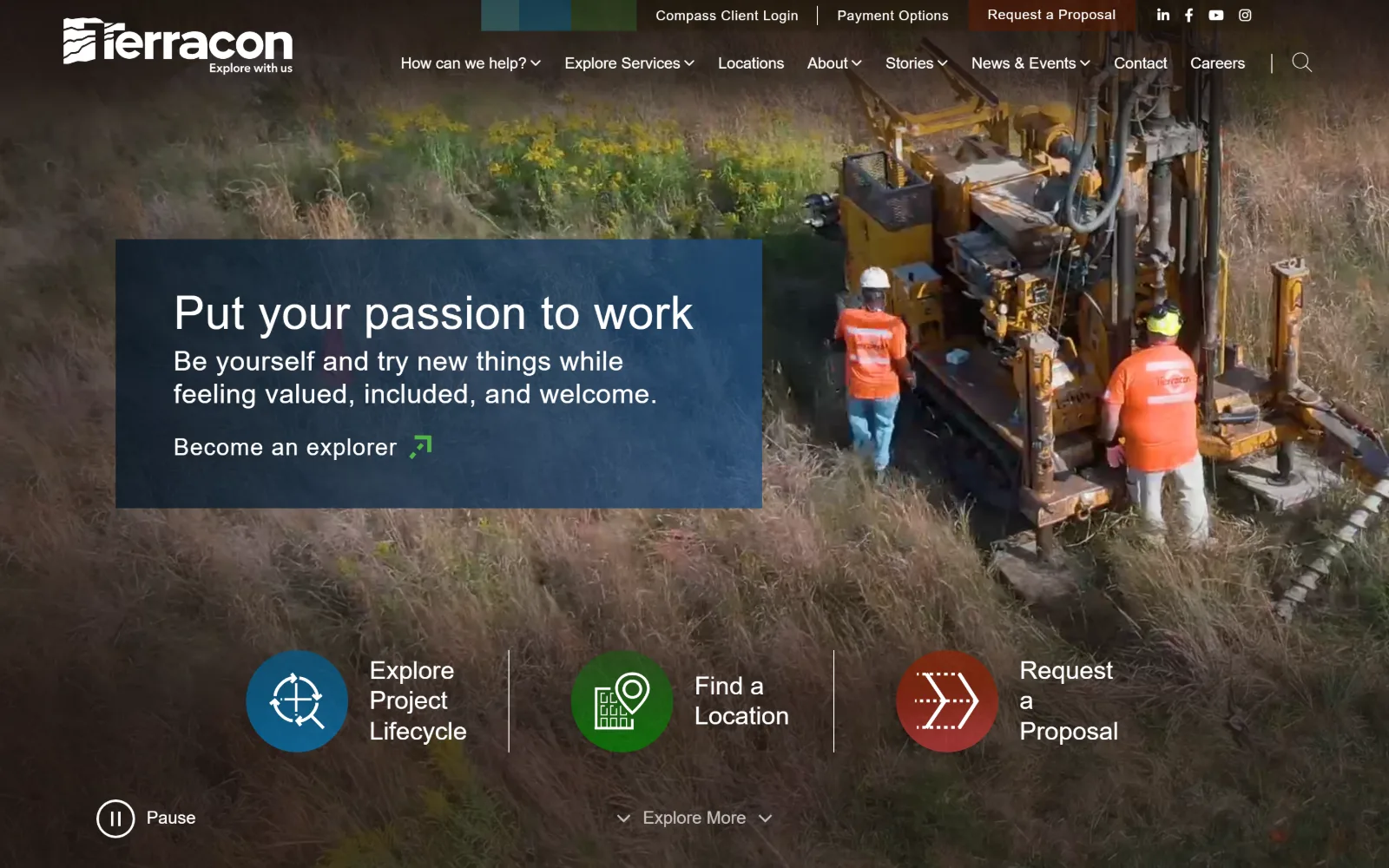
A drilling rig in long autumn grass fills the frame, with a navy text panel at the left and three circular icon links across the lower third.
Type
Figtree 48px, weight 100
Body
Figtree 16px / 1.50
Build
full-bleed video, left navy panel, 101px padding
Made on
WordPress
Colour
#ffffff #201800 #45c5e0
Type. Figtree at extreme light weights: the headline is 48px at weight 100 with 0.012em tracking, and a 96px at weight 300 and -0.040em appears three times below the fold. Body is 16px at weight 100 as well, which is thin for paragraph text. The 18px weight 500 used ten times is what actually carries the interface labels.
Colour. White at 201.5 coverage and #201800 at 12.3, a near-black with a warm cast carrying 1882 characters of ink. The accents are tiny and plural: #45c5e0, #387c2b and #8c2004 at 0.2 or 0.3 percent each, which are the three circular icons for project lifecycle, locations and proposals. Nothing else on the page is coloured.
Layout. Full-bleed video behind a semi-opaque navy panel pinned to the left third, with three icon links in a row beneath it separated by vertical hairlines. The header stacks a utility row above a three-item main nav. Container is 1440px, section padding 101px, radius 0, and a three-column grid of 410px tracks follows below.
The ask. Four asks compete above the fold: Request a Proposal as a filled tab in the utility row, the same words again as a circular icon lower down, Become an explorer inside the panel, and Compass Client Login. Repeating one ask twice at two sizes is the clearest signal of what the business actually wants.
Three colour-coded circular icons split client, careers and location traffic before anyone has scrolled a single pixel.
14
rsandh.com
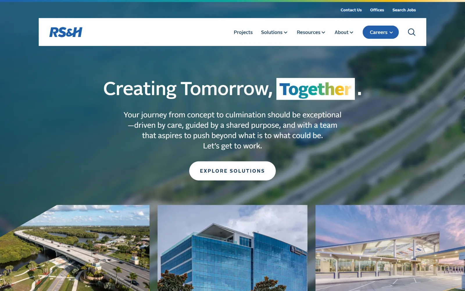
A blurred aerial of a causeway and interchange sits behind a centred headline where one word is boxed in white and set in four colours.
Type
Alright 58px, -0.012em
Body
Alright 23px / 1.39
Build
floating header card, centred hero, 250px padding
Made on
WordPress
Colour
#f3f7fa #103353 #415364
Type. Alright throughout: 58px at weight 500 and -0.012em for the headline, 23px on 1.39 for the standfirst, and 15px at weight 700 and 0.167em uppercase for buttons, with a 52px weight 900 once below. The headline is centred, rare in this set, and the full stop after the boxed word is deliberately kept outside the box.
Colour. Six measured values. #f3f7fa at 123.8 is the page ground, #103353 at 76.2 the navy, #415364 at 55.2 the hero overlay and #215dab at 0.7 the button fill. One word of the headline is set letter by letter in blue, teal, green and gold, the same four hues as the gradient rule running across the very top of the viewport.
Layout. A floating white header card inset from both edges sits over the photograph instead of spanning it, below a thin four-colour gradient rule at the top. Section padding is 250px, by far the largest here. Beneath the hero, three project images sit in a 463px three-column grid with their outer corners cut on an angle.
The ask. EXPLORE SOLUTIONS is the single centred button at 73px radius, with Careers as a filled pill in the nav and Search Jobs in the utility row above, so recruitment holds two of the three asks. The $18 billion and $1.2 billion figures further down do the credentialling that a client logo wall would elsewhere.
Repeating a four-colour gradient rule inside one word of the headline ties brand to message without adding a separate graphic.
15
intelligentproduct.solutions
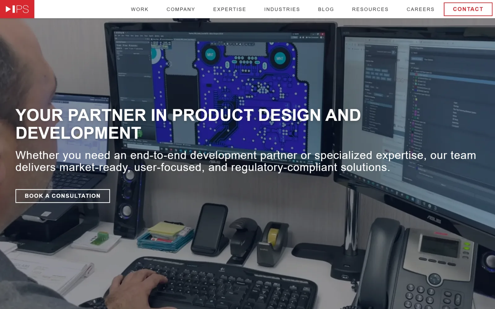
An engineer at a desk, a circuit board layout filling the monitor behind him, with a white uppercase headline set across the middle of the frame.
Type
IBM Plex Sans 48px uppercase
Body
IBM Plex Sans 16px, +0.100em caps
Build
white header bar, full-bleed video, 1440px
Made on
Webflow
Colour
#030820 #ebdfdf #ffffff
Type. IBM Plex Sans in four registers: 48px bold uppercase for the headline, 80px at weight 500 and 0.020em plus 56px at weight 300 and 0.030em below the fold, and 14px at 0.143em uppercase for the nav, six times over. That nav tracking is wide enough that eight items fit on one bar, which is the system's main achievement.
Colour. An even split, #030820 at 50 percent and #ebdfdf at 50, between a near-black navy and a warm off-white, with white at 2.9 and #333333 at 1.1. The brand red #d7282f shows in only seven characters of ink, plus the logo tile and the CONTACT outline. The blue circuit board on screen supplies the rest of the saturation.
Layout. Full-bleed video under a solid white header bar rather than behind it, so the eight nav items keep full contrast at any frame of the loop. The headline sits at the vertical midpoint, left aligned, with the button directly below. Container is 1440px at full width and radius 0 on both the outlined button and the logo tile. Built on Webflow.
The ask. BOOK A CONSULTATION is the ask, an outlined rectangle under the standfirst, with CONTACT in a red outline top right as its duplicate. Both are outlines rather than fills, so neither dominates the other. No phone number in the header, and nothing else on the first screen competes for the click.
Wide letter-spacing on a 14px uppercase nav fits eight items on one bar and removes the need for a burger at desktop width.
16
hrgreen.com
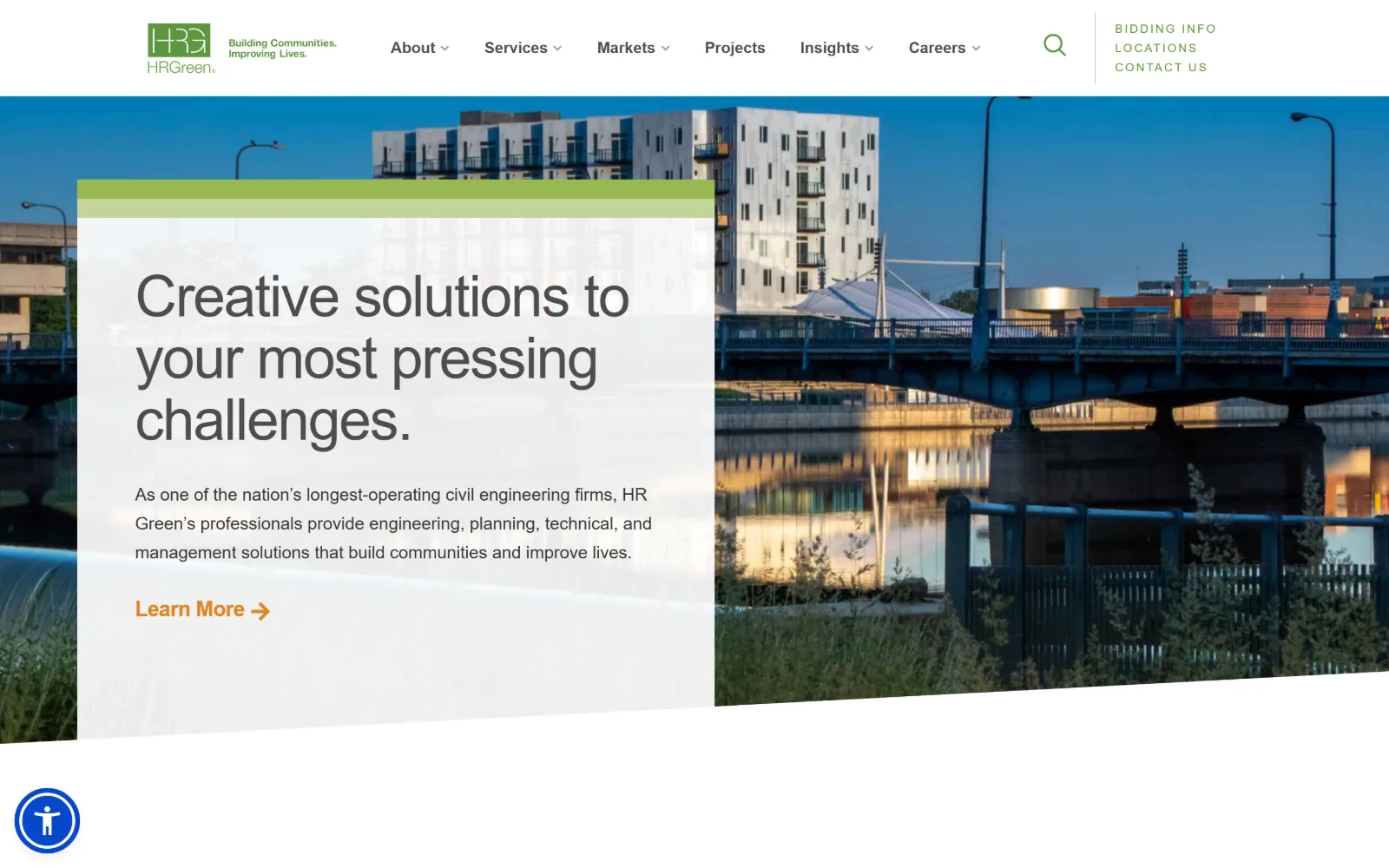
A river bridge at dusk sits behind an angled translucent white panel holding a three-line heading and an orange Learn More link.
Type
acumin-pro 60px, -0.025em
Body
acumin-pro 18px / 1.67
Build
angled translucent panel over photo, 1440px
Made on
WordPress
Colour
#ffffff #f6f6f6 #97b953
Type. Acumin Pro at 60px, weight 300, with -0.025em tracking for the headline, a 48px at -0.042em used four times below and 18px on 1.67 for body in #333333. The small end is where the system shows itself: 12px at 0.167em uppercase for labels. A light weight at 60px survives over a photograph only because the panel behind it is nearly opaque.
Colour. White at 122.6 coverage and #f6f6f6 at 26.7 are effectively the whole page, with #97b953 and #c1d598 at 0.5 percent each as the two greens. Ink runs #333333 for 507 characters, a darker #4d4d4f for 131, a green #5e9732 for 68 and an orange #e18327 for just 10, which is the Learn More arrow.
Layout. The signature move is the angle. A translucent white panel topped by a lime bar is cut on a slope at its base, and the photograph behind it is cropped on the same slope. Container is 1440px at full width, radius 0. A circular accessibility control pins to the bottom left, and the header carries a six-item nav plus a three-line utility stack.
The ask. Learn More in orange with an arrow is the only ask in the hero, and orange appears nowhere else, so ten characters of ink carry the whole conversion weight. CONTACT US and LOCATIONS sit in the utility stack alongside BIDDING INFO, which is a tell about exactly who the firm expects on the page.
Cutting the text panel and the photograph on the same slope links them structurally and hides the panel edge that would read as a box.
17
dewberry.com
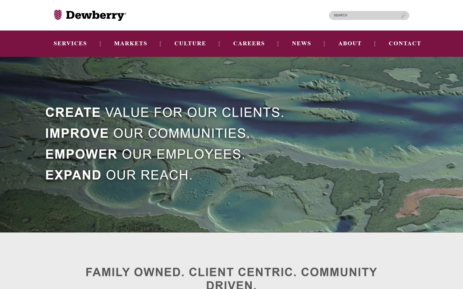
A false-colour aerial survey of a river delta in green and purple sits under a maroon nav bar, with four stacked uppercase lines across it.
Type
proxima-nova 40px uppercase, +0.050em
Body
open-sans 27px / 1.64
Build
three stacked bands, 1440px, radius 0
Made on
Not detected
Colour
#ffffff #ebebeb #7a1341
Type. Proxima Nova at 36 and 40px, uppercase, at 0.050em tracking, with the first word of each of the four lines at weight 600 and the rest at 400. Body is open-sans at 27px, weight 300, with 0.041em tracking and 1.64 line height. Both faces are tracked wide, an older habit, but it is applied consistently at every size measured.
Colour. White at 200 coverage, #ebebeb at 29.4 and #7a1341 at 10.1, the maroon filling the navigation bar and the logo mark. Body ink is a flat #595959 grey across 391 characters rather than black. The survey image carries far more saturation than the palette does, which is precisely why the maroon bar has to separate the two.
Layout. Three stacked bands: a white logo and search row, a solid maroon nav of eight items separated by dotted colons, then the full-bleed image. Container is 1440px at full width with radius 0 everywhere. A grey band below the hero carries a centred three-part statement. The structure is older, but the nav never floats over the picture.
The ask. CONTACT is the measured call to action and it sits as the last of eight nav items rather than as a button. There is no form, no phone and no filled element on the first screen. The $763.00 million revenue figure below does the credentialling. For a firm selling to public agencies, the nav is the funnel.
A solid colour bar between the logo row and a busy image keeps navigation legible with no scrim, blur or drop shadow at all.
18
gza.com
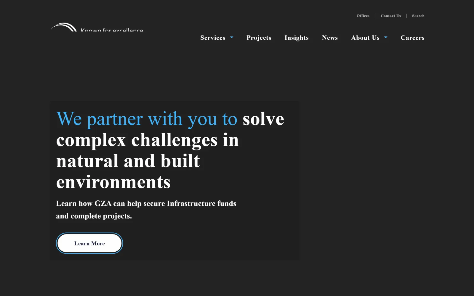
Four lines of serif headline sit on a near-black ground, the opening clause in bright blue, with a white Learn More pill beneath them.
Type
Heebo serif stack 60px / 1.07
Body
Heebo 20px / 1.60
Build
left headline block, 1440px, 50px button radius
Made on
Not detected
Colour
#fefefe #232323 #40b1f7
Type. Heebo resolving through a serif stack at 60px on 1.07 line height for the headline, with the standfirst and the navigation also serif: 20px on 1.60 for body and 12px at 0.037em weight 700 for nav. Setting navigation in the same serif as the headline is unusual here and gives the page an editorial register rather than a corporate one.
Colour. Two measured values, #fefefe at 100.4 coverage and #232323 at 55.6, so the ink does the work instead. A bright #40b1f7 carries 293 characters including the entire first clause of the headline, against 66 of white and 66 of mid grey #5d5d5d. Colouring half a sentence rather than one word is a bolder use of a single accent than most of this group risks.
Layout. The headline block sits left at roughly 40 percent of the viewport width, leaving the right half empty because the hero video had not painted at the moment of capture. The header splits into a utility row of Offices, Contact Us and Search above a six-item serif nav. Radius is 0 across the page and 50px on the single button.
The ask. One ask, a white Learn More pill at 50px radius, under a line offering help securing infrastructure funds. That is a specific offer rather than a generic contact prompt, and it is the only button on the screen. Contact Us sits in the utility row above as the fallback, and no phone number appears anywhere.
Running a headline's opening clause in the accent colour marks emphasis across several words where bolding one would read as shouting.
How these were chosen
Twenty four firms were captured and eighteen made the page. The pattern that holds is restraint in the type system: most of these run a single family across display, navigation and body, and corner radius is 0 on all but a handful, with curves saved for whatever the page actually wants clicked. The pattern that does not hold is the idea that engineering website design means a skyline and a slogan. Four of these open on a hard vertical split, two give the first screen to a named project rather than to the firm, and one fades its photograph into the page background so the headline needs no scrim. The real division is between firms selling the work and firms selling the staff. The first puts a project name or case study label above the fold; the second puts recruitment links in the hero. Both are defensible, and the colour and type follow from that choice.
Finding engineering sites that someone had actually designed took far longer than it should have. 30 candidates made the shortlist. 18 made the page.
Each one was opened and looked at properly: what the type is doing, where the colour gets spent, how the page is built, how it asks for the job. Nothing is here because it ranks. Nothing is here because an agency filed it under portfolio. Several well known names were left out for the plain reason that their site came out of the same template as everyone else's, and a few sites worth including did not survive a second look.
Where a site is only competent, it says so. The order is the order worth your time, best first.
Reviewed and selected by Larry W. Matthews for Websitely.