Manufacturing Website Design, 16 Real Factory Sites
Sixteen US plants, machine shops and contract manufacturers. Manufacturing website design that photographs the floor instead of a stock handshake.
Shown
16 sites
Reviewed
30 candidates
Chosen on
The work, not the ranking
Updated
15 October 2026
01
mcandrs.com
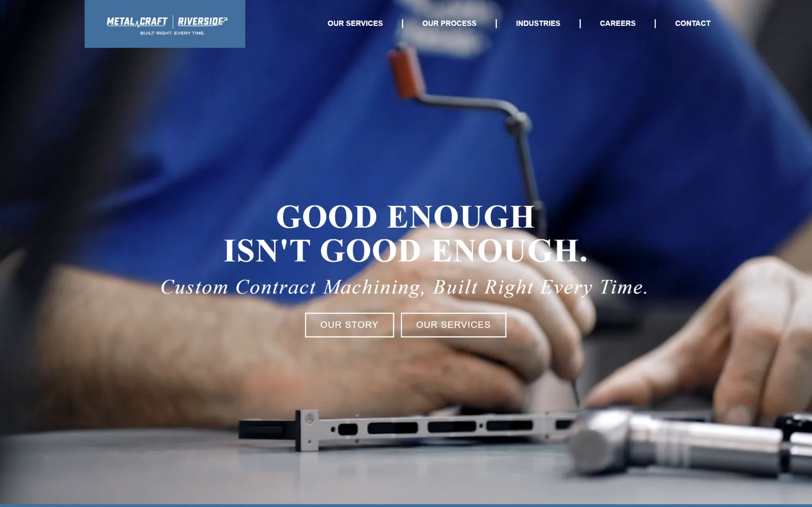
Two hands deburr an aluminium rail in close-up, the worker in a blue shop shirt, with a serif headline and two outlined buttons centred over it.
Type
Oswald 58px / 700
Body
Fieldwork Geo Regular 16px / 1.88
Build
Full-bleed video, floating logo plate, centred overlay
Made on
WordPress
Colour
#ffffff #426f9d #63696d
Type. The measured scale tops out at Oswald 58px weight 700 with 0.017em tracking, then a 38px step, then a Fieldwork Hum Bold Italic cut at 25px used three times, with Fieldwork Geo Regular at 16px on a loose 1.88 line height for reading. In the captured frame the hero line renders as a high-contrast serif with an italic serif line under it, a register almost nobody else in this set attempts.
Colour. Two measured values only: white at full coverage and #426f9d, a muted slate blue, at 30.8 percent. Ink is white across 577 characters with #63696d on 74. The blue comes from the logo plate and from the shirt in the footage rather than from a brand bar, so the accent and the subject are literally the same colour.
Layout. No container width is set, so the video runs the full 1440px with the header floating on top: a solid blue logo plate at left and five nav items separated by thin vertical rules. Headline, subline and two ghost buttons sit centred on the lower middle rather than left aligned. Radius 0 throughout, document 4670px.
The ask. Two outlined buttons of equal weight, Our Story and Our Services, and neither asks for a quote. Contact is the last of five nav items and there is no phone number in the header. A shop that leads with its story rather than a quote form is betting the visitor is early in the search.
Two ghost buttons of equal weight work only when neither is the real ask; pick one solid button the moment you want a quote.
02
hoggeprecision.com
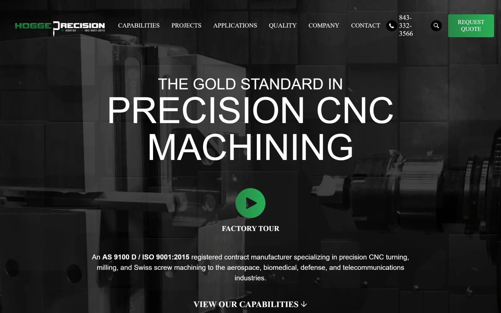
Desaturated machining footage fills the frame under a 104px white headline, with a green play button and a centred paragraph beneath it.
Type. Barlow Condensed at 104px weight 500, uppercase, at a 1.02 line height is the largest display size anywhere in this group, and it is set over a 44px line of the same cut so the two stack as one block. Below that Barlow drops to 20px and 19px for 535 characters of body. One superfamily, three widths, and the condensed cut is what lets a 23-character headline run that big.
Colour. Three measured values: white at full coverage, black at 66.1 percent and #3a3a3a at 0.3. Ink splits almost evenly, 646 white characters against 635 black. The photograph is already greyscale, so the only saturation on the page is the green of the play button and the quote button, applied nowhere else above the fold.
Layout. The container is the full 1440px viewport with 220px of section padding, unusually generous for a shop site and the reason the headline has room to breathe. The header is a single row carrying eight nav items, a stacked phone number, a search glyph and a green quote button. Radius 0, document 4830px deep.
The ask. Three asks compete above the fold: Request Quote in the header, the Factory Tour play button in the centre and View Our Capabilities at the base. The phone number is in the header but wrapped across three lines, so it reads as cramped beside the button it sits next to.
A condensed display cut lets a headline run at 104px without hyphenating, which is how a short line fills a wide frame cleanly.
03
owensind.com
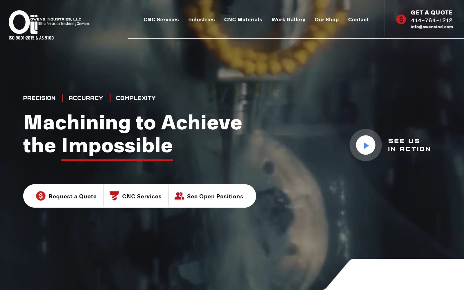
Dark machining video runs behind a bold white two-line headline, a red rule, a white pill holding three buttons and a round play control.
Type. RNS Physis runs the whole page across a wide weight range: 65px at weight 900 with 0.012em tracking for the headline, 45px at weight 300 for a second line, and 16px at a deliberate 0.050em on a 1.80 line height for 317 characters of body. One 18px Orbitron cut at 0.200em uppercase handles the Precision Accuracy Complexity strap, the only second family here.
Colour. Near-black #111111 at 65.1 percent coverage, white at 52.2 and #d51b1c at 0.4. That last 0.4 percent does all the work: the rule under Impossible, the dollar glyph, the services icon and 12 characters of ink. Everything else on screen is the desaturated blue-grey of the footage.
Layout. Full 1440px field with 100px section padding and a two-column 638px grid below. The header splits into three zones divided by hairlines, with certifications stacked under the logo at far left and the quote block boxed off at far right. The three buttons share one white pill with dividers rather than sitting as three separate shapes. Radius 0.
The ask. Three buttons in one container, Request a Quote, CNC Services and See Open Positions, plus a phone number and email boxed at top right and a video play control. Putting a careers link beside a quote button is a choice: this shop is recruiting as hard as it is selling.
Grouping three unrelated calls to action inside one pill reads as a single control instead of three buttons fighting for the same space.
04
natechplastics.com
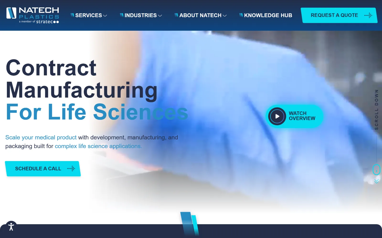
Gloved hands in blue blur behind a navy header bar, with a three-line headline whose last line fades from blue into the photograph.
Type
Blinker 84px / 600
Body
Blinker 22px / 1.50
Build
Sticky navy header, diagonally masked hero video
Made on
WordPress
Colour
#242e49 #278cc3 #05daef
Type. Blinker carries everything: 84px weight 600 at a 1.00 line height for the headline, 22px weight 400 for the standfirst, nav at 20px weight 700 uppercase, and a 16px cut at 0.200em for the smallest label. The headline's third line is set in #278cc3 while the first two are near-black, so colour does the hierarchy that a second weight would normally do.
Colour. Two background values, white at 90.7 percent and #242e49 at 85, with four ink colours: white, #242e49, #05daef on 41 characters and #278cc3 on 18. The cyan is electric enough to carry the Schedule a Call button and the Watch Overview pill on its own, and it is the only high-saturation value on a page otherwise built from navy.
Layout. A sticky navy header spans the full 1440px with four nav items, each prefixed by a small angled mark, and a cyan quote button at the right end. The hero is full width with the video masked behind a diagonal fade, so the left third stays white and the type sits on paper rather than on footage. Radius 0, document 8400px deep.
The ask. Two asks in view, Request a Quote in the header and the cyan Schedule a Call button in the hero, with Watch Overview as a softer third. No phone number appears above the fold, which suits a contract manufacturer whose sales cycle starts with a booked conversation.
Fading a video out to white behind the first third of the frame lets headline type sit on paper, with no scrim and no contrast problem.
05
oberg.com
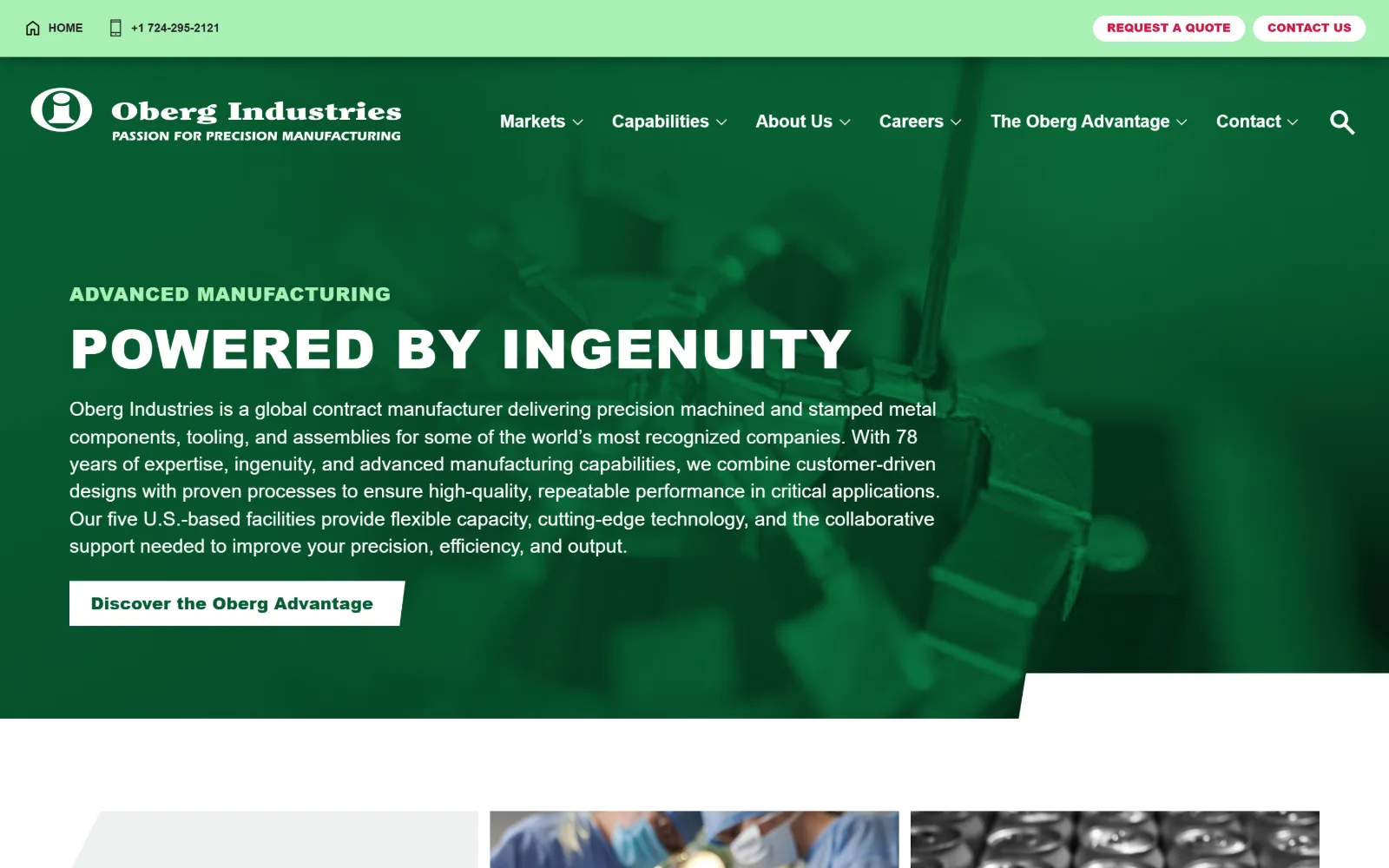
The whole screen is flooded dark green, a machining photograph showing through it as a duotone behind white caps and a long paragraph.
Type
Nunito Sans 56px / 900 uppercase
Body
Nunito Sans 20px / 1.40
Build
1300px container, flooded green hero, angled bottom edge
Made on
WordPress
Colour
#064726 #a8f0b4 #085e33
Type. Nunito Sans at 56px weight 900, uppercase, 0.020em tracking and a 1.00 line height sets the headline, with a 30px cut of the same weight above it in pale green. Body runs 20px weight 400 across 566 characters, far more copy than most of these put above the fold, and an 800 weight at 14px with 0.030em handles eight small uppercase labels.
Colour. The hero is one flooded colour, #064726, with #085e33 for button ink, #a8f0b4 at 3.3 percent for the eyebrow and the top bar, and #cf1745 on 25 characters of contact link. The photograph is pushed through the green rather than placed on it, so a generic machining shot becomes brand material instead of decoration.
Layout. A 1300px container at 90 percent of viewport with 96px section padding, and a three-column 424px grid underneath at a tight 12px gap. The green field is cut off at the bottom by an angled edge rather than a straight one. Button radius is 0, and the quote and contact pills in the top bar are the only rounded shapes present.
The ask. Four asks: a phone number plus Request a Quote and Contact Us pills in a pale green utility bar, then Discover the Oberg Advantage as the hero button. That hero button leads to an about page rather than a form, so the actual quote request is pushed up into the smallest bar on the page.
Duotoning stock photography into your brand colour costs nothing and stops a generic machining shot from looking like a generic machining shot.
06
waupacafoundry.com
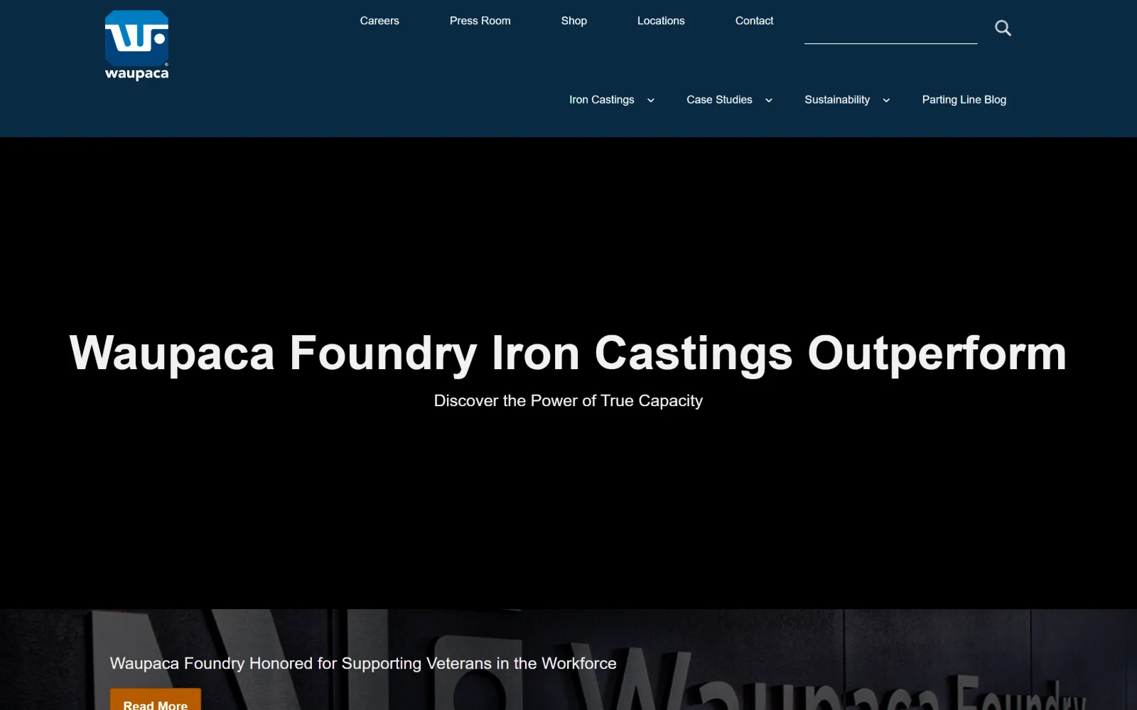
White headline type and a one-line subhead sit alone on a black field, with a navy header above and a dark news strip appearing below.
Type
sans-serif 60px / 700
Body
sans-serif 14px / 1.49
Build
Full-bleed black hero, two-row header, zero-gap grid
Made on
Not detected
Colour
#092a43 #f2f2f2 #b85b00
Type. The stack resolves to the browser's generic sans-serif at every size, which is either a failed webfont or a decision not to load one. The headline runs 60px weight 700 at a 1.20 line height in #f2f2f2 rather than pure white, with a 30px line under it and nav at 14px weight 400 used 24 times. System type at 60px is cleaner than it has any right to be.
Colour. The measured body background is #0100f8, a pure blue that never appears on screen because the hero video covers it, with #8d8d8d at 37.1 percent, #092a43 for the header navy and white at 11.7. Ink is #061f31 across 220 characters. The orange #b85b00 button in the news strip is the single warm value on the page.
Layout. Full 1440px field with 48px section padding and a three-column 320px grid at zero gap, so the lower cards meet edge to edge. The header is two rows, utility links and a search field on top and product nav beneath, both sitting left of centre with a wide empty gutter beyond them. Button radius is 3px, the only non-zero radius here.
The ask. No quote button, no phone number, no form in view. The only button is Read More on a veterans news item at the foot of the hero. For the largest foundry on this list the homepage behaves like a press page, which is what you can do when buyers already know who you are.
Ink at #f2f2f2 rather than pure white on a black field reduces halation at large sizes and keeps a 60px headline from vibrating.
07
divplast.com
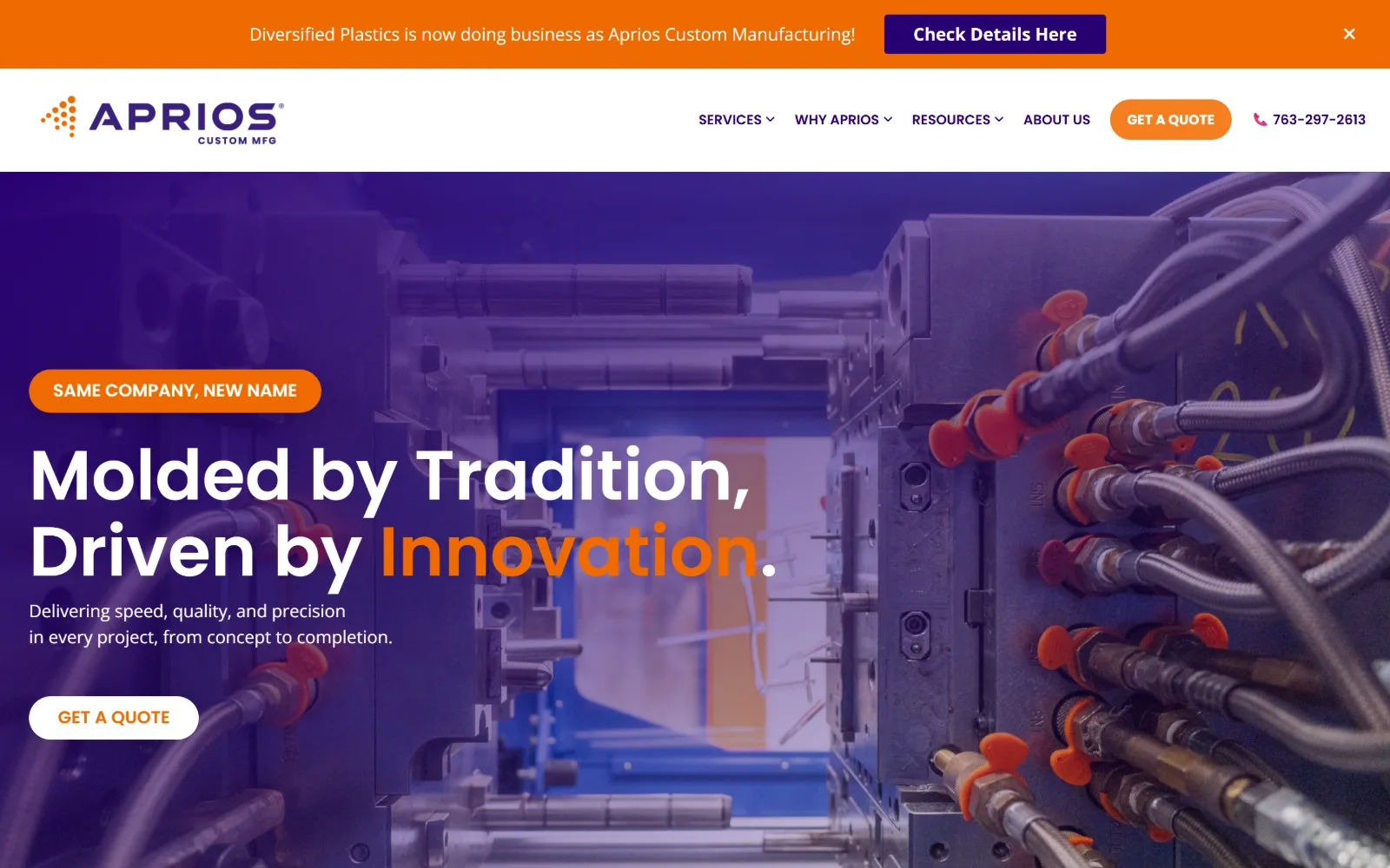
Purple wash over a photograph of an open injection mould, with a two-line headline whose final word is set in orange.
Type
Poppins 72px / 600
Body
Open Sans 18px / 1.50
Build
Announcement bar, full-bleed washed photo, 30px pills
Made on
Not detected
Colour
#280071 #ef6a00 #ffffff
Type. Poppins at 72px weight 600 on a 1.10 line height sets the headline over two lines, with a 60px cut further down, and Open Sans takes the 18px body. Geometric against humanist is a common enough pairing, but the decision that matters is the full stop after Innovation, left white while the word itself is orange.
Colour. Four values: white at 137.4 percent coverage, #ef6a00 at 4.4, #280071 at 0.4 and #f57e20 at 0.2. Two near-identical oranges is one too many. The deep violet is the interesting one, applied as a wash over the mould photograph so the page ground and the imagery share a hue.
Layout. Full 1440px field with an orange announcement bar above a white header carrying six nav items, a 30px-radius quote pill and a phone number. The hero is a full-bleed background image with all content left aligned inside the first third. Button radius is 30px against a page radius of 0, so the pills are the only soft shapes.
The ask. Three asks and they are all the same ask: Get a Quote in the header, Get a Quote in the hero, and a phone number beside the first. A fourth, Check Details Here, sits in the rename banner. Repeating one button verbatim is safer than offering two different ones, but it wastes the second position.
Washing a photograph in your brand violet makes hero imagery and page ground share a hue, so the overlay stops reading as a filter.
08
customeng.com
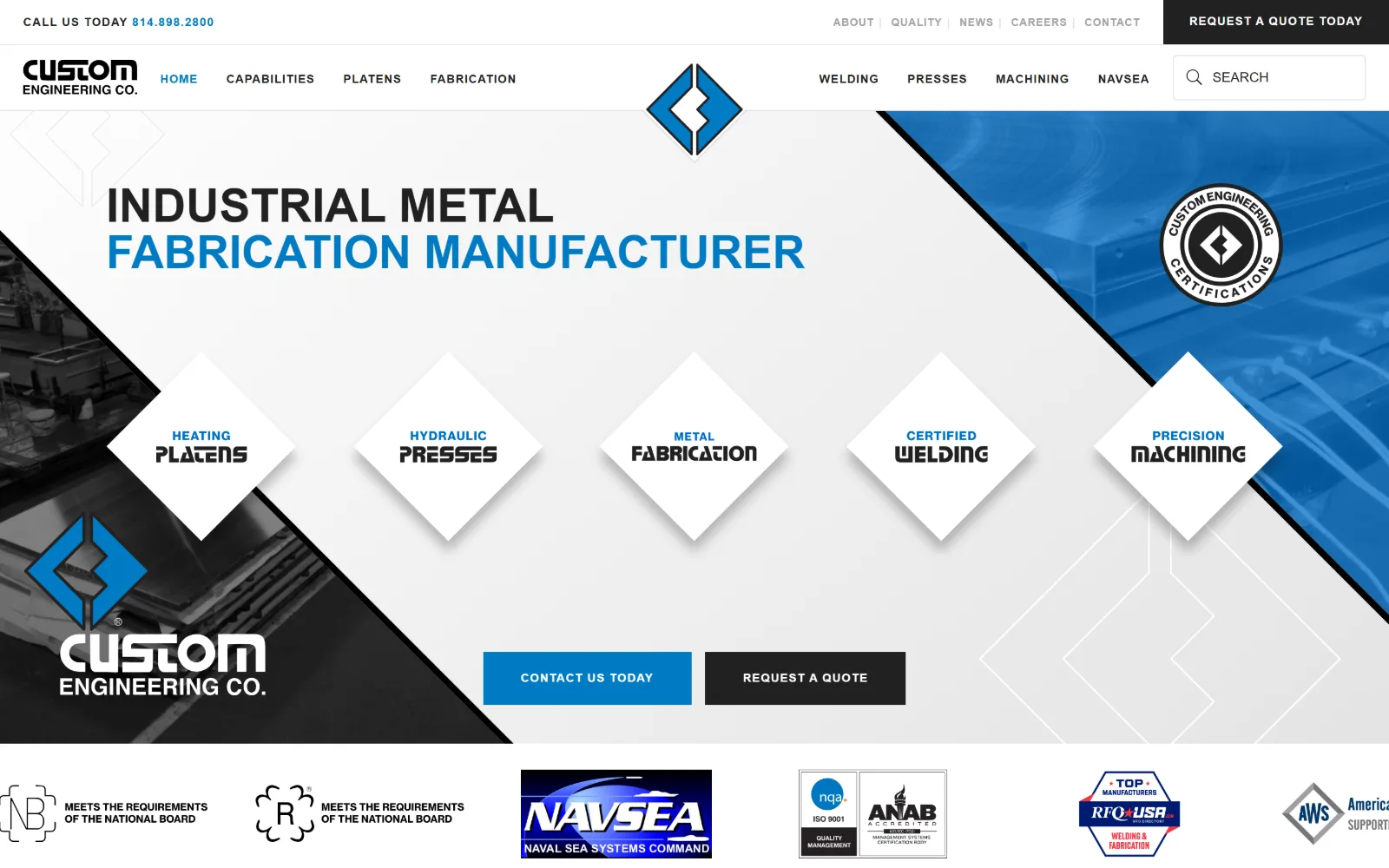
Five white diamonds holding service names cross a diagonal split between a grey factory photo, a pale field and a blue-tinted panel.
Type
neue-haas-grotesk-display 48px uppercase
Body
Open Sans 16px / 2.00
Build
Diagonal wedges, five rotated tiles, sticky header
Made on
WordPress
Colour
#212121 #007ac2 #ffffff
Type. neue-haas-grotesk-display at 48px weight 700 uppercase carries the headline across two lines, the second line in blue, and the same face drops to 12px at 0.083em for 156 characters across 14 uses. Open Sans at 16px with a 2.00 line height handles 797 characters of body. The rotated labels inside the diamonds use a squared industrial cut that appears nowhere else.
Colour. White at 260.8 percent cumulative coverage, #212121 at 102.2, #007ac2 at 19.2 and black at 2.8. The blue is spent on the second headline line, the logo, one button and the diamond labels, while the dark grey takes the first headline line and the second button. Only 16 characters of ink are actually blue.
Layout. The whole composition is built on 45-degree diagonals: a photo wedge at lower left, a blue-tinted wedge at upper right, and five diamonds in a row across the middle with drop shadows under them. The field is the full 1440px with a sticky header above it. Radius is 0 everywhere, consistent for a page made of rotated squares.
The ask. Four asks: Request A Quote Today in a black bar at top right, a phone number at top left, then Contact Us Today in blue and Request A Quote in dark grey sitting side by side in the hero. The two hero buttons are the same size and weight, so neither one wins.
Rotating service tiles 45 degrees gives a flat grid a structure, but it holds only if every label is short enough to fit inside the diamond.
09
lamjen.com
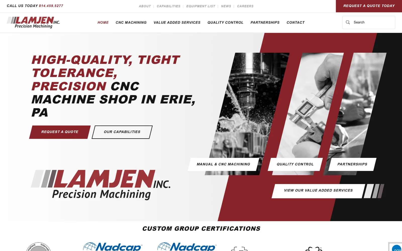
Red parallelogram sweeps the frame behind three skewed greyscale machining photos, beside an italic headline and a large wordmark.
Type. pt-sans-pro at 53px weight 900 uppercase with 0.019em tracking sets the headline, with 42px and 21px cuts below it and a 12px weight 700 at 0.082em used 16 times for every label and button on the page. Body is Open Sans at 14px on a 2.00 line height. The headline is obliqued, and so are the buttons, which matches the skewed photo frames exactly.
Colour. Three values: white at 156.9 percent coverage, #141414 at 40.9 and #882329 at 1.2. That deep brick red takes the first two words of the headline, the quote bar, the primary button and the large parallelogram behind the photographs. Ink splits 462 white, 261 near-black, 42 grey and only 16 red characters.
Layout. A full 1440px field with the header pinned above a composition running on one consistent oblique: three photographs sheared at the same angle as the red field behind them, with white label plates overlapping their lower edges. The wordmark sits at lower left at roughly the same size as the headline. Radius is 0 throughout.
The ask. A phone number top left, Request A Quote Today in the top bar, then Request A Quote and Our Capabilities as a pair in the hero, plus four label plates that double as links. Seven clickable things above the fold is a lot, and the two quote buttons say the same thing twice.
If you shear your imagery, shear the buttons and label plates by the same angle, or the composition reads as broken rather than styled.
10
tlxtech.com
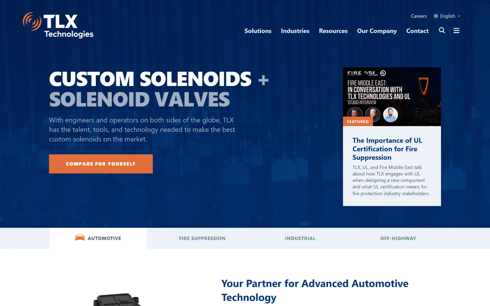
A deep navy field holds a two-line uppercase headline in white and grey, an orange button, and a white card carrying an article preview.
Type
proxima-nova 60px / 900, -0.025em
Body
proxima-nova 20px / 1.40
Build
1150px container, 18-column named grid, two-thirds split
Made on
Not detected
Colour
#1e2d5c #e2703c #edf2f7
Type. proxima-nova at 60px weight 900, uppercase, with -0.025em tracking sets the headline, and the second line drops to a pale grey so one sentence carries two levels with no change of size. Body runs 20px weight 400 in #a0aec0 at 1.40, and the button sits at 14px weight 800 with a wide 0.100em. Negative tracking on a 900 weight keeps the caps from spacing out.
Colour. White at 100.7 percent, #edf2f7 at 10, #1e2d5c at 5.6 and #e2703c at 1.1. The navy is a true corporate blue rather than near-black, and the orange is muted rather than safety orange, which is what stops the pairing looking like a warning sign. Body ink is #4a5568 across 585 characters.
Layout. A 1150px container at 80 percent of viewport with 48px section padding, sitting on an 18-column named grid with full, feature, popout and content zones, plus a 12-column grid at a 64px gap. The hero splits roughly two thirds text to one third article card, and a four-tab industry switcher sits immediately beneath. Radius 0.
The ask. One hero button, Compare For Yourself, which is an unusual ask: it invites comparison rather than a quote. Contact is the last nav item and there is no phone number in the header. The featured article card competes with the button for attention and is physically the larger of the two.
Dropping the second line of a headline to a pale tint gives two levels of hierarchy inside one sentence with no change of size or weight.
11
aimprocessing.com
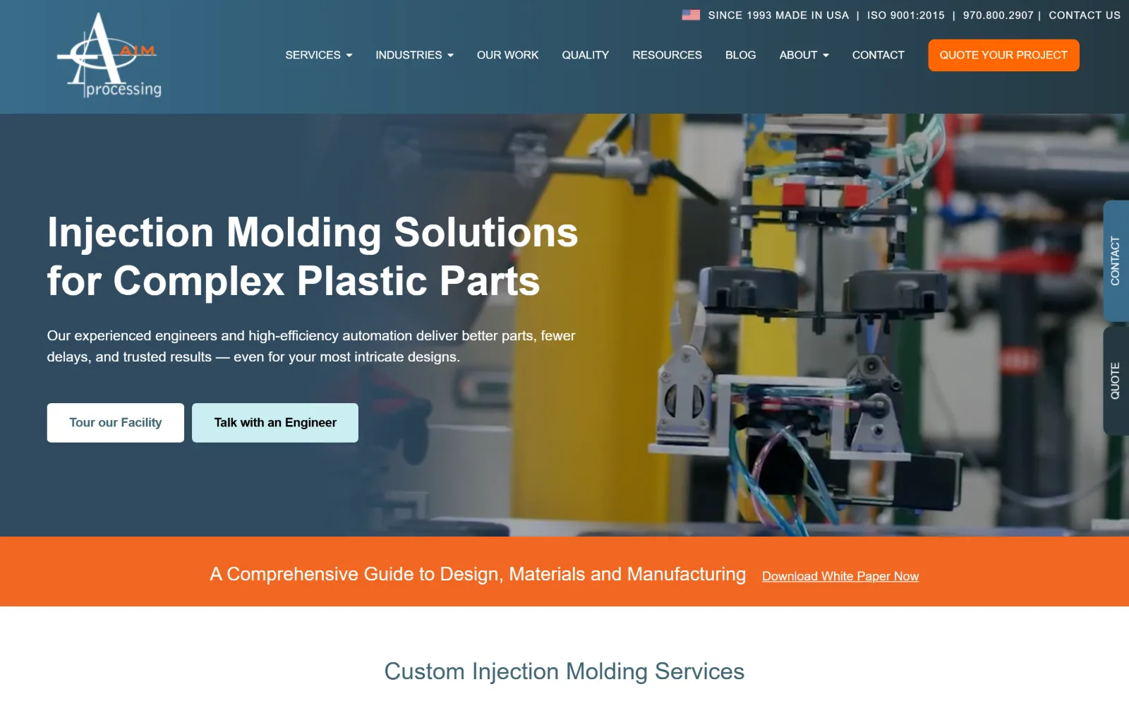
Slate-blue wash over a robot arm lifting moulded parts, with a white headline, two buttons and a full-width orange band below.
Type
Lato 52px / 700
Body
Lato 18px / 1.50
Build
700px container, full-bleed video, pinned side tabs
Made on
Not detected
Colour
#406573 #ff6600 #cbeef2
Type. Lato does everything: 52px weight 700 for the hero line and 30px weight 400 in #406573 for the section head below it, with 18px and 16px cuts handling 571 characters of body between them. A 13px size at 0.078em tracking takes the smallest labels. Setting the section head in slate blue rather than black is what keeps the page from going heavy.
Colour. Six measured values, more than most here: white, black at 59.9 percent, #cbeef2 and #007078 at 0.4 each, #ff6600 at 0.3 and #386b8a at 0.2. The pale aqua is reserved for the secondary button, the teal for the pinned side tabs and the orange for the quote button and the white paper band. Three accents at tiny coverage, each with one job.
Layout. A narrow 700px container, 49 percent of the viewport and about half the width most of these use, holds the hero text while the video runs full bleed behind it. Two vertical tabs are pinned to the right edge for Contact and Quote. The orange band under the hero spans the full width. Button radius is 8px.
The ask. Five asks: Quote Your Project in the header, a phone number and Contact Us in the utility line, Tour our Facility and Talk with an Engineer in the hero, plus the pinned side tabs and a white paper download. Talk with an Engineer is the useful one, because it names who answers.
Naming the person on the other end of a button, as in Talk with an Engineer, converts better than a generic Contact Us on a technical sale.
12
venangomachine.com
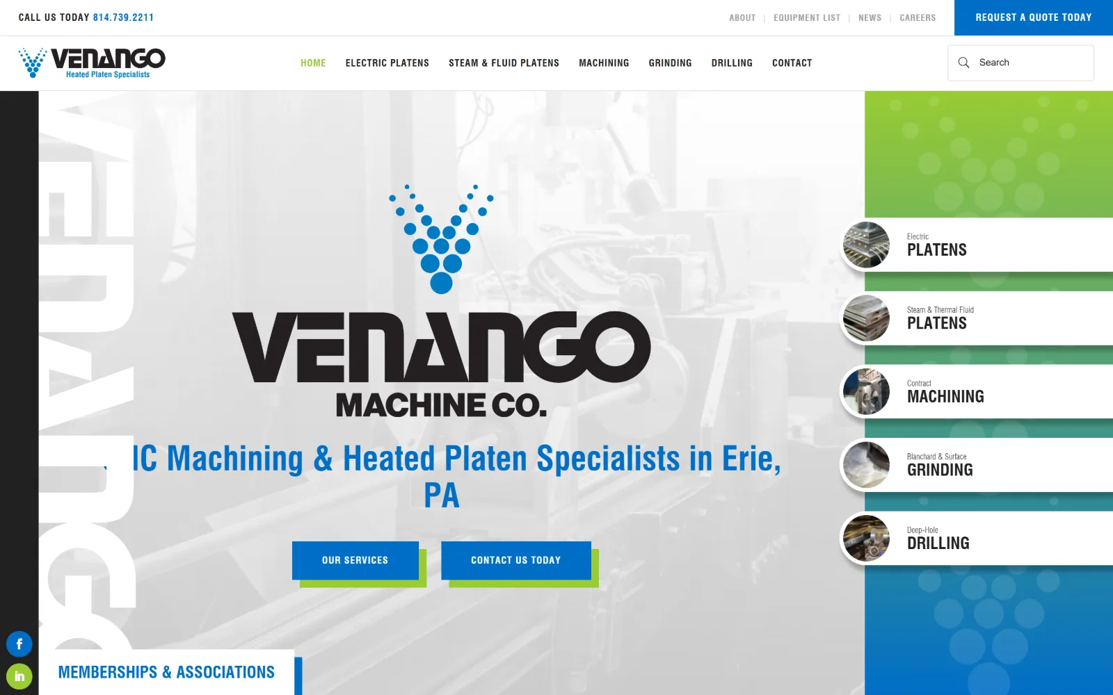
Washed-out shop photo carries a black wordmark and a blue strapline, beside a right column of five green and blue service rows.
Type
Swiss721 53px / 700 uppercase
Body
Open Sans 14px / 2.00
Build
85/15 split, fixed service column, circular thumbnails
Made on
WordPress
Colour
#006ec7 #99cc33 #212121
Type. Swiss721 does the display work at 53px, 43px and 42px weight 700, mostly uppercase, with a 21px cut used six times for the service row labels and 12px at 0.082em across 163 characters of buttons. Open Sans at 14px on a 2.00 line height takes 658 characters of body. The strapline sits in #006ec7, the only coloured type above the fold.
Colour. White at 163.8 percent, #212121 at 43.4, #006ec7 at 1.5, and #99cc33 measured at zero coverage but plainly present in the frame as the lime behind the top service rows and under the buttons. The blue to green vertical ramp down the right column is the whole colour story, and 106 characters of ink are blue.
Layout. Full 1440px field split roughly 85 to 15: a washed-out photograph with the logo and strapline centred over it on the left, and a fixed right column of five service rows, each with a circular thumbnail overlapping the row's left edge. A ghosted vertical wordmark runs up the far left margin. Radius 0 on everything but those circles.
The ask. Phone number top left, Request A Quote Today top right, then Our Services and Contact Us Today as a pair in the hero, plus five service rows that are each links. Social icons are pinned to the lower left edge. The layout lets a visitor pick a process without reading a word of copy.
A fixed column of labelled service rows lets a visitor self-select a process immediately, which beats a paragraph explaining the same five things.
13
texasinjectionmolding.com
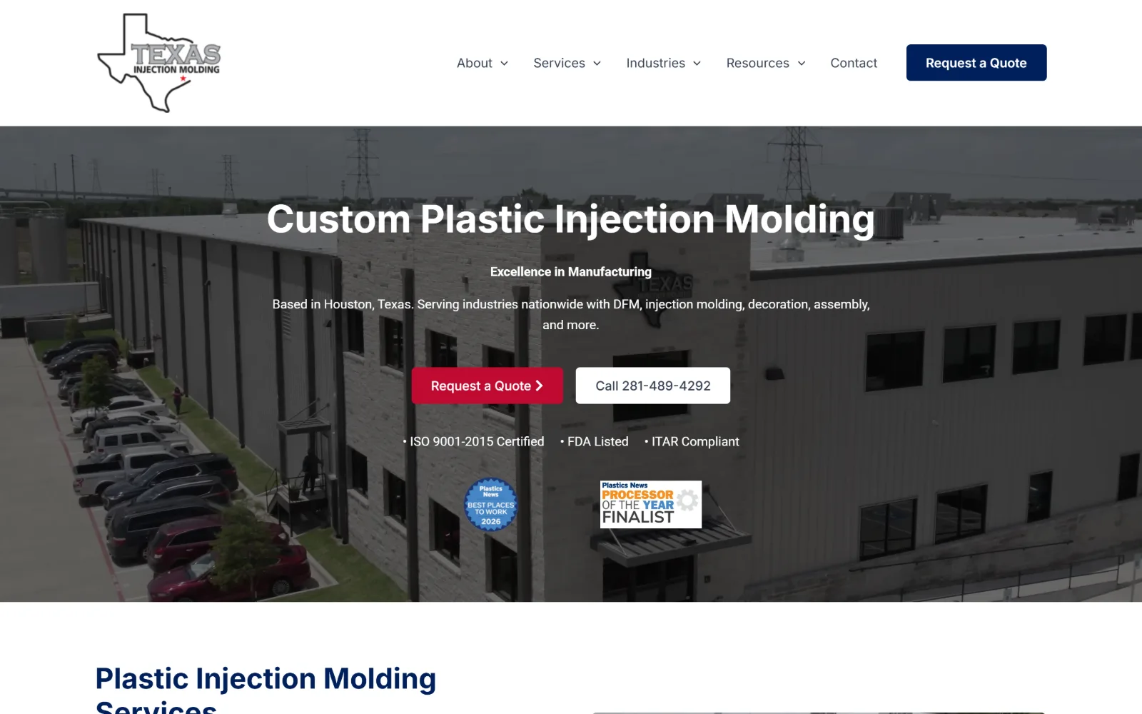
Aerial photo of a grey plant building and its car park sits under a centred white headline, two buttons and a line of certification marks.
Type
Inter 48px / 700
Body
Roboto 16px / 1.60
Build
Sticky header, centred hero, 20px-gap grids
Made on
WordPress
Colour
#00205b #bf0a30 #364153
Type. Inter at 48px weight 700 with a capitalize transform sets the hero line, 36px takes the next level, and Roboto at 16px on a 1.60 line height carries 904 characters of body. Two neutral, system-adjacent faces with no tracking adjustment at any size. It is the plainest type system in this group, and on a page this centred that is the right call.
Colour. Five values: white at 129.9 percent, #f9fafb at 24.5, black at 7.2, #bf0a30 at 0.9 and #00205b at 0.3. Those last two are the red and navy of the state flag, used at tiny coverage for the quote button and the headings. Body ink is #364153 across 782 characters, a cool grey rather than black.
Layout. Full 1440px field with a sticky white header holding five nav items and a 5px-radius red quote button. Everything in the hero is centre aligned, which is rare in this set, and the certification line and two award badges stack under the buttons. Lower grids run 2-column at 297 and 882px, 2-column at 182px and 3-column at 386px, all on a 20px gap.
The ask. Two buttons side by side, Request a Quote in red and Call 281-489-4292 in white, with the number spelled out in full on the button face rather than hidden behind a label. Three certifications sit directly under them, which is the right order: ask first, reassure second.
Putting the digits of the phone number on the button face, rather than the word Call, lets a desktop visitor dial without a second click.
14
metalcraftind.com
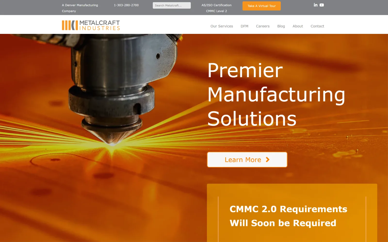
Laser head cutting plate throws yellow sparks across an orange field, with a three-line white headline and a white Learn More button at right.
Type
Verdana 72px / 400
Body
Verdana 13px
Build
680px container pushed right, full-bleed photo
Made on
WordPress
Colour
#fb7f00 #808285 #ffffff
Type. The stack resolves to Verdana at every size, 72px weight 400 for the headline and 13px weight 400 in #888888 for nav, with 32px and 24px steps between them. A 400 weight at 72px is unusual, and it works because the photograph behind it is loud enough that a bolder cut would have fought it. The face rendered in the frame is lighter and more geometric than Verdana.
Colour. Measured values are nearly all neutral: white at 103.9 percent, #808285 at 3.1, #f7f7f7 at 0.7 and #f7941d at 0.2. The entire orange of the page comes from the photograph rather than the stylesheet, with #fb7f00 appearing on just ten characters of button ink. A hero that takes its colour from the image needs no brand field behind it.
Layout. A narrow 680px container at 47 percent of viewport, with headline and button pushed into the right half of a full-bleed photograph while the sparks occupy the left. A grey utility bar sits above a white header carrying six nav items. Button radius is 8px, and the announcement panel below uses a flat orange that does not quite match the photo.
The ask. Learn More is the only hero button, and it asks for nothing. Take A Virtual Tour sits in the utility bar in orange with a phone number beside it, and a compliance panel follows below. For a defence-adjacent shop the compliance message is the real pitch, and it is given more room than the quote.
When the hero photograph already carries a saturated colour, pull the accent out of the image rather than adding a brand field behind it.
15
armachining.com
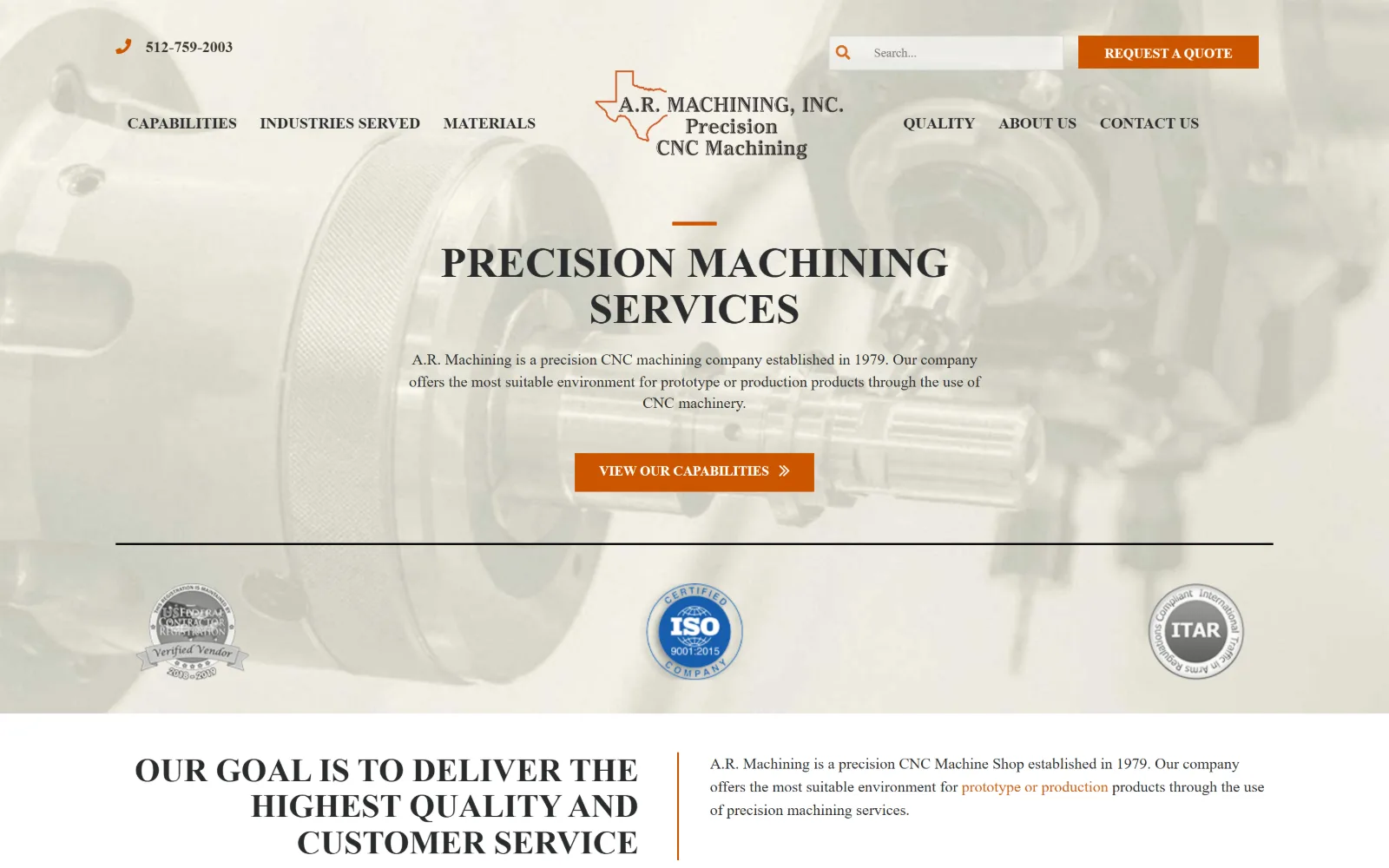
Sepia-toned lathe chuck sits behind centred serif capitals, a short paragraph, an orange button and three certification seals.
Type
industry 44px / 700 uppercase
Body
Heebo 16px / 1.43
Build
Centred logo, split nav, hero centred on one axis
Made on
Not detected
Colour
#cc5500 #292b2c #f8f6f3
Type. The DOM reports a face called industry at 44px weight 700 uppercase for the headline, with 34px and 24px steps below it and Heebo at 16px on a 1.43 line height for 766 characters of body. The capture renders that display line as a high-contrast serif in centred capitals, which gives the page a legal-notice formality no other machine shop here attempts.
Colour. Three measured values and all of them warm: white at 112.1 percent, #f8f6f3 at 7.4 and #cc5500 at 0.8. Ink is #292b2c across 861 characters with #cb6115 on 114. The photograph is pushed to a pale sepia, so the burnt orange of the button and of the short rule above the headline reads as the only real colour present.
Layout. Full 1440px field with the logo centred in the header and nav items split three to the left and three to the right of it, a symmetry almost nobody else here uses. The hero is centred on the same axis: rule, headline, paragraph, button. Three certification seals sit across the base of the hero. Radius 0 and no measured container.
The ask. A phone number top left, Request A Quote top right in orange, View Our Capabilities as the hero button, and three seals: federal contractor, ISO 9001 and ITAR. The hero button sells the capability list rather than the quote, which assumes the visitor is still checking whether this shop can do the job.
Splitting navigation either side of a centred logo only works when both halves carry the same item count, as here, three and three.
16
5thaxis.com
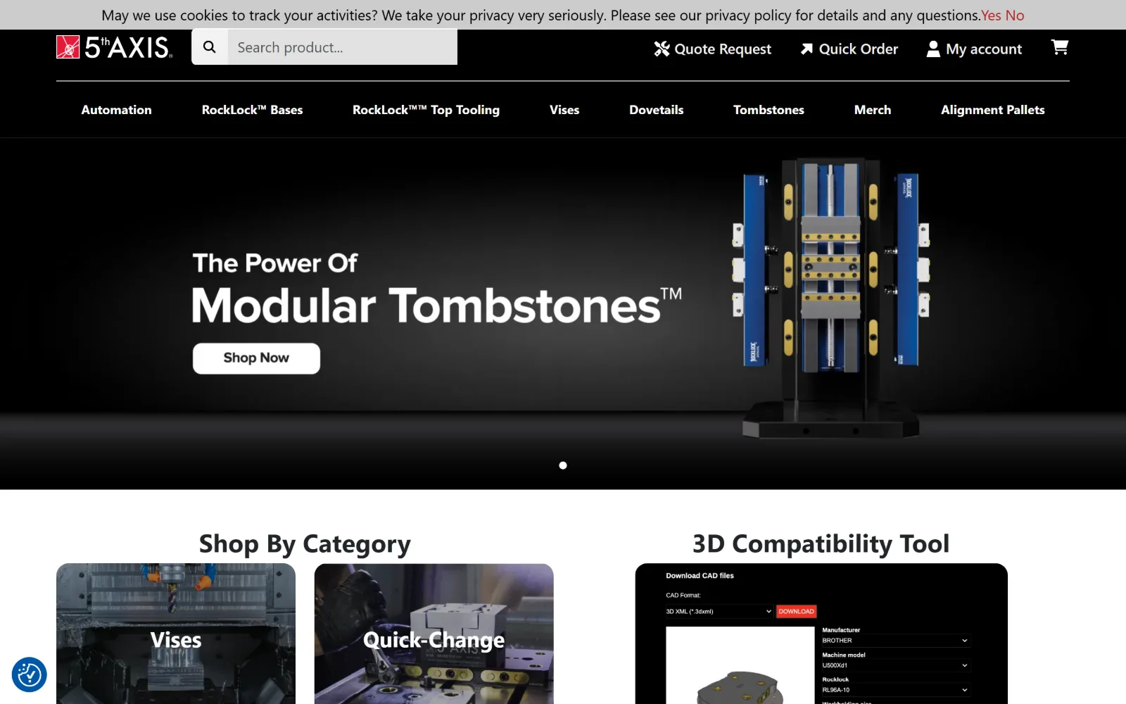
Black header with a product search bar sits above a dark hero of a blue and gold tombstone fixture, with Shop Now under the headline.
Type
proxima-nova 56px / 700
Body
proxima-nova 18px / 1.50
Build
1320px container, three stacked header bars, dark hero
Made on
WordPress
Colour
#000000 #f0f1f1 #dd2828
Type. proxima-nova at 56px weight 700 is the largest measured size, with 32px and 28px steps below it and 18px weight 400 across 481 characters of body. A 23px weight 300 cut on a 1.50 line height takes the standfirst, and a 16px weight 700 capitalize cut is used eight times for category labels. Light at 23px against bold at 56px is a wide contrast for a shop page.
Colour. Six values, the most measured in this group: white at 120.8 percent, #f0f1f1 at 33.2, black at 13.7, #e2e2e2 at 0.5, #dd2828 at 0.3 and #0056a7 at 0.1. The red appears on exactly five characters, the Yes and No of the cookie prompt, so the only accent is spent on a consent dialog rather than on anything the business sells.
Layout. A 1320px container at 92 percent of viewport with 48px section padding. The header is three stacked bars: cookie notice, then logo with a search field and account links, then an eight-item product nav. That pushes the hero down by roughly 190px before a single product is visible. Radius 0, document 4849px.
The ask. This is the only storefront in the set, so the asks are commercial: Quote Request, Quick Order, My account, a cart glyph, a search field and a Shop Now button on the hero slide. Six competing surfaces, and the search field is the one most buyers of workholding will actually use.
A product search field given more width than the logo tells a returning buyer the catalogue is the point, which suits a parts business over a services one.
How these were chosen
Twenty-four contract manufacturers went into this shortlist and sixteen came out. The pattern that holds is the quote button: every one of these puts Request a Quote somewhere in the top right, usually in a utility bar sitting above the real header, and most repeat it in the hero. The pattern that does not hold is the dark hero. Half of these flood the top of the page with near-black or a brand colour and set white type on footage, and half go the other way with a pale field and dark ink. What separates good manufacturing website design here from vendor-template filler is whether the photography is of their own floor. The shops that shot their own machines could build a page around one image. The ones that bought a stock render had to decorate instead.
Finding manufacturing sites that someone had actually designed took far longer than it should have. 30 candidates made the shortlist. 16 made the page.
Each one was opened and looked at properly: what the type is doing, where the colour gets spent, how the page is built, how it asks for the job. Nothing is here because it ranks. Nothing is here because an agency filed it under portfolio. Several well known names were left out for the plain reason that their site came out of the same template as everyone else's, and a few sites worth including did not survive a second look.
Where a site is only competent, it says so. The order is the order worth your time, best first.
Reviewed and selected by Larry W. Matthews for Websitely.