18 Cyber Security Website Designs That Build Trust
Eighteen US security firms and testers. Cyber security website design past the dark-and-neon reflex, measured on type and real hex values.
Shown
18 sites
Reviewed
30 candidates
Chosen on
The work, not the ranking
Updated
15 October 2026
01
trailofbits.com
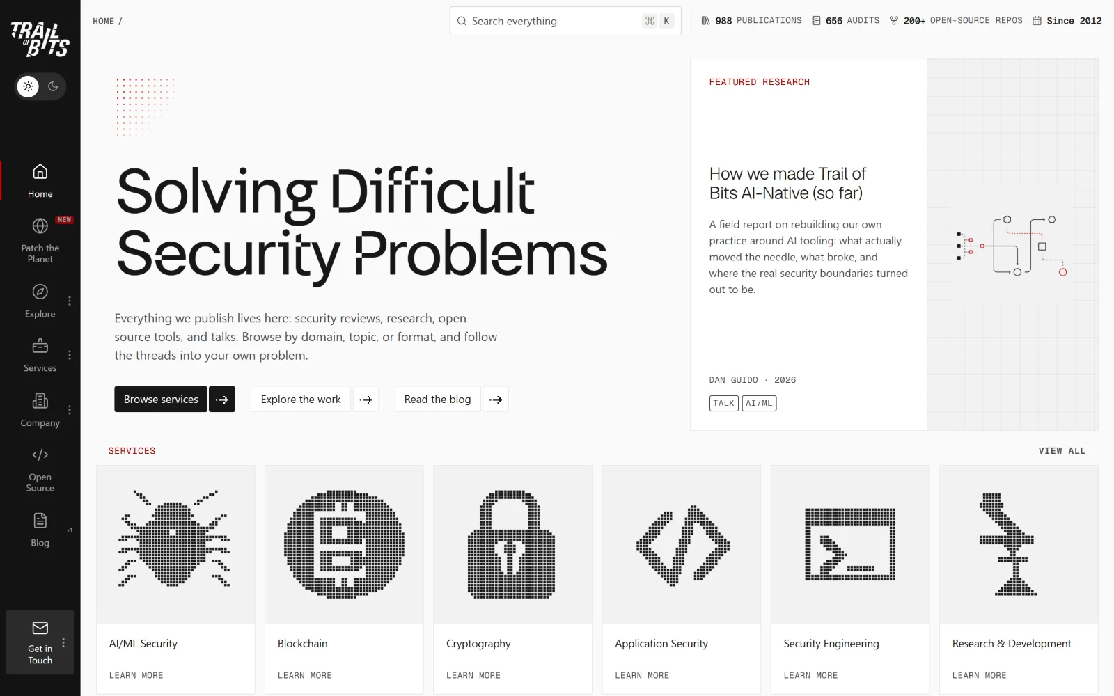
A black icon rail runs down the left edge, 'Solving Difficult Security Problems' sits huge in a grotesk, six dithered pixel tiles below.
Type
FH Lecturis 80px, -0.025em
Body
Geist 16px, Geist Mono 14px labels
Build
fixed icon rail, 1300px 12-col grid
Colour
#fafafa #131313 #4a4b4d
Type. FH Lecturis carries the headline at 80px with -0.025em tracking and a line-height of exactly 1.00, so the two lines stack tight enough to read as one block. Everything underneath drops to Geist at 16px, and the labels switch again to Geist Mono at 14px, 0.04em, uppercase. Three voices, each kept to one job.
Colour. Near monochrome: #fafafa page, #131313 for the rail and the primary button, #4a4b4d for body copy, #181717 for headings. The only saturation is #a20000, used on the featured research label and the thin dotted motif above the headline, about sixty characters of red on the entire screen.
Layout. Not a hero at all. A fixed icon rail holds the navigation while content sits in a 1300px container on a 12-column grid with 20px gutters. The featured research panel is a bordered card pinned right and the services row runs as six equal tiles. Total page depth is 2283px, so the site is two screens long.
The ask. Three flat text buttons sit in a row, Browse services, Explore the work, Read the blog, with the dark fill only on the first. A persistent Get in Touch block anchors the bottom of the rail. The top bar replaces a phone number with counts: 988 publications, 656 audits, 200+ open-source repos.
A left icon rail buys back the vertical space a hero would eat, letting the headline, a featured article and six services share one screen.
02
raxis.com
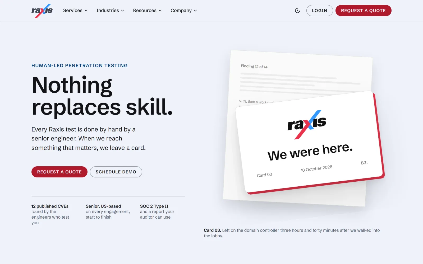
Set on pale blue, 'Nothing replaces skill.' faces a photographed stack of leave-behind cards, the top one reading 'We were here.'
Type
Schibsted Grotesk 76px, -0.02em
Body
Schibsted Grotesk 21px/1.5
Build
1290px container, 522/639 split, 96px padding
Colour
#eff2fa #141417 #ae1a2d
Type. Schibsted Grotesk does everything. The headline runs 76px at weight 600 with -0.02em and a 0.98 line-height, so the descenders nearly touch the line below. Body sits at 21px with 1.5 leading, and the eyebrow and buttons use the same family at 16px with 0.08em uppercase, the only tracking change on the page.
Colour. #eff2fa fills the ground, a blue-grey rather than white, with #e5eaf9 behind panels. Text is #141417 and #4a5568. The red is split in two: #ae1a2d on the pill button, a brighter #ea344b on the card edge inside the photograph, which is where the 6.8 per cent coverage reading comes from.
Layout. Two columns in a 1290px container, 522px of text against 639px of image with a 64px gutter and 96px section padding. Buttons are true capsules at 999px radius while the proof row below sits under a hairline rule, split into three equal columns of bold label plus grey explanation.
The ask. Request a quote leads in red, Schedule demo follows as an outline pill, and the same quote button repeats in the header. No phone number anywhere. The real persuasion is the caption under the photograph, which dates the card and states how long the engineers took to reach the domain controller.
Photographing your own deliverable beats a stock image: it shows what the client actually receives and dates it to a real engagement.
03
binarydefense.com
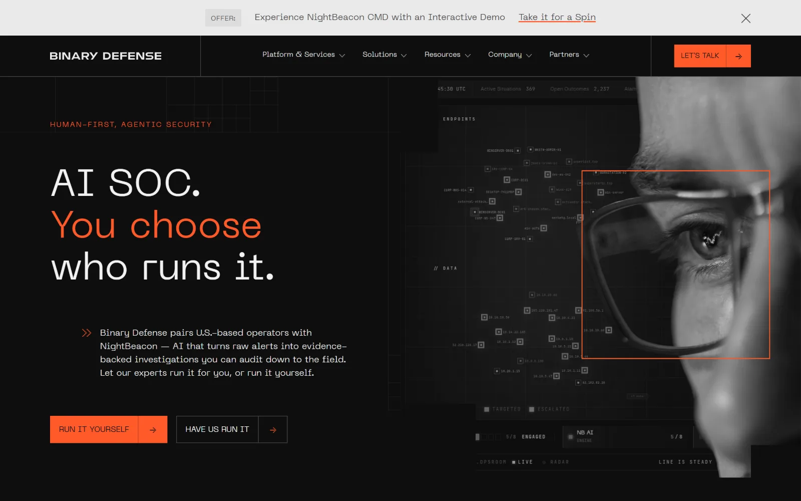
Orange 'You choose' splits a three-line white headline on near-black, with an analyst's eye and a dark endpoint map filling the right half.
Type
Neue Machina 68px, 1.10
Body
Neue Machina 16px, weight 200
Build
16-col 90px grid, 90px padding, 0 radius
Colour
#000000 #010024 #010000
Type. Neue Machina runs the whole page, a squarish grotesk with flat-sided bowls. The headline is 68px at weight 400 with a 1.10 line-height, so size does the work rather than weight. Body falls to 16px at weight 200, and the eyebrow and buttons sit at 13 to 14px uppercase. Three clear tiers without a single bold.
Colour. Three measured values: #000000 ground, #010000 for type, #010024 on the button. The orange does not appear in the stylesheet because it rides in the image layer and one headline span, used on exactly one phrase, the eyebrow, the primary button and the tracking box over the eye.
Layout. A 16-column grid of 90px tracks spans the full 1440px, with the hero split clean at the halfway mark and 90px section padding. Corner radius is zero everywhere, buttons included, so each one reads as a rectangle with its arrow sitting in a separate cell. A dismissible offer bar sits above the header.
The ask. Two hero buttons state the choice the headline poses: Run it yourself in solid orange, Have us run it as an outline. A third, LET'S TALK, sits boxed off at the far right of the nav. The offer bar adds a fourth ask, an interactive product demo.
When the headline poses a choice, label the two buttons with the two answers so the copy and the interface say the same thing.
04
a-lign.com
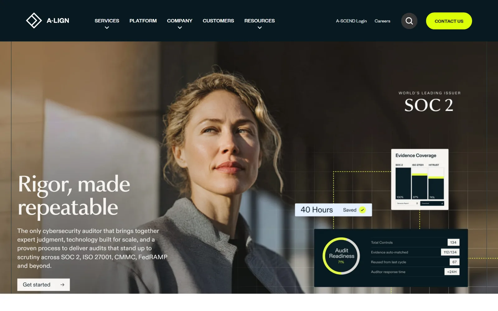
A portrait against sunlit stone fills the hero, 'Rigor, made repeatable' sits lower left, and three product panels float on a faint yellow grid.
Type
Amarelle-Sans 64px, -0.03em
Body
ABC-Diatype 18px, 0.01em
Build
full-bleed hero, 88px padding, floating UI panels
Made on
WordPress
Colour
#f5f4f1 #0c1e25 #dcff07
Type. Amarelle-Sans sets the headline at 64px, weight 500, -0.03em, line-height 1.05, with a flared almost bookish g that stops it reading as another grotesk. Body switches to ABC-Diatype at 18px with 0.01em and 1.4 leading, and the buttons move again to FoundersGrotesk 14px. Three families, one role each.
Colour. A warm near-white, #f5f4f1 and #fafafa, against #0c1e25 and #081a21 for the header and panels, with ink at #10222a. The accent is acid #dcff07 at 0.3 per cent coverage, carried only by the Contact us pill and a single arc in the audit readiness dial.
Layout. Full-bleed 1440px hero with the type block at the left margin and the product interface overlaid right, hung off a dotted yellow grid that visually links the three floating panels. Section padding is 88px, corners are square apart from the 40px pill buttons, and the grids below run asymmetric 430/861 splits.
The ask. Contact us in yellow is the only loud ask and it is parked top right. In the hero, Get started is a quiet outlined pill with an arrow. The floating panels sell instead, naming 40 hours saved, 134 total controls, 112 of them auto-matched, and a sub-24-hour auditor response.
Overlay real product numbers on the hero image instead of a second paragraph, so the claim and its evidence occupy the same glance.
05
expel.com
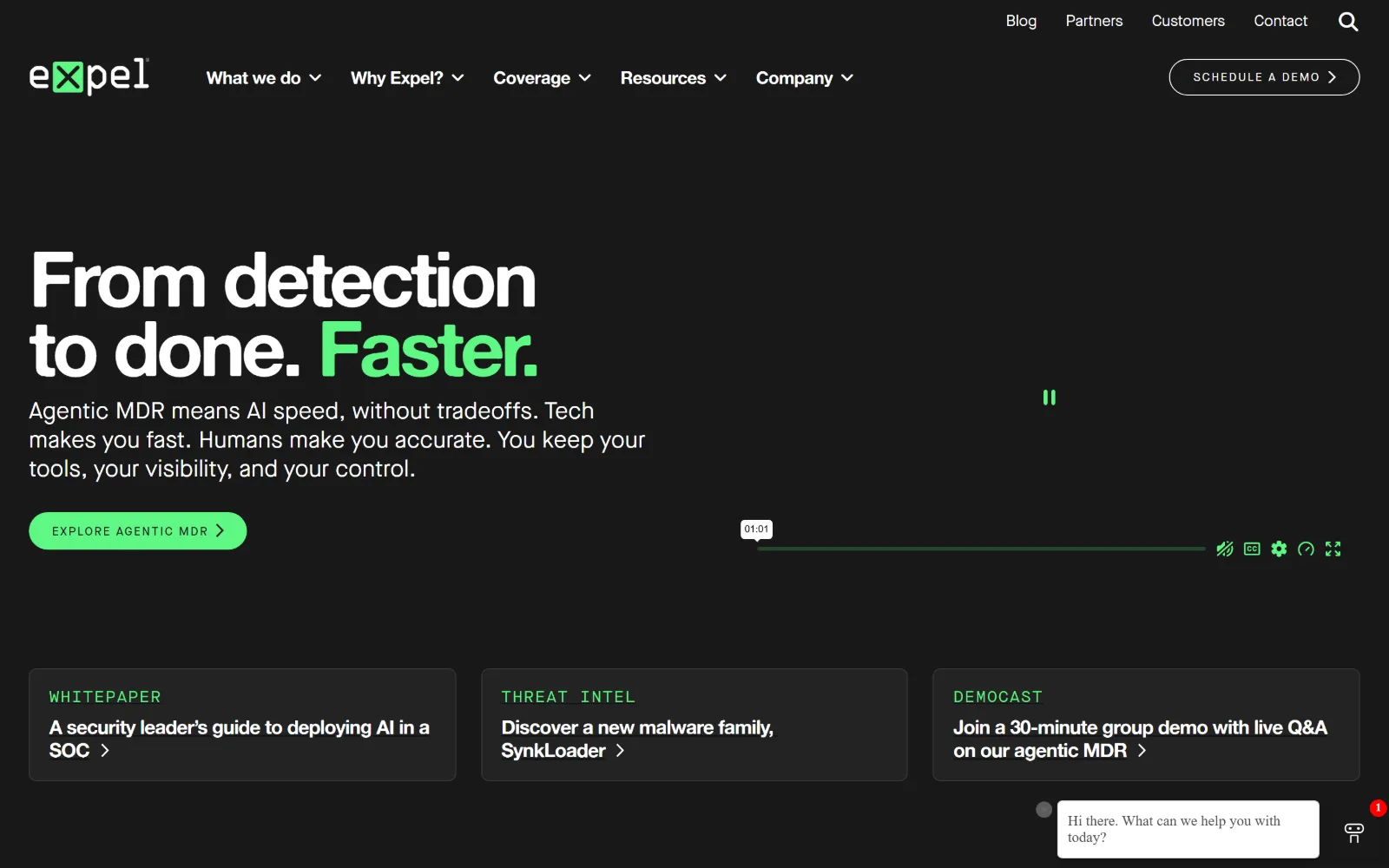
'From detection to done. Faster.' sits on flat black with the last word in mint, a muted video to the right and three resource cards beneath.
Type
Alte Haas Grotesk 80px, -0.05em
Body
Maison Neue 24px/1.25
Build
full-bleed, 50px padding, three equal cards
Made on
WordPress
Colour
#181818 #ffffff #5ef784
Type. Alte Haas Grotesk handles display at 80px, weight 800, tracked in at -0.05em so the two lines lock together. Body is a different family, Maison Neue at 24px with 0.01em and a tight 1.25. Card eyebrows drop to 12px with 0.15em uppercase, a tracking jump large enough to turn them into labels rather than headings.
Colour. #ffffff and #181818 do almost all of the work, with #e7e3d7 as a warm neutral further down. #5ef784 is the single accent at one per cent coverage: one word of the headline, the pill button, three card eyebrows and the video controls. Nothing else on the page is coloured at all.
Layout. Full 1440px width with no container inset and 50px section padding, the hero split as type left and video right. The three cards below are equal thirds with a 1px border on near-black fill. The CTA pill uses a 400px radius, so it reads as a true capsule next to otherwise square cards.
The ask. One hero button, Explore agentic MDR, plus Schedule a demo in the header. The cards are soft asks, a whitepaper, a threat intel post and a group demo, each ending in a chevron rather than a button. A chat bubble opens itself at bottom right with an unread badge.
One accent colour used on exactly one word, one button and the section labels makes a black page feel designed rather than merely dark.
06
hurricanelabs.com
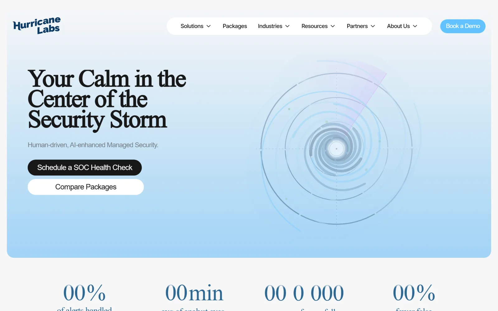
A pale blue panel holds 'Your Calm in the Center of the Security Storm' in a serif, with a faint concentric radar diagram spiralling out right.
Type
Roboto Serif 56px, -0.04em
Body
Inter 24px, -0.037em
Build
inset rounded hero panel, stacked pill CTAs
Made on
Framer
Colour
#f7f7f7 #171717 #2d6893
Type. The display face is Roboto Serif at 56px, weight 600, pulled to -0.04em, which is rare in this trade and immediately reads as a professional service rather than a product. Inter takes the body at 24px with -0.037em and 1.3. Negative tracking on both means the two families share a rhythm despite the serif split.
Colour. A #f7f7f7 page with the hero panel washing from near-white into soft blue, ink at #171717, links at #2d6893 and a #61c3ff highlight at 0.2 per cent coverage. There is no dark field anywhere on the page and no second saturated colour competing with the blue.
Layout. The hero is a rounded panel inset from the edges of a full-width 1440px page rather than a full-bleed band, with 50px section padding. The two buttons stack vertically instead of sitting side by side, both as full pills, and the statistics row below sits on the page ground outside the panel.
The ask. Schedule a SOC health check in solid black leads, Compare packages sits beneath it in white, and Book a demo repeats in the header. The counter row underneath carries the proof, covering alerts handled, average analyst eyes and false positives, though it was still at zero when this frame was taken.
A serif display face on a light ground separates a security firm from its competitors faster than any amount of dark-mode polish.
07
atredis.com
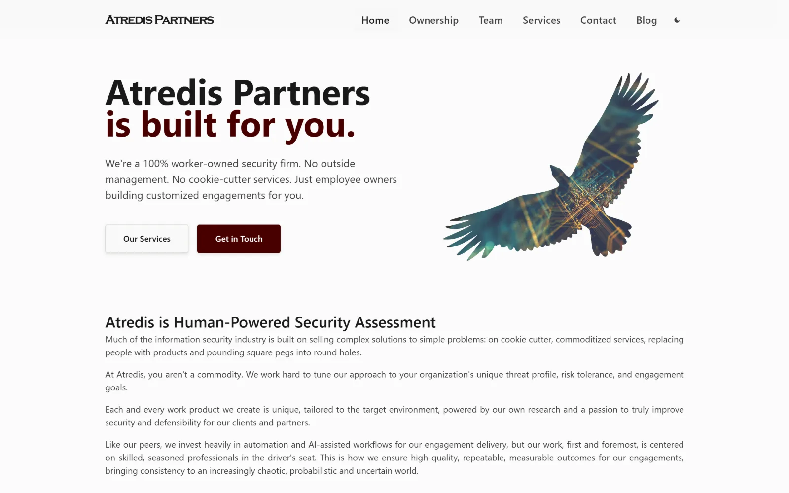
On off-white, 'Atredis Partners is built for you.' runs in heavy Inter with the second line in oxblood, beside a teal and gold circuit-board eagle.
Type
Inter 64px, 0.90 line-height
Body
Inter 19px/1.5
Build
1200px container, 64px padding, prose body
Made on
Squarespace
Colour
#fafafa #3f3f3f #480000
Type. Inter at 64px, weight 700, with a 0.90 line-height that pulls the two lines almost into contact. Body runs 19px at 1.5 in #3f3f3f, a 45px gap in the scale with nothing in between, which is a deliberate refusal of mid-sized subheads. The wordmark is Copperplate Gothic at 22px with -0.065em, the one antique note.
Colour. #fafafa ground with #f4f2ef and #ddd9d3 panels, type in #3f3f3f and #1a1a1a. Oxblood #480000 appears on half the headline and on the primary button and nowhere else, 0.3 per cent of the screen. The eagle illustration supplies the only teal and gold, and it is artwork rather than a palette value.
Layout. A 1200px container at 83 per cent of viewport, 64px section padding, hero type left against the illustration right. Buttons take a 4px radius. Below the fold the page drops to a single measure of running prose, four paragraphs deep, with no icon cards and no grid at all.
The ask. Our services in white and Get in Touch in oxblood sit side by side at equal size, so neither dominates. The header repeats Contact as a plain nav item. There is no form, no chat widget and no phone number; four paragraphs of argument carry the whole case.
Running prose below the hero reads as confidence when every competitor in the category is using three icon cards to say the same thing.
08
trustedsec.com
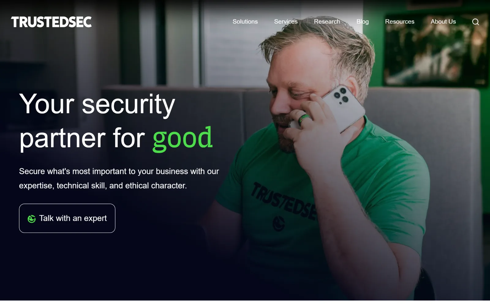
A full-bleed photo of a man in a green branded t-shirt on the phone, with 'Your security partner for good' over it, the last word in bright green.
Type
Switzer 80px, 1.25
Body
Switzer 24px/1.75
Build
full-bleed photo fading to flat navy, 8px radius
Colour
#000000 #ffffff #4cde4a
Type. Switzer at 80px, weight 400, with no tracking change and a generous 1.25 line-height, the opposite of the condensed display type most of this field reaches for. Body is the same family at 24px with 1.75 leading, so the paragraph reads loose and slow. A single 14px JetBrains Mono string appears lower down as the only monospace.
Colour. Black and white sit at roughly equal coverage, 49 and 41 per cent, with #edf1f4 as the light panel below. Two accents: #2447ff on interactive elements and #4cde4a on exactly four characters, the word good. The green in the photograph is wardrobe rather than an overlay, which is why it matches.
Layout. Full 1440px width, the photograph bleeding from the centre to the right edge and fading into flat navy on the left so the type sits on solid colour rather than on an image. Section padding is only 24px, corner radius 8px, and the CTA is an outlined rounded rectangle rather than a filled block.
The ask. Talk with an expert, outlined and prefixed with the logo glyph, is the sole ask above the fold. The nav carries six items and a search icon but no second button, no phone number and no chat widget. Everything funnels into one link.
A photograph of your own staff in branded clothing solves the trust problem stock imagery creates, and it costs one afternoon to shoot.
09
cobalt.io
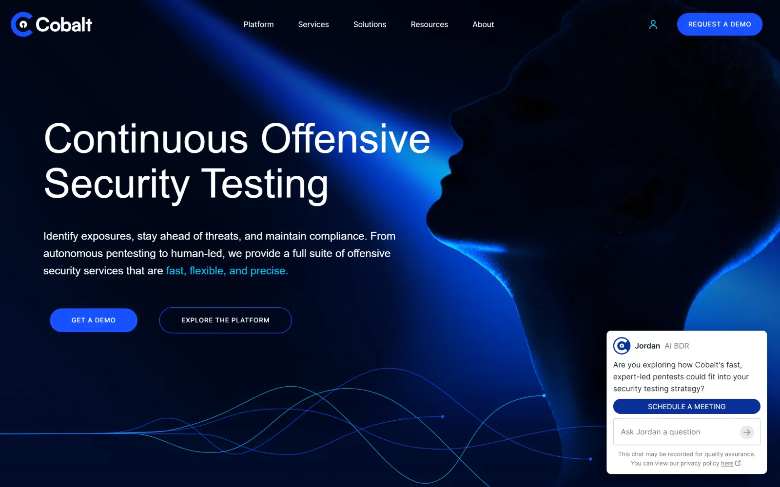
A profile in silhouette lit by a blue beam fills the right of a deep navy field, with the headline in light-weight type at the left.
Type
Satoshi 75px, weight 300
Body
Satoshi 20px/1.6
Build
full-bleed, 160px section padding
Colour
#000d2b #1751ff #06c8fc
Type. Satoshi at 75px, weight 300, is the decision here. A light display weight at that size reads calm where the rest of the category reaches for 800. Body matches at 20px weight 300 with 1.6 leading, and the buttons drop to 12px with 0.06em uppercase at weight 500, the only place any emphasis appears at all.
Colour. Two values for the entire page: #000d2b at full coverage and #1751ff at half a per cent. Ink is white with #06c8fc on a three-word phrase at the end of the body paragraph. There is no gradient in the stylesheet; the glow is held entirely inside the hero image.
Layout. Full-bleed 1440px with 160px section padding, the largest in this set, which is what makes a one-colour page feel composed rather than empty. The headline block occupies the left 60 per cent, the figure the right, and a flowing line graphic along the bottom edge carries the eye into the next section.
The ask. Get a demo in blue and Explore the platform as an outline sit as a matched pair, with Request a demo repeated top right. An AI chat panel then opens itself at bottom right carrying a Schedule a meeting button, adding a fourth ask to a page that had kept to two.
160px of section padding does more for a single-colour page than a second colour would: space is what signals deliberate rather than unfinished.
10
praetorian.com
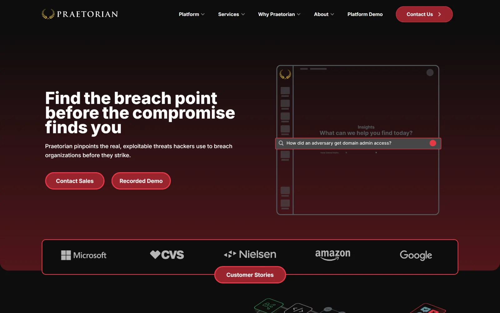
Near-black fading to maroon at the edges, headline left, a dim product panel right, and a five-logo client strip in its own red-bordered box.
Type
Inter 48px, weight 800
Body
Inter 16px/1.63
Build
45/55 hero split, bordered logo strip
Made on
WordPress
Colour
#0d0d0d #98242d #e62948
Type. Inter throughout, topping out at 48px weight 800 for the headline, which is restrained for a hero and leaves the 32px and 24px tiers below it room to stay distinct. Body is 16px at weight 500 with 1.63 leading. Nav runs 16px at weight 700 in red, heavier than the body copy it sits above.
Colour. #0d0d0d and #0d0d28 carry the page, with #98242d at 1.7 per cent on the two pill buttons and the thin borders of the logo strip. Type is white and #fcfcfc, with #e62948 and #e63948 on links. The maroon bleeding in at the lower corners is the only gradient in play.
Layout. Full 1440px, hero split roughly 45/55 between type and a screenshot panel outlined in a 1px grey frame. Buttons are 25px pills. The client logo row sits inside its own red-bordered rectangle with a Customer stories pill straddling the bottom edge, a small structural joke that earns its place.
The ask. Contact sales and Recorded demo sit as equal red pills, with Contact us repeated in the header and Platform demo given its own nav slot. The logo strip carries Microsoft, CVS, Nielsen, Amazon and Google, and the button on its lower edge turns that proof into a click.
Hanging a button off the bottom border of a logo strip converts passive social proof into a click without adding another block to the page.
11
bishopfox.com
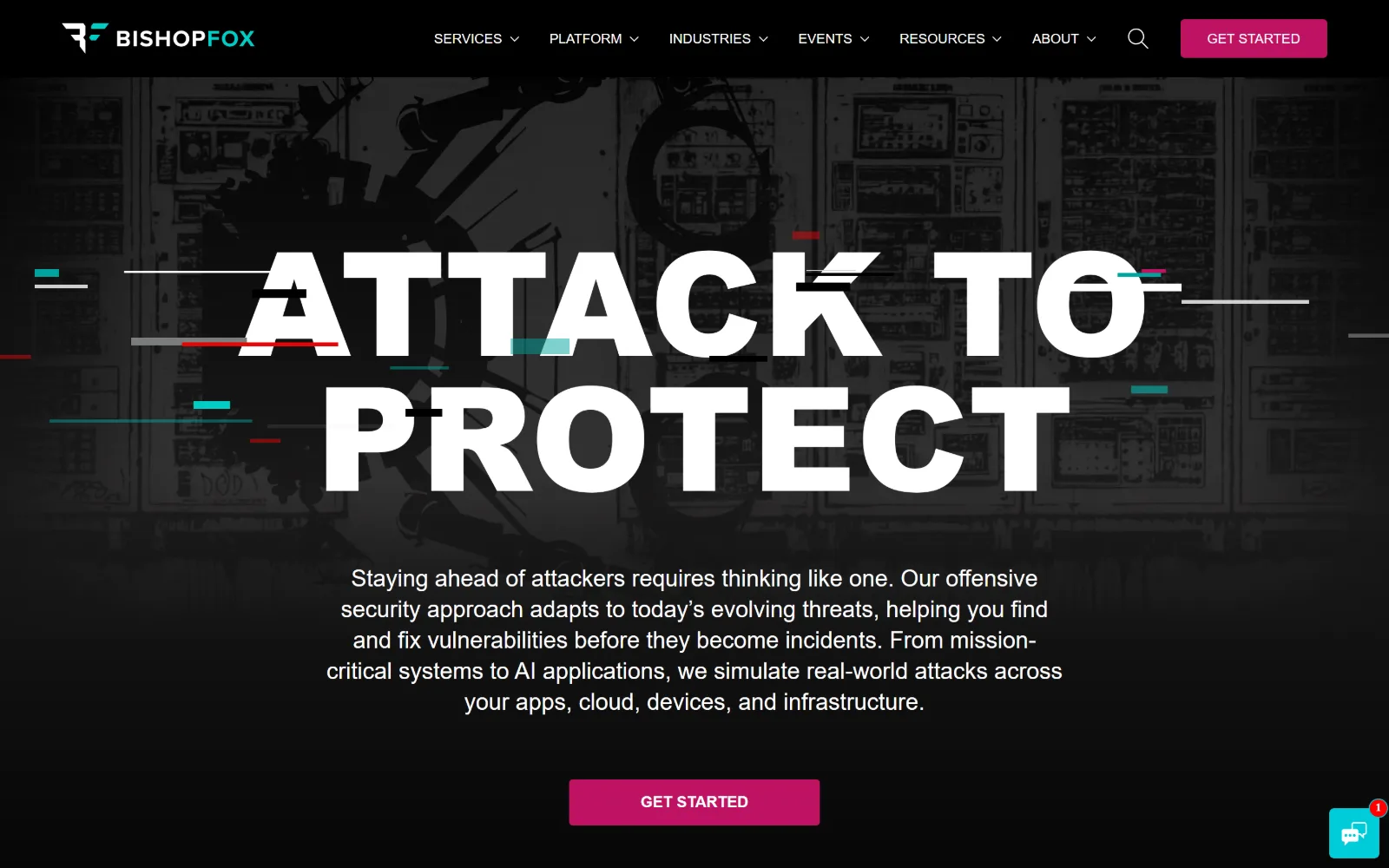
Enormous white capitals reading 'ATTACK TO PROTECT' over a dark server-room illustration, sliced by short red, teal and white glitch bars.
Type
proxima-nova 150px, weight 900
Body
proxima-nova 24px/1.33
Build
centred full-bleed hero, 4-col grid below
Colour
#000000 #ffffff #bf1363
Type. proxima-nova at 150px, weight 900, uppercase, is the entire idea. Nothing else comes close: the next tier is 60px and the body sits at 24px weight 400, centred under the headline at a comfortable measure. The gap between the two tiers is about six to one, which is why the glitch bars read as texture rather than as damage.
Colour. White and black take 200 and 120 per cent coverage respectively, and #bf1363 takes 0.7 per cent across the two Get started buttons. The glitch bars add red and teal in the image layer only, and a single #00cdc5 string survives in the ink colours, forty-four characters in total.
Layout. Full-bleed 1440px with no container inset, dropping to a four-column grid further down. The hero is centred rather than split, with headline, paragraph and button stacked on one axis and the illustration desaturated almost to black behind them. Button radius is 4px throughout.
The ask. Get started appears twice above the fold, magenta in the header and again as a wide centred block under the paragraph, with identical wording. A chat widget shows an unread badge at bottom right. The nav carries six dropdowns and a search icon but no phone number.
A 150px headline only works if the paragraph under it stays small and centred; the gap between those two tiers is what reads as control.
12
deepwatch.com
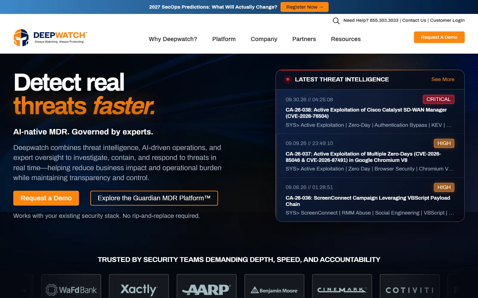
Heavy type reading 'Detect real threats faster.' on dark navy, beside a live threat intelligence panel listing three CVEs with severity badges.
Type
Archivo 75px, -0.06em, weight 900
Body
Archivo 21px, weight 300
Build
725/570 hero split, 120px padding
Made on
WordPress
Colour
#081226 #ff850d #a4b2c4
Type. Archivo at 75px, weight 900, with -0.06em tracking, the tightest setting in this set, and a 0.94 line-height. The word faster is set in the italic, the only italic on the page. Body drops to 21px at weight 300, a 600-unit weight swing that makes the headline the single thing the eye lands on first.
Colour. #081226 and #040810 for the field, #050a14 for panels, white at 8.7 per cent and #a4b2c4 for body copy. #ff850d takes 0.7 per cent: half the headline, the demo button and the See more link. Red and amber appear only inside the feed panel, on the CRITICAL and HIGH severity badges.
Layout. Full-bleed 1440px with 120px section padding and a 725/570 two-column hero. The threat feed is a 4px-radius panel with internal rules between items, each timestamped to the second. A logo wall of seven customers runs full width below, every logo set in its own bordered cell.
The ask. Request a demo in orange, Explore the Guardian MDR Platform as an outline, a reassurance line under both reading no rip-and-replace required, the same demo button in the header, a phone number at 855.303.3033 and a webinar bar above all of it. Six asks before a single scroll.
A timestamped threat feed in the hero proves the service is running right now, which no amount of adjective-led copy can do for you.
13
specterops.io
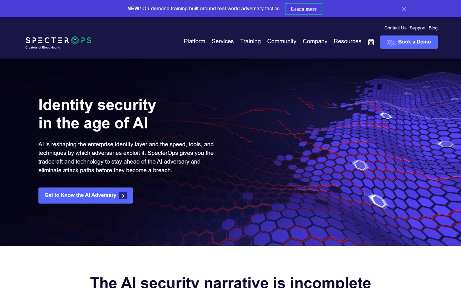
A glowing indigo hexagon field sweeps across the right of a near-black hero while 'Identity security in the age of AI' sits plainly at the left.
Type
Nunito Sans 48px, weight 700
Body
Nunito Sans 18px/1.5
Build
full-bleed band, 88px padding, hard cut to white
Made on
WordPress
Colour
#0d0a30 #5465ff #5c6f8a
Type. Nunito Sans at 48px weight 700 is modest for a hero, and the rounded terminals of the face soften a page that is otherwise all hard geometry. Body is the same family at 18px with 1.5 leading. Only four sizes sit above 16px on the whole page, which is why nothing in the type competes with the illustration.
Colour. #ffffff and #0d0a30 carry the structure, with #191646 for panels, #4a3bd7 at three per cent and #5465ff at 0.9 per cent across the buttons and the announcement bar. Body text is #5c6f8a and #676d80. The red filaments threading the hexagon field exist only in the artwork.
Layout. Full 1440px with 88px section padding, an announcement bar above the header and a hero that runs as a single band, type left and image bleeding off the right edge. The page then cuts straight to a white ground immediately below, a hard edge rather than a gradient transition.
The ask. Get to know the AI adversary is the only hero button, with Book a demo in the header and a dismissible training banner above both. Three of the seven nav items are community-facing, Training, Community and Resources, which treats the audience as practitioners before buyers.
If the illustration carries the category signal, the headline can drop to 48px and stay plain, which keeps the page readable at a glance.
14
coalfire.com
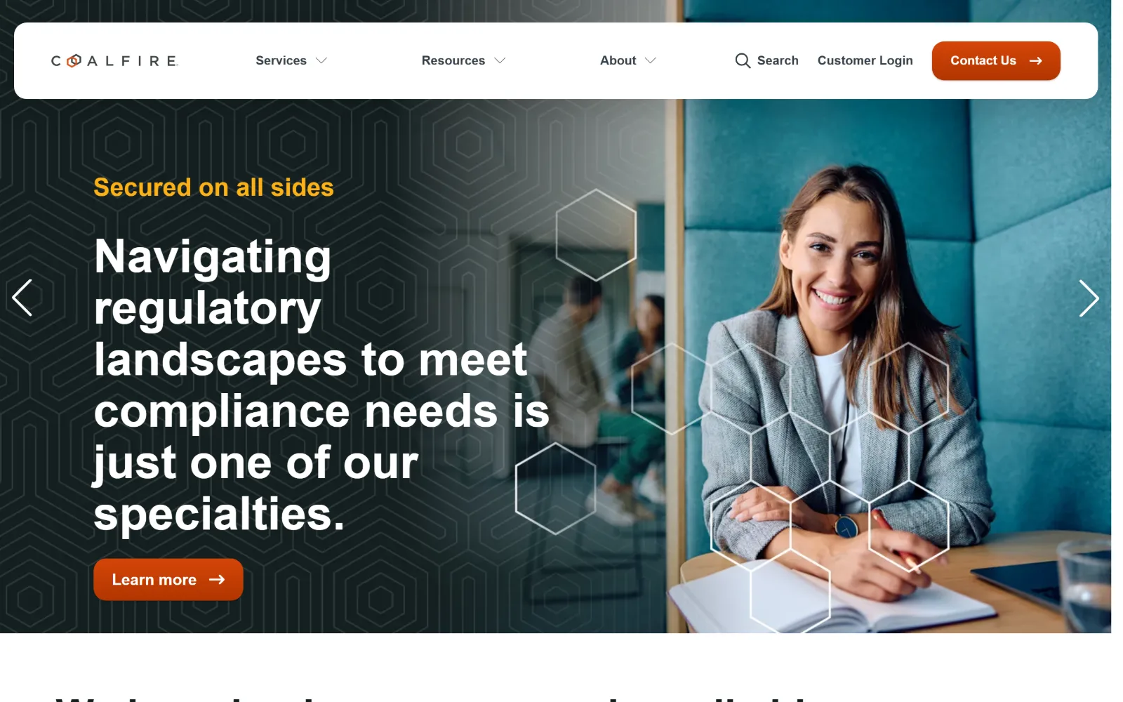
A white rounded header floats over a dark hexagon-patterned hero, long headline left, a seated consultant right, slider arrows at both edges.
Type. neue-haas-grotesk-display at 52px weight 700 for the slide headline, running six lines deep, which is long for a hero and is absorbed by a 1.2 line-height rather than by cutting words. The amber eyebrow above it is 32px at weight 600, nearly as large as most sites in this set set their headlines. Nav sits at 14px.
Colour. #ffffff and #242b31 only, at 119 and 45 per cent coverage. All the accent work happens in the ink: #fcb116 on the eyebrow and #e04a26 on the orange button and links. The hexagon pattern is a low-contrast tint of the dark ground itself rather than a second colour laid over it.
Layout. A 1280px container at 89 per cent of viewport with 76px section padding, and a header that is a white rounded card floating clear of the top edge rather than a bar fixed to it. The hero runs as a slider with arrows at both margins, and the editorial grid below uses 19 columns with named wide and main lines.
The ask. Learn more in orange is the slide's ask, Contact us sits in the floating header, and Customer login is given equal weight beside it. Because the hero is a carousel, the primary ask changes every few seconds, which is the cost of choosing that format.
Detaching the header into a floating white card gives a dark hero a visible top edge without the weight of a solid full-width bar.
15
synack.com
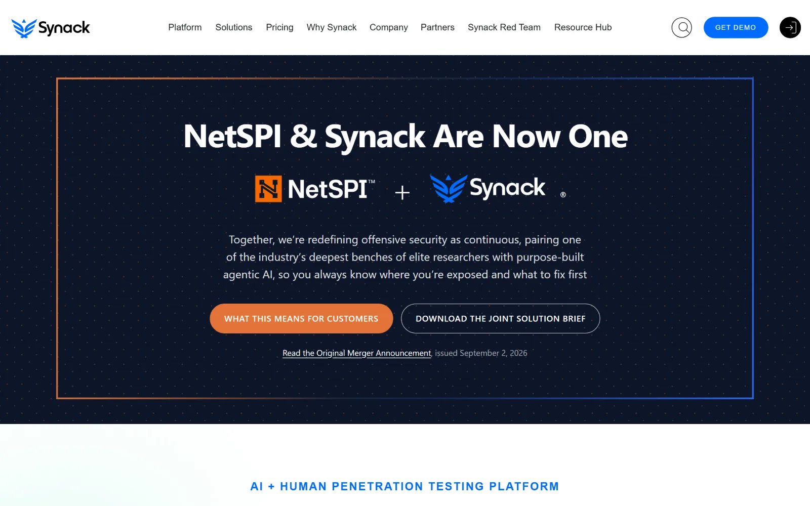
A merger announcement centred inside a thin rectangle whose border fades from orange top left to blue bottom right, on a dotted navy field.
Type
DM Sans 58px, -0.03em
Body
DM Sans 20px/1.55
Build
gradient-bordered frame, 66px padding
Made on
WordPress
Colour
#0d1629 #e27338 #016bff
Type. DM Sans at 58px weight 700 with -0.03em for the announcement line, while the page below carries a 68px weight 900 tier the hero never uses. Body runs 20px with 1.55 leading, centred at a measure of roughly seventy characters. A section label further down sits at 20px with 0.5em tracking, an extreme setting used once.
Colour. #0d1629 at 65 per cent under a faint dot matrix, with #f5f5f5 and white below the fold. #e27338 takes the primary button and the top left of the border, #016bff the links and its bottom right, so the two merging brands' colours meet along one gradient stroke rather than sitting in separate blocks.
Layout. Full 1440px, the announcement held inside a 1px gradient-bordered rectangle inset about 110px from each side, which turns a text block into an object. Section padding is 66px, button radius 40px, and a four-column grid of 332px tracks handles the content below the fold.
The ask. What this means for customers in orange, Download the joint solution brief as an outline, and a dated link to the original announcement underneath. Get demo sits in the header. Further down, a $185,000 figure does the work a testimonial would normally do.
A gradient border blending two brands' colours is a cheaper and clearer merger signal than a paragraph explaining the merger.
16
securisea.com
A navy-washed photograph of colleagues at a desk runs full width, with the headline in thin type and a yellow button at the lower left.
Type. Archivo at 72px in weight 200, with the first word set in a heavier cut so the contrast lives inside one line rather than between two. A 200 weight at that size is rare in this field and is what stops a photographic hero feeling heavy. Body is Archivo at 20px with 1.5 leading, nav 15px at weight 800.
Colour. #ffffff and #15224e split the page, with #2f78f6 at 5.8 per cent on links and panels and #fadd4a at 1.5 per cent on the single button. Type sits in white and #f2f1ec. The photograph is tinted toward the navy, so the image and the brand colour resolve to the same value.
Layout. A 1380px container at 96 per cent of viewport, so the hero is effectively edge to edge, split by a hard vertical seam where the tinted half of the photograph meets the untinted half. Section padding is 40px, button radius 4px, and the accreditation mark sits bottom left inside the image.
The ask. Get compliance-ready in yellow is the only hero button, with Contact us in the header. The supporting line does the qualifying instead, naming SOC 1, SOC 2, FedRAMP, GovRAMP, PCI DSS and HITRUST so a visitor self-selects before clicking anything.
Tinting a stock photograph to your darkest brand colour makes it read as art direction rather than as a purchase from a library.
17
guidepointsecurity.com
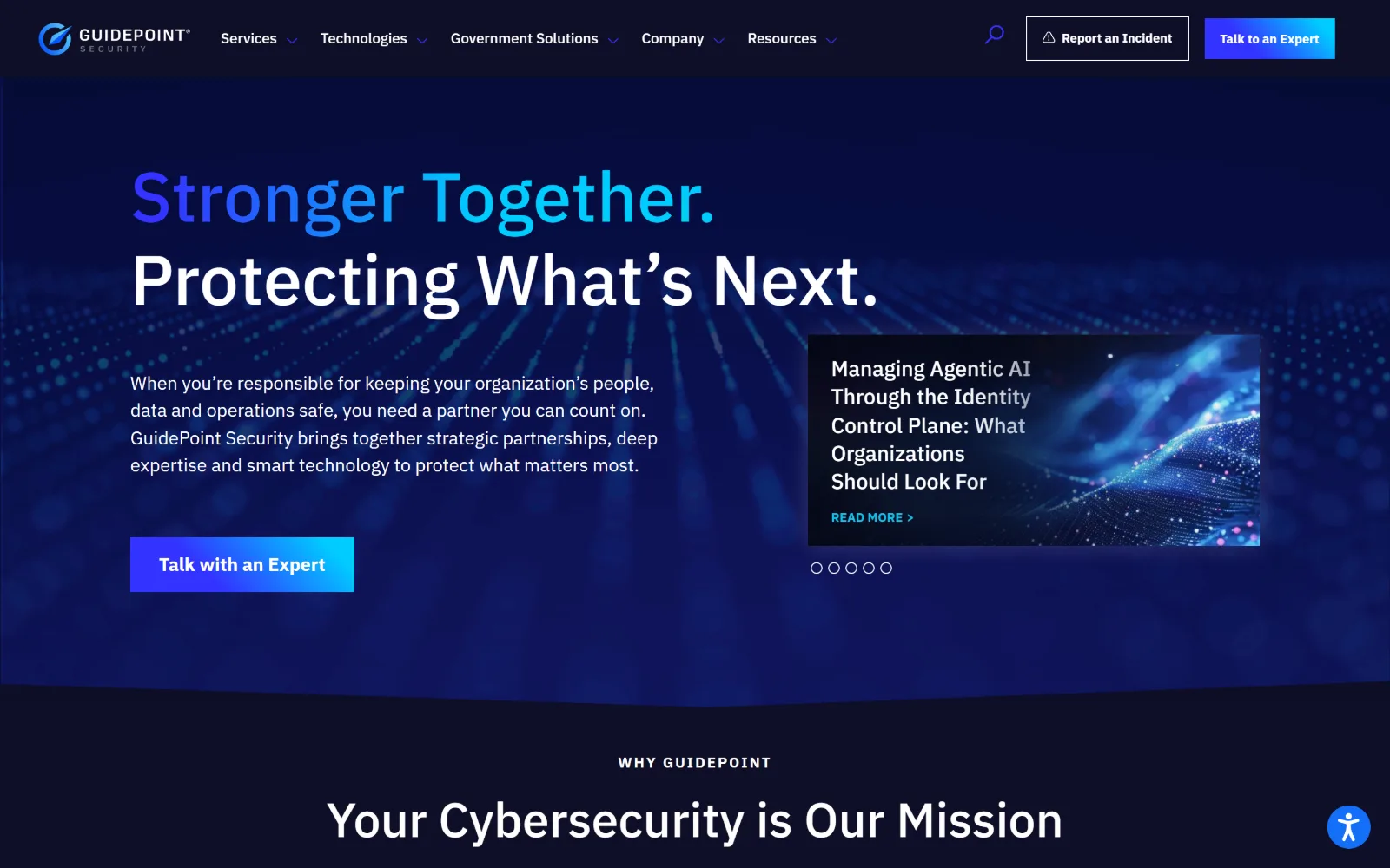
A blue dot field recedes toward a horizon behind a two-line gradient headline, with a five-dot carousel of article cards at the right.
Type
IBM Plex Sans 72px, weight 500
Body
IBM Plex Sans 19px/1.5
Build
1170px container, 48px padding, hero carousel
Made on
WordPress
Colour
#0f0f27 #ffffff #13bfea
Type. IBM Plex Sans at 72px weight 500, the first line running a blue-to-cyan gradient and the second in flat white, which separates the two sentences without any change of size. Body is 19px with 1.5 leading. The scale below holds 50, 27 and 22px tiers, giving the page four distinct heading levels instead of the usual two.
Colour. #0f0f27 at 145 per cent coverage and white at 100, with #040818 beneath. Ink is almost entirely white, 2100 characters of it, plus #13bfea on about a hundred characters of link text. The blue of the hero is background artwork rather than a fill, which is why the measured palette reads as two values.
Layout. A 1170px container at 81 per cent of viewport, the tightest inset here, with 48px section padding and three flex rows. The hero holds a five-dot article carousel at the right, and the band below switches to centred type on a darker ground under a small uppercase eyebrow.
The ask. Talk with an expert, in a blue gradient block, is the hero ask and repeats in the header, where Report an incident sits beside it in an outlined box with a warning triangle. Splitting the emergency route from the sales route is the right call for this audience.
Give incident reporting its own header button, visually distinct from the sales CTA, so a visitor in a crisis does not land in a demo form.
18
360advanced.com
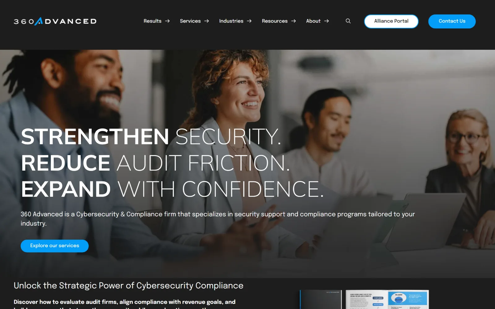
Three lines of uppercase display, each pairing a bold word with a light one, over a dimmed photograph of four people at a meeting table.
Type
Mulish 64px, weight 200, uppercase
Body
Epilogue 16px/1.5
Build
dark header band, 680px two-col, 264px four-col
Made on
WordPress
Colour
#ffffff #1d1d1d #012c61
Type. Mulish at 64px weight 200 uppercase carries the headline, with the first word of each line set heavy so the emphasis comes from weight inside a single size. Epilogue takes everything else: 40px for section heads, 16px body at 1.5 leading, and a 14px capitalised nav style used fifty times across the page.
Colour. White dominates at 200 per cent coverage, with #1d1d1d for the header band and #f9f9f9 for panels. Ink is #012c61, nine hundred characters of navy. The accent is #039cf7 at half a per cent, appearing on the Contact us pill in the header and the hero button and nowhere else.
Layout. Full 1440px with a tall dark header band sitting above a photographic hero, 50px section padding, and square corners apart from the 30px pill buttons. Content below runs on a two-column 680px split and a four-column grid of 264px tracks with 48px gutters.
The ask. Explore our services in blue is the hero ask, with Contact us and Alliance portal paired in the header, one filled and one outlined. The section beneath leads with a gated compliance guide, so the page offers a download before it offers a conversation.
Splitting each headline line into a heavy word and a light one creates hierarchy without a second typeface and without a second size.
How these were chosen
Twenty-six homepages went in, eighteen came out, and what stood out assembling them is how narrow the visual vocabulary has become. Dark field, one hot accent, a hexagon or dot lattice fading off to the right: most cyber security website design in the United States now starts from that template, and several of the sites here do too. What separates them is what happens to type and spacing once the dark ground is a given. Cobalt runs 160px section padding and two colours. Deepwatch swings 600 weight units between headline and body. Binary Defense builds on a 16-column grid of 90px tracks. The pattern that does not hold is the dark ground itself: Raxis, Hurricane Labs, Atredis and Trail of Bits all work on light grounds, and all four read as professional services firms rather than products. Order runs from the sites making the most decisions to the ones leaning hardest on defaults.
Finding cyber security sites that someone had actually designed took far longer than it should have. 30 candidates made the shortlist. 18 made the page.
Each one was opened and looked at properly: what the type is doing, where the colour gets spent, how the page is built, how it asks for the job. Nothing is here because it ranks. Nothing is here because an agency filed it under portfolio. Several well known names were left out for the plain reason that their site came out of the same template as everyone else's, and a few sites worth including did not survive a second look.
Where a site is only competent, it says so. The order is the order worth your time, best first.
Reviewed and selected by Larry W. Matthews for Websitely.