What a Committee Buys in Staffing Agency Website Design
Sixteen US search firms and talent platforms. Staffing agency website design where the client and the candidate want opposite things.
Shown
16 sites
Reviewed
41 candidates
Chosen on
The work, not the ranking
Updated
15 October 2026
01
onpartners.com
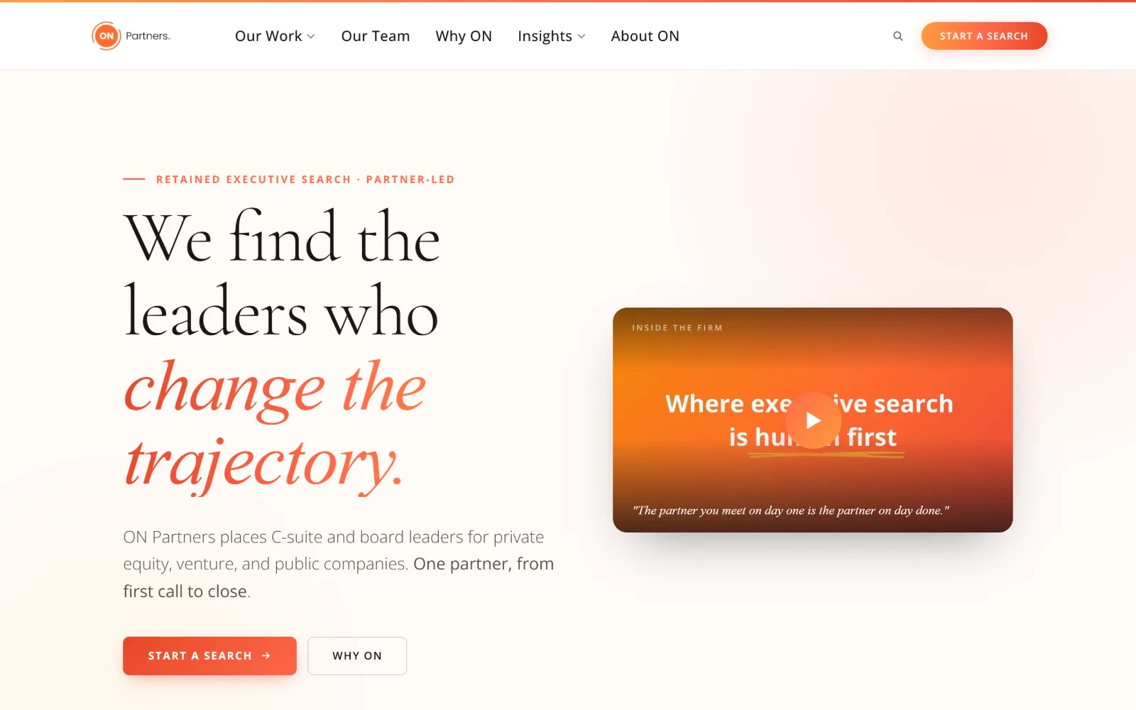
Warm ivory page with a 92px serif headline whose last three words run coral italic, beside an orange video card and a coral button.
Type
Cormorant Garamond 92px, 300, -0.02em
Body
Open Sans 20px/1.8
Build
two-column hero, 1440px full width, 120px padding
Colour
#fefaf7 #1a1614 #ff6b4a
Type. The display is Cormorant Garamond at 92px, weight 300, tracking tightened to -0.02em and leading at 1.02, so the three lines close up into a single block. The last phrase switches to the italic in coral. Body is Open Sans at 20px with 1.8 leading, and a 14px eyebrow in 0.1em uppercase marks the section above it.
Colour. Five values, and the ground does most of the work: #fefaf7 covers 242% of the viewport across the scroll, with #1a1614 carrying 1,183 characters of text. Coral #ff6b4a handles the eyebrow, the italic phrase and the primary button, while #2d1f1a and #f5ede6 only shade the video card and the area around it.
Layout. A two-column split inside the full 1440px frame, text left and a rounded video card right, with 120px section padding and a 64px gutter between the pair. The header is a slim white bar with a hairline orange gradient running above it. Corners stay at 5px, so nothing on the page reads as a card grid.
The ask. Two asks sit under the body copy, Start a Search filled in coral and Why ON outlined, and the same Start a Search repeats as a pill in the header. There is no phone number and no form. The video card is a third softer ask, labelled Inside the Firm with a partner quote under the play control.
Give one phrase the italic and the accent colour and leave the rest of the headline roman: the sentence gains a stress without paying for a second typeface.
02
dsgco.com
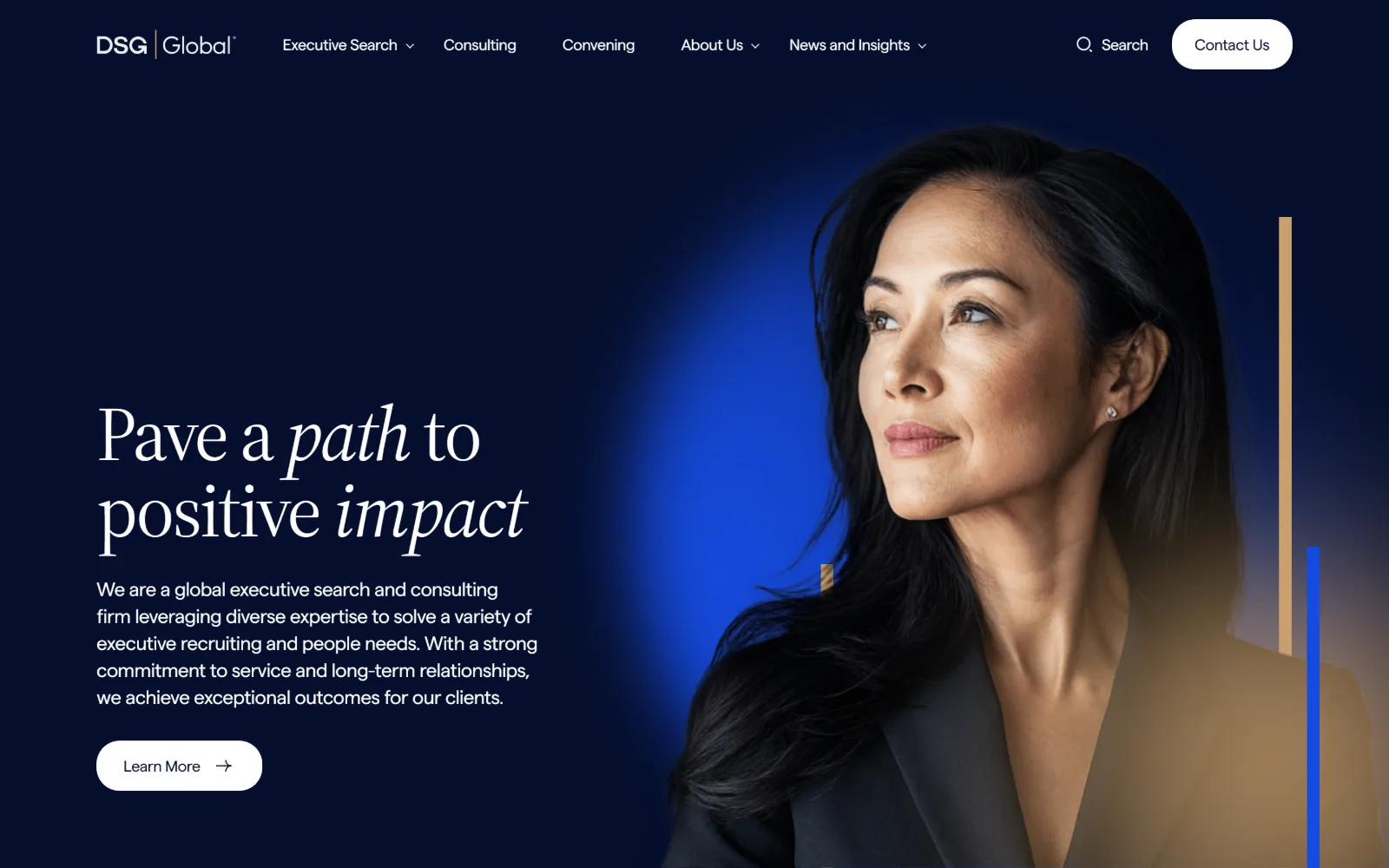
Deep navy hero with a 79px serif line setting two words in italic, a portrait lit by a blue glow at right, and a white Learn More pill.
Type
Source Serif 4 79px, -0.03em
Body
Matter 20px, -0.02em
Build
half-and-half hero, 1440px, 24px radius
Made on
WordPress
Colour
#050e2d #ffffff #ca9f6d
Type. Source Serif 4 runs the display at 79px, weight 400, tracking at -0.03em and leading locked to 1.0, with two words dropped into the italic. Matter carries everything else: 20px body at 1.4 leading and 18px navigation, both set around -0.02em, which keeps the sans tight enough to sit under a serif that size.
Colour. Four values only. White takes 200% coverage across the page while #050e2d holds the hero, and type sits in #707587 and white over it. The saturation is rationed hard: a gold #ca9f6d bar and a blue #154adf rule, at 0.5% and 0.2% coverage, are the entire accent budget for the first screen.
Layout. Half and half at 1440px, copy in the left column and a cut-out portrait bleeding off the right edge with the glow behind it. Section padding is 24px and the content pair sits on a two-column grid with a 64px gutter. Buttons round to 24px and the header floats over the hero with no bar behind it.
The ask. One ask in the hero, a white Learn More pill with an arrow, backed by a Contact Us pill pinned top right. Five navigation dropdowns mean the page leans on browsing rather than pushing a form at anyone. No phone number appears above the fold and no fields are shown.
Rationing the accent to two thin bars under one per cent coverage lets a single portrait and a serif headline carry the entire hero.
03
addisongroup.com
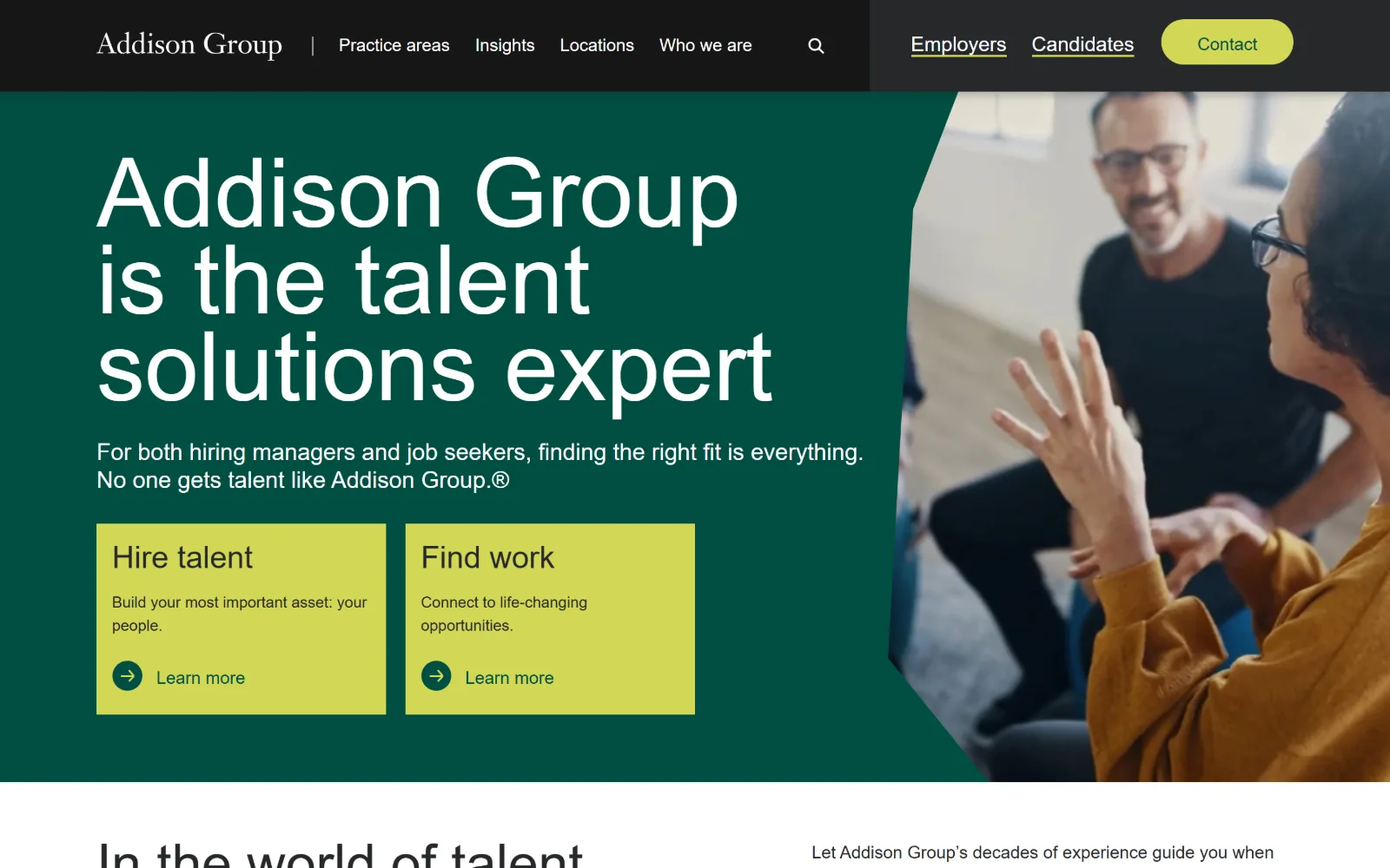
Black header bar above a deep green hero, a 100px headline in four lines, and two chartreuse cards for Hire talent and Find work.
Type
Degular 100px, 0.90 leading
Body
Inter 24px/1.2
Build
1300px container, angled photo cut, sticky black header
Made on
WordPress
Colour
#004e42 #01322a #d2d755
Type. Degular sets the headline at 100px, weight 400, with leading compressed to 0.90 so the four lines stack almost without gaps. Inter variable handles the rest at 24px for the standfirst and 18px for navigation, and a 56px cut repeats seven times further down. The serif wordmark is the only historical shape on screen.
Colour. Green does the structural work: #004e42 for the hero and #01322a beneath it, against white at 155% coverage. Chartreuse #d2d755 is the only bright value, used for the Contact pill, the two action cards and 30 characters of text, which is just enough for it to read as the brand rather than a highlight.
Layout. A 1300px container at 90% of the viewport, with the hero split so copy fills the left and a photograph enters on an angled cut from the right. The black header runs full bleed above it and stays sticky. The two action cards are flat rectangles with no radius, each closing on a circular arrow.
The ask. Three asks, ranked clearly. Contact sits in the header as a chartreuse pill, Employers and Candidates are underlined links beside it, and the two hero cards split the audience before anything scrolls. Each card ends in Learn more rather than a form, and no phone number is shown.
Splitting the two audiences into matching cards inside the hero answers the first question a visitor has before they scroll a single pixel.
04
acertitude.com
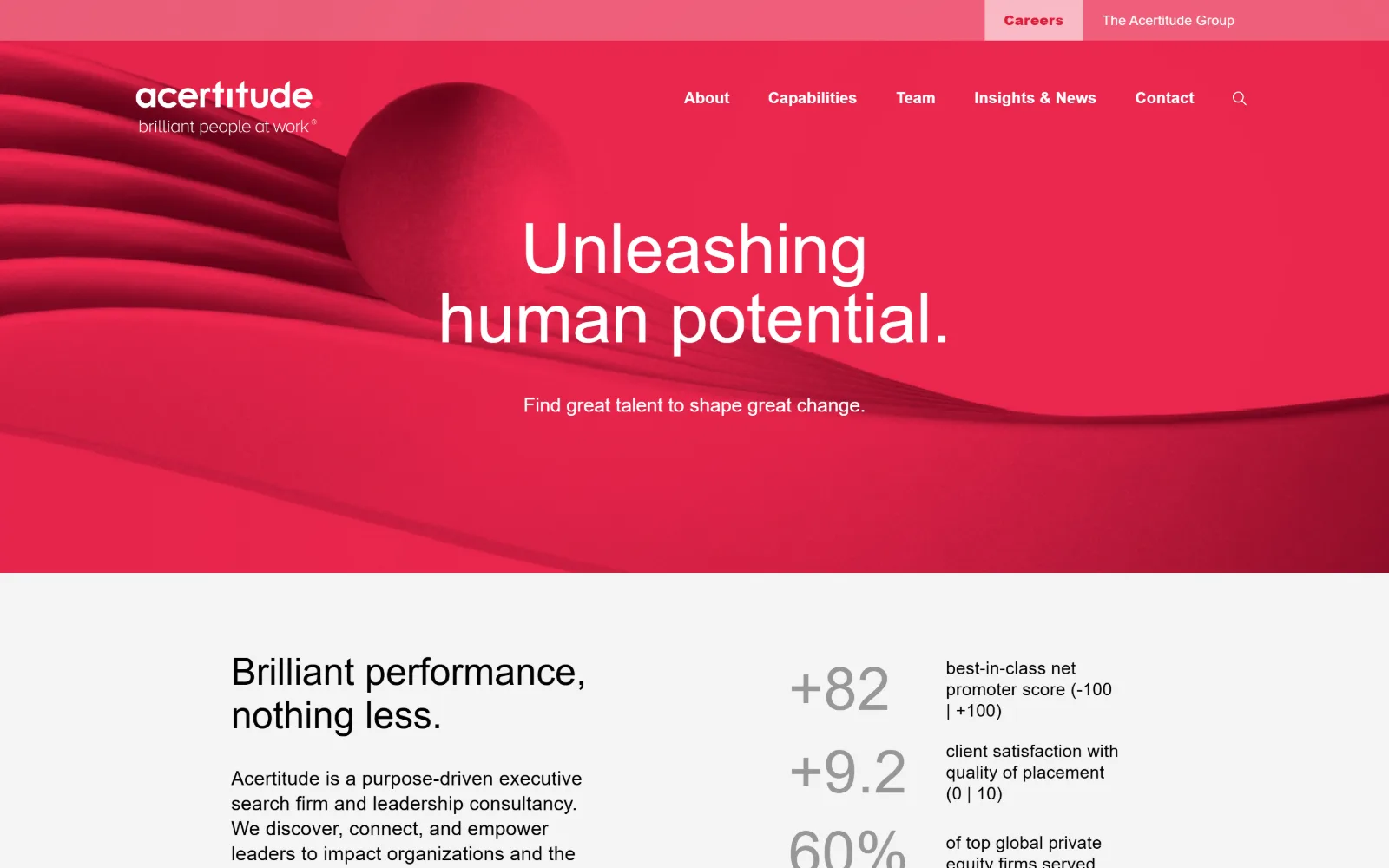
A full-bleed crimson render of folded ribbons and a sphere, with a 72px white headline centred over it and one line of support copy below.
Type
Proxima Nova 72px, 1.0 leading
Body
Proxima Nova 20px/1.3
Build
full-bleed render, 12-column grid, 35px gutter
Colour
#ff2c55 #f4f4f4 #dd1c39
Type. Proxima Nova at 72px, weight 400, with leading set to exactly 1.0, which is what lets the two centred lines sit so close together. There is no bold anywhere in the hero. Underneath, a 62px cut repeats three times, body runs 20px at 1.3, and navigation drops to 14px at weight 800 with 0.015em tracking.
Colour. Three values. The crimson #ff2c55 covers 43% of the page, #f4f4f4 takes the section below at 24%, and white is the remainder. Ink is 943 characters of white on the hero and 352 of black beneath it. A deeper #dd1c39 appears on seven characters only, marking the active navigation item.
Layout. Full 1440px bleed with no container edge visible in the hero, so the rendered ribbon runs corner to corner and the type is centred over it. Below the fold the page switches to a twelve-column grid with 35px gutters for the statistics block. Radius is zero throughout and the header floats without a bar.
The ask. Nothing is asked for in the hero: no button, no form, no phone. The first ask is the navigation itself, with Careers and The Acertitude Group split into a secondary strip above, and the persuasion is handed to the figures underneath, +82, +9.2 and 60%, each with a line of explanation.
A hero with no button at all holds up when the proof sits one scroll below and the navigation carries the only two routes a visitor needs.
05
medely.com
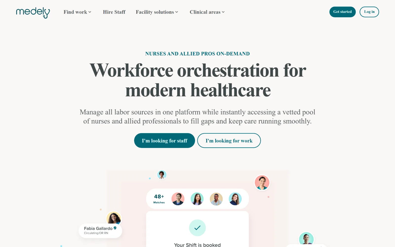
Centred warm pink page with a 72px serif headline, teal eyebrow caps above it, two pill buttons and a floating product mock with avatar bubbles.
Type
serif 72px, 600, -0.04em
Body
27px/1.2
Build
centred 1440px, 100px padding, pill buttons
Made on
custom JS framework
Colour
#faf7f5 #006878 #576062
Type. At 72px the serif display is pulled to -0.04em with leading at 1.0, so the two centred lines nearly touch, and weight 600 keeps the thin strokes from vanishing on a pale ground. The standfirst is 27px at 1.2, close enough in size that the pair reads as one paragraph. A 19px teal eyebrow in caps is the only tracked type.
Colour. Three values and almost no saturation. A warm #faf7f5 ground covers 281% across the scroll, white lifts the cards off it, and teal #006878 appears on 93 characters of text plus the filled button. Ink is #576062 for body and #3f484a for the display, a two-step grey rather than anything approaching black.
Layout. Everything centres inside the 1440px frame with 100px section padding, which gives the headline air on both sides. The product mock below is a composed scene rather than a screenshot in a frame, with avatar bubbles escaping the card edge in four directions. Buttons are full pills at 9999px radius.
The ask. Two asks of equal weight sit side by side, I am looking for staff filled in teal and I am looking for work outlined, splitting the marketplace at the first decision. Get started repeats as a pill in the header with Log in beside it. No phone number and no enquiry form above the fold.
When a marketplace serves two sides, give each one a button of equal size in the hero instead of making one of them hunt in the navigation.
06
huntclub.com
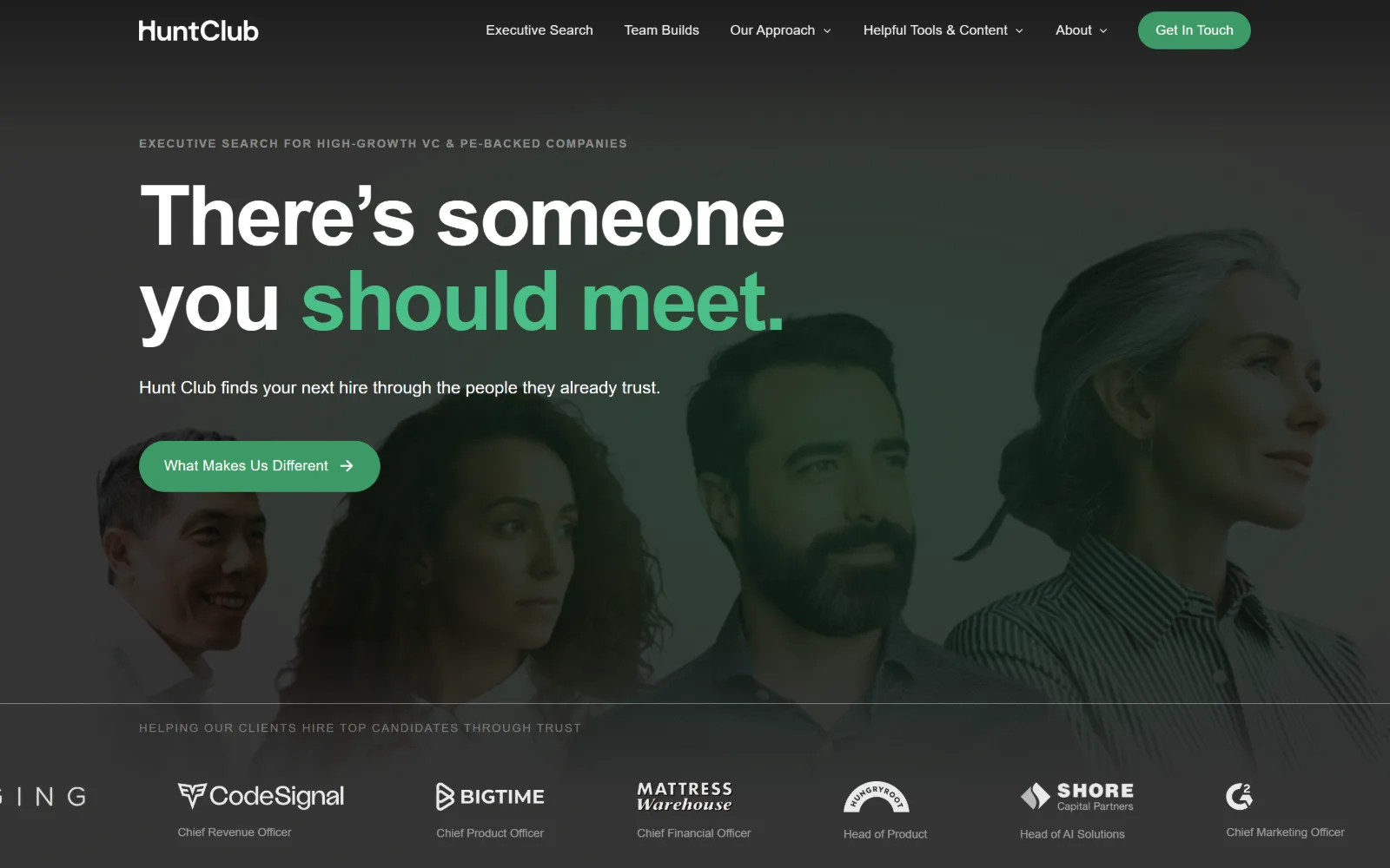
Near-black hero with a row of ghosted portraits behind it, an 86px headline whose last two words turn green, and a green pill button below.
Type
grotesque 86px, 700, -0.03em
Body
DM Sans 17px/1.65
Build
full-bleed ghosted portrait band, 100px padding
Colour
#f9f7f3 #0b0c0a #3d9a66
Type. An 86px grotesque at weight 700 with tracking at -0.03em does the shouting, and the colour change on the last two words does the rest. DM Sans takes the supporting line at 17px, weight 300, leading 1.65, a deliberately light companion. The eyebrow above runs in caps with wide tracking and names the client type.
Colour. Four near-greys and a green. The page ground is #f9f7f3 with #f4f1eb beneath it, the hero inverts to #0b0c0a, and body text sits at #555555 rather than black. Green #3d9a66 covers 0.7% of the page: the pill button, the two accented words, and a darker #267044 on 68 characters further down.
Layout. Full width at 1440px with 100px section padding. The portraits are not a grid but one ghosted band tinted into the background, so the headline sits on photography without competing with it. The logo strip beneath is a flat row of six marks with no box or border around any of them.
The ask. One pill, What Makes Us Different, which is an argument rather than a form, with Get In Touch held in the header as the only hard ask. The proof is the logo row directly under the fold, where each client mark carries the title that was filled, and 600M and 1.1b appear further down the page.
Captioning each client logo with the role you placed turns a decorative trust strip into evidence a buyer can actually read.
07
trustedhealth.com
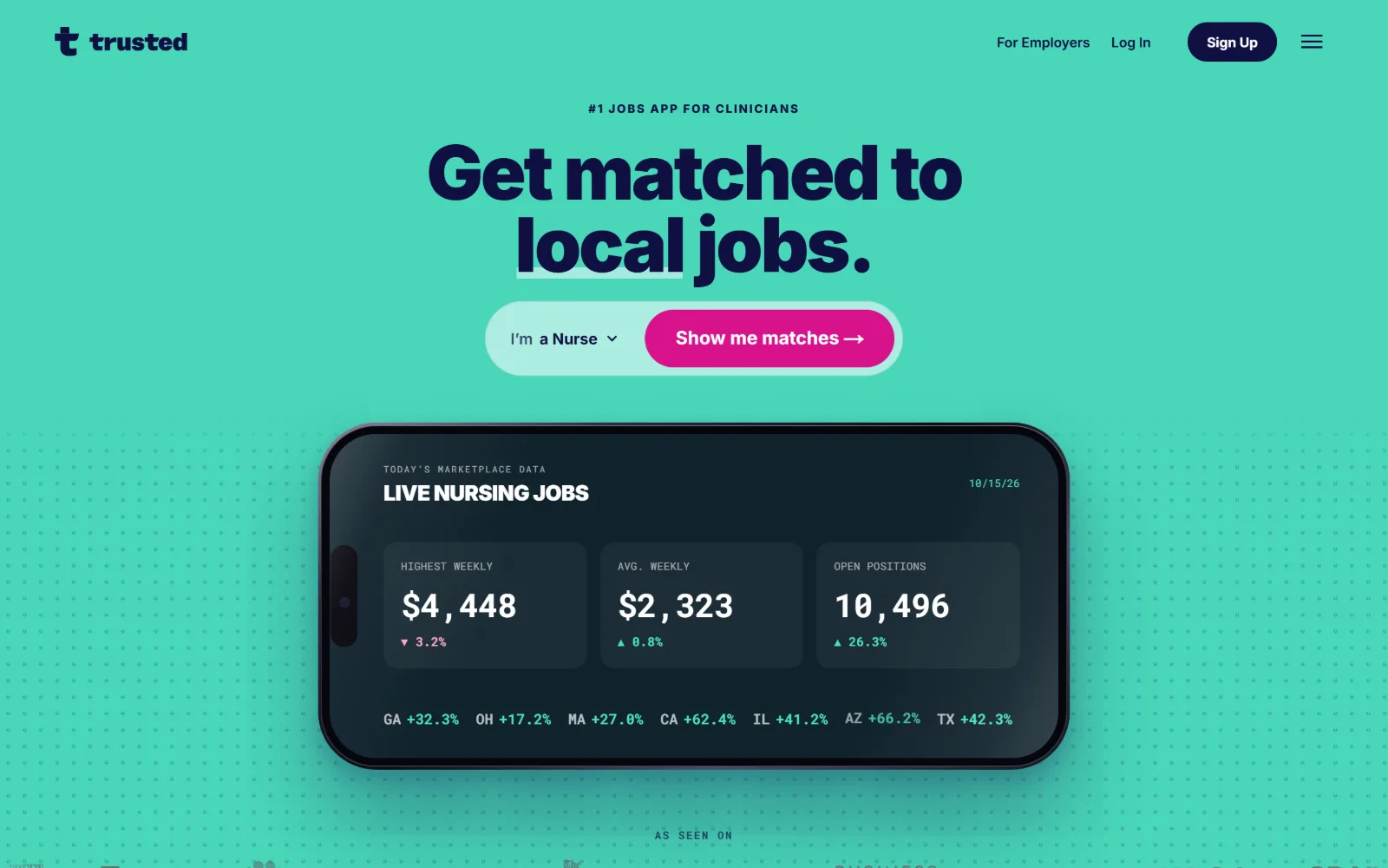
Mint green field with a dotted texture, a navy 78px headline in two lines, a white selector pill and a magenta button, over a dark phone mock.
Type
Inter 78px, 900, -0.035em
Body
Inter 14px/1.5
Build
centred column, 1440px, 104px padding
Colour
#49d7ba #0f1041 #d7128a
Type. Inter at 78px and weight 900, tracking -0.035em with leading at 0.96, which is about as tight as that face goes before the descenders start colliding. Body drops all the way to 14px, so the gap between display and text is five steps. A small caps eyebrow sits above, and the phone mock sets its figures in a monospaced face.
Colour. Six values, and the mint #49d7ba is the ground rather than the accent, at 54% coverage against white at 248%. Navy #0f1041 does all the reading and also fills the primary button. Magenta #d7128a is the real accent at 7.7%, carried by the call to action and one falling figure inside the mock.
Layout. A centred column inside 1440px with 104px section padding, where the selector and the button fuse into one rounded control. Beneath it a phone mock breaks the section edge. The grid under the fold runs seven columns at a 10px gap for the figures strip and three at 20px for the cards.
The ask. A single compound ask: choose a discipline in the dropdown, then press Show me matches, so the first click is a low-cost choice rather than a form. Sign Up sits in the header with Log In beside it. Weekly pay figures and a press row under the fold do the remaining persuading.
Pairing a dropdown with the submit control inside one pill turns a commitment into a two-second choice, which is why this hero needs no second ask.
08
heidrick.com
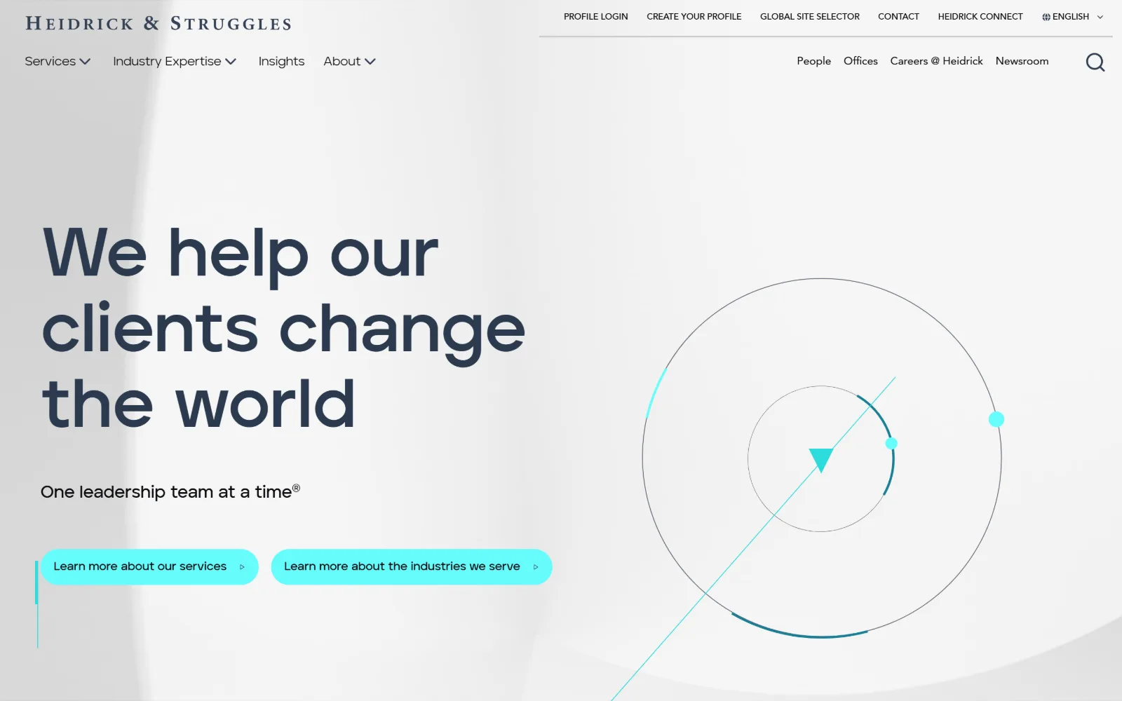
Pale grey page with an engraved serif wordmark, an 88px navy headline in three lines, two cyan pill buttons and a thin circle diagram at right.
Type
Aventa 88px, 700
Body
Aventa 16px
Build
left-weighted hero, 1440px, line diagram right
Colour
#002136 #2cdada #66fcfc
Type. Aventa carries the headline at 88px, weight 700, leading 1.10, in navy rather than black. Everything else is tiny by comparison: 16px navigation, a 15px weight 600, and an 11px uppercase cut used six times for labels. The engraved serif wordmark holds the firm's age while the headline holds its present tense.
Colour. Four values. White and a near-white gradient take 54% of the page, #002136 holds the darker sections at 46%, and all the brightness is two cyans, #2cdada and #66fcfc, used on the buttons and the diagram marks. Reading ink is #0b0c10 with a muted #197e95 appearing on ten characters.
Layout. A left-weighted hero inside 1440px, type in the left half and a line diagram occupying the right with two concentric circles and a diagonal through them. There is no photograph and no card. The header splits into two rows, a utility strip above and the main navigation below, both on the same white ground.
The ask. Both buttons are soft: Learn more about our services and Learn more about the industries we serve, each a cyan pill. The harder asks live in the utility strip as Profile Login, Create your profile and Contact. There is no phone number and no form in the first screen.
A line diagram in place of stock photography gives a hero its right-hand weight without implying anything the business has not actually claimed.
09
trueplatform.com
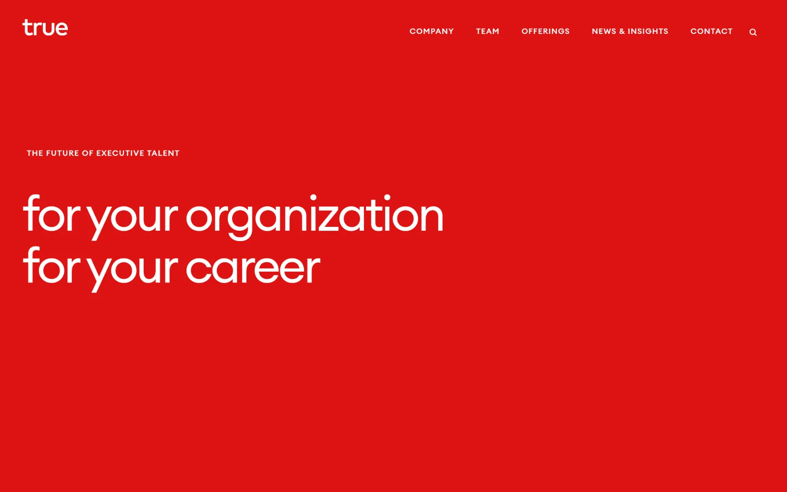
A single saturated red field carrying white type: a lowercase wordmark, uppercase navigation, a tracked eyebrow and two lines of large lowercase.
Type
True Euclid 88px, -0.05em
Body
True Euclid 18px/1.75
Build
full-bleed red field, 96px padding
Made on
WordPress
Colour
#be0b0b #ffffff
Type. Everything is one face, True Euclid. Labels run 14px at weight 500 with 0.1em tracking and 2.0 leading, used 59 times across the page, while the display cut reaches 88px at weight 400 with tracking pulled to -0.05em. The contrast is in the tracking rather than the family: loose for the small caps, tight for the large lowercase.
Colour. One colour and white. The body background is #be0b0b and 1,794 characters of ink are white, with black appearing only in the section below the fold. Nothing is tinted, nothing is shaded, and there is no second accent anywhere in the frame, not even on the search icon.
Layout. Full 1440px bleed with 96px section padding and no container edge visible, so the red runs to all four sides. The headline sits low in the frame, roughly two thirds down, leaving a deliberate void above it. No cards, no radius, no dividing rules, and no image of any kind in the first screen.
The ask. Nothing is asked above the fold. Five navigation items and a search icon are the entire interface, and the hero text is a statement rather than an offer. Contact is the last navigation item, treated exactly like the other four, and no phone number or form appears.
A brand confident enough to ask for nothing on first view needs typography to carry the argument, which means one face and ruthless tracking discipline.
10
themomproject.com
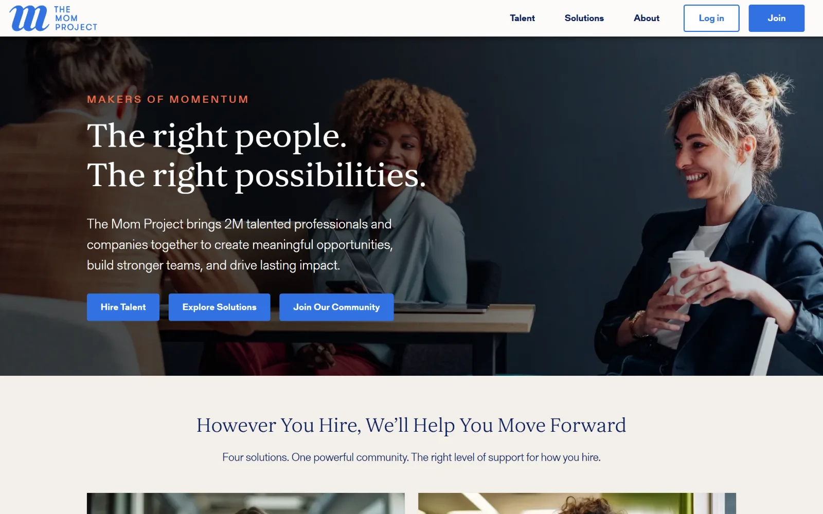
Full-bleed photograph of three people at a table, a coral eyebrow, a 60px serif headline in two lines and three blue buttons in a row.
Type
serif 60px, 500, 1.15 leading
Body
24px, 300
Build
full-bleed photo, two-column grid, 24px gutter
Made on
custom JS framework
Colour
#f3f0ea #3272e2 #ef6e4a
Type. A serif display at 60px, weight 500, with slight positive tracking at 0.002em and 1.15 leading, set over a dark photograph so the thin strokes still hold. The supporting sans runs 24px at weight 300, with a coral eyebrow at 18px in caps and 0.2em tracking. Below the fold the same serif returns at 36px for the section head.
Colour. Six values, which is unusual in this set. A warm #f3f0ea takes the second section, while blue #3272e2, green #34a874, coral #ef6e4a and yellow #ffb818 sit at roughly matched coverage near 4 to 6%. The hero itself is photographic, so the palette only becomes visible once the page scrolls.
Layout. The photograph runs the full 1440px width with no container inset and the copy is ranged left over it. Content below drops onto a two-column grid with a 24px gutter. Buttons are nearly square at 4px radius, which keeps them from looking like app chrome on top of editorial photography.
The ask. Three asks in a row, Hire Talent, Explore Solutions and Join Our Community, all the same blue at the same size, with Join and Log in repeated in the header. That is five routes competing in one view, and the flat ranking leaves the visitor to sort them out alone.
Three equally weighted buttons in a hero read as a menu rather than a recommendation, so rank them visually if one route matters more than the rest.
11
mondo.com
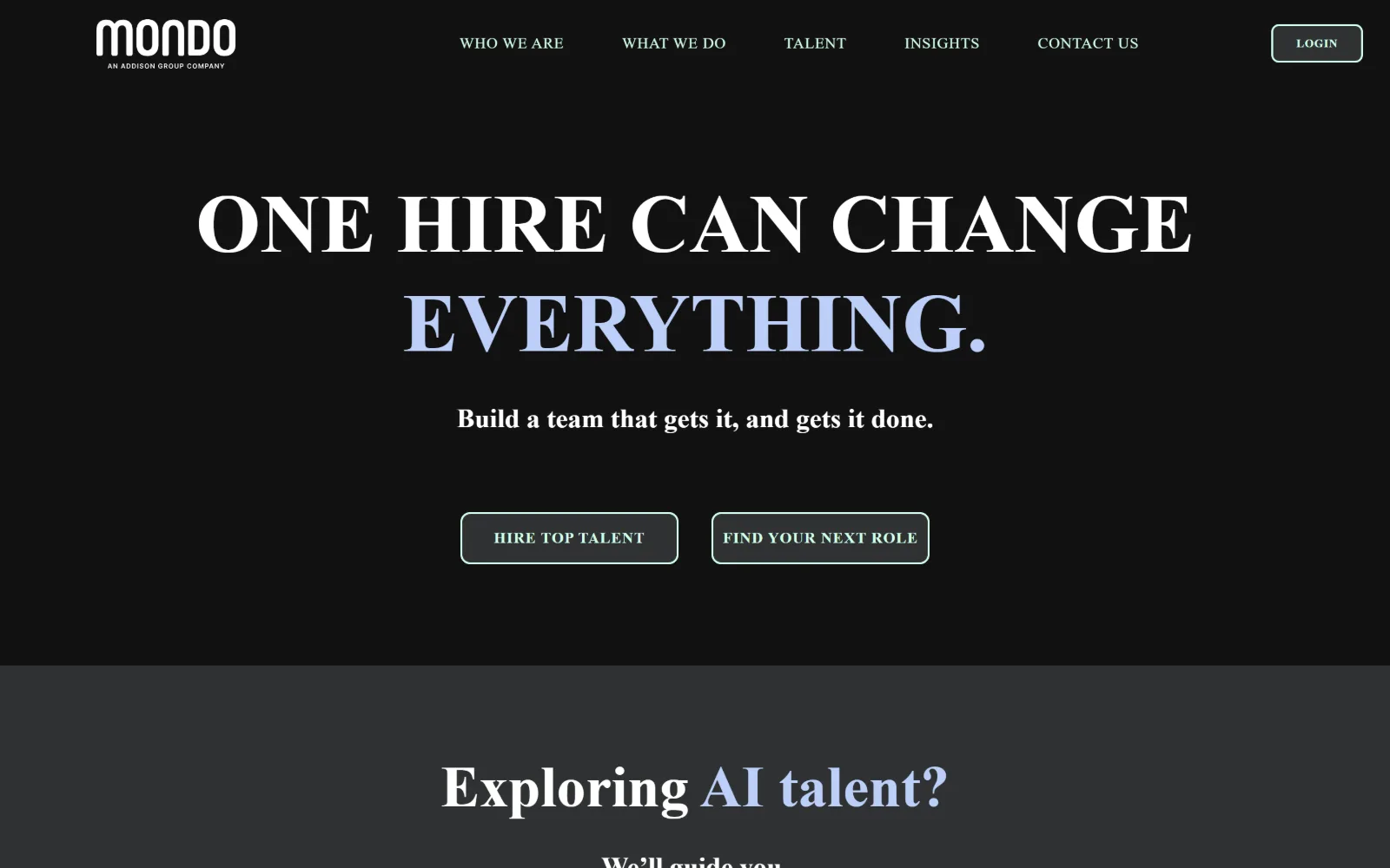
All-caps serif headline across two lines of black, with the word Everything in periwinkle and two outlined buttons carrying mint labels below.
Type
serif caps 86px, 700
Body
Inter 20px/1.5
Build
1300px centred, 8px radius outlines
Made on
WordPress
Colour
#121212 #2f3233 #bdcff9
Type. Caps at 86px in a high-contrast serif, weight 700, leading 1.20, which is an unusual pick for a technology staffing firm and the reason the page does not look like its competitors. Inter handles body at 20px and navigation at 16px with 0.04em tracking in caps, so the sans stays deliberately plain underneath it.
Colour. Three structural values: white, #121212 for the hero and #2f3233 for the band below. The accents live in the ink instead, periwinkle #bdcff9 on 109 characters and mint #d1ffe7 on 138, which is why the buttons and the second half of the headline glow faintly against the black rather than shouting.
Layout. A 1300px container at 90% of the viewport, everything centred, with the hero taking roughly three quarters of the first screen before a grey band takes over. Buttons are 8px radius outlines rather than fills. The header is sticky and the wordmark carries a line of fine print directly beneath it.
The ask. Two outlined buttons, Hire Top Talent and Find Your Next Role, split the audience at equal weight and neither is filled. Login sits alone in the header as an outline too, so no element on the page is a solid button. Contact Us is the fifth navigation item and no phone number appears.
Carrying accent colour in the text rather than in filled shapes keeps a dark page calm while still giving the buttons somewhere to glow.
12
egonzehnder.com
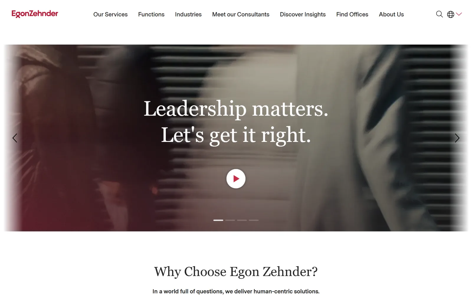
White header with a crimson wordmark above a motion-blurred photographic band, a 64px serif headline centred on it and a red play control.
Type
Coranto 2 64px, 1.25 leading
Body
Messina Sans 16px/1.5
Build
1400px container, 86px padding, inset photo band
Colour
#ffffff #242424 #b61a37
Type. Coranto 2 holds the headline at 64px, weight 400, leading 1.25, and the same cut is reused sixteen times down the page, which is unusual restraint for a firm this size. Messina Sans takes body at 16px plus an 18px weight 600 that repeats 23 times for links, so the serif is reserved entirely for statements.
Colour. Four values. White at 143% and #f6f6f6 at 35% hold the page, #242424 takes the dark sections and all the reading, and crimson #b61a37 appears on 41 characters plus the play button. That is under one per cent of coverage doing the whole job of brand recognition.
Layout. A 1400px container at 97% of the viewport, so the photographic band keeps a visible margin on both sides rather than bleeding to the edge. Section padding is 86px. Slider arrows sit outside the band at the page edges and the progress marks sit below it, which keeps every control off the image.
The ask. The headline is itself the slide's link and the play control is the only visible ask above the fold. Six navigation items, a search icon and a language selector handle the rest. No phone number, no form, and nothing styled as a call to action in the first screen.
Insetting a hero image so the container edge stays visible lets slider controls live in the margin instead of printing arrows over the photograph.
13
gun.io
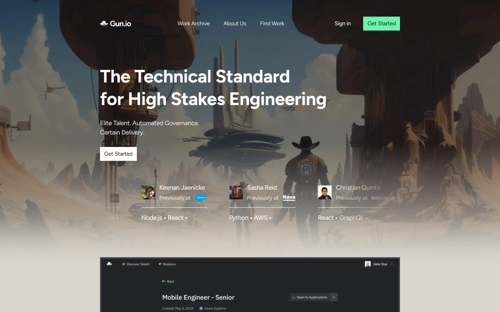
Painted desert landscape with floating structures, a white two-line headline over it, three talent cards with avatars and a dark dashboard mock.
Type. A geometric sans at 52px, weight 700, tracking -0.01em for the headline, with Figtree at 18px for nearly everything else and used 31 times, which leaves the page close to single-sized below the fold. Navigation drops to 16px at -0.016em. There is no serif and no uppercase styling anywhere in the frame.
Colour. Six values built on an unexpected ground: #dbd6ce, a warm stone, covers the whole page in place of white. Dark #1c1d21 and #121211 take the product mock, and mint #69f5ab appears at 0.2% coverage, on the Get Started button alone. The illustration supplies every other bit of saturation on screen.
Layout. Full 1440px bleed with 100px section padding. The illustration fades into the stone ground rather than ending on a hard edge, and three engineer cards sit over its lower half in a flat row divided by hairline rules. Corners are square throughout, including on both buttons.
The ask. Get Started appears twice, as a mint button in the header and a white one in the hero, with Sign in beside it. Three named engineers with former employers and stacks sit directly beneath as proof. No form, no phone, and the dashboard mock previews the product instead of asking for anything.
Letting an illustrated hero dissolve into the page ground instead of stopping on a hard edge removes the banner feeling a cropped photograph gives.
14
kingsleygate.com
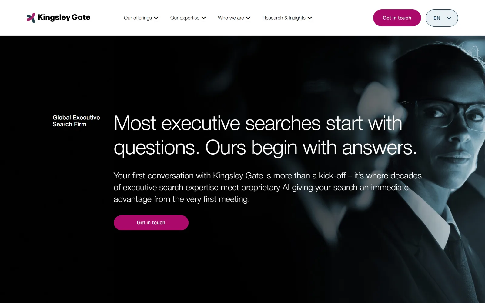
A dark duotone portrait fills the right third under a solid white header, beside a light 60px headline and a magenta Get in touch pill.
Type
60px, 300, -0.017em
Body
Helvetica Neue 25px/1.4
Build
1440px, solid white header, 30px pills
Made on
WordPress
Colour
#ffffff #e8f1f4 #aa096c
Type. The headline runs 60px at weight 300 with tracking at -0.017em, light enough to read as a sentence rather than a slogan, and the body sits unusually large at 25px, weight 300, with 1.4 leading. The small label above it, Global Executive Search Firm, is the only element on the first screen set in a bold weight.
Colour. Three values. White holds 106% of the page and #e8f1f4 takes the section below, while the hero is a blue-black duotone photograph. Magenta #aa096c covers 0.7%, carried by the pill in the header and the pill in the hero. Reading ink is #1e3e49, a blue-grey chosen over black.
Layout. The header sits on solid white above the hero rather than floating over it, so the photograph starts on a clean line at 1440px full width. The portrait occupies the right third with the subject's face close to the edge. Buttons are 30px pills and the language selector is built to match them.
The ask. The same ask twice, Get in touch as a magenta pill in the header and again under the body copy, and it is the only button on the first screen. Four navigation dropdowns cover everything else. No phone number and no form, with the body paragraph doing the work of a value proposition.
Repeating one button rather than offering two keeps a long paragraph of hero copy from ending in a choice the reader has to make.
15
nomadhealth.com
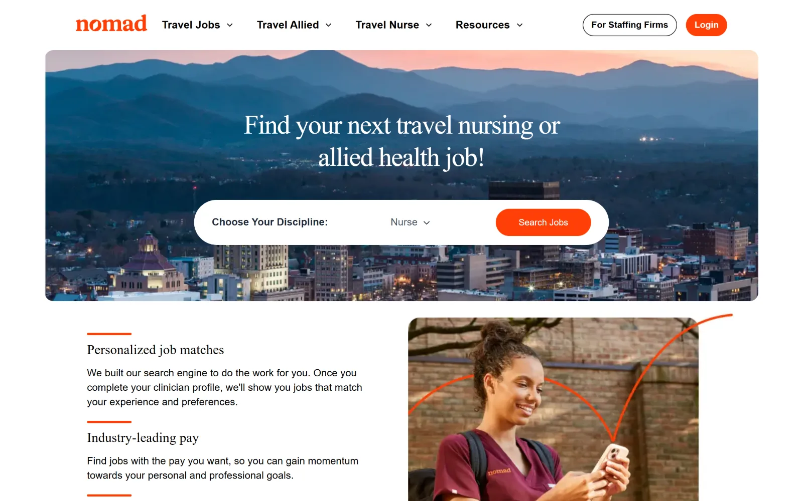
Orange wordmark over an inset photograph of mountains at dusk, a centred serif headline and a white pill search bar laid across the image.
Type
serif 48px, 300, -0.03em
Body
DM Sans 18px/1.44
Build
inset rounded hero photo, pill controls
Made on
custom JS framework
Colour
#ffe2dc #ff4007 #ffffff
Type. Set centred on the photograph, the serif display runs 48px at weight 300, tracking -0.03em and leading 1.20, and the same cut returns at 24px seven times below. DM Sans handles body at 18px with 0.004em tracking. Section headings use a 19px weight 700, so hierarchy under the fold comes from weight rather than scale.
Colour. Three values, and one of them is the point. Blush #ffe2dc covers 40% of the page while white is only 8%, and orange #ff4007 appears on 11 characters plus every button and rule. Ink is black across 1,025 characters, which keeps the body copy plain while the orange does all the pointing.
Layout. The hero is an inset photograph with rounded corners and a margin on all four sides rather than a bleed, which makes the page feel like a product instead of a brochure. Buttons are full pills at 9999px radius. Below, a two-column block pairs copy with a photograph crossed by a hand-drawn orange arc.
The ask. One search control, a white pill holding a discipline dropdown and an orange Search Jobs button, and that is the entire ask. Login and For Staffing Firms sit in the header, pulling the second audience out of the main flow. No phone number and no enquiry form above the fold.
Insetting the hero image with a margin on all four sides makes a job board read as an application rather than as another marketing landing page.
16
aquent.com
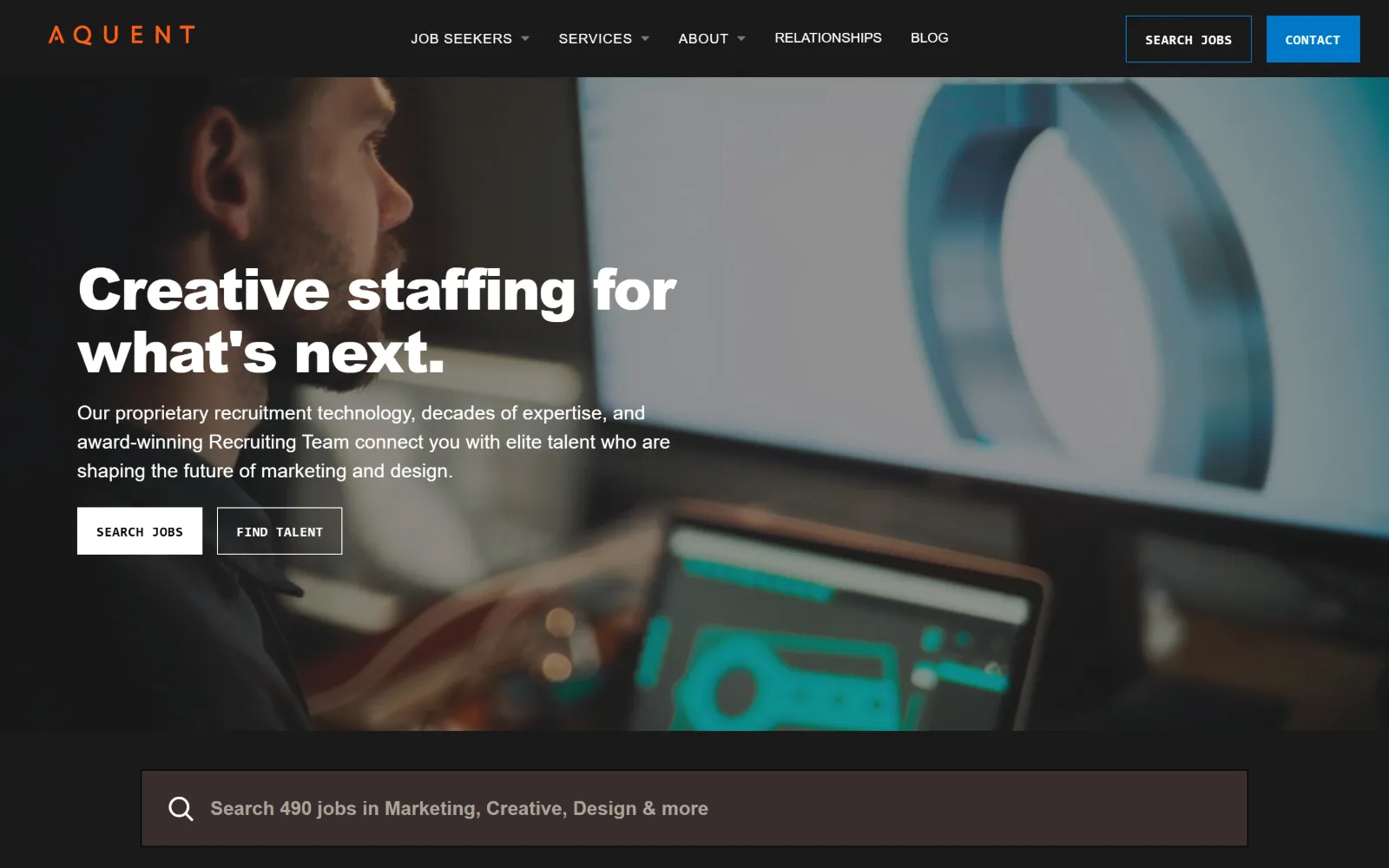
Dark photograph of a designer at a monitor behind a black header, with a heavy 60px headline and two square outlined buttons in mono caps.
Type
heavy sans 60px, 900, -0.029em
Body
sans 20px/1.5
Build
1440px, 40px padding, zero-gutter grids
Made on
WordPress
Colour
#f3f0eb #1a1919 #0077c8
Type. The headline is a heavy sans at 60px, weight 900, with tracking pulled to -0.029em, and further cuts at 55px and 45px appear down the page. The buttons break the system entirely: a monospaced face at 14px, weight 600, 0.036em tracking, uppercase, and that detail is what makes the page look made by the agency.
Colour. Five values. A warm #f3f0eb holds the lower page at full coverage, #1a1919 takes the hero and the header, and blue #0077c8 sits at 0.6% on the single Contact button. Ink is #1a1919 on the light sections and white on the dark ones, with #382e2c shading the search bar below the fold.
Layout. Full 1440px width with modest 40px section padding, which keeps the page dense rather than airy. The hero photograph bleeds behind both the header and the search bar under it. Content below drops onto four and three column grids with zero gutter, so blocks meet edge to edge. Nothing is rounded.
The ask. Four asks compete above the fold: Search Jobs and Contact in the header, Search Jobs and Find Talent under the headline, then a live search field counting 490 open roles. The repeated Search Jobs is the strongest signal, and the job count persuades harder than any of the four buttons.
A monospaced uppercase button label is a cheap way to signal craft, but it only works while the rest of the type system stays plain underneath it.
How these were chosen
Executive search and creative or technical staffing turned out to be the two pockets of this industry where real design budgets land, and the shortlist leans that way. The pattern holding across almost every one of them is a hero split in two, one route for the company hiring and one for the person looking, settled before anything scrolls. The second constant is restraint with colour: most of these pages spend under one per cent of their surface on an accent and let a ground tone do the rest. What does not hold is the display face. Staffing agency website design is supposed to mean a confident grotesque, and half of this set reaches for a serif instead, from Cormorant Garamond at 92px down to a 48px light serif floated over a photograph.
Finding staffing sites that someone had actually designed took far longer than it should have. 41 candidates made the shortlist. 16 made the page.
Each one was opened and looked at properly: what the type is doing, where the colour gets spent, how the page is built, how it asks for the job. Nothing is here because it ranks. Nothing is here because an agency filed it under portfolio. Several well known names were left out for the plain reason that their site came out of the same template as everyone else's, and a few sites worth including did not survive a second look.
Where a site is only competent, it says so. The order is the order worth your time, best first.
Reviewed and selected by Larry W. Matthews for Websitely.